A Complete Step-by-Step Guide to PCA for RNA-seq Data Analysis: From Basics to Advanced Applications
This comprehensive guide provides researchers, scientists, and drug development professionals with a complete protocol for performing Principal Component Analysis (PCA) on RNA-seq data.
A Complete Step-by-Step Guide to PCA for RNA-seq Data Analysis: From Basics to Advanced Applications
Abstract
This comprehensive guide provides researchers, scientists, and drug development professionals with a complete protocol for performing Principal Component Analysis (PCA) on RNA-seq data. Covering foundational concepts through advanced applications, we detail the entire workflow from data preprocessing and normalization to visualization and interpretation using established tools like DESeq2. The article addresses critical quality control measures, troubleshooting common pitfalls, and validation techniques to ensure robust analysis. With practical examples and optimization strategies, this resource enables reliable exploratory analysis and meaningful biological insights from high-dimensional transcriptomic data, supporting applications in biomarker discovery, experimental quality assessment, and clinical research.
Understanding PCA Fundamentals and RNA-seq Data Preparation
What is PCA? Core Concepts and Mathematical Principles
Core Concepts of PCA
Principal Component Analysis (PCA) is a dimensionality reduction technique that simplifies complex datasets by transforming a large set of variables into a smaller one that still contains most of the information from the original set [1]. This method is foundational in data analysis and machine learning, particularly valuable for exploring and visualizing high-dimensional data [2] [3].
The Purpose of Dimensionality Reduction
Large datasets with many variables present significant challenges: they are difficult to visualize, computationally intensive to process, and often contain correlated variables or noise that can obscure meaningful patterns [2]. PCA addresses these issues by:
- Reducing computational requirements and improving efficiency for subsequent analysis [2] [4].
- Minimizing noise by filtering out less significant variations in the data [2] [3].
- Enabling visualization of high-dimensional data in 2D or 3D spaces [3].
- Mitigating multicollinearity by creating new, uncorrelated variables for downstream statistical analysis [3] [4].
Understanding Principal Components
Principal Components (PCs) are new variables constructed as linear combinations of the original variables [1]. They are designed to be uncorrelated (orthogonal), and are ordered such that the first component captures the maximum possible variance in the data, the second component captures the next highest variance while being uncorrelated to the first, and so on [1] [5].
Geometrically, principal components represent the directions of maximum variance in the data. Think of them as new axes that provide the optimal angle to view and evaluate data, making differences between observations more apparent [1]. The first principal component (PC1) is the axis along which data points show the greatest spread, the second component (PC2) is perpendicular to PC1 and captures the next best direction of spread, and this continues for all subsequent components [3].
Table: Key Characteristics of Principal Components
| Characteristic | Description |
|---|---|
| Orthogonality | All principal components are perpendicular (uncorrelated) to each other [1]. |
| Variance Ranking | Components are ordered by the amount of variance they explain, from highest to lowest [1]. |
| Interpretation | PCs are less interpretable than original variables as they lack direct real-world meaning [1]. |
| Completeness | The total number of PCs equals the number of original variables, but only the first few are typically used [1]. |
Mathematical Principles of PCA
The mathematical foundation of PCA lies in linear algebra and statistical concepts including standardization, covariance, and eigenvectors/eigenvalues [2].
The PCA Algorithm: A Step-by-Step Mathematical Workflow
The computation of principal components follows a systematic, five-step process.
Step 1: Standardization and Centering The goal is to standardize the range of continuous initial variables so that each contributes equally to the analysis [1]. Without this step, variables with larger ranges would dominate those with smaller ranges, leading to biased results [1]. Standardization is performed by subtracting the mean and dividing by the standard deviation for each value of each variable [1] [4]:
[ Z = \frac{X - \mu}{\sigma} ]
where ( \mu ) is the mean of the feature and ( \sigma ) is its standard deviation [4]. This transforms all variables to the same scale with a mean of 0 and standard deviation of 1 [3].
Step 2: Covariance Matrix Computation The covariance matrix reveals how variables in the dataset vary from the mean relative to each other [1]. It identifies correlated variables that may contain redundant information [1]. For a dataset with ( p ) variables, the covariance matrix is a ( p \times p ) symmetric matrix where the diagonal elements represent the variances of each variable, and the off-diagonal elements represent the covariances between variable pairs [1]. The covariance between two features ( x1 ) and ( x2 ) is calculated as [4]:
[ \text{cov}(x1,x2) = \frac{\sum{i=1}^{n}(x{1i} - \bar{x1})(x{2i} - \bar{x_2})}{n-1} ]
The sign of the covariance indicates the nature of the relationship: positive (variables increase together), negative (one increases when the other decreases), or zero (no linear relationship) [1] [3].
Step 3: Eigen Decomposition Eigenvectors and eigenvalues of the covariance matrix are calculated to determine the principal components [1]. The eigenvectors represent the directions of the axes with the most variance (the principal components themselves), while the eigenvalues indicate the magnitude or amount of variance carried by each principal component [1] [2]. For a square matrix ( A ), an eigenvector ( X ) (a non-zero vector) and its corresponding eigenvalue ( \lambda ) satisfy [4]:
[ A\mathbf{X} = \lambda\mathbf{X} ]
Step 4: Feature Selection In this step, we decide which principal components to keep. The eigenvectors are ranked by their eigenvalues in descending order, and only the most significant components (those with the highest eigenvalues) are retained [1]. This forms a feature vector - a matrix containing the selected eigenvectors [1]. The choice of how many components to retain involves a trade-off between dimensionality reduction and information preservation, often determined using a scree plot which shows the proportion of total variance explained by each component [3].
Step 5: Data Projection (Recast the Data) The final step transforms the dataset onto the new principal component axes. This is done by multiplying the original standardized data by the feature vector (the matrix of retained eigenvectors) [1]. The result is a new dataset with reduced dimensions that captures the most significant patterns in the original data [1].
Key Mathematical Outputs and Their Interpretation
Eigenvalues and Variance Explained The proportion of total variance explained by each principal component is calculated by dividing its eigenvalue by the sum of all eigenvalues [5]. For example, if the eigenvalues for PC1 and PC2 are ( \lambda1 ) and ( \lambda2 ), then:
- Variance explained by PC1 = ( \frac{\lambda1}{\lambda1 + \lambda_2} )
- Variance explained by PC2 = ( \frac{\lambda2}{\lambda1 + \lambda_2} ) [1]
In practical applications, the first few components often capture the majority of the variance in the dataset [1].
Principal Components as Linear Combinations Each principal component is expressed as a linear combination of the original variables. For example: [ PC1 = w{11}X1 + w{12}X2 + \cdots + w{1p}Xp ] [ PC2 = w{21}X1 + w{22}X2 + \cdots + w{2p}Xp ] where the weights ( w{ij} ) are derived from the eigenvectors, and ( Xj ) are the standardized original variables [5].
Table: Mathematical Elements of PCA
| Element | Mathematical Role | Interpretation in PCA |
|---|---|---|
| Covariance Matrix | ( \mathbf{\Sigma} = \frac{1}{n-1} \mathbf{X}^T \mathbf{X} ) [2] | Captures variable relationships and variances [1]. |
| Eigenvectors | ( \mathbf{\Sigma v} = \lambda \mathbf{v} ) [2] | Directions of maximum variance (principal components) [1] [3]. |
| Eigenvalues | ( \lambda ) in the equation above [2] | Amount of variance carried by each component [1] [3]. |
| Data Projection | ( \mathbf{T} = \mathbf{XW} ) [5] | Transformed data in the new coordinate system. |
Application Note: PCA for RNA-Seq Data Analysis
In RNA sequencing (RNA-seq) experiments, PCA is an essential tool for quality control, exploratory analysis, and visualizing sample relationships based on gene expression patterns [6] [7].
Workflow for RNA-Seq PCA
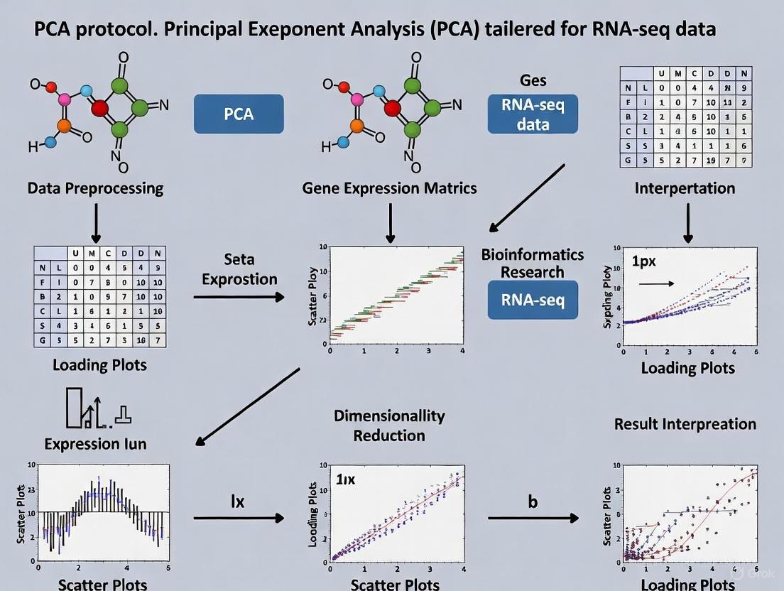
The following diagram illustrates the complete protocol for applying PCA to RNA-seq data, from raw counts to visualization and interpretation.
Experimental Protocol: PCA Implementation for RNA-Seq Data
Purpose: To reduce the dimensionality of gene expression data and visualize global expression patterns, sample relationships, and potential batch effects or outliers [6] [7].
Sample Preparation and Data Generation
- RNA Extraction: Isolate high-quality RNA from samples (e.g., cells, tissues). For the example murine alveolar macrophage dataset, RNA integrity number (RIN) should be >7.0 [6].
- Library Preparation and Sequencing: Convert RNA to cDNA, prepare libraries using appropriate kits (e.g., NEBNext Ultra DNA Library Prep Kit for Illumina), and sequence on a platform such as Illumina NextSeq 500 [6].
- Read Processing: Demultiplex raw sequencing data (bcl2fastq), align reads to a reference genome (e.g., mm10 for mouse) using aligners like TopHat2, and generate raw counts per gene using tools such as HTSeq [6].
Computational Methods
- Data Preprocessing:
- Low-count filtering: Remove genes with minimal expression that add mostly noise. A common threshold is keeping only genes with 10 or more reads total across all samples [7].
- Normalization: Account for differences in library size and other technical variations. For RNA-seq data, methods in packages like DESeq2 are commonly used [7].
- PCA Implementation in R:
Interpretation of Results
- Sample Grouping: Samples that cluster together in PCA space have similar gene expression profiles [6].
- Variance Explained: The percentage values on axes indicate how much of the total gene expression variability is captured by each PC [6] [7].
- Outlier Detection: Samples far from main clusters may indicate quality issues or biologically distinct states [6].
- Batch Effects: Strong separation along any PC correlated with technical factors (e.g., processing date) rather than biological variables indicates potential batch effects [6].
The Scientist's Toolkit: Essential Reagents and Computational Tools
Table: Key Research Reagent Solutions for RNA-seq PCA Analysis
| Item | Function/Application | Example Products/Tools |
|---|---|---|
| RNA Isolation Kit | Extract high-quality RNA from biological samples | PicoPure RNA Isolation Kit [6] |
| Library Prep Kit | Prepare sequencing libraries from RNA | NEBNext Poly(A) mRNA Magnetic Isolation Kit, NEBNext Ultra DNA Library Prep Kit [6] |
| Sequencing Platform | Generate raw sequencing reads | Illumina NextSeq 500 [6] |
| Alignment Software | Map sequences to reference genome | TopHat2 [6] |
| Gene Counting Tool | Generate count data per gene | HTSeq [6] |
| Statistical Environment | Data analysis and PCA implementation | R programming language [7] |
| Analysis Packages | Specialized methods for RNA-seq data | DESeq2, ggplot2 [7] |
Advanced Applications in Drug Discovery and Development
PCA has proven particularly valuable in drug discovery, where it helps researchers identify patterns in complex chemical and biological data [8] [9].
Molecular Descriptor Analysis for Compound Optimization
In a study investigating quercetin analogues for improved blood-brain barrier (BBB) permeability, PCA was applied to identify which molecular descriptors contribute most significantly to BBB penetration [9]. Researchers calculated numerous molecular descriptors related to membrane permeability for 34 quercetin analogues and used PCA to transform these descriptors into a reduced set of principal components [9].
The analysis revealed that descriptors related to intrinsic solubility and lipophilicity (logP) were primarily responsible for clustering four quercetin analogues (trihydroxyflavones) with the highest predicted BBB permeability [9]. This application demonstrates how PCA can guide lead optimization in neuroprotective drug development by highlighting structural characteristics most relevant to desired pharmacokinetic properties.
Protein Dynamics and Ligand Binding Analysis
In drug discovery projects, PCA is frequently used to analyze Molecular Dynamics (MD) simulations of protein-ligand complexes [8]. By applying PCA to the 3D coordinates of protein trajectories, researchers can:
- Identify the dominant collective motions of proteins and how they are affected by ligand binding [8].
- Compare conformational spaces explored by proteins under different conditions (e.g., with different ligands bound) [8].
- Detect structural convergence and identify distinct conformational states that might be missed by conventional analyses like RMSD [8].
For example, in analyzing a dimeric protein, PCA revealed an allosteric effect between subunits - when one binding site was unoccupied, the protein explored a significantly different conformational space compared to when both sites were occupied [8]. Such insights are valuable for understanding mechanisms of drug action and designing more effective therapeutics.
Technical Considerations and Limitations
While PCA is a powerful technique, researchers should be aware of its limitations and appropriate use cases:
- Linearity Assumption: PCA is a linear technique and may not capture complex nonlinear relationships in data [4]. For nonlinear data, alternatives like Kernel PCA may be more appropriate [2].
- Interpretation Challenges: Principal components are mathematical constructs that may not have straightforward biological interpretations, as they are linear combinations of all original variables [1] [4].
- Sensitivity to Scaling: PCA results are heavily influenced by data scaling, making proper standardization crucial [1] [4].
- Information Loss: While dimensionality reduction is beneficial, discarding components with low eigenvalues inevitably sacrifices some information [1] [4].
- Variance vs. Relevance: PCA focuses on directions of maximum variance, but these may not always be the most biologically relevant patterns [6].
For RNA-seq data specifically, proper experimental design is essential to minimize batch effects that can dominate the true biological signal in PCA results [6]. Strategies include processing control and experimental samples together, harvesting samples at the same time of day, and minimizing variations in RNA isolation procedures [6].
RNA sequencing (RNA-seq) has become the primary method for transcriptome analysis since its introduction in 2008, generating unprecedented detail about the RNA landscape and enabling comprehensive understanding of gene expression, regulatory networks, and biological processes [6] [10]. The technique involves converting RNA into cDNA, followed by fragmentation, adapter ligation, and high-throughput sequencing to produce "reads" that must be computationally processed and interpreted [6]. The enormous datasets generated by RNA-seq present significant bioinformatics challenges, requiring researchers to understand the principles underlying each processing step to avoid misinterpretation and draw meaningful biological conclusions [6].
The transformation of raw sequencing data into an analysis-ready format represents a critical phase in RNA-seq experiments. This process involves multiple computational steps that progressively refine the data quality and structure until it becomes suitable for sophisticated analyses such as differential expression and dimensionality reduction techniques like Principal Component Analysis (PCA) [6]. Proper processing ensures that biological signals are preserved and enhanced while technical artifacts and noise are minimized. This protocol outlines the complete workflow from raw sequencing outputs to structured datasets ready for exploratory analysis, with particular emphasis on preparation for PCA, which serves as a powerful quality control and hypothesis-generation tool in transcriptomic studies.
RNA-seq Experimental Design and Data Generation
Experimental Considerations
Robust RNA-seq analysis begins with proper experimental design. Key considerations include minimizing batch effects, which can introduce technical variation that confounds biological signals. Batch effects can originate from multiple sources including different researchers, temporal factors, environmental conditions, RNA isolation procedures, library preparation techniques, and sequencing runs [6]. To mitigate these effects, researchers should harvest controls and experimental conditions simultaneously, process samples in randomized orders when possible, use intra-animal and littermate controls, perform RNA isolation and library preparation for all samples on the same day, and sequence all samples in a single run when feasible [6].
Sample quality is paramount throughout this process. RNA integrity should be verified using metrics such as RNA Integrity Number (RIN), with values above 7.0 indicating high-quality RNA suitable for library preparation [6]. For library construction, researchers must select appropriate kits based on their specific needs—standard mRNA kits for abundant RNA, specialized low-input kits for limited starting material, and rRNA depletion methods when seeking to retain non-coding RNA species [11].
Sequencing Output and Raw Data Structure
The initial output from RNA-seq experiments consists of raw sequencing reads stored in FASTQ format. These files contain both sequence information and quality scores for each base call (Phred scores) [12]. A typical FASTQ file contains four lines per read: a sequence identifier, the nucleotide sequence, a separator line, and quality scores encoded in ASCII format [12].
The data structure at this stage includes:
- Read identifiers: Unique identifiers for each sequence read
- Nucleotide sequences: The actual DNA sequences derived from RNA transcripts
- Quality scores: Probability-based scores indicating confidence in each base call
- Adapter sequences: Artificial sequences added during library preparation that may need removal
Primary Data Processing and Quality Control
Quality Assessment and Read Trimming
The initial quality assessment of raw FASTQ files uses tools like FastQC to evaluate key metrics including Phred quality scores, adapter contamination, GC content, duplication rates, and length distribution [11] [12]. This assessment identifies potential issues that might compromise downstream analyses.
Following quality assessment, reads typically undergo trimming and filtering to remove low-quality bases, adapter sequences, and contaminants. This step is crucial as inaccuracies and artifacts at this stage can propagate through the entire analysis pipeline. Commonly used tools include fastp and Trimmomatic, which offer flexible parameters for adapter removal and quality filtering [11] [10].
Table 1: Quality Control Tools and Their Applications
| Tool | Purpose | Key Features | Best For |
|---|---|---|---|
| FastQC | Quality control | Generates visual quality reports | Initial assessment of raw reads |
| fastp | Trimming and filtering | Fast processing, integrated QC | Comprehensive preprocessing |
| Trimmomatic | Trimming | Flexible parameters, thorough trimming | Customized adapter removal |
| MultiQC | Aggregate reporting | Combines multiple QC reports | Projects with many samples |
A typical trimming command using fastp for paired-end data includes:
This command trims both read pairs, automatically detects adapters, sets a minimum read length of 25 bases, and generates both HTML and JSON reports for quality assessment [12].
Read Alignment and Quantification
Alignment-Based Approaches
Trimmed reads are aligned to a reference genome or transcriptome using splice-aware aligners that can handle the gaps created by intron splicing in eukaryotic transcripts [13]. The alignment process produces Sequence Alignment Map (SAM) or Binary Alignment Map (BAM) files that contain mapping locations and CIGAR strings describing alignment characteristics [13].
Table 2: Comparison of RNA-seq Alignment Tools
| Aligner | Strengths | Limitations | Best Application |
|---|---|---|---|
| STAR | Accurate spliced alignment, fast | High memory requirements | Complex transcriptomes, novel junction detection |
| HISAT2 | Fast, memory-efficient | Less accurate for complex splicing | Large datasets, standard splicing |
| TopHat2 | Established method | Slower than newer alternatives | Legacy compatibility |
For alignment with STAR, a typical command includes:
This command executes alignment using multiple threads, handles compressed input files, outputs unsorted BAM files, and generates both genome and transcriptome alignments [12].
Pseudoalignment and Quantification
As an alternative to traditional alignment, pseudoaligners like Salmon and Kallisto use k-mer matching to assign reads to transcripts without generating full alignments, offering dramatic improvements in speed [11] [13]. These tools decompose reference transcripts into k-mers (short subsequences), construct a network where these k-mers serve as nodes, and then determine the most likely transcript of origin for each read by finding the best path through this network [13].
The quantification step generates count data representing the abundance of each transcript or gene in the sample. These counts are typically stored in matrix format with genes as rows and samples as columns. For alignment-based approaches, tools like HTSeq count the number of reads overlapping each genomic feature [6], while pseudoaligners use expectation-maximization algorithms to estimate transcript abundances [13].
Data Transformation and Normalization
Count Normalization Methods
Raw count data requires normalization to account for technical variations such as sequencing depth and gene length, enabling meaningful comparisons between samples. Different normalization methods address specific technical artifacts:
- TPM (Transcripts Per Million): Normalizes for both sequencing depth and gene length, allowing comparison within and between samples [11]
- FPKM/RPKM (Fragments Per Kilobase Million): Similar to TPM but with different mathematical properties that make between-sample comparisons less reliable [11]
- DESeq2's Median of Ratios: Assumes most genes are not differentially expressed and uses the geometric mean to calculate size factors for each sample [7]
- edgeR's Trimmed Mean of M-values (TMM): Trims extreme values before calculating normalization factors, robust against highly differentially expressed genes [6]
The choice of normalization method significantly impacts downstream analysis, particularly for differential expression and dimensionality reduction. For PCA applications, variance-stabilizing transformations such as the regularized logarithm (rlog) in DESeq2 or the variance stabilizing transformation (VST) are particularly valuable as they reduce the mean-variance relationship in count data [7].
Low-Count Filtering and Data Cleaning
Prior to analysis, genes with low counts are typically filtered out as they contribute mostly noise rather than biological signal. The filterByExpr function in edgeR provides a robust method for this filtering by keeping only genes with a minimum number of counts in a sufficient number of samples [11]. In a typical analysis, this filtering might retain approximately 58% of genes while removing those with consistently low expression [11].
Additional data cleaning may involve checking for outliers using PCA or hierarchical clustering, examining the percentage of reads mapping to ribosomal RNA genes (indicating potential contamination), and verifying that sample relationships reflect expected biological groupings rather than technical batches [11].
Analysis-Ready Data Structure for PCA
Data Formatting for PCA
The final analysis-ready dataset for PCA typically takes the form of a normalized, transformed expression matrix with genes as rows and samples as columns. This matrix should have appropriate dimensions—after quality filtering, a typical dataset might contain 10,000-20,000 genes across multiple samples [7]. The data should be free of technical artifacts, with normalization applied to address sequencing depth and composition biases.
In preparation for PCA, the expression matrix is often transformed using variance-stabilizing techniques that make the data more amenable to linear dimensionality reduction methods. The DESeq2 package provides built-in functions for both normalization and transformation specifically designed for RNA-seq count data [7].
Workflow Integration
The complete workflow from raw data to PCA-ready format can be visualized as a sequential process with multiple checkpoints:
Diagram 1: RNA-seq Data Processing Workflow for PCA. This diagram illustrates the sequential steps required to transform raw sequencing data into an analysis-ready format suitable for Principal Component Analysis.
The Scientist's Toolkit: Essential Research Reagents and Computational Tools
Table 3: Essential Research Reagents and Computational Tools for RNA-seq Analysis
| Category | Tool/Reagent | Function | Application Notes |
|---|---|---|---|
| Quality Control | FastQC | Quality assessment of raw reads | Provides visual reports for key metrics including Phred scores and adapter contamination [11] [12] |
| Trimming | fastp | Read trimming and filtering | Fast processing with integrated quality control, suitable for most applications [10] [12] |
| Alignment | STAR | Spliced alignment of reads | Accurate for complex transcriptomes, generates both genome and transcriptome alignments [11] [12] |
| Quantification | Salmon | Alignment-free quantification | Extremely fast, useful for large datasets and isoform-level analysis [11] [13] |
| Normalization | DESeq2 | Statistical normalization | Uses median of ratios method, ideal for differential expression analysis [7] |
| Visualization | ggplot2 | Data visualization | Flexible plotting system for creating publication-quality figures [7] |
| Reference Genome | GRCh38 (human) | Alignment reference | Use most recent version with appropriate annotations [11] [12] |
| Gene Annotation | GENCODE | Gene model annotations | Ensure compatibility with reference genome version [12] |
Quality Assessment and Validation
Post-Processing Quality Metrics
After processing, the quality of the analysis-ready data should be verified using multiple approaches. Qualimap provides comprehensive quality metrics for aligned reads, including the distribution of reads across genomic features (exonic, intronic, intergenic), which should show strong enrichment for exonic regions in standard mRNA-seq experiments [12]. Additional metrics include the alignment rate (typically >80%), the uniformity of coverage along transcripts, and the complexity of the library [11].
PCA itself serves as a powerful quality assessment tool. When applied to the processed data, it should reveal whether biological replicates cluster together and whether the major sources of variation correspond to expected biological conditions rather than technical batches [6] [7]. Samples that appear as outliers in PCA may indicate potential quality issues that require further investigation.
Batch Effect Detection and Correction
PCA is particularly effective for visualizing batch effects, which occur when technical variations dominate biological signals [6] [14]. In a PCA plot, batch effects typically manifest as clear separation of samples processed in different batches, often along the first principal component. When batch effects are detected, correction methods such as ComBat or removeBatchEffect can be applied before proceeding with downstream analysis [14].
The effectiveness of batch correction can be validated by examining PCA plots before and after correction. Successful correction should reduce the separation between batches while maintaining biological differences of interest. However, it is always preferable to minimize batch effects through proper experimental design rather than relying solely on computational correction [6].
The transformation of raw RNA-seq data into an analysis-ready format represents a critical multi-step process that progressively enhances data quality and biological interpretability. Each stage—from quality control and trimming through alignment, quantification, and normalization—prepares the data for sophisticated analytical techniques like Principal Component Analysis. Proper execution of these steps ensures that the resulting expression matrix accurately reflects biological reality rather than technical artifacts, enabling meaningful insights into transcriptomic regulation.
The structured approach outlined in this protocol emphasizes quality assessment at multiple checkpoints, appropriate tool selection based on experimental needs, and thorough validation of the final dataset. By following this comprehensive workflow, researchers can confidently proceed to dimensionality reduction, differential expression analysis, and other advanced computational methods, secure in the knowledge that their data foundation is robust and analytically sound.
In the context of transcriptomics research, particularly when preparing data for Principal Component Analysis (PCA), the preprocessing steps of quality control (QC) and normalization form the critical foundation for all subsequent biological interpretations. RNA sequencing (RNA-Seq) has revolutionized the study of transcriptomes by enabling comprehensive, genome-wide quantification of RNA abundance with lower background noise and finer resolution than previous methods like microarrays [15]. However, the reliability of conclusions drawn from RNA-Seq data, including PCA visualizations that reveal sample clustering and patterns, is directly dependent on the quality of preprocessing [16]. Without rigorous QC and appropriate normalization, technical variations can obscure true biological signals, leading to misinterpretations that compromise research validity, especially in critical applications like drug development and biomarker discovery [15] [16].
This protocol outlines a systematic approach to RNA-seq data preprocessing, emphasizing how each step influences the integrity of downstream PCA. We provide detailed methodologies for quality assessment, data cleaning, and normalization strategies, enabling researchers to transform raw sequencing data into robust datasets capable of revealing meaningful biological insights through dimension reduction techniques.
RNA-seq Workflow: From Raw Data to Analysis-Ready Information
The journey from raw sequencing outputs to analysis-ready data involves multiple critical steps that progressively enhance data quality and comparability. The following diagram illustrates the complete workflow, highlighting how each preprocessing stage contributes to preparing data for downstream applications like PCA:
Comprehensive Quality Control Protocol
Three-Stage Quality Control Implementation
Quality control in RNA-seq analysis is not a single step but a continuous process applied at multiple stages to ensure data integrity. Systematic QC practices help detect technical artifacts early, preventing misleading biological conclusions [16].
Stage 1: Raw Data Quality Control
The initial QC assessment evaluates FASTQ files obtained directly from the sequencer, providing the first indication of data quality and potential technical issues [15] [16].
Protocol Steps:
- Run FastQC on all FASTQ files to generate quality metrics
- Use MultiQC to aggregate and compare results across all samples
- Critical metrics to assess:
- Per-base sequence quality (Phred scores)
- Adapter contamination levels
- GC content distribution
- Sequence duplication levels
- Overrepresented sequences
Quality Thresholds:
- Base quality: Phred score ≥ Q30 (indicating 0.1% error rate) [16]
- Adapter contamination: Minimal presence (<5% of reads)
- GC content: Should match organism expectations without unusual bimodal distributions
Table 1: Key QC Metrics and Interpretation Guidelines
| QC Metric | Optimal Range | Potential Issue | Corrective Action |
|---|---|---|---|
| Per-base Sequence Quality | Q30 or higher across all bases | Quality drops at read ends | Increase trimming at low-quality regions |
| Adapter Contamination | <5% of reads | High adapter content (>10%) | More aggressive adapter trimming |
| GC Content | Organism-specific normal distribution | Unusual bimodal distribution | Potential contamination; investigate sources |
| Sequence Duplication | <20-50% depending on organism | Very high duplication (>70%) | PCR over-amplification; consider duplicate removal |
| rRNA Content | <10% in mRNA-seq | High rRNA percentage (>30%) | Inadequate rRNA depletion during library prep |
Stage 2: Preprocessing and Data Cleaning
After initial assessment, raw reads undergo cleaning to remove technical artifacts while preserving biological signal [15].
Tools and Parameters:
- Trimmomatic: For adapter removal and quality trimming
- Cutadapt: Specifically designed for adapter sequence removal
- fastp: All-in-one FASTQ preprocessor with comprehensive reporting
Implementation Protocol:
Critical Consideration: Balance between removing technical artifacts and preserving biological data. Over-trimming reduces sequencing depth and statistical power, while under-trimming leaves artifacts that distort downstream analysis [15].
Stage 3: Post-Alignment Quality Control
After reads are aligned to a reference genome or transcriptome, additional QC metrics become available to assess alignment quality and potential biases [15] [17].
Assessment Protocol:
- Mapping Rate Evaluation:
- Minimum acceptable: >70% uniquely mapped reads
- Optimal: >80% uniquely mapped reads
- Investigate samples with mapping rates <70% for potential contamination or reference mismatches [16]
Alignment Distribution Analysis:
- Evaluate gene body coverage uniformity using RSeQC
- Check for 5' or 3' bias that might indicate library preparation issues
- Assess splice junction detection rates
Duplicate Read Analysis:
- Use Picard Tools to mark and assess PCR duplicates
- High duplication rates may indicate low input material or over-amplification
Batch Effect Detection and Mitigation
Batch effects arising from experimental conditions (different library preparation dates, sequencing runs, or technicians) can introduce systematic variations that obscure biological signals [6] [16].
Detection Methods:
- Principal Component Analysis (PCA) coloring samples by potential batch variables
- Hierarchical clustering to identify sample groupings by technical factors
- Correlation analysis between technical covariates and principal components
Mitigation Strategies:
- Include biological replicates to distinguish technical from biological variation
- Randomize sample processing across experimental batches
- Utilize statistical batch correction methods (ComBat, Limma) when necessary, applied after normalization but before downstream analysis [18]
RNA-seq Normalization Strategies
Understanding Normalization Requirements
Normalization adjusts raw count data to account for technical variations, enabling meaningful biological comparisons. The diagram below illustrates the three primary normalization contexts in RNA-seq analysis:
Normalization Methods: Protocol and Applications
Different normalization methods address specific technical biases and are suited for particular analytical contexts. The choice of method significantly impacts downstream analysis, including PCA outcomes and differential expression results [19] [18].
Within-Sample Normalization Methods
These methods enable comparison of expression levels between different genes within the same sample by accounting for gene length and sequencing depth variations [18].
FPKM/RPKM Protocol:
- Formula: FPKM = [Fragment Count / (Gene Length in kb × Total Fragments in Millions)]
- Application: Gene expression comparisons within a single sample
- Limitation: Not suitable for between-sample comparisons due to composition effects [20]
TPM (Transcripts Per Million) Protocol:
- Calculation Steps:
- Divide read counts by transcript length in kilobases (yielding reads per kilobase)
- Sum all per-kilobase values for the sample
- Divide each per-kilobase value by the sample sum and multiply by 10⁶
- Advantage: Sum of all TPMs is identical across samples, enabling more accurate cross-sample comparisons than FPKM [18] [20]
- Application: Both within-sample and between-sample comparisons when used with additional between-sample normalization
Between-Sample Normalization Methods
These methods enable robust comparisons of gene expression across different samples by accounting for library size differences and composition effects [18].
TMM (Trimmed Mean of M-values) Protocol:
- Assumption: Most genes are not differentially expressed [19]
- Implementation:
- Select a reference sample (often with median library size)
- Calculate fold changes (M-values) and absolute expression levels (A-values) for all genes relative to reference
- Trim extreme M and A values (typically 5% from each end and 30% of M-values)
- Calculate scaling factors from weighted mean of remaining log-fold-changes
- Tools: Available in edgeR package [19]
RLE (Relative Log Expression) Protocol:
- Assumption: Most genes are not differentially expressed [19]
- Implementation:
- Calculate geometric mean for each gene across all samples
- Compute ratio of each sample's counts to these geometric means
- Calculate median of these ratios for each sample (size factor)
- Divide raw counts by sample-specific size factors
- Tools: Default method in DESeq2 package [19]
Table 2: Comparative Analysis of RNA-seq Normalization Methods
| Method | Type | Corrects For | Best Applications | Limitations |
|---|---|---|---|---|
| TPM | Within-sample | Sequencing depth, Gene length | Within-sample comparisons, RNA-seq with varying transcript lengths | Less accurate for between-sample DE analysis |
| FPKM/RPKM | Within-sample | Sequencing depth, Gene length | Single-sample gene expression comparisons | Problematic for between-sample comparisons [20] |
| TMM | Between-sample | Library size, RNA composition | Differential expression, PCA visualization | Assumes most genes not DE; sensitive to extreme outliers |
| RLE (DESeq2) | Between-sample | Library size, RNA composition | Differential expression, Small sample sizes | Similar assumptions to TMM; performance affected by many DE genes |
| Quantile | Between-sample | Distribution differences | Making expression distributions similar across samples | Assumes technical variation causes distribution differences |
Advanced Normalization: Batch Effect Correction
When integrating multiple datasets or dealing with batch effects, additional normalization is required to remove unwanted technical variation while preserving biological signals [18].
ComBat Protocol:
- Principle: Empirical Bayes method that adjusts for known batch effects
- Implementation:
- Apply within-dataset normalization first (e.g., TMM or RLE)
- Identify batch variables (sequencing date, facility, etc.)
- Use ComBat to estimate and remove batch-specific effects
- Verify effectiveness using PCA visualization colored by batch
Surrogate Variable Analysis (SVA):
- Application: Detect and adjust for unknown sources of technical variation
- Implementation: Identify hidden factors that correlate with expression but not primary variables of interest
Table 3: Essential Computational Tools for RNA-seq Quality Control and Normalization
| Tool | Primary Function | Key Features | Application Context |
|---|---|---|---|
| FastQC | Raw data quality assessment | Comprehensive quality metrics, HTML reports | Initial QC of FASTQ files [15] [16] |
| MultiQC | Aggregate QC reports | Summarizes multiple tools and samples, Comparative visualization | Study-level quality assessment [15] |
| Trimmomatic | Read trimming | Adapter removal, Quality-based trimming, Leading/trailing base cutting | Pre-alignment data cleaning [15] |
| STAR | Read alignment | Spliced alignment, Fast processing, High accuracy | Mapping reads to reference genome [15] [17] |
| featureCounts | Read quantification | Fast processing, Multiple annotation formats, Strand-specific counting | Generating count matrices from aligned reads [15] [17] |
| DESeq2 | Normalization & DE analysis | RLE normalization, Negative binomial model, Multiple testing correction | Between-sample normalization, Differential expression [19] |
| edgeR | Normalization & DE analysis | TMM normalization, Robust statistical framework | Between-sample normalization, Differential expression [19] |
| Qualimap | Post-alignment QC | Mapping quality analysis, Coverage biases, Junction detection | Comprehensive alignment assessment [15] |
Integration with PCA: From Preprocessing to Visualization
The ultimate goal of rigorous preprocessing is to enable biologically meaningful PCA visualizations that accurately reflect sample relationships rather than technical artifacts.
Preprocessing Impact on PCA Outcomes
Effective normalization is crucial for PCA because:
- Technical variations can dominate principal components, obscuring biological patterns
- Inadequate normalization may cause samples to cluster by technical factors (batch, sequencing depth) rather than biological conditions
- Properly normalized data should show biological replicates clustering together in PCA space
Protocol: PCA Implementation After Preprocessing
Step 1: Data Preparation
- Start with normalized count matrix (e.g., TMM- or RLE-normalized counts)
- Filter lowly expressed genes (e.g., keep genes with ≥10 counts in minimum sample size)
- Apply variance-stabilizing transformation (e.g., DESeq2's vst or rlog) if using count-based methods
Step 2: PCA Computation
- Use standard statistical packages (prcomp in R, scikit-learn in Python)
- Center data to mean zero (essential)
- Scale to unit variance (recommended when genes have different expression ranges)
Step 3: Result Interpretation
- Examine variance explained by each principal component
- Color samples by biological conditions and technical factors to identify potential confounders
- Assess whether biological replicates cluster more tightly than samples from different conditions
Quality control and normalization are not mere technical formalities but fundamental processes that determine the validity of all subsequent RNA-seq analyses, including PCA. By implementing the systematic protocols outlined in this document—incorporating multi-stage quality assessment, appropriate normalization strategies, and batch effect management—researchers can transform raw sequencing data into reliable datasets capable of revealing meaningful biological insights. The stringent application of these preprocessing steps ensures that PCA visualizations and other downstream analyses reflect true biological signals rather than technical artifacts, ultimately supporting robust scientific conclusions in transcriptomics research and drug development.
RNA sequencing (RNA-Seq) has revolutionized transcriptomic research by enabling genome-wide quantification of RNA abundance, but the resulting count data presents significant statistical challenges for analysis [21] [15]. The raw count matrix generated from RNA-Seq experiments exhibits characteristic properties that complicate direct application of statistical methods: counts are restricted to non-negative integers, the variance depends on the mean (heteroskedasticity), and technical variations in sampling efficiency between samples create systematic biases [22] [23]. Data transformation methods address these challenges by converting raw counts into continuous, normalized values with stable variance, making the data amenable to downstream statistical analyses and visualization techniques such as Principal Component Analysis (PCA) [24] [25].
The fundamental need for transformation arises from the statistical properties of RNA-Seq data. Without transformation, a few highly expressed genes can dominate the variance structure, potentially obscuring biologically relevant patterns [25]. As demonstrated in single-cell RNA-Seq studies, when data is not properly transformed, "PC1 will basically coincide with a single gene" that has extreme expression differences between samples [25]. Effective transformation methods stabilize variance across the dynamic range of expression and remove technical artifacts, enabling more biologically meaningful interpretation of data structure through dimensionality reduction techniques like PCA [7].
Theoretical Foundations of RNA-Seq Data Transformation
Characteristics of Raw Count Data
RNA-Seq data originates from counting sequencing reads mapped to genomic features, resulting in a genes × samples matrix of non-negative integers [22] [23]. These raw counts possess several challenging statistical properties. First, they exhibit mean-variance dependence, where highly expressed genes show greater absolute variability than lowly expressed genes [24]. Second, counts are subject to compositional biases, where a few highly expressed genes can consume a large fraction of the total sequencing depth, creating spurious differences between samples [21]. Third, the data displays heteroskedasticity, with variance increasing with mean expression level, violating assumptions of many standard statistical methods [22] [25].
The mathematical relationship between mean and variance in RNA-Seq data is typically modeled using a negative binomial distribution [24], which accounts for overdispersion (extra-Poisson variation) through the mean-variance relationship: Var[Y] = μ + αμ², where Y represents the count, μ is the mean expression, and α is the dispersion parameter [22] [23]. This quadratic mean-variance relationship has important implications for data transformation and downstream analysis.
The Necessity of Transformation for PCA
Principal Component Analysis (PCA) is a dimensionality reduction technique that identifies axes of maximum variance in high-dimensional data [26]. When applied to untransformed RNA-Seq counts, PCA results become dominated by technical artifacts rather than biological signals [25]. The inherent mean-variance relationship means that highly expressed genes contribute disproportionately to principal components, regardless of their biological relevance.
As demonstrated in empirical studies, log-transformation of RNA-Seq data redistributes the variance structure, requiring more principal components to achieve the same explained variance but providing a more biologically meaningful representation [25]. Without transformation, "there is one gene that alone explains above 40% of the variance" in some datasets, whereas proper transformation allows multiple biological factors to contribute to the variance structure [25].
Transformation Methods: Principles and Applications
The Shifted Logarithm (logCPM)
The shifted logarithm transformation, commonly implemented as log-counts-per-million (logCPM), applies a logarithmic transformation to counts after scaling by library size and adding a pseudo-count [22] [27]. The transformation follows the formula:
log(y/s + y₀)
where y represents the raw counts, s is a size factor (typically accounting for library size differences), and y₀ is a pseudo-count added to avoid undefined values when y = 0 [22] [23]. The choice of pseudo-count significantly impacts the transformation: conventional CPM with L = 10⁶ implies y₀ = 0.005, while Seurat's approach with L = 10,000 implies y₀ = 0.5 [22]. For optimal performance with typical RNA-Seq data, researchers recommend parameterizing the shifted logarithm in terms of overdispersion using y₀ = 1/(4α), where α represents the typical overdispersion [22].
Table 1: Comparison of logCPM Implementations
| Implementation | Library Size Factor (L) | Implied Pseudo-count | Typical Use Cases |
|---|---|---|---|
| Conventional CPM | 1,000,000 | 0.005 | Bulk RNA-Seq visualization |
| Seurat | 10,000 | 0.5 | Single-cell RNA-Seq |
| Parameterized by overdispersion | Variable | 1/(4α) | Differential expression analysis |
Variance Stabilizing Transformation (VST)
Variance Stabilizing Transformation (VST) employs a more sophisticated approach based on the delta method to explicitly address heteroskedasticity [22] [23]. For the negative binomial distribution with mean μ and overdispersion α, the theoretically optimal VST is given by:
g(y) = 1/√α · acosh(2αy + 1)
This transformation stabilizes the variance across the entire dynamic range of expression values, making it particularly effective for lowly expressed genes [22]. In practice, VST is implemented in packages like DESeq2, which estimate gene-specific dispersion parameters and apply an empirical Bayes approach to shrink these estimates toward a trended mean [24]. The resulting transformed data has approximately homoskedastic variance, satisfying the assumptions of many statistical tests and linear modeling approaches.
Pearson Residuals
An alternative approach based on generalized linear models uses Pearson residuals for variance stabilization [22] [23]. The formula for Pearson residuals is:
r_gc = (y_gc - μ̂_gc) / √(μ̂_gc + α̂_g · μ̂_gc²)
where ygc represents the count for gene g in cell c, μ̂gc is the predicted mean from a gamma-Poisson GLM, and α̂_g is the estimated dispersion parameter [22]. This approach simultaneously accounts for library size differences and mean-variance relationships while providing normalized residuals that can be used for downstream analysis. Hafemeister and Satija [22] developed this method specifically to address the limitation of delta-method transformations for lowly expressed genes.
Comparative Analysis of Transformation Methods
Table 2: Properties of RNA-Seq Data Transformation Methods
| Method | Variance Stabilization | Handling of Zeros | Computational Complexity | Optimal Use Cases |
|---|---|---|---|---|
| logCPM | Moderate | Pseudo-count avoids undefined values | Low | Exploratory analysis, visualization |
| VST | Strong | Handles zeros naturally | Medium | Differential expression, PCA |
| Pearson Residuals | Strong for moderately-high expression | Limited by clipping | High | Single-cell RNA-Seq, clustering |
| acosh Transformation | Strong across all expression levels | Handles zeros naturally | Medium | Bulk and single-cell RNA-Seq |
Empirical comparisons of these transformation methods reveal that despite the theoretical advantages of more sophisticated approaches, the simple shifted logarithm with appropriate parameterization often performs comparably or better in benchmarks [22]. However, each method has distinct strengths: VST and Pearson residuals better stabilize variance for lowly expressed genes, while logCPM remains computationally efficient and interpretable [22] [23].
Practical Implementation for PCA Applications
Integrated Workflow for RNA-Seq Data Transformation and PCA
Figure 1: RNA-Seq Data Transformation and PCA Workflow
Step-by-Step Protocol for DESeq2-Based Transformation and PCA
Preprocessing and Transformation
- Filter lowly expressed genes: Remove genes with minimal expression across samples. A common threshold is keeping genes with at least 10 counts total or in a minimum number of samples [7].
- Create DESeqDataSet object: Incorporate count data, sample information, and design formula.
- Apply transformation: Use either the
vst()orrlog()functions in DESeq2 for variance stabilization. - Extract transformed values: Use
assay()to obtain the transformed matrix for downstream analysis.
PCA Implementation
- Compute PCA: Apply the
prcomp()function to the transformed data matrix. - Visualize sample relationships: Create a scatter plot of the first two principal components.
- Color by experimental conditions: Use metadata variables (e.g., treatment, cell type) to annotate points.
- Interpret variance explained: Check the proportion of variance explained by each principal component.
Quality Control Considerations
- Examine the PCA plot for batch effects and outliers.
- Ensure sufficient separation between biological conditions of interest.
- Verify that technical replicates cluster together.
Research Reagent Solutions
Table 3: Essential Tools for RNA-Seq Data Transformation and PCA
| Tool/Category | Specific Software/Package | Function |
|---|---|---|
| Quality Control | FastQC, MultiQC | Assess read quality, adapter contamination, GC bias |
| Alignment | HISAT2, STAR | Map reads to reference genome |
| Quantification | featureCounts, HTSeq-count | Generate count matrices from aligned reads |
| Transformation | DESeq2, edgeR, limma | Implement VST, logCPM, and related methods |
| Visualization | ggplot2, pheatmap | Create PCA plots, heatmaps, and other visualizations |
| Differential Expression | DESeq2, edgeR, limma-voom | Identify statistically significant expression changes |
Applications in Drug Development and Biomedical Research
Proper data transformation enables more accurate biological interpretation in pharmaceutical and clinical research settings. In drug development, transformed RNA-Seq data facilitates identification of gene expression signatures associated with drug response, resistance mechanisms, and patient stratification [15]. For example, PCA applied to properly transformed data can reveal distinct molecular subtypes of tumors that may respond differently to targeted therapies [7].
In a prostate cancer study analyzing pre- and post-androgen deprivation therapy (ADT) samples, PCA applied to transformed data successfully separated samples based on treatment status, revealing key transcriptional changes induced by therapy [7]. Such analyses provide insights into drug mechanisms of action and potential resistance pathways, guiding combination therapy strategies and biomarker development.
The choice of transformation method impacts sensitivity to detect biologically relevant signals. While logCPM offers computational efficiency for large-scale drug screening applications, VST may provide enhanced power to detect subtle expression changes in preclinical models, potentially identifying more candidate biomarkers or drug targets.
Data transformation methods including VST, logCPM, and Pearson residuals serve as critical preprocessing steps that enable biologically meaningful application of PCA to RNA-Seq data. By addressing the statistical challenges inherent to count-based sequencing data, these methods stabilize variance, reduce the influence of technical artifacts, and enhance detection of biologically relevant patterns. The optimal choice of transformation depends on specific research goals, dataset characteristics, and analytical priorities, with each method offering distinct advantages for different applications in basic research and drug development.
Principal Component Analysis (PCA) is a fundamental statistical technique used to simplify the complexity of high-dimensional data by transforming it into a lower-dimensional space while preserving the key patterns of variation [26]. In the context of RNA sequencing (RNA-seq), where each sample contains expression values for tens of thousands of genes, PCA serves as an indispensable tool for quality control, outlier detection, and understanding the major sources of variation in the dataset [28] [15].
RNA-seq has revolutionized transcriptomic research by enabling genome-wide quantification of mRNA levels in cells and tissues [29] [15]. However, the data generated from these experiments presents significant analytical challenges due to its high-dimensional nature, where the number of genes (features) far exceeds the number of samples (observations). PCA addresses this challenge by identifying the principal components (PCs)—new orthogonal variables that capture the directions of maximum variance in the data [26] [30]. The first principal component (PC1) accounts for the largest possible variance, followed by PC2, which captures the next highest variance under the constraint of being orthogonal to PC1, and so on [26].
This application note explores the critical dual role of PCA in RNA-seq analysis: assessing sample similarity based on global gene expression patterns and detecting technical artifacts known as batch effects. We provide a comprehensive, step-by-step protocol framed within a broader thesis on PCA applications in genomic research, specifically tailored for researchers, scientists, and drug development professionals working with transcriptomic data.
Theoretical Foundations of PCA in RNA-seq
Mathematical Principles
The mathematical foundation of PCA relies on eigen decomposition of the covariance matrix or singular value decomposition (SVD) of the data matrix [30]. For an RNA-seq dataset with samples as columns and genes as rows, PCA identifies linear combinations of the original genes that define new axes of variation. The explained variance ratio indicates how much of the total variability in the original data each principal component captures, while the cumulative explained variance ratio represents the total variance explained by the first m components [26].
When RNA-seq data is represented as a matrix where rows correspond to genes and columns to samples, PCA transforms this high-dimensional data into a new coordinate system that highlights the dominant patterns of expression variation across samples [26]. The principal components are calculated such that PC1 represents the direction of maximum variance, PC2 captures the next highest variance while being orthogonal to PC1, and subsequent components continue this pattern while maintaining orthogonality [30].
Preprocessing Requirements for RNA-seq Data
Proper normalization is essential before applying PCA to RNA-seq data. Raw read counts must be normalized to account for differences in sequencing depth and library composition between samples [15]. The most common approach involves:
- Counts Per Million (CPM) calculation: Uses the effective library sizes as calculated by the TMM (Trimmed Mean of M-values) normalization [28].
- Log transformation: Applying log2 transformation to the CPM values to reduce the influence of extreme values [28].
- Z-score normalization: Mean centering and scaling to unit variance across samples for each gene [28].
Additionally, filtering out lowly expressed genes is crucial as they contribute mostly noise rather than biological signal to the analysis [7]. A common approach is to "filter out the genes that have not been expressed or that have low expression counts since these genes are likely to add noise rather than useful signal to our analysis" [7]. For instance, keeping only genes with 10 or more reads total across all samples effectively removes uninformative genes [7].
PCA for Sample Similarity Assessment
Visualizing Global Expression Patterns
PCA enables researchers to visualize the overall similarity between samples based on their global gene expression profiles. When samples cluster closely together in PCA space, it indicates they have similar expression patterns across thousands of genes, while distant points represent samples with divergent expression profiles [26] [28]. This visualization provides immediate insights into data quality, reproducibility of biological replicates, and potential outliers that may require further investigation.
In practice, after performing PCA on RNA-seq data, researchers typically create a two-dimensional scatter plot using the first two principal components (PC1 vs. PC2), which together capture the largest proportion of variability in the dataset [26]. The explained variance ratios for each component are indicated in parentheses on the axis labels, allowing assessment of how well the 2D representation reflects the complete expression landscape [26]. For example, if PC1 explains 38.57% of variance and PC2 explains 19.55%, the cumulative explained variance would be 58.12%, meaning the plot captures over half of the total variability in the original high-dimensional data [26].
Interpreting Sample Clusters
The grouping of samples in PCA plots provides valuable biological insights. Biological replicates (samples from the same experimental condition) should cluster together, indicating technical reproducibility and biological consistency [15]. Conversely, samples from different conditions (e.g., treated vs. control, different tissue types, or different disease states) may form distinct clusters, revealing systematic differences in gene expression patterns driven by the experimental conditions [26] [28].
Unexpected clustering patterns can reveal previously unappreciated relationships between samples or potential issues in sample labeling or processing. For instance, if samples from the same biological group do not cluster together, it may indicate problems with sample processing, hidden covariates, or excessive technical variation that needs to be addressed before proceeding with differential expression analysis [15].
PCA for Batch Effect Detection
Understanding Batch Effects
Batch effects represent systematic technical variations introduced during different stages of the RNA-seq workflow, including sample collection, library preparation, sequencing runs, or different personnel handling the samples [31] [32]. These non-biological variations can significantly compromise data quality and lead to false conclusions if not properly identified and addressed [33] [32].
Common sources of batch effects in transcriptomics include [32]:
- Sample Preparation Variability: Different protocols, technicians, or enzyme efficiency
- Sequencing Platform Differences: Machine type, calibration, or flow cell variation
- Library Prep Artifacts: Reverse transcription efficiency, amplification cycles
- Reagent Batch Effects: Different lot numbers, chemical purity variations
- Environmental Conditions: Temperature, humidity, handling time
Identifying Batch Effects through PCA
PCA serves as a powerful diagnostic tool for detecting batch effects by revealing whether samples cluster primarily by technical factors rather than biological conditions [31]. When batch effects are present, the PCA plot typically shows clear separation of samples processed in different batches, often along the first or second principal component, which would otherwise be expected to separate samples by biological group [31] [32].
This visualization approach allows researchers to identify the presence and magnitude of batch effects before proceeding with differential expression analysis. The impact of batch effects can be substantial, potentially causing "clustering algorithms might group samples by batch rather than by true biological similarity" and leading to false discoveries in downstream analyses [31].
Table: Common Batch Effect Signatures in PCA Results
| PCA Pattern | Interpretation | Recommended Action |
|---|---|---|
| Clear separation by known batch variable | Significant batch effect present | Apply batch correction methods |
| Mixing of samples across batches | Minimal batch effect | Proceed with analysis |
| Separation by unknown factor | Potential hidden batch effect | Investigate experimental metadata |
| Biological groups separate within batches | Both biological signal and batch effect present | Include batch in statistical models |
Computational Protocols
Research Reagent Solutions
Table: Essential Computational Tools for PCA in RNA-seq Analysis
| Tool/Package | Application | Key Function |
|---|---|---|
| FastQC [29] [15] | Quality Control | Assesses raw sequence quality before alignment |
| Trimmomatic [29] [15] | Read Preprocessing | Removes adapter sequences and low-quality bases |
| STAR [34] [15] | Read Alignment | Splice-aware alignment to reference genome |
| HISAT2 [29] [15] | Read Alignment | Alternative splice-aware aligner |
| Salmon [34] | Quantification | Alignment-free transcript quantification |
| featureCounts [29] | Quantification | Assigns reads to genomic features |
| DESeq2 [7] | Normalization/PCA | Performs variance-stabilizing transformation and PCA |
| limma [31] | Batch Correction | Removes batch effects using linear models |
| ComBat-seq [33] [31] | Batch Correction | Adjusts for batch effects in count data |
| ggplot2 [29] [7] | Visualization | Creates publication-quality PCA plots |
Step-by-Step PCA Protocol for RNA-seq Data
Step 1: Data Preparation and Quality Control
Begin with raw FASTQ files from sequencing and perform quality assessment using FastQC to identify potential issues with adapter contamination, unusual base composition, or duplicated reads [29] [15]. Clean the reads by trimming adapter sequences and low-quality bases using Trimmomatic [29] [15].
Step 2: Read Alignment and Quantification
Align the cleaned reads to a reference genome using a splice-aware aligner such as STAR or HISAT2 [29] [34]. Alternatively, use pseudoalignment tools like Salmon for faster quantification [34]. Generate a count matrix where rows represent genes and columns represent samples, containing the number of reads mapped to each gene [29] [15].
Step 3: Data Normalization and Filtering
Normalize the raw counts to account for differences in sequencing depth between samples using methods such as DESeq2's median of ratios or edgeR's TMM (Trimmed Mean of M-values) [15] [7]. Filter out lowly expressed genes that may contribute noise rather than biological signal—a common approach is to "keep only genes with 10 or more reads total" across all samples [7].
Step 4: PCA Computation
Perform the principal component analysis on the normalized and filtered expression data. In R, this can be accomplished using the prcomp() function or through the DESeq2 package, which internally applies a variance-stabilizing transformation before computing principal components [7].
Step 5: Visualization and Interpretation
Create a PCA plot showing samples projected onto the first two principal components. Color points by biological conditions and/or batch variables to assess data structure and identify potential batch effects [7]. Examine the percentage of variance explained by each component to understand how well the low-dimensional projection represents the original data [26].
RNA-seq PCA Analysis Workflow
Batch Effect Correction Methods
When PCA reveals significant batch effects, several computational approaches can be employed to mitigate their impact:
ComBat-seq: Specifically designed for RNA-seq count data, ComBat-seq uses an empirical Bayes framework to adjust for batch effects while preserving biological signals [33] [31]. It employs a negative binomial model for count data adjustment and can select a reference batch with the smallest dispersion, preserving count data for the reference batch while adjusting other batches toward the reference [33].
limma removeBatchEffect: This function applies linear modeling-based correction and works on normalized expression data rather than raw counts [31]. It is particularly well-integrated with the limma-voom workflow for differential expression analysis [31].
Mixed Linear Models (MLM): For complex experimental designs, MLM can handle both fixed and random effects, making them suitable for scenarios with nested or hierarchical batch effects [31].
Table: Comparison of Batch Effect Correction Methods
| Method | Data Type | Mechanism | Strengths | Limitations |
|---|---|---|---|---|
| ComBat-seq [33] [31] | Count data | Negative binomial model, empirical Bayes | Preserves biological signals, reference batch approach | Requires known batch information |
| limma removeBatchEffect [31] [32] | Normalized data | Linear modeling | Efficient, integrates with DE analysis workflows | Assumes known, additive batch effects |
| SVA [32] | Various | Surrogate variable analysis | Captures hidden batch effects | Risk of removing biological signal |
| Mixed Linear Models [31] | Normalized data | Random effects for batch | Handles complex designs | Computationally intensive |
After applying batch effect correction, it is essential to repeat the PCA to verify that batch effects have been successfully mitigated without removing biological variation of interest [31]. The corrected PCA plot should show mixing of samples across batches while maintaining separation by biological groups [31] [32].
Advanced Applications and Considerations
Quantitative Assessment of Batch Effects
Beyond visual inspection of PCA plots, several quantitative metrics can be used to assess batch effect correction quality [32]:
- Average Silhouette Width (ASW): Measures how similar samples are to their own cluster compared to other clusters
- Adjusted Rand Index (ARI): Assesses the similarity between two clusterings
- Local Inverse Simpson's Index (LISI): Quantifies batch mixing while preserving biological separation
- k-nearest neighbor Batch Effect Test (kBET): Tests whether batches are well-mixed in the local neighborhood of each sample
These metrics provide objective criteria for evaluating the success of batch effect correction methods and complement visual assessment of PCA plots [32].
Experimental Design to Minimize Batch Effects
The most effective approach to managing batch effects is through proper experimental design that minimizes their impact from the outset [32]. Key strategies include:
- Randomization: Distributing samples from different biological groups across processing batches
- Balancing: Ensuring each condition is represented within each processing batch
- Replication: Including at least two replicates per group per batch for robust statistical modeling
- Consistency: Using consistent reagents and protocols throughout the study
Proactive experimental design significantly reduces reliance on post-hoc computational correction and produces more reliable results [32].
PCA Visualization Process
PCA serves as an indispensable tool in RNA-seq data analysis, providing critical insights into sample similarity and technical artifacts such as batch effects. By projecting high-dimensional gene expression data into a lower-dimensional space, PCA enables researchers to visualize global patterns, assess data quality, identify outliers, and detect unwanted technical variation that could compromise downstream analyses.
The integration of PCA throughout the RNA-seq analytical workflow—from initial quality assessment to post-correction validation—ensures that biological interpretations are based on true biological signals rather than technical artifacts. When combined with appropriate experimental design and batch correction methods, PCA significantly enhances the reliability, reproducibility, and biological relevance of RNA-seq studies.
As transcriptomic technologies continue to evolve and study designs grow in complexity, the role of PCA in quality assessment and batch effect detection remains fundamental. Researchers should incorporate PCA as a standard component of their RNA-seq analytical pipeline to maximize the value of their transcriptomic data and draw robust biological conclusions.
Hands-On PCA Protocol: From Raw Data to Visualization
The initial step in any RNA-seq analysis, including Principal Component Analysis (PCA), requires two fundamental components: the count matrix and the sample metadata. The count matrix is a numerical table where rows represent genomic features (genes or transcripts) and columns represent individual samples. Each entry contains the raw expression count for a specific feature in a specific sample [15] [35]. The sample metadata is a data frame where rows correspond to samples and columns describe the experimental conditions (e.g., treatment, time point, cell type) and other technical factors (e.g., batch, sequencing lane) [35]. Proper preparation of these components is critical, as the accuracy of all downstream analyses, including PCA, depends on the integrity of this input data.
The Count Matrix: Structure and Properties
The gene-level count matrix summarizes how many sequencing reads were mapped to each gene in each sample, where a larger number of reads indicates higher gene expression [15]. It is generated after a multi-step computational preprocessing pipeline that converts raw sequencing files (FASTQ) into a table of summarized expression values [34].
Table: Characteristics of an RNA-seq Count Matrix
| Aspect | Description |
|---|---|
| Data Structure | Rows = Genes/Transcripts, Columns = Individual Samples [35] |
| Matrix Entries | Raw read counts (integer values) for a specific gene in a specific sample [35] |
| Data Distribution | Typically modeled with a Negative Binomial distribution, as the mean is less than the variance [36] |
| Key Feature | Raw counts cannot be directly compared between samples without normalization due to differences in sequencing depth [15] |
RNA-seq count data can be modeled using a Poisson distribution. However, a unique property of this distribution is that the mean equals the variance. Realistically, with RNA-Seq data, there is always biological variation across replicates, and genes with larger average expression levels tend to have larger observed variances. The model that best fits this type of variability (mean < variance) is the Negative Binomial model [36].
The Sample Metadata: Structuring Experimental Design
The metadata file links the biological and technical reality of the experiment to the abstract count matrix. It is essential for both specifying statistical models in differential expression testing and for interpreting the results of unsupervised analyses like PCA.
A correctly formatted metadata data frame might look like this:
Table: Example Structure of a Sample Metadata File
| Sample | Condition | TimePoint | Batch |
|---|---|---|---|
| Sample01 | Treated | Day1 | A |
| Sample02 | Treated | Day1 | B |
| Sample03 | Treated | Day5 | A |
| Sample04 | Treated | Day5 | B |
| Sample05 | Untreated | Day1 | A |
| Sample06 | Untreated | Day1 | B |
| Sample07 | Untreated | Day5 | A |
| Sample08 | Untreated | Day5 | B |
For a situation where all samples were sequenced in the same run and only a single characteristic is being compared, the metadata would be simpler, containing just one column, for example, "Condition" with values like "treated" and "untreated" [35]. The rownames of the metadata data frame must exactly match the column names of the count matrix [35].
Generating Count Matrices: Experimental Protocols
The journey from raw sequencing data to a count matrix involves several key steps, each with specific tools and quality control checkpoints. The general workflow is as follows [15] [29]:
Quality Control (QC): The first step identifies potential technical errors, such as leftover adapter sequences, unusual base composition, or duplicated reads using tools like FastQC or multiQC. It is critical to review QC reports to ensure errors are removed without over-trimming good reads [15] [29].
Read Trimming: This step cleans the data by removing low-quality parts of the reads and leftover adapter sequences that can interfere with accurate mapping. Tools like Trimmomatic, Cutadapt, or fastp are commonly used [15] [29].
Alignment (Mapping): Cleaned reads are aligned (mapped) to a reference genome or transcriptome using software such as STAR, HISAT2, or TopHat2. This step identifies which genes or transcripts are being expressed in the samples [15] [29]. An alternative is pseudo-alignment with Kallisto or Salmon, which estimate transcript abundances without full base-by-base alignment. These methods are faster and use less memory, making them well-suited for large datasets [15] [34].
Post-Alignment QC and Quantification: Post-alignment QC is performed by removing reads that are poorly aligned or mapped to multiple locations, using tools like SAMtools, Qualimap, or Picard. This step is essential because incorrectly mapped reads can artificially inflate read counts and distort expression comparisons. The final step is read quantification, where the number of reads mapped to each gene is counted by tools like featureCounts or HTSeq-count, producing a raw count matrix [15] [29].
Practical Protocol: Using Automated Pipelines
For reproducibility and efficiency, automated workflows are highly recommended. The nf-core/rnaseq pipeline is a community-supported, portable Nextflow workflow that automates the entire process from raw FASTQ files to count matrices [34].
Procedure:
- Input Preparation: Prepare a sample sheet in the required format, a genome FASTA file, and a GTF/GFF annotation file [34].
- Pipeline Execution: Run the nf-core/rnaseq workflow on a high-performance computing cluster or cloud environment, selecting the "STAR-salmon" option for a comprehensive analysis that includes splice-aware alignment with STAR and accurate quantification with Salmon [34].
- Output Acquisition: The pipeline generates a gene-level count matrix alongside extensive quality control reports, which are crucial for the next step of data assessment [34].
Table: Key Resources for RNA-seq Data Input and Preparation
| Resource Name | Type | Primary Function |
|---|---|---|
| Salmon [34] [36] | Software Tool | Fast and accurate transcript-level quantification via pseudo-alignment. |
| STAR [34] [29] | Software Tool | Splice-aware aligner for mapping RNA-seq reads to a reference genome. |
| nf-core/rnaseq [34] | Bioinformatics Pipeline | Automated, reproducible workflow for processing raw FASTQ files into count matrices. |
| FastQC [15] [29] | Software Tool | Generates quality control reports for raw sequencing data. |
| tximport [36] | R/Bioconductor Package | Prepares transcript-level abundance estimates from tools like Salmon for gene-level analysis in R. |
| GEO (Gene Expression Omnibus) [37] | Public Database | Repository to download published count matrices and associated metadata. |
Data Input and Quality Assessment
After generating or obtaining a count matrix, the next step is to import it into the analytical environment (e.g., R) and perform initial checks. When using transcript-level quantifiers like Salmon, the tximport R package is used to import the transcript abundance estimates and summarize them to the gene-level, creating a count matrix suitable for downstream tools [36].
A critical initial check is to assess the count distribution, which typically shows a large number of genes with low counts and a long right tail due to highly expressed genes. This visual inspection can help identify potential issues before proceeding [36].
Normalization is a critical preprocessing step in RNA-seq data analysis, essential for removing systematic technical variations to ensure that biological differences can be accurately detected. These technical biases include library size (total number of reads per sample), RNA composition (differential expression of a few genes can skew counts for others), and gene length [38] [39]. Without proper normalization, these factors can lead to false positives in differential expression analysis and misinterpretation of patterns in Principal Component Analysis (PCA). PCA, which is highly sensitive to variance structure in data, requires properly normalized counts to accurately reveal the true biological separation between sample groups rather than technical artifacts [6] [40]. This section details three fundamental between-sample normalization approaches—TMM, RLE, and library size factors—that enable meaningful downstream transcriptome mapping and visualization.
Core Normalization Methods
Trimmed Mean of M-values (TMM)
Theoretical Principle: TMM normalization operates on the assumption that the majority of genes are not differentially expressed (DE) across samples [39] [19]. It calculates a scaling factor between a test sample and a reference sample by comparing their expression profiles. The method robustly summarizes the log-fold-changes (M-values) after trimming both the M-values and the absolute expression levels (A-values) [39].
Calculation Methodology:
- A reference sample is selected (often the one with the highest library size or a synthetic reference based on all samples).
- For each gene g in the test sample (k) and reference sample (R), the log-fold-change (M-value) and absolute expression level (A-value) are calculated:
- ( Mg = \log2(\frac{Y{gk}/Nk}{Y{gR}/NR}) )
- ( Ag = \frac{1}{2} \times \log2(Y{gk} \times Y{gR}) - \frac{1}{2} \times \log2(Nk \times N_R) ) Here, ( Y ) represents the count and ( N ) the library size.
- Both the M-values and A-values are trimmed by a set percentage (typically 30% total trim: 15% from each tail).
- The TMM factor for sample k is the weighted mean of the remaining M-values, where weights are the inverse of the approximate asymptotic variances.
Typical Use Case: TMM is particularly effective when the RNA composition of samples differs substantially, such as when a small subset of genes is highly upregulated in one condition [39]. It is the default normalization method in the
edgeRpackage for differential expression analysis [19].
Relative Log Expression (RLE)
Theoretical Principle: The RLE method also assumes that most genes are not differentially expressed. Its core idea is to estimate a size factor for each sample by comparing the count of each gene to a pseudo-reference sample, which is typically the geometric mean of counts for each gene across all samples [38] [19].
Calculation Methodology:
- For each gene, compute the geometric mean across all samples to create a pseudo-reference.
- For each sample, calculate the ratio of each gene's count to the pseudo-reference count for that gene.
- The size factor for a given sample is the median of all these ratios (excluding genes with a geometric mean of zero).
- The original counts of the sample are then divided by this size factor to obtain normalized counts.
Typical Use Case: RLE is the default normalization method used in the
DESeq2package [38] [19]. It performs robustly across a wide range of experimental designs and is effective for controlling false positives, especially with larger sample sizes [38].
Library Size Scaling (Total Count)
Theoretical Principle: This is the most intuitive normalization method, which assumes that the total number of sequenced reads (library size) is the primary source of technical variation. The count for each gene is scaled by the total number of mapped reads in its sample to yield counts per million (CPM) [39].
Calculation Methodology:
- ( \text{CPM}g = \frac{Yg \times 10^6}{N} )
- Here, ( Y_g ) is the raw count for gene g, and ( N* is the total mapped reads for the sample.
Limitations and Use Case: While simple, this method is highly susceptible to biases caused by RNA composition. If a few genes are extremely highly expressed in one sample, they consume a large fraction of the sequencing "real estate," artificially deflating the CPM values of all other genes in that sample [39]. Therefore, it is generally not recommended for cross-condition comparison unless the RNA composition is known to be very similar across all samples. It forms the baseline upon which more sophisticated methods like TMM and RLE improve.
Comparative Performance of Normalization Methods
The choice of normalization method significantly impacts the results of downstream analyses, including PCA and differential expression testing. The table below summarizes the key characteristics and performance metrics of TMM, RLE, and Library Size Scaling.
Table 1: Performance Comparison of RNA-seq Normalization Methods
| Method | Underlying Principle | Handles Composition Bias | Best for Small Sample Sizes | Impact on Downstream GEMs | Common Software Package |
|---|---|---|---|---|---|
| TMM | Most genes are not DE; robustly averages log-fold-changes [39]. | Yes [39] | Good, especially when combined with an exact test or QL F-test [38]. | Produces models with low variability and accurate disease-gene capture [19]. | edgeR [19] |
| RLE | Most genes are not DE; uses median of ratios to a pseudo-reference [19]. | Yes | Good; Wald test better for large samples, QL F-test recommended for small samples [38]. | Produces models with low variability, comparable to TMM [19]. | DESeq2 [38] [19] |
| Library Size Scaling | Total read count is the main source of variation. | No [39] | Not recommended, can inflate false positives. | Leads to highly variable metabolic models and less accurate predictions [19]. | Base for CPM/FPKM |
Performance benchmarks indicate that TMM, RLE, and the related GeTMM method form a coherent cluster, producing highly consistent and reliable results for downstream analyses like building condition-specific Genome-scale Metabolic Models (GEMs). In contrast, within-sample methods like TPM and FPKM show higher variability and less accurate capture of disease-associated genes [19]. For differential expression analysis, the combination of normalization and statistical test is crucial. For instance, UQ-pgQ2 normalization with an exact test or QL F-test can be superior for controlling false positives with small sample sizes, while a QL F-test or Wald test becomes preferable as sample size increases [38].
Experimental Protocol for Normalization and Pre-PCA Check
This protocol provides a step-by-step guide for normalizing raw count data and validating the normalization prior to PCA.
Materials and Reagents
Table 2: Essential Research Reagent Solutions for RNA-seq Normalization
| Item | Function/Brief Description | Example/Note |
|---|---|---|
| Raw Count Matrix | Starting data from alignment tools (e.g., STAR, HISAT2) and quantifiers (e.g., FeatureCounts, HTSeq). Contains mapped read counts per gene per sample [41]. | Input must be unnormalized counts. |
| R/Bioconductor Environment | Software environment for executing normalization and statistical analysis. | Requires installation of edgeR (for TMM) and/or DESeq2 (for RLE) [41]. |
| Sample Information Table | A metadata file that links each sample ID to its experimental group (e.g., Control, Treatment). | Essential for defining the experimental design for DESeq2 and edgeR [41]. |
| FastQC and Trimmomatic | Tools for initial raw read quality control and adapter trimming. | Ensures high-quality input data for alignment and counting [41]. |
Step-by-Step Procedure
Data Input and Quality Control:
- Load the raw count matrix and sample information table into R.
- Check for and filter out genes with very low counts across all samples, as these contribute little information and increase noise. A common filter is to keep genes with at least 1 count per million (CPM) in at least the number of samples equal to the size of the smallest group.
Apply Normalization:
- For TMM (using
edgeR): - For RLE (using
DESeq2):
- For TMM (using
Visual Quality Control Post-Normalization:
- Use visualization tools to confirm that normalization has reduced technical variation.
- Boxplots: Plot log-normalized counts per sample. The medians should be aligned across samples after normalization.
- PCA Plot: Perform PCA on the normalized (and log-transformed) data. The primary separation on PC1 should ideally correspond to the biological groups of interest, not to technical batches or library size. As demonstrated in studies, effective normalization ensures that intergroup variability (biological differences) is greater than intragroup variability (technical or biological replicates) [6] [40].
The following workflow diagram illustrates the logical sequence from raw data to a PCA plot suitable for interpretation, highlighting the central role of normalization.
Diagram 1: Normalization and PCA Workflow. The choice of normalization method (TMM, RLE, or Library Size) is a critical step that influences the final PCA outcome.
Troubleshooting and Data Interpretation
High Replicate Variability in PCA: If replicates of the same group do not cluster tightly in the PCA plot, this indicates high within-group variation. Re-examine the experimental design for batch effects or other hidden covariates. Check that normalization was applied correctly and consider using methods like
limma'sremoveBatchEffectif a batch is known [6].Poor Separation Between Conditions: If the biological groups of interest do not separate on any principal component, verify that the expected differential expression exists. Use a positive control dataset with known differences. Ensure that the normalization method used is appropriate for handling the RNA composition of your samples.
Validation with Visualization: Beyond PCA, employ other multivariate plots to inspect your normalized data. Parallel coordinate plots can reveal genes with inconsistent patterns between replicates, while scatterplot matrices can help visualize the correlation structure between all samples, confirming that replicates are more similar to each other than to samples from other conditions [40].
In RNA-seq analysis, the raw count matrix generated from read quantification cannot be used directly for statistical analyses or visualization techniques like Principal Component Analysis (PCA). This is because RNA-seq data exhibits a specific mean-variance relationship where the variance of counts increases with the mean [42]. Data transformation is therefore a critical computational step that adjusts the count data to meet the assumptions of downstream statistical models and enables effective visualization [43].
The primary goal of data transformation is to stabilize the variance across the entire dynamic range of expression levels and to minimize the influence of technical artifacts, such as differences in sequencing depth between samples [21]. Without proper transformation, the results of PCA and other distance-based analyses can be dominated by a few highly expressed genes or technical rather than biological variations [42]. This article details two fundamental transformation methods—log2 transformation and variance stabilizing transformation (VST)—within the context of preparing data for PCA in RNA-seq studies.
Theoretical Foundation of Transformation Needs
Characteristics of Raw RNA-seq Count Data
RNA-seq data is typically represented as a matrix of raw counts, where each element corresponds to the number of reads uniquely assigned to a particular gene in a specific sample. These raw counts possess two key characteristics that necessitate transformation:
- Sequence Depth Variation: The total number of reads obtained for each sample (library size) can vary significantly. Simple normalization methods like Counts Per Million (CPM) correct for this depth but remain susceptible to biases from a few highly expressed genes, which can consume a large fraction of the sequencing reads and create a misleading picture when comparing across samples [21].
- Mean-Variance Relationship: In raw count data, genes with higher expression levels also exhibit higher variance. This property, known as heteroscedasticity, violates the assumptions of many statistical tests and can adversely affect the performance of PCA, as the first principal component may simply reflect this variance trend rather than meaningful biological signal [42].
The Role of Transformation in PCA
PCA is a powerful dimension-reduction technique that transforms high-dimensional gene expression data into a lower-dimensional set of principal components while preserving the most significant patterns of variance [26]. For PCA to accurately reflect biological differences rather than technical artifacts, the input data must be homoscedastic, meaning the variance of each gene should be independent of its mean expression level. Data transformation achieves this homoscedasticity, ensuring that the separation observed in a PCA plot is driven by genuine biological variation [43].
Transformation Methodologies
log2 Transformation of Normalized Counts
A common and straightforward approach involves applying a logarithmic transformation to normalized counts.
Protocol: Implementing log2 Transformation with DESeq2
The following step-by-step protocol uses the DESeq2 package in R to generate log2-transformed data [42].
Create a DESeqDataSet Object: Begin by creating a DESeqDataSet object (
dds) from your raw count matrix and associated sample information (metadata). The design formula should reflect the experimental design.Estimate Size Factors: Calculate normalization factors (size factors) to account for differences in sequencing depth between samples. DESeq2 uses the median-of-ratios method for this purpose [21].
Generate log2-Transformed Data: Extract the normalized counts and apply a log2 transformation. A pseudocount of 1 is added to avoid taking the logarithm of zero.
The resulting log2_normalized_counts matrix can be transposed (so that samples are rows and genes are columns) and used as input for the prcomp() function to perform PCA [42].
Characteristics and Considerations
- Effect on Variance: While log2 transformation helps mitigate the mean-variance relationship, it may not fully stabilize variance, particularly for genes with very low counts. The spread of points (variance) in the log space is often higher for low values, sometimes called "Poisson noise" [42].
- Interpretability: The output is in intuitive log2 units, making fold-changes easily interpretable.
Variance Stabilizing Transformation (VST)
VST is a more sophisticated transformation implemented in DESeq2 that aims to remove the dependence of the variance on the mean, particularly for low-count genes [42].
Protocol: Implementing VST with DESeq2
This protocol outlines the steps for performing VST using DESeq2, which is recommended for PCA over the regular log2 transformation [43].
Create and Prepare the DESeqDataSet: As in the previous protocol, create the
ddsobject and estimate size factors. You do not need to run the full differential expression analysis (DESeq()) for VST.Perform the VST: Apply the
vst()orrlog()function. Thevstfunction is faster and is the recommended choice for larger datasets.The
blind = TRUEargument is used when the transformation is intended for exploratory analysis like PCA, as it ensures that the transformation is not biased by the experimental design.Extract the Transformed Matrix: The transformed data is stored in the
assayslot of the resulting object.This
vst_transformed_matrixis now ready for PCA, typically usingprcomp(t(vst_transformed_matrix)).
Characteristics and Considerations
- Superior Variance Stability: VST uses a fitted mean-variance relationship to shrink the variance of low-count genes, effectively stabilizing variance across the full range of expression values [42]. This leads to more reliable PCA results where biological groups may cluster more distinctly [42].
- Computational Efficiency: The
vstfunction is optimized for speed and is suitable for datasets with many samples.
Comparative Analysis of Transformation Methods
The table below summarizes the key properties of the two transformation methods to guide researchers in selecting the most appropriate technique for their PCA analysis.
Table 1: Comparative Analysis of log2 and Variance Stabilizing Transformation Methods
| Feature | log2 Transformation of Normalized Counts | Variance Stabilizing Transformation (VST) |
|---|---|---|
| Primary Goal | Reduce the influence of sequencing depth and moderate variance spread. | Remove the dependence of variance on the mean, especially for low counts. |
| Theoretical Basis | Logarithmic scaling of normalized counts with a pseudocount. | Uses a fitted mean-variance trend to stabilize variance across expression levels. |
| Variance Stability | Moderate; may not fully control variance for very lowly expressed genes. | High; effectively stabilizes variance, producing more homoscedastic data. |
| Computational Speed | Fast. | Faster than rlog and suitable for large datasets. |
| Recommended Use Case | Initial exploratory analysis; when a simple, interpretable method is preferred. | Recommended for PCA and other analyses where stable variance is critical [42]. |
| Key Advantage | Simple and produces easily interpretable log2-fold changes. | Leads to more accurate and reliable visualization of sample distances in PCA. |
Integrated Workflow for PCA Preparation
The following diagram illustrates the standard analysis workflow, highlighting the pivotal role of data transformation in preparing for PCA.
Figure 1: RNA-seq Data Transformation Workflow for PCA. This workflow outlines the critical steps from raw counts to PCA visualization, with data transformation as a central step.
The Scientist's Toolkit: Essential Research Reagents and Software
Successful execution of the transformation and PCA protocols requires specific computational tools and packages. The following table details the essential components of the analysis toolkit.
Table 2: Essential Research Reagents and Software Solutions for RNA-seq Data Transformation
| Item Name | Function / Application | Specific Use Case |
|---|---|---|
| DESeq2 R Package | A comprehensive package for differential gene expression analysis. | Provides the functions estimateSizeFactors() for normalization, and vst() for variance stabilizing transformation. It is the preferred tool for these steps [42] [43]. |
| R Statistical Environment | The software platform for statistical computing and graphics. | Serves as the foundational environment for running the DESeq2 package and performing subsequent PCA with prcomp(). |
| Raw Count Matrix | The input data table from read quantification (e.g., from HTSeq-count or featureCounts). | Serves as the direct input for the DESeq2 pipeline. The matrix should contain integer counts without prior normalization [43]. |
| ggplot2 R Package | A powerful and versatile plotting system for R. | Used to create publication-quality visualizations, such as PCA plots, after the dimensionality reduction is complete [7]. |
Principal Component Analysis (PCA) is a fundamental dimensionality reduction technique widely used in RNA-Seq data analysis to visualize high-dimensional gene expression data and assess sample relationships. PCA transforms a large set of variables (expression values for thousands of genes) into a smaller set of principal components that capture the main patterns of variation in the data [26]. The first principal component (PC1) represents the direction of maximum variance in the dataset, followed by PC2 capturing the next highest variance in an orthogonal direction, and so on [28]. This transformation allows researchers to project complex, high-dimensional RNA-Seq data into two or three dimensions that can be easily visualized, enabling identification of sample clustering patterns, detection of potential outliers, and assessment of batch effects or biological group separations [44] [7]. In the context of RNA-Seq analysis, PCA serves as a crucial quality control tool and provides initial insights into the major sources of variation in the experimental data.
Theoretical Foundation of PCA
Mathematical Principles
The PCA algorithm operates through a systematic mathematical process that can be distilled into three key computational steps. First, data standardization is performed to ensure all features (genes) are on a comparable scale, typically using Z-score normalization which centers each variable around zero with a standard deviation of 1 [45]. This step prevents genes with naturally higher expression levels from disproportionately influencing the results. Second, the covariance matrix calculation measures how changes in one variable are associated with changes in another, creating a symmetrical square matrix with variances on the diagonal and covariances elsewhere [45]. Finally, eigendecomposition is performed on this covariance matrix to compute eigenvectors (principal components) and eigenvalues (variances explained by each component) [45]. The resulting principal components are sorted by the percentage of explained variance, with the first component capturing the largest proportion of variability in the dataset.
Key PCA Metrics
Understanding and interpreting PCA results requires familiarity with several important metrics. The explained variance ratio indicates the percentage of total dataset variance captured by each principal component [26]. The cumulative explained variance ratio represents the sum of explained variances up to a certain component, indicating how much of the original information is retained when using a subset of components for visualization [26]. For example, if PC1 explains 50% of variance and PC2 explains 30%, the cumulative variance up to PC2 would be 80%. Loading scores represent the coefficients that show how much each original variable (gene) contributes to each principal component, with higher absolute values indicating greater influence [45]. These metrics collectively help researchers determine how many principal components to retain for adequate representation of the original data.
Experimental Design and Data Preparation
RNA-Seq Data Processing Pipeline
Proper data preprocessing is essential before performing PCA on RNA-Seq data. The typical workflow begins with raw FASTQ files containing sequenced reads, followed by quality control using tools like FastQC to identify technical artifacts such as adapter contamination or poor-quality bases [15] [29]. The next step involves read trimming to remove adapter sequences and low-quality regions using tools like Trimmomatic [29]. Processed reads are then aligned to a reference genome using aligners such as HISAT2 or STAR, or alternatively, pseudoaligned with tools like Kallisto or Salmon for transcript abundance estimation [15]. After alignment, post-alignment QC removes poorly mapped or ambiguous reads, followed by read quantification to generate a count matrix representing the number of reads mapped to each gene in each sample [15]. This count matrix serves as the input for downstream statistical analyses including PCA.
Normalization Methods
RNA-Seq count data requires appropriate normalization before PCA to account for technical variations. Raw read counts are not directly comparable between samples due to differences in sequencing depth (total number of reads per sample) and library composition [15]. DESeq2 implements a median of ratios method for normalization that accounts for these factors by calculating size factors for each sample [46]. For PCA visualization specifically, DESeq2 recommends the regularized logarithm (rlog) transformation, which moderates the variance across the mean and stabilizes the variance for genes with low counts [44]. The rlog transformation is particularly important for improving distance measures between samples in PCA by reducing the influence of highly variable low-count genes. When using the rlog() function, the blind=TRUE argument should be specified for quality assessment purposes to ensure the transformation is performed without considering sample groups, providing an unbiased visualization of sample relationships [44].
Implementation Protocols
DESeq2 plotPCA() Method
The DESeq2 package offers a streamlined approach for PCA visualization of RNA-Seq data through its built-in plotPCA() function. The implementation begins with creating a DESeqDataSet object containing the count matrix and sample metadata, followed by data transformation using the rlog() function [44] [46]. The code implementation proceeds as follows:
The plotPCA() function requires two main arguments: a DESeqTransform object (typically the output of rlog()) and the intgroup (interesting group) parameter specifying the metadata column name containing experimental factors to color the points [44]. By default, the function uses the top 500 most variable genes for PCA calculation, but this can be adjusted using the ntop argument to include more or fewer genes [44]. The function automatically returns a ggplot2 object displaying PC1 versus PC2, with percentage of variance explained shown in the axis labels, and points colored according to the specified intgroup factor [44] [7].
prcomp() Method Implementation
The base R prcomp() function provides more flexibility and control over the PCA process compared to the DESeq2 wrapper function. The implementation requires explicit data extraction and transformation from the DESeq2 object:
The prcomp() function returns an object containing several components: sdev (standard deviations of principal components), rotation (variable loadings or eigenvectors), center (means of variables), and x (principal component scores for samples) [47] [45]. To create customized PCA plots, researchers can access the PC scores from the pca$x component and combine them with sample metadata for enhanced visualization using ggplot2 [44]. This approach also enables examination of additional principal components beyond PC1 and PC2, which can be valuable for detecting subtler patterns of variation in the data [44].
Comparative Analysis of Methods
Table 1: Comparison of DESeq2 plotPCA() and prcomp() Methods for RNA-Seq PCA
| Feature | DESeq2 plotPCA() | Base R prcomp() |
|---|---|---|
| Input Requirements | DESeqTransform object (e.g., from rlog()) | Numeric matrix of transformed expression values |
| Default Gene Selection | Top 500 most variable genes | All genes (can be pre-filtered) |
| Visualization Output | Automatic ggplot2 output | Manual plotting required |
| Customization Flexibility | Limited | Extensive |
| Additional PCs Access | Only PC1 and PC2 | All computed components |
| Variance Explanation | Automatic in axis labels | Manual calculation needed |
| Integration with DESeq2 | Native integration | Requires data extraction |
Data Interpretation and Quality Assessment
Interpreting PCA Results
Interpreting PCA plots requires understanding both the spatial relationships between samples and the variance metrics provided. Sample clustering in PCA space indicates similarity in gene expression profiles; samples that cluster closely together have similar expression patterns across the most variable genes [26] [28]. The percentage of variance explained by each principal component, typically shown in axis labels, indicates how much of the total dataset variability is captured in that dimension [44] [26]. In RNA-Seq applications, PCA plots often reveal whether the major sources of variation in the data correspond to the experimental design (e.g., separation by treatment group) or to technical factors (e.g., batch effects, sequencing run) [44]. Researchers should evaluate whether the observed patterns align with biological expectations from the experimental design, while also checking for potential outliers that appear separated from other samples in the same group [44] [7].
Quality Control Applications
PCA serves as a powerful quality control tool in RNA-Seq analysis by visualizing overall data structure and identifying potential issues. Sample outliers appearing as isolated points in PCA space may indicate poor-quality samples or technical artifacts that require further investigation [28] [7]. Batch effects manifest as systematic separations of samples based on processing date, sequencing lane, or other technical factors rather than biological groups [7]. The percentage of variance explained by early principal components provides insight into data quality; when biological groups represent the dominant source of variation, they typically separate along PC1 or PC2 with substantial variance explained [44]. Researchers should compare PCA results using different transformation methods (e.g., rlog vs. VST) and gene selection thresholds (e.g., top 500 vs. top 1000 variable genes) to assess result robustness [44].
Advanced Applications and Extensions
Alternative Visualization Approaches
Beyond basic PCA plots, researchers can employ several enhanced visualization techniques to extract additional insights from PCA results. Scree plots display the percentage of variance explained by each principal component in descending order, helping determine the optimal number of components to retain by identifying an "elbow" point where explained variance drops sharply [45]. Biplots overlay sample positions in PCA space with vectors representing original variables (genes), showing how specific genes contribute to the principal components and sample separation [45]. 3D PCA plots incorporate a third principal component, enabling visualization of additional variance patterns that might not be apparent in two dimensions [45]. Loading plots visualize the contribution of individual genes to each principal component, potentially identifying genes with disproportionate influence on the observed sample separation [45].
Integration with Downstream Analysis
PCA represents an intermediate step in comprehensive RNA-Seq analysis pipelines, with results informing subsequent analytical decisions. Sample clustering patterns observed in PCA can guide the selection of appropriate statistical models for differential expression analysis by revealing potential covariates that should be incorporated into the design matrix [44] [46]. Hierarchical clustering analysis often complements PCA by providing an alternative visualization of sample relationships using heatmaps of sample-to-sample distances [44]. When PCA reveals strong batch effects, researchers may apply batch correction methods before proceeding to differential expression testing. Furthermore, the genes that contribute most significantly to principal components separating biological groups of interest may represent promising candidate biomarkers worthy of further investigation, potentially connecting the exploratory analysis with hypothesis-driven research directions [45].
Research Reagent Solutions
Table 2: Essential Computational Tools for RNA-Seq PCA Analysis
| Tool/Package | Application | Key Function |
|---|---|---|
| DESeq2 | Differential expression analysis, data normalization, and PCA | rlog(), plotPCA(), DESeqDataSet object creation |
| ggplot2 | Advanced visualization of PCA results | Customizable plotting of prcomp() results |
| pheatmap | Hierarchical clustering visualization | Sample-to-sample distance heatmaps |
| FactoExtra | Enhanced PCA visualizations | fviz_pca_var() for biplots |
| Plotly | Interactive 3D PCA plots | Three-dimensional data visualization |
| FastQC | Initial quality control of raw sequencing data | Quality reports and sequence artifacts |
| Trimmomatic | Read trimming and adapter removal | Pre-processing of FASTQ files |
| HISAT2/STAR | Read alignment to reference genome | Generation of alignment files |
| featureCounts | Read quantification per gene | Generation of count matrices |
Principal Component Analysis (PCA) is an essential dimensionality reduction technique that simplifies complex RNA-seq datasets by transforming them into a set of orthogonal components called principal components (PCs) [1]. These new variables capture the maximum variance in the data, allowing researchers to identify hidden patterns, reduce noise, and reveal the underlying structure of gene expression data [48]. In the context of RNA-seq analysis, PCA serves as a critical quality control tool and enables the visualization of global expression patterns, sample clustering, and potential outliers [6].
The transition from data analysis to visualization represents a pivotal phase in the research workflow. Creating publication-ready PCA plots requires careful consideration of technical implementation, aesthetic customization, and biological interpretation. This protocol provides comprehensive guidelines for generating both 2D and 3D PCA visualizations tailored specifically for RNA-seq data, enabling researchers to produce figures that effectively communicate their findings while maintaining scientific rigor.
Tools for PCA Visualization
Selecting appropriate software tools is fundamental for creating effective PCA visualizations. The table below summarizes key available options, their primary features, and their suitability for RNA-seq data analysis:
Table 1: Software Tools for Creating PCA Plots from RNA-seq Data
| Tool Name | Type | Key Features | Best For | Programming Skill Required |
|---|---|---|---|---|
| R (FactoMineR/factoextra) [48] | Statistical Package | Comprehensive PCA computation and ggplot2-based visualization; eigenvalue extraction, biplots, individual/variable plots | Customizable, publication-ready figures; users with basic R knowledge | Intermediate |
| SimpleViz [49] | Web Application | User-friendly, web-based platform; box/violin/dot plots, PCA plots, heatmaps | Researchers without programming expertise; quick generation of standard plots | None |
| ScRDAVis [50] | Shiny Application | Interactive, browser-based; specialized for single-cell RNA-seq; cell type annotation, trajectory inference | Single-cell transcriptomics; users preferring GUI over command line | None |
| CLC Genomics Workbench [51] | Commercial Workbench | Interactive 3D PCA rendering; metadata visualization, coordinate system adjustment | Users within integrated genomics environment; 3D visualizations | None |
For researchers with some programming experience, R provides the most flexibility and customization options through packages like FactoMineR for computation and factoextra for visualization [48]. For those without coding expertise, web-based tools like SimpleViz offer accessible alternatives for generating standard PCA plots [49].
Detailed Experimental Protocol
The following diagram illustrates the complete workflow for creating publication-ready PCA plots from RNA-seq data:
Sample Preparation and Data Requirements
Before generating PCA plots, ensure your RNA-seq data has undergone proper preprocessing and normalization:
- Input Data: Start with a normalized count matrix (e.g., TPM, FPKM, or variance-stabilized counts) where rows represent genes and columns represent samples [11] [52].
- Data Standardization: PCA is sensitive to variable scales, so standardization is critical. Scale your data to have mean zero and standard deviation one using the
scale()function in R or equivalent in other tools [48]. - Metadata Preparation: Prepare a sample metadata table containing categorical factors (e.g., treatment groups, time points, tissue types) that will be used to color and label points in the PCA plot [51].
Step-by-Step Visualization Methods
Creating 2D PCA Plots Using R
For most publications, 2D PCA plots provide sufficient insight into data structure. Follow these steps to create them in R:
Install and load required packages:
Perform PCA computation:
Extract and examine variance explained:
Generate the basic 2D PCA plot:
Color points by experimental groups:
Creating 3D PCA Plots
For more complex datasets where two principal components don't capture sufficient variance, 3D PCA plots are valuable:
Tool Selection: Use specialized tools like CLC Genomics Workbench [51] or R packages like
plotlyorrglfor 3D rendering.Component Selection: Choose which three principal components to visualize based on their variance explanation percentages [51].
Interactive Navigation:
Enhancing Depth Perception:
Customization for Publication Readiness
To create figures that meet publication standards, apply these customization techniques:
- Color Schemes: Select color-blind friendly palettes and maintain consistency across figures. Use distinct colors for different experimental groups.
- Point Styles and Labels: Adjust point shapes, sizes, and transparency to improve readability. Label outliers or key samples directly on the plot [51].
- Axes and Labels: Include variance explained percentages on axis labels (e.g., "PC1 (72.5%)") to inform readers of each component's importance [51].
- Legends and Annotations: Position legends strategically to avoid obscuring data points. Add necessary annotations to highlight relevant patterns or groupings.
- Statistical Insets: Consider adding scree plots as insets to show the proportion of variance explained by each principal component [48].
The Scientist's Toolkit
Table 2: Essential Research Reagent Solutions for RNA-seq PCA Analysis
| Item Name | Function/Application | Example/Specification |
|---|---|---|
| Normalized Count Matrix | Input data for PCA; represents gene expression values after accounting for technical variability | TPM, FPKM, or variance-stabilized counts from tools like DESeq2 or edgeR [11] |
| Sample Metadata Table | Provides grouping variables for coloring and labeling samples in PCA plots | Should include experimental factors like treatment conditions, time points, tissue types [51] |
| R Statistical Software | Primary environment for PCA computation and visualization | Version 4.5.1 or later with packages FactoMineR, factoextra [48] |
| Quality Control Metrics | Ensures RNA-seq data quality before PCA | FastQC for raw reads, Qualimap for aligned reads, MultiQC for multi-sample reports [11] |
| Graphics Card with OpenGL 2.0 | Hardware requirement for 3D PCA rendering | Necessary for interactive 3D visualizations in tools like CLC Genomics Workbench [51] |
Visualization and Interpretation Guidelines
Interpretation of PCA Results
Effective interpretation of PCA plots is essential for drawing meaningful biological conclusions:
- Variance Explanation: The percentage of variance explained by each principal component indicates its importance in capturing data structure. The first PC (PC1) accounts for the most variation, PC2 for the second most, and so on [1] [48].
- Sample Clustering: Samples that cluster together in the PCA plot share similar gene expression patterns, potentially indicating similar biological states or conditions [6].
- Outlier Identification: Samples that separate dramatically from the main clusters may represent technical artifacts, unique biological states, or potential sample contamination [11].
- Group Separation: Clear separation between experimental groups along a principal component suggests that this component captures biological effects of interest.
Troubleshooting Common Visualization Issues
Researchers often encounter these challenges when creating PCA plots:
- Poor Group Separation: If experimental groups don't separate in the PCA plot, this may indicate minimal transcriptomic differences or high technical variance overshadowing biological signals.
- Low Variance Explained: When the first two PCs explain a small percentage of total variance (<50%), consider examining higher PCs or using 3D plots to visualize the first three PCs [53].
- Overplotting: For datasets with many samples, adjust point transparency, use different point shapes, or consider interactive plots to distinguish overlapping points.
- Batch Effects: If batch effects dominate the PCA, implement batch correction methods before PCA to reveal biological signals of interest.
Best Practices and Applications
Applications in RNA-seq Research
PCA visualization serves multiple critical functions in RNA-seq data analysis:
- Quality Control: Identify sample outliers, technical artifacts, and batch effects before differential expression analysis [11] [6].
- Exploratory Data Analysis: Discover inherent data structure, sample relationships, and unexpected patterns that might inform downstream analysis [54].
- Result Communication: Effectively convey key findings to scientific audiences through intuitive visual representations of complex data [49].
- Hypothesis Generation: Generate new biological hypotheses based on observed sample clustering and separation patterns.
Optimization Strategies
Implement these strategies to enhance the quality and impact of your PCA visualizations:
- Dimensionality Assessment: Always examine scree plots to determine how many principal components warrant interpretation in your specific dataset [48].
- Interactive Exploration: For 3D plots, take advantage of rotation, zooming, and panning capabilities to fully explore data structure from multiple angles [51].
- Metadata Integration: Color points by different metadata variables to uncover patterns related to specific experimental factors or sample characteristics [51].
- Reproducibility: Document all parameters and code used to generate plots to ensure analytical reproducibility.
- Multi-panel Figures: Combine PCA plots with other visualization types (e.g., heatmaps, volcano plots) to provide complementary views of the data [49].
By following this comprehensive protocol, researchers can create publication-ready 2D and 3D PCA plots that effectively visualize the structure and patterns in their RNA-seq data, facilitating both scientific discovery and clear communication of research findings.
In RNA sequencing (RNA-seq) analysis, Principal Component Analysis (PCA) serves as a critical exploratory tool for visualizing global gene expression patterns and assessing data quality prior to differential expression testing [6]. PCA transforms high-dimensional transcriptomic data into a lower-dimensional space, creating new, uncorrelated variables called principal components (PCs) that capture the maximum variance in the dataset [55] [1]. This transformation simplifies complex data tables and enables researchers to identify dominant patterns, detect sample outliers, and verify experimental group separation, which is essential for ensuring the validity of downstream analyses [15] [6].
The interpretation of PCA results focuses on two primary aspects: sample clustering, which confirms that biological replicates group together and experimental conditions separate meaningfully, and outlier detection, which identifies potential technical artifacts or anomalous samples that could skew analytical results [6] [56]. For researchers, scientists, and drug development professionals, rigorous PCA interpretation provides a crucial checkpoint before proceeding with resource-intensive bioinformatic workflows and statistical testing for biomarker discovery or therapeutic target identification [15] [29].
Key Concepts and Quantitative Metrics
Foundational Principles of PCA
Principal Component Analysis operates on the principle of identifying directions of maximum variance in high-dimensional data through a coordinate system transformation [1] [57]. The mathematical procedure begins with standardization of the RNA-seq count data to ensure equal feature contribution, followed by computation of the covariance matrix to capture expression relationships between genes [1] [57]. Eigen decomposition of this matrix yields eigenvectors, which define the directions of the new principal components, and eigenvalues, which quantify the amount of variance captured by each component [1]. These principal components are ordered by significance, with the first component (PC1) explaining the most variance, the second component (PC2) explaining the next highest variance, and so on [55]. The resulting components are orthogonal (uncorrelated), maximizing the unique information captured by each successive component [55].
Essential Quantitative Metrics for Interpretation
The following table summarizes the key quantitative metrics used when interpreting PCA results from RNA-seq data:
Table 1: Key Quantitative Metrics for PCA Interpretation
| Metric | Definition | Interpretation Guide | Optimal Range for RNA-seq |
|---|---|---|---|
| Explained Variance Ratio | Proportion of total dataset variance captured by each principal component [57] | Higher values indicate components that retain more biological information; typically reported as percentage [57] | PC1+PC2 should explain >30-50% of total variance for good signal detection [6] |
| Eigenvalues | Numerical values indicating the variance captured by each principal component [1] | Used to rank components by importance; raw values behind variance ratios [1] | Follow Kaiser criterion (eigenvalue >1) for component selection [58] |
| Cumulative Variance | Sum of explained variance ratios up to each successive component [57] | Determines how many components to retain for adequate data representation [57] | Typically 70-90% for components retained in downstream analysis [57] |
| Sample Coordinates (Scores) | Position of each sample in the new principal component space [54] | Used to assess clustering and separation between experimental groups [6] | Biological replicates should cluster tightly; conditions should separate along key PCs [6] |
Workflow and Visualization
Systematic Approach to PCA Interpretation
The following workflow diagram outlines the comprehensive procedure for interpreting PCA results in RNA-seq studies:
PCA Interpretation Workflow for RNA-seq Data
Sample Clustering Analysis Protocol
Objective: Determine whether biological replicates cluster together and experimental conditions separate meaningfully along principal components.
Procedure:
- Generate 2D Scatter Plots: Create plots of PC1 versus PC2, which capture the largest proportion of variance in the dataset [6]. Color-code data points by experimental condition (e.g., control vs. treatment, different time points).
- Assess Replicate Consistency: Verify that biological replicates from the same condition cluster closely together, indicating low technical variability and high reproducibility [6].
- Evaluate Condition Separation: Determine whether samples from different experimental conditions separate along PC1, PC2, or both. Clear separation suggests strong transcriptomic differences driven by the experimental manipulation.
- Document Variance Explained: Record the percentage of variance explained by each component displayed in the plot, as this indicates the strength of the patterns observed [57].
Interpretation Guidelines:
- Strong experimental effects typically manifest as clear separation along PC1, which captures the largest source of variation in the dataset [6].
- Batch effects or other technical artifacts may appear as separation along secondary components, necessitation additional normalization or statistical correction [6].
- Poor clustering of biological replicates suggests excessive technical variability or insufficient sequencing depth, potentially requiring additional replicates or quality control measures [15].
Outlier Detection and Investigation Protocol
Objective: Identify and address anomalous samples that may distort downstream differential expression analysis.
Procedure:
- Visual Identification: Examine PCA plots for samples that fall outside the main cluster of their experimental group [6] [56]. These may indicate potential outliers requiring further investigation.
- Quantitative Assessment: Calculate the distance of each sample from the centroid of its experimental group in the principal component space. Samples with excessive distance may be outliers.
- Multi-Component Examination: Analyze later principal components (PC3, PC4, etc.) for extreme values, as outliers may not separate along the first few components but can be evident in higher dimensions [56].
- Reconstruction Error Analysis: Project samples onto the first few principal components and measure reconstruction error—samples with high error are poorly represented by the main data patterns and may be outliers [56].
Interpretation Guidelines:
- Outliers consistent across multiple components likely represent true anomalous samples rather than random variation.
- Consider whether outliers reflect biological reality (e.g., unique responders) or technical artifacts (e.g., RNA degradation, library preparation issues).
- Investigate potential causes by correlating outlier status with RNA quality metrics, sequencing statistics, and other sample metadata.
The following diagram illustrates the process for investigating potential outliers identified through PCA:
Outlier Investigation Process
Research Reagent Solutions
Table 2: Essential Computational Tools for PCA in RNA-seq Analysis
| Tool/Category | Specific Examples | Function in PCA Workflow |
|---|---|---|
| Quality Control Tools | FastQC [15] [29], MultiQC [15] | Assess raw read quality before alignment; identify potential technical biases that may affect PCA interpretation |
| Alignment & Quantification | HISAT2 [15] [29], STAR [15], featureCounts [29] | Generate count data from raw sequencing files; accurate alignment is prerequisite for meaningful PCA |
| Statistical Computing | R [29], Python [57] | Primary environments for performing PCA calculations and generating visualizations |
| Specialized RNA-seq Packages | DESeq2 [29], edgeR [6] | Perform data normalization specific to RNA-seq data prior to PCA; essential for variance stabilization |
| Visualization Libraries | ggplot2 [29], pheatmap [29] | Create publication-quality PCA plots with sample labeling and variance documentation |
| Dimensionality Reduction | scikit-learn [57] [56], FactoMineR | Implement PCA algorithm and related dimensionality reduction techniques |
Troubleshooting and Quality Assessment
Common Interpretation Challenges and Solutions
Table 3: Troubleshooting Guide for PCA Interpretation Issues
| Problem | Potential Causes | Solution Approaches |
|---|---|---|
| Poor Separation Between Conditions | Weak biological effect, insufficient replicates, excessive technical variation | Increase biological replicates; review experimental design; check for batch effects; consider alternative normalization |
| Unexpected Grouping Patterns | Batch effects, confounding variables, sample mislabeling | Incorporate batch correction; verify sample metadata; use additional visualization methods (e.g., heatmaps) |
| Low Variance in Early Components | Excessive technical noise, inappropriate normalization, low-information dataset | Apply variance-stabilizing transformations; review QC metrics; consider whether experimental design captures meaningful biological variation |
| Single Sample Driving Component | Potential outlier disproportionately influencing PCA | Perform PCA with and without suspected outlier; use robust PCA methods; investigate sample-specific technical issues |
Data Quality Decision Framework
Based on PCA interpretation, researchers should make one of the following data quality decisions:
Proceed with Analysis: PCA shows clear separation between experimental conditions along primary components, biological replicates cluster tightly, and no extreme outliers are detected. The explained variance by PC1 and PC2 is substantial (>30-50% combined) [6].
Exclude Samples and Reanalyze: Clear outliers are identified with technical issues (poor RNA quality, low sequencing depth), and these samples disproportionately influence component definitions. Exclusion should be documented with justification.
Implement Additional Normalization: Batch effects are evident as separation along components correlated with processing date, sequencing lane, or other technical factors. Batch correction methods should be applied before proceeding.
Augment with Additional Replicates: Excessive variability within experimental groups suggests insufficient power to detect meaningful biological differences. Additional biological replicates may be necessary for robust differential expression analysis.
The systematic interpretation of PCA results represents a critical checkpoint in RNA-seq analysis, enabling researchers to verify data quality, identify potential issues, and ensure the biological validity of subsequent analytical steps before proceeding with differential expression testing and functional interpretation [15] [6].
Solving Common PCA Challenges and Enhancing Analysis Quality
Identifying and Addressing Poor Sample Separation
In RNA-seq data analysis, Principal Component Analysis (PCA) is a fundamental tool for visualizing sample relationships and assessing data quality. Effective sample separation in PCA plots indicates that biological differences between experimental conditions are greater than technical noise, providing confidence in downstream analyses. However, poor sample separation frequently occurs, where distinct groups fail to cluster separately, potentially obscuring biological signals and compromising differential expression results. This challenge is particularly prevalent in RNA-seq studies due to the high-dimensional noise inherent in transcriptomic data, where thousands of genes are measured across limited samples [59].
Within the broader context of developing a step-by-step PCA protocol for RNA-seq research, addressing separation issues is crucial for ensuring data quality and analytical validity. This protocol provides a systematic framework for diagnosing causes of poor separation and implementing targeted solutions, enabling researchers to distinguish between technical artifacts and genuine biological phenomena.
Background: PCA in RNA-seq Analysis
Fundamentals of PCA for Sample Separation
PCA is a linear dimensionality reduction technique that transforms high-dimensional gene expression data into a new coordinate system defined by principal components (PCs). These components are ordered by the amount of variance they explain in the original dataset, with the first PC capturing the largest variance direction, the second PC the second largest (while being orthogonal to the first), and so on [5]. The technique works by computing the eigenvectors and eigenvalues of the data's covariance matrix, with each eigenvalue representing the variance explained by its corresponding PC [5].
In RNA-seq studies, PCA is primarily applied to visualize global expression patterns and assess sample relationships. When samples from different experimental conditions cluster tightly within groups but separate between groups in PCA space (particularly along the first few PCs), this suggests that biological effects dominate technical variation. Conversely, poor separation indicates that biological signals may be obscured by technical noise or insufficient effect size.
Interpreting Variance Explained
The explanatory power of each principal component is quantified through two key metrics:
- Explained variance: The absolute amount of variance captured by each PC, equivalent to the eigenvalue associated with that component [60].
- Explained variance ratio: The proportion of total variance explained by each PC, calculated as the ratio of its eigenvalue to the sum of all eigenvalues [60].
The cumulative explained variance ratio determines how much overall variability is captured when considering multiple PCs together. In RNA-seq applications, the first two PCs typically capture between 30-70% of total variance, with diminishing returns for subsequent components. A steep drop in explained variance after the first few PCs often indicates that these components capture meaningful biological signal, while later components primarily represent noise [61] [60].
Diagnostic Framework for Poor Separation
Visual Assessment of PCA Plots
The initial diagnosis of poor sample separation begins with visual inspection of PCA plots, focusing on these key aspects:
- Overlapping Confidence Ellipses: When confidence ellipses or convex hulls drawn around experimental groups show substantial overlap in the PC1-PC2 plane, this indicates poor separation between conditions.
- Color Pattern Muddling: In labeled scatter plots where points are colored by experimental condition, intermixed coloring rather than distinct color clusters suggests inadequate separation.
- Batch Cluster Patterns: Systematic clustering by sequencing batch, processing date, or other technical factors rather than biological conditions indicates batch effects are dominating biological signals.
Quantitative Metrics for Assessment
Beyond visual inspection, these quantitative metrics provide objective assessment of separation quality:
Table 1: Quantitative Metrics for Assessing Sample Separation
| Metric | Calculation Method | Interpretation | Threshold Guidelines |
|---|---|---|---|
| Variance Explained by PC1 | Eigenvalue of first principal component | Low values (<30%) suggest no dominant biological signal | >40%: Good separation likely20-40%: Moderate concern<20%: Significant concern |
| Between-Group Variance Ratio | Between-group sum of squares / Total sum of squares | Proportion of variance attributable to experimental conditions | >0.7: Strong separation0.4-0.7: Moderate separation<0.4: Poor separation |
| Cluster Silhouette Score | Mean silhouette width by experimental group | Measures how similar samples are to their own group vs. other groups | >0.5: Strong structure0.25-0.5: Weak structure<0.25: No substantial structure |
Systematic Troubleshooting Workflow
The following diagnostic workflow provides a structured approach to identify root causes of poor sample separation:
Common Causes and Solutions
Data Quality Issues
Insufficient Sequencing Depth Inadequate sequencing depth reduces detection sensitivity for differentially expressed genes, weakening biological signals in PCA. The recommended coverage for RNA-seq on human samples is 30-50 million reads (single-end), with a minimum of three replicates per condition [62] [15]. If trading off between depth and replicates, preference is generally given to a higher number of replicates with lower per-sample sequence yield (15-20 million reads) when studying strong biological effects [62].
Poor Read Quality and Contamination Low-quality reads, adapter contamination, and poor base qualities introduce technical noise that obscures biological signals. Quality issues manifest in PCA as scattered patterns without clear grouping.
Solution Protocol:
- Run FastQC for quality assessment [62] [15] [29]
- Trim adapters and low-quality bases using Trimmomatic or fastp [62] [15]
- Remove very short reads (<20 bases) that align ambiguously [62]
- Re-run FastQC to verify quality improvement [62]
Inefficient Mapping Poor alignment rates reduce the number of informative reads available for detecting biological differences. Mapping rates below 70-80% for RNA-seq data indicate substantial mapping issues.
Solution Protocol:
- Use splice-aware aligners (STAR, HISAT2) with appropriate parameters [62] [29]
- Provide correct annotation files (GTF/GFF3) matching reference genome version [62]
- For strand-specific protocols, specify correct strandedness settings [62]
- Consider pseudo-alignment with Salmon or Kallisto for potentially improved quantification [15] [63]
Normalization and Batch Effects
Inadequate Normalization Without proper normalization, technical variations in sequencing depth and library composition dominate biological signals, manifesting as separation primarily by technical factors rather than experimental conditions.
Solution Protocol:
- Apply appropriate normalization methods (TMM for bulk RNA-seq) to account for library size differences [62] [15]
- For large studies, consider more advanced normalization (RUV, ComBat) to address additional unwanted variation [59]
- Validate normalization by examining PCA plots pre- and post-normalization
Unaccounted Batch Effects Batch effects from sequencing runs, processing dates, or laboratory personnel represent one of the most common causes of poor separation in PCA plots. These systematic technical variations can completely obscure biological signals if unaddressed.
Solution Protocol:
- Include batch information in experimental design and randomize samples across batches
- Visualize batches in PCA coloring to identify batch-associated clustering
- Apply batch correction methods (ComBat, limma removeBatchEffect) when batch structure is confirmed
- Validate correction by demonstrating that biological rather than technical factors drive separation post-correction
Biological and Experimental Factors
Weak Biological Signal When the actual gene expression differences between conditions are subtle, even technically perfect data may show poor separation. This commonly occurs with gentle perturbations, similar cell types, or when studying post-transcriptional regulation.
Solution Protocol:
- Increase biological replicates to improve power for detecting subtle effects (6+ per condition recommended for subtle differences)
- Focus analysis on relevant gene subsets (pathway-specific, known responsive genes)
- Consider alternative dimensionality methods (t-SNE, UMAP) while recognizing their different limitations
- Apply variance-stabilizing transformations to enhance signal detection
Insufficient Replication Inadequate replication remains one of the most prevalent causes of poor separation and unreliable RNA-seq results. With only two replicates, variability estimation is severely compromised, while three replicates represents a bare minimum for robust inference.
Solution Protocol:
- Implement proper experimental design with adequate replication before sequencing
- For pilot studies with limited replication, focus on large-effect genes and validate findings experimentally
- When adding replicates is impossible, consider borrowing information across genes using shrinkage estimation (DESeq2, edgeR)
Advanced Solution: RMT-Guided Sparse PCA
For particularly challenging datasets where standard approaches fail, Random Matrix Theory (RMT)-guided sparse PCA offers a mathematically sophisticated solution that has demonstrated consistent improvements in cell-type classification tasks across seven single-cell RNA-seq technologies [59].
This approach addresses the fundamental challenge that the sample covariance matrix (S) poorly approximates the true signal contained in E[S] when the number of cells is comparable to the number of genes [59]. The method incorporates two key innovations:
Biwhitening Preprocessing The algorithm introduces a novel biwhitening method, inspired by the Sinkhorn–Knopp algorithm, that simultaneously stabilizes variance across genes and cells [59]. This enables reliable estimation of the outlier eigenspace where biological signal resides.
RMT-Guided Sparsity Selection Random Matrix Theory provides an analytical criterion to automatically select the sparsity level in sparse PCA, rendering the approach nearly parameter-free [59]. This retains the interpretability of standard PCA while enabling robust inference of sparse principal components that better approximate the leading eigenspace of the true covariance matrix.
Implementation Protocol:
- Apply biwhitening to stabilize variance across genes and cells
- Use RMT-based criterion to identify optimal sparsity parameters
- Apply sparse PCA algorithm to denoise the leading eigenvectors
- Validate using known sample groupings or positive control genes
Validation and Interpretation
Separation Quality Metrics
After applying corrective measures, these validation approaches confirm improved separation:
Table 2: Validation Metrics for Separation Improvement
| Validation Method | Procedure | Success Criteria |
|---|---|---|
| Variance Explained Shift | Compare variance explained by PC1 pre- and post-correction | Significant increase in PC1 variance explained |
| Positive Control Gene Correlation | Examine projection of known marker genes in PC space | Strong correlation between control genes and experimental separation |
| Technical Metric Improvement | Monitor alignment rates, duplicate percentages, GC content normality | All technical metrics within acceptable ranges |
| Biological Replication Assessment | Examine within-group distances vs between-group distances | Significant reduction in within-group variation |
Interpretation Guidelines
When interpreting successfully corrected PCA plots:
- Primary Separation Direction: Biological groups should separate along primary PCs (PC1 or PC2) rather than later components
- Variance Proportion: Successful experiments typically show PC1 and PC2 collectively explaining >50% of total variance
- Group Tightness: Samples within experimental conditions should cluster tightly, indicating low technical variability and biological consistency
- Outlier Status: No more than 10% of samples should appear as outliers from their group clusters
- Batch Neutralization: After batch correction, samples should cluster by biological condition regardless of processing batch
Research Reagent Solutions
Table 3: Essential Research Reagents and Computational Tools
| Resource Category | Specific Tools/Reagents | Function/Purpose |
|---|---|---|
| Quality Control Tools | FastQC, MultiQC, Trimmomatic, fastp | Assess and improve raw read quality, remove adapters, trim low-quality bases |
| Alignment Software | STAR, HISAT2, TopHat2 | Map sequencing reads to reference genome/transcriptome |
| Quantification Tools | featureCounts, HTSeq-count, Salmon, Kallisto | Generate count matrices from aligned or raw reads |
| Normalization Methods | TMM, RLE, Upper Quartile, TPM | Remove technical biases from count data |
| Batch Correction Algorithms | ComBat, limma removeBatchEffect, svaseq | Identify and remove technical batch effects |
| Statistical Frameworks | DESeq2, edgeR, limma-voom | Perform differential expression analysis |
| Advanced PCA Methods | RMT-guided sparse PCA, Biwhitening | Denoise principal components for improved separation |
Effective identification and resolution of poor sample separation in RNA-seq PCA requires systematic investigation of both technical and biological factors. By implementing this structured diagnostic framework and targeted solution protocol, researchers can transform problematic datasets into robust analytical resources. The key success factors include: (1) comprehensive quality control from raw reads to normalized counts; (2) appropriate experimental design with adequate replication; (3) methodical application of normalization and batch correction when needed; and (4) validation using both statistical metrics and biological knowledge.
Integrating these approaches within a step-by-step PCA protocol for RNA-seq research ensures that dimensionality reduction effectively captures biological signals rather than technical artifacts, providing a solid foundation for subsequent differential expression analysis and biological interpretation.
In high-dimensional RNA sequencing (RNA-Seq) data analysis, filtering lowly expressed genes is a critical preprocessing step that directly impacts the quality and reliability of all downstream analyses, including Principal Component Analysis (PCA). This procedure removes genes with insufficient expression counts across samples, which otherwise contribute disproportionately to technical noise rather than meaningful biological signal. Effective filtering enhances the signal-to-noise ratio, reduces the multiple testing burden, improves the stability of statistical models, and ensures that the principal components derived from PCA reflect biologically relevant variation rather than technical artifacts [6] [64]. For researchers and drug development professionals, proper implementation of this step is fundamental to generating accurate and interpretable transcriptomic insights.
Theoretical Foundations: Why Filter Lowly Expressed Genes?
Impact on Downstream Analyses
Low-abundance transcripts present several analytical challenges in RNA-Seq data. From a statistical perspective, counts from lowly expressed genes have higher relative variance, making it difficult to distinguish true biological differences from technical noise [64]. From a computational perspective, retaining these genes increases data dimensionality without adding informative content, which can obscure patterns in unsupervised learning techniques like PCA and clustering [6] [64]. Filtering mitigates these issues by focusing analysis on genes with sufficient evidence for meaningful biological interpretation.
The relationship between gene filtering and PCA performance is particularly crucial. PCA is sensitive to variance structure in the data, and genes with low, variable counts can disproportionately influence principal component directions. By removing these uninformative genes, the resulting PCA plot will more accurately represent the true biological relationships between samples [7].
Quantitative Guidelines for Filtering
While specific filtering thresholds depend on experimental design and sequencing depth, established guidelines provide a starting point for method development. The following table summarizes common filtering strategies referenced in literature and bioinformatics protocols:
Table 1: Common Filtering Strategies for Lowly Expressed Genes
| Strategy | Typical Threshold | Rationale | Considerations |
|---|---|---|---|
| Counts Per Million (CPM) | CPM > 0.5 - 1 in at least (n) samples | Ensures minimum expression relative to sequencing depth | Adjust (n) based on experimental design; common to require expression in at least the number of samples in the smallest experimental group [64]. |
| Minimum Read Count | > 5-10 reads in at least (n) samples | Absolute count threshold independent of library size | Simpler to implement but less adjusted for library size differences between samples. |
| Proportion-Based | Expression in >20% of samples | Retains genes with reasonably prevalent expression | Useful for preserving genes expressed in a meaningful subset of samples, not necessarily all. |
The most commonly recommended approach for differential expression analysis involves requiring a minimum count (e.g., 5-10 reads) or a minimum CPM (e.g., 0.5-1) in at least the number of samples that constitute the smallest experimental group [64]. For instance, in an experiment with three treatment groups containing six, six, and four samples respectively, a gene would be retained if it met the threshold in at least four samples.
Experimental Protocols and Methodologies
Protocol 1: Filtering Using the edgeR Package in R
The edgeR package provides robust statistical methods for RNA-Seq analysis, including sophisticated filtering capabilities [6] [64].
Step 1: Install and load required packages in R.
Step 2: Create a DGEList object from a matrix of raw counts. The samples' group assignment must be specified.
Step 3: Calculate Counts Per Million (CPM) and define a filtering threshold.
Step 4: Apply the filter to the DGEList object.
Step 5: Reset library sizes after filtering, which is crucial for accurate normalization.
Protocol 2: Filtering Using the DESeq2 Package in R
DESeq2 employs a similar approach but uses raw counts for its filtering step, as its internal normalization handles library size differences [7].
Step 1: Install and load the DESeq2 package.
Step 2: Create a DESeqDataSet from a count matrix and colData (sample information).
Step 3: Apply a pre-filtering step to remove genes with very low counts. This is done before the main DESeq2 analysis.
Step 4: Perform the standard DESeq2 analysis, which includes its own independent filtering step during differential expression to optimize the number of adjusted p-values.
Table 2: Comparison of Filtering Approaches in edgeR and DESeq2
| Feature | edgeR | DESeq2 |
|---|---|---|
| Primary Input for Filtering | CPM values | Raw count values |
| Typical Pre-filtering | rowSums(cpm > 1) >= n |
rowSums(counts >= 10) |
| Internal Filtering | No independent filtering | Yes, optimizes for multiple testing |
| Key Function | cpm(), rowSums() |
rowSums(counts()) |
Integration with a PCA Workflow
Filtering lowly expressed genes is an essential precursor to performing a robust Principal Component Analysis. The following workflow diagram and subsequent protocol outline the complete process from raw data to PCA visualization.
Diagram 1: RNA-Seq PCA workflow with filtering.
Step-by-Step PCA Protocol Incorporating Filtering
Step 1: Begin with a raw count matrix where rows are genes and columns are samples. Ensure that quality control (e.g., FastQC, MultiQC) and normalization for library size (e.g., TMM in edgeR, median-of-ratios in DESeq2) have been performed [64] [7].
Step 2: Filter the normalized data using one of the protocols described in Section 3.1 or 3.2.
Step 3: Apply a variance-stabilizing transformation to the filtered and normalized counts. This is critical for PCA, which is sensitive to variance.
Step 4: Perform PCA on the transformed data.
Step 5: Visualize the principal components using a scatter plot.
Table 3: Key Research Reagent Solutions for RNA-Seq and Gene Filtering
| Resource Category | Specific Examples | Function in Analysis |
|---|---|---|
| Quality Control Tools | FastQC, MultiQC, Trimmomatic [64] [41] | Assesses raw sequence data quality, performs adapter trimming, and generates aggregated reports for multiple samples. |
| Alignment Software | STAR, HISAT2 [64] [41] | Maps sequenced reads to a reference genome or transcriptome, crucial for accurate gene count quantification. |
| Quantification Tools | featureCounts, HTSeq [6] [64] | Generates the raw count matrix by counting the number of reads mapped to each gene feature. |
| Statistical Analysis Packages | edgeR, DESeq2 [6] [64] [7] | Provides functions for normalization, filtering of lowly expressed genes, and differential expression analysis. |
| Visualization Packages | ggplot2, pheatmap, RColorBrewer [7] [41] | Creates publication-quality PCA plots, heatmaps, and other visualizations for interpreting results. |
Troubleshooting and Best Practices
Addressing Common Filtering Challenges
- Overly Stringent Filtering: If an excessive number of genes are removed, consider relaxing the threshold (e.g., CPM > 0.5 instead of 1) or requiring expression in fewer samples. This preserves more biological signal, potentially including critically important low-abundance transcripts.
- Species-Specific Considerations: Studies on organisms with less annotated genomes or those with different transcriptional landscapes (e.g., plants, microbes) may require adjusted thresholds based on pilot data or literature review.
- Single-Cell RNA-Seq Considerations: Note that the protocols described here are primarily for bulk RNA-Seq. Single-cell RNA-Seq (scRNA-seq) data, characterized by high dropout rates and technical zeros, requires specialized filtering approaches not covered in this protocol.
Validation of Filtering Efficacy
The success of gene filtering can be qualitatively assessed by examining PCA plots before and after filtering. A successful filter should reduce technical noise, which often manifests as increased separation between biological groups and tighter clustering of biological replicates on the PCA plot [7]. Quantitatively, the proportion of variance explained by the primary principal components (PC1 and PC2) should increase for the key biological variable of interest (e.g., treatment group) after appropriate filtering.
Detecting and Correcting for Batch Effects and Technical Variability
Batch effects constitute a significant challenge in RNA sequencing (RNA-seq) studies, representing systematic technical variations that are introduced during experimental processing rather than originating from biological sources. These non-biological variations can arise from multiple sources, including differences in sample preparation protocols, sequencing platforms, reagent lots, personnel, or processing dates [32]. In transcriptomics, even biologically identical samples processed in different batches may exhibit substantial differences in gene expression profiles, potentially obscuring true biological signals and leading to both false positive and false negative findings in downstream analyses [65] [66]. The presence of batch effects can compromise data reliability and reduce statistical power in differential expression analysis, making their detection and correction essential for ensuring robust and reproducible research outcomes, particularly in contexts such as drug development where accurate biological interpretation is critical.
The impact of batch effects extends beyond individual studies to meta-analyses combining datasets from different sources. When batch effects are present, samples may cluster by technical variables rather than biological conditions in dimensionality reduction visualizations, potentially leading to incorrect biological conclusions [66] [32]. Proper detection and correction are therefore fundamental to the analytical workflow, serving as a bridge between raw data processing and biological interpretation. This protocol outlines a comprehensive approach to detecting and correcting batch effects within the context of principal component analysis (PCA), providing researchers with practical methodologies to enhance the quality and interpretability of their RNA-seq data.
Understanding the Impact of Batch Effects
Consequences for Differential Expression Analysis
Batch effects can significantly distort differential expression analysis, one of the primary applications of RNA-seq technology. When technical variation correlates with biological groups, statistical models may incorrectly identify genes as differentially expressed, leading to an increased false discovery rate [32]. Conversely, genuine biological signals may be masked by batch-related noise, resulting in reduced sensitivity to detect true differentially expressed genes. This compromise in statistical power can necessitate larger sample sizes to achieve the same level of detection, increasing experimental costs and potentially leading to missed biological insights [65]. The confounding nature of batch effects is particularly problematic in clinical and drug development settings, where accurate identification of expression signatures is essential for understanding disease mechanisms and treatment responses.
Visualization of Batch Effect Impact
The following diagram illustrates how batch effects can confound biological interpretation in RNA-seq data analysis:
Detection Methods for Batch Effects
Principal Component Analysis for Batch Effect Detection
Principal Component Analysis serves as a powerful exploratory tool for detecting batch effects in RNA-seq data. PCA projects high-dimensional gene expression data into a lower-dimensional space, typically 2D or 3D, where the principal components represent directions of maximum variance [28]. When batch effects are present, they often capture substantial variance in the data, causing samples to cluster by technical batch rather than biological condition in PCA plots. To perform PCA for batch effect detection, researchers should first normalize raw count data using appropriate methods such as log counts per million (CPM) with TMM normalization for library size differences, followed by Z-score normalization across samples for each gene to mean-center and scale to unit variance [28]. Genes with zero expression across all samples should be removed prior to analysis.
The interpretation of PCA results focuses on the pattern of sample clustering in the reduced dimensional space. When the first few principal components separate samples based on known batch variables (e.g., processing date, sequencing lane) rather than biological conditions of interest, this provides strong evidence for the presence of batch effects [67]. The percentage of variance explained by each principal component offers additional insights; when early components explaining substantial variance correspond to batch variables rather than biological factors, batch effects are likely present and require correction before proceeding with downstream analysis.
Quantitative Metrics for Batch Effect Assessment
Beyond visual inspection of PCA plots, several quantitative metrics can assist in objectively assessing batch effects:
Table 1: Quantitative Metrics for Batch Effect Assessment
| Metric | Purpose | Interpretation | Ideal Value |
|---|---|---|---|
| Average Silhouette Width (ASW) | Measures clustering quality and batch separation | Higher values indicate better separation between batches | Close to 0 (well-mixed batches) |
| Adjusted Rand Index (ARI) | Compares clustering similarity between batch and biological labels | Lower values indicate less confounding between batch and biology | Close to 0 |
| Local Inverse Simpson's Index (LISI) | Assesses batch mixing within local neighborhoods | Higher values indicate better batch mixing | >1 (higher indicates better mixing) |
| kBET Acceptance Rate | Tests whether batch labels are randomly distributed | Higher acceptance rates indicate successful batch mixing | Close to 1 |
These metrics provide objective measures of batch effect severity and can be used to compare the effectiveness of different correction methods [32]. They are particularly valuable in large-scale studies where visual inspection of all sample relationships becomes impractical.
Batch Effect Correction Methods
Multiple computational methods have been developed to address batch effects in RNA-seq data, each with distinct strengths and limitations. These methods can be broadly categorized into those requiring known batch information and those that can handle unknown or hidden batch effects. The selection of an appropriate method depends on factors such as study design, availability of batch metadata, data structure, and the specific analytical goals. It is crucial to recognize that different correction methods may be more or less suitable for particular data types and experimental designs, and method selection should be guided by both the nature of the batch effects and the biological questions under investigation.
Comparison of Major Correction Methods
Table 2: Comparison of Batch Effect Correction Methods for RNA-seq Data
| Method | Mechanism | Strengths | Limitations | Applicability |
|---|---|---|---|---|
| ComBat-seq/ComBat-ref | Empirical Bayes framework with negative binomial model [65] | Preserves count data integrity; handles known batch effects effectively | Requires known batch information; may not capture nonlinear effects | Bulk RNA-seq with known batches |
| SVA (Surrogate Variable Analysis) | Estimates hidden factors of variation | Identifies unknown batch effects; does not require batch labels | Risk of removing biological signal; requires careful modeling | Bulk RNA-seq with unknown batches |
| limma removeBatchEffect | Linear modeling approach | Fast; integrates well with differential expression workflows | Assumes additive effects; requires known batches | Bulk RNA-seq with known batches |
| Harmony | Iterative clustering and integration | Effective for complex datasets; preserves biological variation | Computationally intensive for very large datasets | Single-cell and bulk RNA-seq |
| fastMNN | Mutual nearest neighbors correction | Handles nonlinear effects; preserves population structure | May overcorrect with small batches | Single-cell RNA-seq primarily |
ComBat-ref Protocol for Batch Correction
ComBat-ref represents an advanced batch correction method that builds upon the established ComBat-seq framework. This method employs a negative binomial model specifically designed for RNA-seq count data and introduces an innovative approach by selecting a reference batch with the smallest dispersion, then adjusting other batches toward this reference [65]. The protocol involves the following key steps:
Data Preparation: Begin with a raw count matrix where rows represent genes and columns represent samples. Ensure that batch information is accurately recorded for all samples.
Dispersion Estimation: For each batch, estimate batch-specific dispersion parameters using the negative binomial model. The dispersion represents the variance beyond what would be expected from a Poisson distribution.
Reference Batch Selection: Identify the batch with the smallest dispersion parameter, which typically exhibits the most stable expression patterns. This batch is designated as the reference.
Parameter Estimation: Using a generalized linear model (GLM), estimate the global background expression (αg), batch effect (γig), and biological condition effect (βcjg) for each gene.
Data Adjustment: Adjust counts in non-reference batches using the formula: log(μ̃ijg) = log(μijg) + γ1g - γig, where μ̃ijg represents the adjusted expected expression, μijg is the original expected expression, γ1g is the batch effect of the reference batch, and γig is the batch effect of the current batch.
Dispersion Alignment: Set the adjusted dispersion to match the reference batch dispersion (λ̃i = λ1).
Count Calculation: Generate adjusted counts by matching the cumulative distribution function (CDF) of the original negative binomial distribution with the adjusted distribution, preserving the integer nature of count data [65].
The ComBat-ref method has demonstrated superior performance in both simulated and real-world datasets, maintaining high sensitivity and specificity in differential expression analysis compared to other methods, particularly when batch dispersions vary substantially [65].
Integrated Workflow for Detection and Correction
Comprehensive Batch Effect Management
The following diagram presents an integrated workflow for detecting and correcting batch effects in RNA-seq studies:
Step-by-Step PCA Protocol for Batch Effect Assessment
This protocol provides a detailed workflow for implementing PCA specifically for batch effect detection and validation in RNA-seq data:
Data Preprocessing and Normalization
- Begin with a raw count matrix generated from RNA-seq alignment tools (e.g., STAR, HISAT2) or quantification tools (e.g., Salmon, kallisto) [29] [34].
- Filter out genes with zero counts across all samples to reduce noise.
- Apply normalization to account for library size differences. The recommended approach includes:
- Calculate counts per million (CPM) using the effective library sizes as determined by TMM normalization [28].
- Apply log2 transformation to the CPM values to reduce the impact of extreme values.
- Perform Z-score normalization across samples for each gene to mean-center and scale to unit variance [28].
Principal Component Analysis Implementation
- Transpose the normalized expression matrix so that samples are rows and genes are columns.
- Execute PCA using the
prcomp()function in R or equivalent in other programming environments. - Extract the principal component scores for each sample, focusing on the first 2-3 components for visualization.
- Calculate the percentage of variance explained by each principal component using the formula: Percent Variance = (λi / Σλ) × 100, where λi is the eigenvalue of the i-th component [67].
Visualization and Interpretation
- Create a 2D or 3D scatter plot of the samples using the first 2 or 3 principal components.
- Color-code samples by known batch variables (e.g., sequencing run, processing date) and biological conditions.
- Interpret the results by examining whether samples cluster primarily by batch rather than biological condition.
- If batch effects are detected, proceed with appropriate correction methods.
Post-Correction Validation
- Repeat the PCA analysis on the batch-corrected data.
- Compare pre- and post-correction PCA plots to verify reduced batch clustering.
- Calculate quantitative metrics (ASW, ARI, LISI) to objectively assess improvement.
- Ensure that biological signal has been preserved during the correction process.
The Scientist's Toolkit
Essential Research Reagent Solutions
Table 3: Key Research Reagents and Computational Tools for Batch Effect Management
| Tool/Reagent | Function | Application Context |
|---|---|---|
| STAR Aligner | Spliced alignment of RNA-seq reads to reference genome | Read alignment for quality assessment and count estimation [29] [34] |
| Salmon | Alignment-free quantification of transcript abundance | Rapid estimation of gene expression levels [34] |
| FastQC | Quality control assessment of raw sequencing data | Initial QC to identify technical artifacts [29] |
| Trimmomatic | Removal of adapter sequences and low-quality bases | Read trimming to improve mapping quality [29] |
| sva R Package | Implementation of ComBat and SVA methods | Batch effect detection and correction [67] |
| DESeq2 | Differential expression analysis | DE analysis following batch correction [7] |
| limma | Linear models for microarray and RNA-seq data | Differential expression with batch correction capabilities [34] |
| Harmony | Integration of multiple datasets | Batch correction for single-cell and complex bulk RNA-seq [32] |
Effective detection and correction of batch effects is an essential component of rigorous RNA-seq data analysis, particularly in research contexts requiring high reproducibility such as drug development. The integrated approach presented in this protocol, combining PCA-based detection with appropriate correction methods, provides researchers with a comprehensive framework for addressing technical variability while preserving biological signal. The ComBat-ref method offers particular advantages for bulk RNA-seq data with known batch information, while alternative methods like SVA and Harmony address different experimental scenarios. Implementation of these protocols requires careful attention to experimental design, with balanced representation of biological conditions across batches whenever possible. By systematically addressing batch effects, researchers can enhance the reliability of their differential expression results and draw more confident biological conclusions from transcriptomic studies.
In RNA sequencing (RNA-seq) studies, the journey to robust and biologically meaningful results begins with a well-considered experimental design. The choices made at this initial stage profoundly influence the quality of the data, the power of subsequent analyses, and the validity of the conclusions drawn. The parameters of sequencing depth (the number of reads per sample) and biological replication (the number of independent biological samples per condition) represent a critical trade-off, especially when working within the constraints of a finite sequencing budget. Furthermore, the choice of data transformation method is pivotal for preparing the data for exploratory analyses like Principal Component Analysis (PCA), which is often the first step in assessing data quality and overall structure. A poor transformation choice can mask true biological variation or amplify technical noise. This application note, framed within a step-by-step PCA protocol for RNA-seq data research, provides detailed guidance on optimizing these key parameters to ensure your study is powerful, accurate, and efficient.
The Sequencing Depth vs. Biological Replication Trade-off
Quantitative Evidence and Recommendations
A seminal study explicitly addressed the trade-off between sequencing depth and biological replication. The key finding was that adding more biological replicates improves statistical power significantly more than increasing sequencing depth beyond a certain point [68]. The research showed that for a human cell line (MCF7), increasing sequencing depth beyond approximately 10 million reads per sample yielded diminishing returns for detecting differentially expressed genes (DEGs). In contrast, adding more biological replicates continued to improve power substantially, regardless of the sequencing depth [68].
Table 1: Impact of Experimental Design on Power to Detect Differentially Expressed Genes (DEGs)
| Factor | Impact on Statistical Power | Practical Recommendation |
|---|---|---|
| Biological Replicates | Significantly increases power regardless of sequencing depth; reduces false positives and improves generalizability. | Prioritize a higher number of biological replicates (e.g., n≥5 per group is often a good starting point). |
| Sequencing Depth | Increases power initially, but yields diminishing returns after a certain point (e.g., 10-20 million reads). | For standard differential expression studies, 10-20 million reads per sample is often sufficient. |
| Cost-Effectiveness | Sequencing fewer reads per sample to afford more replicates is a more effective strategy for increasing power [68]. | Allocate budget to maximize biological replication after ensuring a minimum sequencing depth. |
This evidence supports a fundamental design principle: for large-scale differential expression RNA-seq studies, sequencing less reads and performing more biological replication is an effective strategy to increase power and accuracy [68].
Consequences of Insufficient Replication
Using an insufficient number of biological replicates is a common pitfall that leads to low statistical power. This makes it inefficient, or even impossible, to detect true, biologically significant differences in gene expression. High variability between samples can easily obscure real signals if only a few replicates are used. A well-replicated experiment provides a more reliable estimate of biological variation and ensures that the findings are representative of the population being studied, not just an artifact of a few individual samples.
Data Transformation for PCA in RNA-Seq
The Role of Transformation in Stabilizing Variance
Raw RNA-seq count data is inherently heteroscedastic, meaning the variance of counts depends on their mean expression level (highly expressed genes have higher variance). PCA, which is sensitive to variance, can be dominated by this technical feature rather than meaningful biological variation if performed on raw or inappropriately transformed counts. Data transformation aims to stabilize the variance across the dynamic range of expression, making the data more suitable for PCA and other distance-based analyses.
Common Transformation Methods
Table 2: Data Transformation Methods for RNA-Seq Count Data Prior to PCA
| Transformation Method | Description | Impact on Data | Considerations for PCA |
|---|---|---|---|
| Variance Stabilizing Transformation (VST) | Uses a parametric model to stabilize the variance of count data across the mean expression range. | Effectively removes the mean-variance relationship. Homogenizes variance across all expression levels. | Often the preferred method for PCA as it specifically addresses the heteroscedasticity of count data. |
| Regularized Logarithm (rlog) | Applies a transformation similar to a log2 transformation, with regularization to handle gene-wise dispersion estimates. | Similar to VST, it stabilizes variance and moderates the effect of low-count genes. | Performs well, though may be computationally slower than VST for large datasets. |
| Log2 Transformation (+ Pseudocount) | A simple log2 transformation of normalized counts (e.g., CPM, TPM) after adding a small pseudocount (e.g., 1). | Partial variance stabilization, but the effect may be uneven for low-count genes. | A simple and common approach, but VST or rlog are generally more statistically rigorous for PCA. |
A Step-by-Step Protocol for RNA-Seq PCA and Experimental Design
Phase I: Optimal Experimental Design and Sequencing
Step 1: Define Biological Replicates and Groups.
- Action: Determine the experimental conditions (e.g., treated vs. control). For each condition, plan for a minimum of 5 independent biological replicates. Biological replicates are samples derived from distinct biological sources (e.g., different animals, primary cell cultures from different donors), not technical replicates from the same source [6].
- Rationale: This is the most critical factor for ensuring statistical power and the ability to generalize findings.
Step 2: Determine Adequate Sequencing Depth.
- Action: For a standard differential expression study, target a sequencing depth of 10-20 million reads per sample. If the study focuses on detecting rare transcripts or complex splice variants, consider a higher depth (e.g., 30-50 million reads).
- Rationale: This range provides a cost-effective balance, as deeper sequencing offers diminishing returns for standard DEG analysis [68].
Step 3: Minimize Batch Effects.
- Action: Design the experiment to minimize confounding technical variation (batch effects). Process and sequence samples from all experimental groups simultaneously and in a randomized order. Avoid processing all controls on one day and all treatments on another [6].
- Rationale: Uncontrolled batch effects can introduce variation that obscures the biological signal of interest and leads to spurious findings in PCA and differential expression analysis [6].
Phase II: From Raw Data to Transformed Count Matrix
Step 4: Quality Control and Read Alignment.
- Action: Process raw FASTQ files through a quality control pipeline (e.g., FastQC, MultiQC). Trim adapters and low-quality bases (e.g., using fastp). Align the cleaned reads to a reference genome using a splice-aware aligner (e.g., STAR) [12].
- Rationale: This ensures that downstream analyses are based on high-quality, accurately mapped data.
Step 5: Read Quantification and Normalization.
- Action: Generate a raw count matrix by quantifying reads overlapping with genomic features (e.g., genes), using tools like HTSeq-count or featureCounts. This matrix, where rows are genes and columns are samples, is the starting point for analysis in R.
- Rationale: Raw counts are required for statistical models that account for the count-based nature of the data (e.g., in DESeq2, edgeR).
Step 6: Apply Variance-Stabilizing Transformation.
- Action: Using a statistical software package like DESeq2 in R, perform the transformation. The typical workflow is:
- Create a
DESeqDataSetobject from the raw count matrix and sample information table. - Run the
DESeq()function to estimate size factors, dispersions, and fit models. - Extract the VST-transformed data using the
vst()orvarianceStabilizingTransformation()function.
- Create a
- Rationale: The VST-transformed data is now suitable for PCA and other analyses that assume homoscedastic data.
Phase III: PCA and Visualization
Step 7: Perform Principal Component Analysis.
- Action: On the VST-transformed matrix, use the
prcomp()function in R to perform PCA. It is standard practice to center the data (setcenter = TRUE) and scale it to unit variance (setscale. = TRUE) to give all genes equal weight in the analysis. - Rationale: PCA reduces the dimensionality of the data (thousands of genes) to a few principal components (PCs) that capture the greatest sources of variance.
Step 8: Visualize and Interpret the PCA Plot.
- Action: Plot the samples in the space defined by the first two or three principal components (e.g., PC1 vs. PC2), coloring the points by experimental condition. Assess whether the largest source of variation (PC1) corresponds to the biological factor of interest.
- Rationale: A successful experiment and transformation will show clear separation between pre-defined biological groups in the PCA plot. Clustering of biological replicates within a group indicates good reproducibility, while the presence of outliers may indicate problematic samples.
The Scientist's Toolkit: Essential Research Reagents and Materials
Table 3: Key Research Reagent Solutions for RNA-Seq Experiments
| Item / Kit Name | Function / Application | Key Considerations |
|---|---|---|
| TruSeq Stranded mRNA Kit (Illumina) | PolyA enrichment for library preparation from mRNA. Focuses on protein-coding genes. | Universally applicable for standard mRNA-seq. Tends to capture genes with higher expression and GC content [69]. |
| TruSeq Stranded Total RNA Kit (Illumina) | Ribosomal RNA (rRNA) depletion for library preparation from total RNA. | Retains both coding and non-coding RNA (e.g., lncRNAs). Performance is comparable to the mRNA kit for DEG analysis of coding genes [69]. |
| SMARTer Ultra Low RNA Kit (TaKaRa) | Library preparation for very low input RNA (e.g., single-cells, rare cell populations). | Suitable when sample material is limiting. May show bias against transcripts with high GC content [69]. |
| Rsubread (R Package) | An aligner used for mapping RNA-seq reads to a reference genome. It is also used for read summarization (featureCounts). | Fast and accurate alignment and counting. Often used in R-based pipelines and tools like inDAGO [70]. |
| DESeq2 (R/Bioconductor Package) | A comprehensive package for differential expression analysis of RNA-seq count data. | Includes functions for data normalization, dispersion estimation, statistical testing, and the VST transformation essential for PCA [12]. |
| inDAGO (R Package) | A user-friendly graphical interface for both bulk and dual RNA-seq analysis. | Enables complex analyses like read QC, alignment, summarization, and DEG identification without programming skills [70]. |
Single-cell RNA-sequencing (scRNA-seq) has revolutionized biological research by enabling the characterization of gene expression at unprecedented resolution, revealing cellular heterogeneity, identifying rare cell populations, and tracing developmental trajectories [71] [72]. However, scRNA-seq data presents substantial analytical challenges due to its high-dimensional nature and technical noise, including prevalent zero counts (sparsity) that arise from both biological and technical sources [73]. Principal Component Analysis (PCA) serves as a fundamental dimensionality reduction technique in most scRNA-seq analysis pipelines, valued for its interpretability and robustness [59] [74]. Despite its widespread use, standard PCA has limitations in the high-dimensional regime of scRNA-seq where the number of cells (n) and genes (p) are large and comparable, as the sample covariance matrix becomes a poor estimator of the true population covariance [59].
Sparse PCA addresses these limitations by producing interpretable principal components (PCs) with sparse loadings, effectively selecting genes that contribute meaningfully to each component while shrinking irrelevant gene loadings to zero [59]. This sparsity enhances biological interpretability by identifying putative marker genes directly within the dimensionality reduction framework. Recent advances have integrated Random Matrix Theory (RMT) with sparse PCA to create a nearly parameter-free method that automatically determines the appropriate sparsity level, overcoming a major practical limitation of traditional sparse PCA implementations [59]. This protocol details the application of RMT-guided sparse PCA for scRNA-seq data, providing a robust framework for extracting biologically meaningful signals from noisy single-cell transcriptomics data.
Theoretical Foundation
The Need for Sparsity in High-Dimensional Data
In typical scRNA-seq experiments, researchers profile thousands of cells while measuring expression across approximately 20,000 genes, creating a high-dimensional data matrix where the number of features (genes) far exceeds the number of observations (cells) [59]. This high-dimensionality leads to statistical challenges including increased variance in covariance matrix estimation and reduced power to detect true biological signals. The sparse covariance structure of biological systems, where each cell's state is determined by a limited subset of genes, provides a rational foundation for applying sparsity constraints to PCA.
Sparsity in scRNA-seq data arises from multiple sources. Biological zeros represent genuine absence of gene expression in certain cell types or states, while technical zeros (also called "dropouts") occur when a gene is expressed but not detected due to methodological limitations in RNA capture, reverse transcription, or sequencing [73]. The distinction between these zero types is crucial for accurate biological interpretation but challenging to discern without proper statistical modeling.
Random Matrix Theory Framework
Random Matrix Theory provides a mathematical foundation for distinguishing between noise and signal in high-dimensional data. Under RMT, the eigenvalue distribution of random correlation matrices follows predictable patterns, allowing identification of eigenvalues that exceed what would be expected by chance alone [59]. For scRNA-seq data with a separable covariance structure, RMT provides an analytical mapping between signal eigenvalues and the outlier eigenvalues that lie outside the support of the spectral distribution [59].
The RMT framework enables data-driven parameter selection for sparse PCA, specifically guiding the choice of sparsity penalty parameters without requiring manual tuning. This addresses a critical practical limitation in traditional sparse PCA applications, where overestimation of sparsity penalties can introduce misleading artifacts mistaken for biological signal [59]. The theoretical underpinnings assume that each cell follows the same stochastic gene regulatory process, with a separable covariance structure where the gene-gene correlation pattern does not vary across cells [59].
Experimental Design and Data Preparation
Sample Preparation and Quality Control
Proper experimental design and sample preparation are crucial for generating high-quality scRNA-seq data amenable to sparse PCA analysis. The initial stage involves extracting viable single cells from the tissue of interest, with careful attention to minimizing technical artifacts during cell dissociation [72]. Emerging approaches such as single-nuclei RNA-seq (snRNA-seq) and split-pooling combinatorial indexing provide alternatives when working with fragile tissues or frozen samples [72] [74].
Table 1: Quality Control Metrics for scRNA-seq Data
| QC Metric | Threshold Value | Interpretation |
|---|---|---|
| Number of UMIs per cell | > 1,000 | Filters dead cells and empty droplets |
| Number of genes detected per cell | > 500 | Removes low-quality cells |
| Mitochondrial read fraction | < 20% | Excludes dying or damaged cells |
| Ribosomal RNA fraction | Variable | Cell-type dependent; may indicate stress |
| Doublet rate | Platform-dependent (~5% for droplet-based) | Identifies multiple cells incorrectly as singlets |
Following established best practices, cells with fewer than 1,000 UMIs (unique molecular identifiers), fewer than 500 detected genes, or more than 20% mitochondrial counts should be filtered out [74]. Additionally, specialized tools like Scrublet or DoubletFinder should be employed to identify and remove doublets (multiple cells incorrectly labeled as single cells), which are particularly prevalent in droplet-based platforms [74].
Technology Selection Considerations
The choice of scRNA-seq platform significantly impacts data characteristics and subsequent analysis. Droplet-based methods (e.g., 10x Genomics, Drop-Seq) typically profile thousands of cells with lower sequencing depth per cell, while plate-based methods (e.g., SMART-Seq2) provide deeper sequencing of fewer cells [72] [74].
Table 2: scRNA-seq Platform Comparison for Sparse PCA Applications
| Platform | Throughput | Genes Detected/Cell | UMI Support | Best Suited For |
|---|---|---|---|---|
| Droplet-based (10x Genomics) | High (thousands) | 1,000-3,000 | Yes | Identifying cell populations in heterogeneous tissues |
| Plate-based (SMART-Seq2) | Low (hundreds) | 5,000-10,000 | No | Detailed characterization of specific cell types |
| inDrop | High | 1,000-3,000 | Yes | Large-scale screening studies |
| Split-pooling (SPLiT-seq) | Very high | 1,000-3,000 | Yes | Fixed samples, large-scale experiments |
For sparse PCA applications targeting cellular heterogeneity in complex tissues, droplet-based methods with UMI counting are generally preferred due to their ability to profile large cell numbers, providing better statistical power for identifying rare populations [72].
Computational Methodology
Biwhitening Transformation
The RMT-guided sparse PCA workflow begins with a biwhitening transformation that simultaneously stabilizes variance across both genes and cells. This critical pre-processing step estimates diagonal cell-wise and gene-wise covariance matrices and transforms the data matrix X to Z = CXD, where C and D are diagonal matrices with positive entries [59]. The objective is to normalize the data such that cell-wise and gene-wise variances are approximately one, addressing the mean-variance relationship that complicates scRNA-seq analysis.
The biwhitening algorithm can be implemented as follows:
- Initialize diagonal matrices C and D with positive entries
- Iteratively update C to normalize row variances
- Iteratively update D to normalize column variances
- Repeat until convergence to approximately unit variance for all rows and columns
This procedure is inspired by the Sinkhorn-Knopp algorithm for matrix balancing and ensures reliable estimation of the outlier eigenspace necessary for subsequent RMT-guided sparsity selection [59]. The biwhitening step resolves critical obstacles in RMT application by ensuring the spectral distribution of the covariance matrix is known analytically, enabling robust identification of statistically significant principal components.
RMT-Guided Sparsity Parameter Selection
Following biwhitening, Random Matrix Theory provides a criterion for automatically selecting the sparsity level in sparse PCA. The methodology leverages the unique mapping between signal and outlier eigenspaces that exists for biwhitened data, irrespective of whether the biological signal originates from mean expression differences or covariance structure [59].
The RMT-guided sparsity selection procedure:
- Compute the sample covariance matrix S of the biwhitened data
- Identify the outlier eigenvalues of S that lie outside the support of the theoretical spectral distribution
- Calculate the predicted angle between signal eigenvectors and the outlier eigenspace using RMT relationships
- Select the sparsity parameter that minimizes the discrepancy between empirical and theoretical angles
This approach renders sparse PCA nearly parameter-free, addressing a major practical limitation where manual tuning of sparsity parameters previously introduced subjectivity and potential overfitting [59]. The mathematical grounding in RMT provides objective criteria for distinguishing biological signals from technical noise in the high-dimensional scRNA-seq data regime.
Sparse PCA Algorithms
The RMT framework is compatible with various sparse PCA algorithms. Benchmarking studies have demonstrated successful application with multiple algorithmic implementations:
- Truncated Power Method: Iteratively updates component loadings with hard thresholding
- SCoTLASS: An L1-penalized PCA formulation that produces sparse components
- SPCA: A regression-based approach to sparse PCA using elastic net constraints
- Generalized Power Method: Extends the standard power method with sparsity constraints
Comparative evaluations across seven single-cell RNA-seq technologies and four sparse PCA algorithms have shown that the RMT-guidance approach systematically improves reconstruction of the principal subspace regardless of the specific sparse PCA implementation [59]. This suggests the methodology is robust to algorithmic choices, though users should select algorithms based on computational efficiency considerations for their specific dataset size.
Step-by-Step Protocol
Data Preprocessing
Pre-processing Workflow
Quality Control Implementation
- Load raw count matrix (cells × genes)
- Calculate QC metrics:
n_umis = np.sum(counts, axis=1)n_genes = np.sum(counts > 0, axis=1)mt_frac = calculate_mitochondrial_fraction(counts)
- Filter cells:
- Remove cells with
n_umis < 1000 - Remove cells with
n_genes < 500 - Remove cells with
mt_frac > 0.2
- Remove cells with
- Filter genes:
- Remove genes expressed in fewer than 20 cells
Normalization
- Apply library size normalization:
lib_size = np.sum(counts, axis=1)size_factors = lib_size / np.median(lib_size)normalized_counts = counts / size_factors[:, np.newaxis]
- Log-transform the normalized counts:
log_normalized = np.log1p(normalized_counts)
- Apply library size normalization:
Biwhitening Transformation
- Center the data:
X_centered = log_normalized - np.mean(log_normalized, axis=0) - Initialize C and D as identity matrices
- Iterate until convergence:
- Update C:
C = diag(1 / std(X_centered, axis=1)) - Update D:
D = diag(1 / std(X_centered, axis=0)) - Apply transformations:
X_transformed = C @ X_centered @ D
- Update C:
- Output the biwhitened matrix for downstream analysis
- Center the data:
RMT-Guided Sparse PCA Implementation
Implementation Steps
Covariance Matrix Estimation
- Compute sample covariance matrix S of biwhitened data
- Code:
S = np.cov(biwhitened_data.T)
Spectral Analysis
- Perform eigen-decomposition:
eigenvalues, eigenvectors = np.linalg.eig(S) - Sort eigenvalues in descending order with corresponding eigenvectors
- Perform eigen-decomposition:
RMT Threshold Detection
- Calculate theoretical spectral distribution support [a, b] using Marcenko-Pastur law
- Identify outlier eigenvalues:
outlier_idx = np.where(eigenvalues > b)[0] - Compute predicted angles between signal and outlier subspaces
Sparsity Parameter Selection
- Initialize sparsity parameters across a range:
sparsity_params = np.logspace(-3, 0, 50) - For each parameter:
- Apply sparse PCA algorithm
- Compute empirical angles between sparse PCs and outlier eigenspace
- Calculate discrepancy from RMT-predicted angles
- Select parameter minimizing discrepancy:
best_sparsity = sparsity_params[np.argmin(discrepancies)]
- Initialize sparsity parameters across a range:
Sparse PCA Execution
- Apply chosen sparse PCA algorithm with selected sparsity parameter
- Extract sparse principal components
- Compute projected cells in sparse PC space:
cell_projections = biwhitened_data @ sparse_components
Result Interpretation and Validation
Biological Interpretation
- Examine genes with non-zero loadings in each sparse PC as putative marker genes
- Perform gene set enrichment analysis on high-loading genes
- Compare sparse PC loadings with known cell-type markers
Validation Procedures
- Assess clustering performance using ground-truth cell type annotations
- Compare reconstruction error to standard PCA
- Evaluate robustness through bootstrap resampling
- Test biological consistency using held-out validation datasets
Research Reagent Solutions
Table 3: Essential Research Reagents and Computational Tools
| Category | Specific Solution | Function in Protocol |
|---|---|---|
| Wet-Lab Reagents | Poly(dT) primers | mRNA capture during reverse transcription |
| Unique Molecular Identifiers (UMIs) | Correction for PCR amplification bias | |
| Cell barcodes | Multiplexing samples and tracking individual cells | |
| Fixatives (PFA/glyoxal) | Cell preservation for combined DNA-RNA assays | |
| Computational Tools | FastQC | Quality control of raw sequencing reads |
| Trimmomatic/Trim Galore | Adapter trimming and read quality processing | |
| STAR aligner | Splice-aware alignment of reads to reference genome | |
| CellRanger/STARsolo | Processing of UMI-based scRNA-seq data | |
| DESeq2 | Differential expression analysis validation | |
| Sparse PCA Software | RMT-guided sparse PCA | Automated sparse principal component analysis |
| Various sparse PCA algorithms | Implementation of sparsity constraints (SCoTLASS, SPCA, etc.) |
Applications and Case Studies
Performance Benchmarking
The RMT-guided sparse PCA approach has been systematically evaluated across seven single-cell RNA-seq technologies and four sparse PCA algorithms [59]. Performance assessments demonstrate consistent advantages over alternative dimensionality reduction methods:
- Improved Subspace Reconstruction: Sparse PCA with RMT guidance better approximates the principal subspace of the true population covariance compared to standard PCA
- Enhanced Cell Type Classification: Consistently outperforms PCA-, autoencoder-, and diffusion-based methods in cell-type classification tasks across diverse technologies
- Robust Signal Detection: Maintains performance across varying levels of technical noise and different scRNA-seq platforms
These improvements are particularly pronounced in challenging high-dimensional regimes where the number of cells and genes are comparable, precisely the scenario encountered in typical scRNA-seq experiments [59].
Biological Discovery Applications
Sparse PCA facilitates multiple downstream biological analyses:
- Rare Cell Population Identification: By focusing on sparse sets of informative genes, the method enhances detection of rare cell types that might be obscured in standard PCA
- Marker Gene Discovery: Non-zero loadings directly identify genes driving each component, serving as putative marker genes for experimental validation
- Developmental Trajectory Analysis: Sparse PCs provide more interpretable low-dimensional embeddings for reconstructing differentiation trajectories
- Tumor Heterogeneity Characterization: In cancer scRNA-seq datasets, sparse PCA effectively disentangles distinct malignant subclones and their associated gene signatures
The method's ability to denoise the leading eigenvectors of the sample covariance matrix makes it particularly valuable for identifying subtle but biologically important expression patterns that standard approaches might miss [59].
Troubleshooting and Optimization
Common Implementation Challenges
Biwhitening Convergence Issues
- Problem: Iterative biwhitening algorithm fails to converge
- Solution: Implement damping factor in updates:
new_C = α * updated_C + (1-α) * old_C
RMT Threshold Detection Failures
- Problem: No eigenvalues exceed theoretical RMT threshold
- Solution: Check data preprocessing; ensure biwhitening properly applied; consider biological expectation of signal strength
Excessive Sparsity
- Problem: Selected components are overly sparse, excluding biologically relevant genes
- Solution: Verify RMT angle calculations; check for technical artifacts in data; consider relaxing convergence criteria
Performance Optimization
Computational Efficiency
- For large datasets (>10,000 cells), implement incremental covariance calculation
- Utilize randomized SVD for initial eigen-decomposition
- Parallelize sparsity parameter search across multiple cores
Biological Validation
- Always correlate sparse PC loadings with known marker genes
- Validate identified gene sets through gene ontology enrichment analysis
- Compare cellular projections with independent clustering methods
This protocol presents a comprehensive framework for applying RMT-guided sparse PCA to single-cell RNA-sequencing data, enabling researchers to extract biologically meaningful patterns from high-dimensional transcriptomic measurements while maintaining mathematical rigor and interpretability.
In the analysis of RNA-Sequencing (RNA-Seq) data, quality assessment is a critical prerequisite for ensuring biologically valid and reproducible results. While Principal Component Analysis (PCA) of gene expression patterns is a powerful tool for visualizing sample relationships and identifying outliers, it can be confounded by technical artifacts and sample degradation. To address this, researchers have integrated quantitative measures of RNA integrity directly into their assessment pipelines. The Transcript Integrity Number (TIN) serves as a robust metric for evaluating the quality of RNA-seq data by measuring the evenness of sequence coverage across transcripts [75]. Using TIN scores in conjunction with expression-based PCA creates a dual-assessment framework that systematically distinguishes biological variation from technical degradation, thereby preventing misinterpretations that can arise from analyzing low-quality samples [75] [76]. This protocol details a step-by-step methodology for employing this integrated approach, providing a reliable quality control system for researchers, scientists, and drug development professionals.
Background and Principles
Principal Component Analysis (PCA) in RNA-Seq
PCA is a dimensionality reduction technique that transforms high-dimensional gene expression data—where the number of dimensions corresponds to the tens of thousands of genes assayed—into a lower-dimensional space [26] [77]. It does this by identifying new, orthogonal axes, termed principal components, which sequentially capture the maximum possible variance in the data. The first principal component (PC1) is the axis of greatest variance, the second component (PC2) is orthogonal to PC1 and captures the next highest variance, and so on [26]. When PCA is applied to an RNA-Seq count matrix, and samples are projected onto the first two principal components, the resulting scatter plot visually represents the overall similarity in gene expression profiles between samples [26] [77]. Samples with similar expression patterns cluster together, while technical outliers or samples from different biological conditions may form distinct clusters. The "explained variance ratio" for each component indicates how much of the original data's structure is captured in the plot, with the cumulative explained variance offering a measure of information retention [26].
Transcript Integrity Number (TIN)
The TIN score is a bioinformatic metric developed to evaluate the integrity of messenger RNA (mRNA) within a sequencing sample. Unlike other metrics such as the RNA Integrity Number (RIN) or RNA Quality Number (RQN), which are based on electrophoretic traces of ribosomal RNA, the TIN score is calculated directly from the mapped RNA-Seq data itself [76] [78]. It assesses the evenness of sequence coverage along the entire length of known transcripts. A high TIN score indicates uniform coverage from the 5' to 3' end, signifying intact mRNA. Conversely, a low TIN score indicates biased, often 3'-end-weighted coverage, which is a hallmark of RNA degradation [75]. Recent studies in clinical settings, such as analyses of necrotising soft tissue infection samples, have highlighted that TIN best reflects the integrity of mRNA in human biological samples and is less susceptible to certain biological confounders compared to other metrics like RQN [76] [78].
The Rationale for a Combined Approach
Relying solely on gene expression PCA for quality assessment is risky because pronounced degradation can itself drive sample clustering, creating patterns that might be mistaken for genuine biological signal [75]. For instance, a batch of degraded cases might cluster separately from well-preserved controls, leading to false conclusions. Similarly, a sample with poor RNA integrity might appear as an outlier in a PCA plot, but without the TIN score, it is impossible to discern whether this is due to a unique biological state or a technical artifact. By generating two PCA plots in parallel—one based on gene expression (e.g., FPKM or normalized counts) and another based on genome-wide TIN scores—researchers can directly compare the two maps [75]. This dual visualization allows for the identification of samples whose position in the expression PCA is strongly influenced by poor RNA quality, enabling their judicious removal or the use of TIN as a covariate in downstream statistical models to control for this confounding effect [76] [78].
Materials and Reagents
Research Reagent Solutions
The following table details the essential computational tools and resources required to execute the protocols in this application note.
Table 1: Essential Research Reagents and Computational Tools
| Item Name | Function/Description | Example Tools / Sources |
|---|---|---|
| RNA-Seq Raw Data | The fundamental input for analysis; typically in FASTQ format. | Illumina short-read sequencing outputs [79]. |
| Reference Transcriptome | A curated set of known transcript sequences for a species, used for read mapping and TIN calculation. | ENSEMBL, GENCODE [34]. |
| Quality Control Tools | Assess initial quality of raw sequencing reads and final aligned data. | FastQC, MultiQC [21] [79]. |
| Read Trimming Tool | Removes adapter sequences and low-quality bases from raw reads. | Cutadapt, Trimmomatic, fastp [21] [79]. |
| Splice-Aware Aligner | Maps sequencing reads to a reference genome, accounting for introns. | STAR [21] [34] [79]. |
| Expression Quantifier | Estimates transcript abundance from mapped reads. | Salmon, Kallisto [21] [34] [79]. |
| TIN Score Calculator | Computes transcript integrity numbers from aligned BAM files. | RSeQC package [76] [78]. |
| Statistical Software | Environment for data normalization, PCA, and statistical analysis. | R programming language with Bioconductor packages [31] [34]. |
Experimental Protocol
The diagram below outlines the complete integrated workflow for RNA-Seq quality assessment, from raw data to final interpretation.
Step-by-Step Procedures
Data Preprocessing and Alignment
- Initial Quality Control: Run FastQC on the raw FASTQ files from all samples to assess per-base sequence quality, adapter contamination, and overall sequence quality [21]. Aggregate results using MultiQC for a consolidated view.
- Read Trimming: Use a tool like Cutadapt to remove adapter sequences and trim low-quality bases from the reads. Critical parameters include the adapter sequence and a minimum quality score threshold (e.g., Q20) [21] [79].
- Read Alignment: Align the trimmed reads to the appropriate reference genome using a splice-aware aligner such as STAR [21] [34]. This step produces BAM files containing the mapped reads.
- Post-Alignment QC: Use tools like SAMtools or Qualimap to check alignment metrics, including the percentage of uniquely mapped reads and the rate of reads mapped to coding regions [21]. This helps identify failed libraries.
Expression Quantification and TIN Calculation
- Generate Expression Matrix: Quantify gene expression levels using an alignment-based tool like Salmon in its alignment-based mode, which uses the BAM files from STAR to generate abundance estimates [34]. This will produce a count matrix or a matrix of normalized expressions (e.g., TPM) where rows are genes and columns are samples.
- Calculate Genome-Wide TIN Scores: Using the RSeQC software package, run the
tin.pycommand on the aligned BAM files and the reference transcriptome annotation (BED file) [76] [78]. This generates a TIN score for each transcript in each sample. - Create TIN Summary Metric: Calculate a median TIN score for each sample, providing a single global integrity metric. Alternatively, create a matrix of TIN scores for a defined set of housekeeping or highly expressed transcripts.
Integrated PCA and Quality Assessment
- Data Normalization: Normalize the gene expression count matrix to correct for differences in sequencing depth and library composition. For the expression PCA, TPM or voom transformation are suitable choices. For differential expression, incorporate methods like DESeq2's median-of-ratios or edgeR's TMM normalization during the statistical testing phase, not necessarily for the PCA visualization [21].
- Generate the PCA Plots:
- Gene Expression PCA: Perform PCA on the normalized gene expression matrix (e.g., TPM-values). Plot the first principal component (PC1) against the second (PC2), coloring samples by known biological groups (e.g., disease vs. control) [75] [26] [77].
- TIN Score PCA: Perform PCA on the matrix of transcript-level TIN scores. This creates a "quality map" where samples cluster based on the similarity of their RNA degradation patterns, not their biological state [75]. Plot PC1 vs. PC2 for the TIN data.
- Comparative Interpretation: Critically compare the two PCA plots side-by-side.
- If samples cluster strictly by biological group in the expression PCA and show no corresponding clustering in the TIN PCA, the result is robust.
- If a sample appears as an outlier in the expression PCA and also has a low median TIN score or is an outlier in the TIN PCA, its position is likely driven by poor quality.
- If an entire group (e.g., all disease samples) shows lower TIN scores and clusters separately in both plots, RNA integrity may be a genuine biological variable, but it is a severe confounder that must be accounted for statistically.
Data Analysis and Interpretation
Quantitative Metrics and Benchmarks
The following table summarizes the key quantitative measures used in this protocol and provides guidance on their interpretation.
Table 2: Key Metrics for Integrated Quality Assessment
| Metric | Calculation / Data Source | Interpretation Guidelines |
|---|---|---|
| Median TIN Score | Median of per-transcript TIN scores within a sample. | > 50: Good integrity [75].30-50: Moderate degradation; use with caution.< 30: Severe degradation; consider exclusion. |
| PCA Explained Variance | Percentage of total data variance captured by a principal component. | A high PC1 value (e.g., >50%) suggests one major source of variation (e.g., condition or batch). High cumulative variance (PC1+PC2) means the 2D plot is a faithful representation. |
| Expression vs. TIN Correlation | Check if expression-based sample clustering corresponds to TIN-based clustering. | Strong correspondence suggests RNA integrity is a primary driver of perceived expression differences. Requires further statistical control. |
Decision Framework for Sample Handling
Based on the comparative PCA analysis, follow this decision framework:
- Action: Retain Sample - When a sample falls within its expected biological cluster in the expression PCA and has a median TIN score above 50.
- Action: Use with Caution / Include TIN as Covariate - When a sample is critical to the experimental design but has a moderate TIN score (30-50). In this case, include the median TIN score as a covariate in downstream differential expression models (e.g., in DESeq2 or limma) to statistically control for its effect [76] [78] [31].
- Action: Exclude Sample - When a sample is a clear outlier in the expression PCA, has a low median TIN score (<30), and is a corresponding outlier in the TIN PCA. This indicates its expression profile is unreliable and not representative of its biological group [75].
Troubleshooting and Best Practices
- Low TIN Scores Across All Samples: This indicates a systematic issue during sample collection, RNA extraction, or library preparation. Review protocols for RNase contamination and ensure tissues are stabilized immediately after collection.
- Batch Effects in PCA: If samples cluster strongly by processing date or sequencing batch in the expression PCA, but not in the TIN PCA, this is a technical batch effect, not an integrity issue. Use batch correction methods like ComBat-seq or include batch as a covariate in statistical models [31].
- Biological vs. Technical Degradation: In studies of necrotic tissues or specific disease states, RNA degradation may be a genuine biological phenomenon [76] [78]. In such cases, excluding samples based solely on TIN can introduce bias. The recommended approach is to retain the samples but use the TIN score as a mandatory covariate in all downstream analyses to separate the technical artifact of degradation from the biological signal of interest.
Validating PCA Results and Comparative Methodologies
Principal Component Analysis (PCA) serves as a fundamental dimensionality reduction technique in RNA-seq data analysis, transforming high-dimensional gene expression data into a lower-dimensional space while preserving major sources of variation. This transformation allows researchers to visualize complex datasets, identify patterns, detect outliers, and assess batch effects. PCA achieves this by creating new variables called principal components (PCs), which are linear combinations of the original genes, ordered by the amount of variance they explain in the dataset. The first principal component (PC1) captures the largest possible variance, with each subsequent component capturing the next highest variance under the constraint of being orthogonal to previous components [80].
In RNA-seq studies, where datasets typically contain thousands of genes (dimensions) across relatively few samples, PCA provides an essential tool for exploratory data analysis. The application of PCA enables researchers to move beyond the limitations of human visualization, which is constrained to three dimensions, while maintaining the fundamental structure of the data without requiring prior model specification. This "summary" of the data arrives through a mathematical reduction process that transforms numerous correlated variables into a smaller set of uncorrelated components, facilitating easier interpretation and visualization of the original data [80].
Theoretical Foundations of PCA Variance
The Mathematics of Explained Variance
The mathematical foundation of PCA rests on eigen decomposition of the covariance matrix or singular value decomposition (SVD) of the data matrix. The principal components themselves are derived from the eigenvectors of the covariance matrix, while the associated eigenvalues represent the variance explained by each corresponding principal component. Formally, if we have a data matrix X with n samples (rows) and p genes (columns), after centering the data by subtracting the mean of each column, we compute the covariance matrix C = XᵀX/(n-1). The eigen decomposition of C yields eigenvectors vi (the principal components) and eigenvalues λi (the variance explained by each PC) [80].
The proportion of total variance explained by the i-th principal component calculates as λi/Σλ, where the denominator represents the sum of all eigenvalues. Similarly, the cumulative variance explained by the first k components equals Σλi (for i=1 to k) divided by the total variance Σλ. This mathematical framework allows researchers to quantify precisely how much information each principal component preserves from the original high-dimensional space [80].
Biological Interpretation of Variance Components
In RNA-seq analysis, the variance captured by principal components reflects both biological and technical sources of variation. Biological variation may stem from differences in treatment conditions, disease states, cell types, or developmental stages, while technical variation can arise from batch effects, library preparation protocols, sequencing depth, or sample quality. The principal components collectively capture all variation present in the dataset, with the first few components typically representing the most substantial sources of variation [80].
A key insight for RNA-seq researchers is that PCA does not automatically distinguish biologically interesting variation from technical artifacts. A dominant first principal component might represent a strong batch effect rather than the biological signal of interest. Similarly, the failure of experimental conditions to separate in PCA space may indicate either minimal transcriptional differences between conditions or that biological variation is captured in later components beyond the first two visualized dimensions. This understanding is crucial for proper interpretation of PCA results in transcriptomic studies [80].
Quantitative Benchmarks for PCA Variance in RNA-seq
Expected Variance Explained in RNA-seq Applications
The proportion of variance explained by principal components in RNA-seq data varies substantially based on experimental design, biological system, and data preprocessing. Based on empirical observations across numerous RNA-seq datasets, the following benchmarks provide expected ranges for variance explained in typical scenarios:
Table 1: Typical Variance Explained by Principal Components in RNA-seq Data
| Scenario | PC1 Range | PC2 Range | PC1+PC2 Range | Key Influencing Factors |
|---|---|---|---|---|
| All genes (~20,000) | 20-40% | 10-20% | 30-60% | Strong batch effects, dominant biological signals |
| Top 1000 variable genes | 35-55% | 15-25% | 50-80% | Gene selection method, data transformation |
| Top 500 variable genes | 40-60% | 15-25% | 55-85% | Biological effect size, sample heterogeneity |
| Top 50 variable genes | 50-75% | 20-30% | 70-95% | Number of informative genes, technical variability |
| Differential genes only | 45-70% | 20-35% | 65-90% | Number of DEGs, effect size, fold changes |
These values represent general trends observed across multiple RNA-seq studies [81]. The specific values for any given dataset will depend on the biological system, experimental design, and computational preprocessing.
Impact of Gene Selection on Variance Explained
The number of genes included in PCA substantially influences the proportion of variance captured by the first few components. As demonstrated in one RNA-seq study analyzing 4000 genes across 20 samples, restricting analysis to increasingly smaller gene sets focused on the most variable features consistently increased the variance explained by the first two principal components [81]:
Table 2: Variance Changes with Gene Subsetting in RNA-seq PCA
| Gene Set | PC1 Variance | PC2 Variance | Total PC1+PC2 | Interpretation |
|---|---|---|---|---|
| All genes (~4000) | 34% | 14% | 48% | Baseline with complete transcriptome |
| Top 1000 variable genes | 45% | 17% | 62% | Moderate focusing on variable genes |
| Top 500 variable genes | 49% | 19% | 68% | Substantial focusing effect |
| Top 50 variable genes | 55% | 24% | 79% | Strong focusing on key drivers |
| Top 5 variable genes | 75% | 24% | 99% | Extreme case for illustration |
This pattern demonstrates the fundamental trade-off in PCA of RNA-seq data: using more genes provides a more comprehensive representation of the complete transcriptome but dilutes the signal in the first few components, while focusing on fewer highly variable genes enhances separation in visualization but potentially omits biologically relevant information [81].
Protocol: Calculating Explained Variance and Generating Scree Plots
Data Preprocessing for RNA-seq PCA
Before performing PCA, RNA-seq count data requires appropriate preprocessing and transformation. Follow this standardized protocol to ensure appropriate input data:
Start with normalized count data: Begin with properly normalized count data, such as TMM-normalized counts from edgeR or variance-stabilized counts from DESeq2. Avoid using raw counts or TPM values directly without proper normalization [80] [41].
Filter lowly expressed genes: Remove genes with minimal expression across samples using a threshold appropriate for your dataset (e.g., requiring at least 10 counts in a minimum of 5-10% of samples).
Select variable features: Identify the most variable genes using methods like mean-variance relationship. A common practice is selecting 300-500 most variable genes for optimal balance between signal concentration and biological completeness [81].
Apply appropriate transformation: For standard PCA, apply log₂ transformation to normalized counts after adding a pseudocount of 1. Alternatively, use variance-stabilizing transformation (DESeq2) or voom transformation (limma) [80].
Center and scale the data: Center the data by subtracting the mean of each gene and consider scaling (standardizing) if genes with different expression ranges should contribute equally to the variance. Note that for RNA-seq data, centering is essential while scaling is optional and depends on the research question [80].
PCA Implementation and Variance Extraction
Execute PCA and extract variance metrics using the following standardized protocol:
Transpose the data matrix: Ensure samples are in rows and genes in columns for standard PCA functions.
Perform PCA computation: Use the
prcomp()function in R with the preprocessed data:Extract variance metrics: Calculate the proportion of variance explained by each component:
Generate the scree plot data: Prepare data for visualization:
Visualizing Scree Plots and Variance Metrics
Create publication-quality scree plots using the following protocol:
Basic scree plot creation:
Enhanced scree plot with cumulative variance:
Create variance summary table:
Workflow Diagram: PCA Quality Assessment Process
Diagram 1: PCA Quality Assessment Workflow. This flowchart illustrates the step-by-step process for calculating and evaluating PCA variance metrics in RNA-seq analysis.
Quality Assessment and Interpretation Framework
Evaluating Scree Plots and Identifying the Elbow
The scree plot provides visual representation of variance explained by each principal component, enabling researchers to identify the optimal number of components to retain. Follow this systematic approach for interpretation:
Identify the "elbow" point: Look for the point where the curve bends sharply, indicating diminishing returns in variance explanation with additional components. This elbow typically represents the optimal trade-off between dimension reduction and information retention.
Assess component importance: Components before the elbow generally contain meaningful biological signal, while those after primarily represent noise. However, in RNA-seq data, biologically relevant information can extend beyond the obvious elbow, particularly for subtle biological effects.
Apply objective cutoff criteria: Supplement visual elbow detection with quantitative thresholds:
- Kaiser criterion: Retain components with eigenvalues >1 (when using correlation matrix)
- Cumulative variance: Retain enough components to explain 70-90% of total variance
- Parallel analysis: Compare to eigenvalues from random data
Consider biological context: The optimal number of components depends on experimental complexity. Simple two-group comparisons may require fewer components, while complex time-series or multi-factorial designs may need more components to capture relevant biology.
Decision Framework for PCA Quality Assessment
Diagram 2: PCA Quality Assessment Decision Framework. This flowchart provides a systematic approach for evaluating PCA results and determining appropriate next steps based on variance distribution and scree plot characteristics.
Troubleshooting Suboptimal Variance Patterns
When PCA results show suboptimal variance distribution, consider these corrective actions:
PC1 explains excessive variance (>60%):
- Investigate potential strong batch effects or confounding technical factors
- Check for outlier samples dominating the variance structure
- Apply batch correction methods if technical artifacts confirmed
- Consider whether the strong signal represents genuine biological effect
Low variance in early components (<20% for PC1):
- Verify proper data preprocessing and normalization
- Increase the number of variable genes included (500-1000)
- Check whether biological effects might be subtle and distributed across many components
- Consider alternative dimension reduction methods (t-SNE, UMAP) for visualization
No clear elbow in scree plot:
- Use cumulative variance threshold (typically 70-90%) to determine retained components
- Consider the study objectives: use more components for comprehensive analysis, fewer for visualization
- Evaluate biological relevance of components through correlation with sample metadata
Table 3: Essential Computational Tools for RNA-seq PCA Analysis
| Tool/Resource | Function | Application Notes |
|---|---|---|
| DESeq2 | Differential expression analysis and data normalization | Provides variance-stabilizing transformation ideal for PCA input [41] |
| edgeR | RNA-seq data normalization and preprocessing | TMM normalization with log-CPM transformation for PCA [80] |
| limma | Linear models for RNA-seq data | voom transformation for PCA preparation [34] |
| PCAtools | Enhanced PCA visualization and analysis | Specialized R package for extended PCA diagnostics beyond base R |
| FactoMineR | Comprehensive multivariate analysis | Additional PCA metrics and visualization capabilities |
| ggplot2 | Publication-quality graphics | Create customized scree plots and PCA visualizations [41] |
| SCREE | Automated elbow detection | Objective identification of optimal component count |
Advanced Considerations in RNA-seq PCA
Methodological Alternatives and Extensions
While standard PCA applied to transformed count data remains widely used, several methodological alternatives have been developed specifically for count-based genomic data:
Correspondence Analysis (CA): A count-based alternative to PCA that avoids distortive log-transformation by decomposing chi-squared residuals. CA has demonstrated improved performance for single-cell RNA-seq data and can be implemented using the
corralpackage in R [82].Biwhitened PCA (BiPCA): An advanced framework that addresses count noise in omics data through adaptive rescaling of rows and columns. This approach standardizes noise variances across dimensions and provides theoretically grounded rank estimation [83].
GLM-based PCA: A generalization of PCA that minimizes deviance rather than mean squared error, accommodating non-canonical link functions and count distributions, as implemented in
glmPCA[82].
Integrating PCA with Downstream Analyses
The variance metrics and component selection decisions from PCA quality assessment directly impact subsequent analyses:
Differential Expression Analysis: PCA results can inform covariate inclusion in linear models to account for batch effects or latent confounding factors.
Sample Quality Control: Extreme outliers in PCA space may indicate sample quality issues requiring exclusion or special consideration.
Clustering and Classification: The optimal number of components identified through scree plot analysis determines the feature space for downstream clustering algorithms.
Power Analysis: Variance distribution across components informs experimental design for future studies by quantifying effect sizes and data structure complexity.
Rigorous assessment of explained variance and scree plots represents a critical component of PCA in RNA-seq analysis. By implementing the standardized protocols outlined in this document, researchers can move beyond qualitative visualization to quantitative evaluation of their dimension reduction results. The benchmarks, decision frameworks, and troubleshooting guidelines provided enable biologically meaningful interpretation of variance patterns and inform subsequent analytical steps.
Proper application of these PCA quality assessment techniques ensures that researchers capture the most biologically relevant information in their transcriptomic datasets while avoiding overinterpretation of technical artifacts or noise. This systematic approach to PCA evaluation strengthens the validity of conclusions drawn from RNA-seq data and enhances the reproducibility of transcriptomic research.
Dimensionality reduction is an indispensable component of RNA-seq data analysis, enabling researchers to transform high-dimensional gene expression data into a lower-dimensional space for visualization, quality control, and downstream analytical tasks [84]. In transcriptomic studies, where each sample contains expression measurements for tens of thousands of genes, these techniques help identify sample-to-sample heterogeneity, detect batch effects, and reveal underlying biological patterns [85] [86]. While Principal Component Analysis (PCA) has been the traditional workhorse for this purpose, several alternative methods including Multidimensional Scaling (MDS), t-Distributed Stochastic Neighbor Embedding (t-SNE), and Uniform Manifold Approximation and Projection (UMAP) have emerged with distinct strengths and limitations.
This application note provides a structured comparison of these four dimensionality reduction techniques within the context of RNA-seq analysis. We summarize their fundamental mechanisms, present performance benchmarks, and provide detailed protocols for their implementation in transcriptomic studies. The guidance is specifically tailored to researchers, scientists, and drug development professionals working with bulk and single-cell RNA-seq data.
Theoretical Foundations and Comparative Analysis
Fundamental Mechanisms of Action
Principal Component Analysis (PCA) is a linear dimensionality reduction technique that operates by identifying new axes (principal components) that maximize the variance in the data [87] [26]. The first principal component (PC1) captures the direction of maximum variance, with each subsequent component capturing the next highest variance while being orthogonal to previous components [26]. In RNA-seq analysis, PCA is typically performed on normalized expression data (e.g., log-CPM values with Z-score normalization across samples) to visualize sample similarities [28].
Multidimensional Scaling (MDS) is a distance-preserving method that aims to place samples in a lower-dimensional space such that between-sample distances are preserved as well as possible [84]. Unlike PCA, which works directly with the expression matrix, MDS typically operates on a distance matrix calculated between samples.
t-Distributed Stochastic Neighbor Embedding (t-SNE) is a non-linear technique that focuses on preserving local data structure [87]. It works by minimizing the Kullback-Leibler divergence between two distributions: one that measures pairwise similarities in the high-dimensional space and a similar distribution in the low-dimensional space [87] [88]. This makes it particularly effective for visualizing complex clusters in data with non-linear relationships.
Uniform Manifold Approximation and Projection (UMAP) is also a non-linear dimensionality reduction method that constructs a high-dimensional graph of the data points and then optimizes a low-dimensional graph to be as structurally similar as possible [87]. UMAP aims to preserve both local and global structure, providing a balance that makes it effective for visualizing the overall distribution of data while maintaining local neighborhood relationships [85].
Comparative Characteristics of Dimensionality Reduction Methods
Table 1: Key characteristics of PCA, MDS, t-SNE, and UMAP
| Characteristic | PCA | MDS | t-SNE | UMAP |
|---|---|---|---|---|
| Technique Type | Linear | Linear | Non-linear | Non-linear |
| Structure Preservation | Global variance | Global distances | Local structure | Local & global structure |
| Deterministic | Yes [87] | Yes | No [87] | Yes (with fixed seed) [87] |
| Hyperparameters | None (except component number) [87] | Distance metric | Perplexity, learning rate, iterations [87] | Number of neighbors, minimum distance [87] |
| Handling Outliers | Highly affected [87] | Affected | Robust [87] | Robust [87] |
| Primary Application | Feature extraction, initial exploration [87] | Distance visualization | Visualization [87] | Visualization & feature extraction [87] |
| Computational Efficiency | High [87] [89] | Moderate (depends on implementation) | Low for large datasets [87] [89] | Moderate to High [85] [89] |
Performance Benchmarking in Transcriptomic Data
Evaluation of these methods on bulk transcriptomic datasets has revealed distinct performance characteristics. In a comprehensive analysis of 71 bulk transcriptomic datasets, UMAP demonstrated overall superiority to PCA and MDS and showed some advantages over t-SNE in differentiating batch effects and identifying pre-defined biological groups [85]. Specifically, UMAP was found to efficiently and effectively reveal clusters in two-dimensional space that were associated with biological features and clinical traits [85].
Computational performance varies significantly between methods. PCA is consistently the fastest option, with UMAP being the next best performer among non-linear techniques [89]. Benchmarking tests have shown that UMAP's scaling performance is dramatically better than t-SNE, with the difference becoming more pronounced as dataset size increases [89].
Table 2: Performance comparison on transcriptomic data
| Metric | PCA | MDS | t-SNE | UMAP |
|---|---|---|---|---|
| Cluster Separation in Bulk RNA-seq | Moderate | Moderate | Good | Excellent [85] |
| Batch Effect Identification | Moderate | Moderate | Good | Excellent [85] |
| Biological Group Revelation | Moderate | Moderate | Good | Excellent [85] |
| Speed on Large Datasets | Excellent [89] | Poor to Moderate [89] | Poor to Moderate [87] [89] | Good [89] |
| Scalability | Excellent [87] | Poor [89] | Moderate (with FIt-SNE) [87] | Good [89] |
Experimental Protocols and Implementation
RNA-seq Data Preprocessing Workflow
Prior to applying any dimensionality reduction technique, RNA-seq data must be properly processed. The standard workflow includes:
- Quality Control: Assess raw sequencing reads using FastQC [29].
- Read Trimming: Remove adapter sequences and low-quality bases using Trimmomatic [29].
- Read Alignment: Map reads to a reference genome using a splice-aware aligner such as HISAT2 or STAR [29] [34].
- Gene Quantification: Generate count matrices using featureCounts [29].
- Normalization: Calculate log-CPM values with TMM normalization for library size differences, followed by Z-score normalization across samples for each gene [28].
The following diagram illustrates the complete workflow from raw data to dimensionality reduction:
PCA Implementation Protocol
For RNA-seq data, implement PCA using the following protocol:
Input Preparation: Start with a normalized expression matrix (genes × samples) where expression values have been transformed to log-CPM and Z-score normalized across samples [28].
Gene Filtering: Remove genes with zero expression across all samples or invalid values (NaN or +/- Infinity) [28].
PCA Execution:
Visualization:
- Create a 2D scatter plot using the first two principal components (PC1 vs. PC2).
- Include explained variance ratios in parentheses on axis labels [26].
- Color points by known sample metadata (e.g., treatment group, batch) to identify patterns.
Interpretation:
t-SNE Implementation Protocol
Input Preparation: Begin with the same normalized expression matrix as used for PCA.
Parameter Selection:
- Set perplexity: typically between 5-50, with higher values for larger datasets [87].
- Determine number of iterations: usually 1000-5000.
- Set random seed for reproducibility.
t-SNE Execution:
- In R, use the
runTSNE()function from the scater package, using PCA results as the high-dimensional input [88]. - The function defaults to creating two-dimensional output.
- In R, use the
Visualization:
- Generate a scatter plot of the two t-SNE dimensions.
- Color points by sample metadata to interpret clusters.
Interpretation:
- Focus on cluster patterns rather than inter-cluster distances, as t-SNE emphasizes local structure.
- Note that t-SNE results can vary between runs due to stochastic initialization [87].
UMAP Implementation Protocol
Input Preparation: Use the normalized expression matrix or PCA-reduced data as input.
Parameter Selection:
- Set number of neighbors: typically 5-50, controlling balance between local and global structure [87].
- Determine minimum distance: usually between 0.001-0.5, affecting how tightly points are clustered.
- Set random seed for reproducibility.
UMAP Execution:
- In R, use the
umap()function from the UMAP package. - Alternatively, in Python, use the
UMAP()function from the umap-learn package.
- In R, use the
Visualization:
- Create a scatter plot of the two UMAP dimensions.
- Color points by sample metadata to identify biological patterns and clinical associations [85].
Interpretation:
- Both local clusters and global data structure can be interpreted.
- Clusters typically correspond to biological groups or technical batches [85].
Decision Framework and Applications
Method Selection Guide
The choice of dimensionality reduction method depends on the specific analytical goals and data characteristics. The following decision diagram provides guidance on method selection:
Applications in RNA-seq Analysis
Quality Control and Outlier Detection: PCA is particularly effective for initial quality assessment of RNA-seq data [86]. By visualizing samples in PCA space, researchers can identify outliers, batch effects, and potential sample mislabeling. The gene expression PCA plot provides insights into the association between samples, while additional metrics like transcript integrity number (TIN) scores can be incorporated in a separate PCA to assess RNA-seq quality [86].
Biological Pattern Discovery: UMAP has demonstrated superior performance in revealing clusters associated with biological features and clinical traits in bulk transcriptomic data [85]. Its ability to preserve both local and global structure makes it particularly valuable for identifying novel subtypes or continuous trajectories in gene expression data.
Drug Development Applications: In pharmaceutical research, dimensionality reduction techniques can identify gene expression signatures associated with drug response, resistance mechanisms, or patient stratification. UMAP's ability to generate sample clusters uncovering biological features with clinical meaning makes it particularly valuable for biomarker discovery [85].
Essential Research Reagent Solutions
Table 3: Key software tools for dimensionality reduction in RNA-seq analysis
| Tool/Package | Function | Implementation | Use Case |
|---|---|---|---|
| scater [88] | PCA and t-SNE for single-cell and bulk RNA-seq | R | Performing dimensionality reduction within a comprehensive analysis workflow |
| UMAP [89] | Uniform Manifold Approximation and Projection | Python/R | Non-linear dimensionality reduction with balance of local and global structure |
| Seurat [84] | PCA and clustering | R | Single-cell RNA-seq analysis with emphasis on clustering |
| PCAtools | Enhanced PCA visualization | R | Extended PCA analysis and visualization capabilities |
| RSeQC [86] | RNA-seq quality control | Python | Comprehensive quality assessment including TIN scores |
| DESeq2 [29] | Differential expression and transformation | R | Data normalization and transformation prior to dimensionality reduction |
| edgeR [29] | Differential expression analysis | R | Data normalization and transformation for RNA-seq data |
Dimensionality reduction methods each offer distinct advantages for RNA-seq data analysis. PCA remains the most efficient method for initial exploration and quality control, while UMAP generally provides superior performance for revealing biologically meaningful clusters in both bulk and single-cell transcriptomic data. t-SNE excels at detailed visualization of local cluster structure but is less scalable to large datasets. MDS provides an alternative for distance preservation but has limitations with modern large-scale datasets.
For most RNA-seq applications, we recommend deploying UMAP for visualizing and analyzing sizable datasets to reinforce sample heterogeneity analysis, while maintaining PCA as a first-line approach for quality assessment and initial data exploration [85]. The choice of method should ultimately be guided by the specific analytical goals, dataset size, and need for local versus global structure preservation.
Principal Component Analysis (PCA) is a foundational tool in RNA sequencing (RNA-seq) analysis, enabling researchers to visualize global gene expression patterns and assess sample relationships by reducing high-dimensional data into principal components (PCs) that capture the greatest variance [26] [28]. However, the mere observation of sample clustering or separation in a PCA plot is an incomplete analytical process. Biological validation is the critical subsequent step that determines the scientific value of a PCA by correlating the computed principal components with established biological knowledge. This process transforms a statistical observation into a biologically meaningful insight, confirming that the major sources of variation detected computationally align with known experimental factors, biological groups, or technical artifacts. This protocol provides a structured framework for performing this essential validation within the context of RNA-seq data analysis, ensuring that PCA findings are both technically sound and biologically interpretable.
Experimental Protocols
Computational Protocol for PCA from RNA-seq Count Data
The generation of a PCA plot begins with a raw count matrix, where rows represent genes and columns represent samples [7] [28]. The following detailed protocol, implemented in R, ensures proper normalization and visualization.
- Step 1: Data Preprocessing and Normalization. Raw RNA-seq count data is inherently variable due to differences in sequencing depth. Use the DESeq2 package to model this data and produce normalized counts. The
vst()(variance stabilizing transformation) function is preferred over regularized-log transformation for its speed when working with many samples. - Step 2: Performing the PCA and Extracting Results. The
plotPCAfunction in DESeq2 is a convenient wrapper, but for full control over the results, perform the PCA manually on the normalized expression data. - Step 3: Visualization and Interpretation. Create a PCA plot using
ggplot2to visualize the first two principal components. The percentage of variance explained by each PC, stored inpca_results$sdev, must be included on the axes to correctly interpret the scale of the differences.
Protocol for Biological Validation of Principal Components
After generating the PCA plot, the following step-by-step protocol guides the biological validation process to decipher the drivers of the observed variation.
- Step 1: Annotate the PCA Plot with Known Biological and Technical Factors. Overlay all available metadata onto the PCA plot to identify which factors correlate with the separation along PC1 and PC2. Generate multiple plots colored by different variables (e.g., disease state, treatment, batch, sex, donor).
- Interpretation Checkpoint: If samples cluster strongly by a technical factor like batch or sequencing date, this indicates a dominant batch effect that may require correction before biological analysis.
- Step 2: Identify Genes Driving the Principal Components. The loadings (or rotations) of the PCA indicate the contribution of each gene to a given PC. Genes with the largest absolute loading values, in either the positive or negative direction, are the strongest drivers.
- Step 3: Perform Functional Enrichment Analysis on Driver Genes. Take the top 100-500 genes with the highest absolute loadings for a PC of interest and perform Gene Ontology (GO) enrichment analysis and pathway analysis (e.g., KEGG, Reactome) using tools like clusterProfiler, Enrichr, or g:Profiler.
- Objective: Determine if the genes that are most influential in separating samples along a PC are functionally related to the biological factor you have annotated. For example, if PC1 separates treated from control samples, the top genes for PC1 should be enriched in pathways known to be affected by the treatment.
- Step 4: Correlate with Prior Knowledge. Compare the list of driver genes with existing literature, known biomarkers, and publicly available gene expression signatures related to your experimental system. A strong correlation with established biology increases confidence in the PCA results and the overall experiment.
- Step 5: Integrate with Differential Expression Analysis. Cross-reference the PCA driver genes with the results from a formal differential expression (DE) analysis. A robust biological signal should be evident in both unsupervised (PCA) and supervised (DE) analyses.
Data Presentation
Quantitative Data from PCA Output
The numerical output from PCA must be carefully examined to understand the data's structure. The two key elements are the scores, which represent the coordinates of the samples in the new PC space, and the loadings (rotations), which represent the contribution of each original variable (gene) to each PC. Table 1 summarizes the interpretation of the critical quantitative outputs from an RNA-seq PCA.
Table 1: Key Quantitative Outputs from RNA-seq PCA and Their Biological Interpretation
| Output Metric | Description | Biological Interpretation Guide |
|---|---|---|
| Explained Variance (%) per PC | The proportion of total data variance captured by each principal component. | A high % for PC1 (e.g., >30%) suggests a strong, dominant source of variation. Biological validation should focus here first. |
| Cumulative Variance (%) | The total variance explained by the first n PCs. | Determines the sufficiency of 2D/3D plots. A low cumulative % for PC1+PC2 (e.g., <50%) suggests high complexity or noise. |
| PC Scores | The coordinates of each sample in the principal component space. | Used for plotting. Clustering of samples with the same biology in this space indicates a shared, strong transcriptional program. |
| Gene Loadings | The weight (correlation) of each gene with a PC. Genes with high absolute loadings are the strongest drivers. | The top genes are the "features" defining the PC. Their biological functions, revealed by enrichment, explain the sample separation. |
Expected Outcomes and Quantitative Benchmarks
Successful biological validation is measured by specific, quantifiable outcomes. The following table outlines the expected results when PCA findings are robust and biologically grounded.
Table 2: Benchmarks for Successful Biological Validation of PCA Findings
| Validation Action | Expected Quantitative Outcome | Protocol Step |
|---|---|---|
| Annotation with Known Factors | Clear visual separation of samples by the primary biological condition (e.g., treated vs. control) in the first 2 PCs. | Section 2.2, Step 1 |
| Functional Enrichment Analysis | Statistically significant (FDR < 0.05) enrichment of biologically relevant pathways/GO terms among top genes for the key PC. | Section 2.2, Step 3 |
| Correlation with Prior Knowledge | Significant overlap (e.g., p-value < 0.01, Fisher's exact test) between top PC driver genes and established gene signatures from literature. | Section 2.2, Step 4 |
| Integration with DE Analysis | High concordance (>60% overlap) between top PC driver genes and the most significant differentially expressed genes. | Section 2.2, Step 5 |
The Scientist's Toolkit
Research Reagent Solutions
The following reagents, software, and computational resources are essential for executing the protocols outlined in this application note.
Table 3: Essential Reagents and Resources for PCA and Biological Validation
| Item Name | Function / Purpose |
|---|---|
| DESeq2 (R Package) | Primary tool for normalizing raw RNA-seq count data and performing the initial PCA calculations. Provides statistical robustness for count data. [7] |
| ggplot2 (R Package) | Creates publication-quality, customizable visualizations of the PCA results, allowing for clear annotation with biological and technical factors. [7] |
| clusterProfiler (R Package) | Performs functional enrichment analysis (GO, KEGG) on the lists of driver genes identified from the PCA loadings, enabling biological interpretation. |
| FastQC | Performs initial quality control on raw FASTQ files, ensuring that data quality is sufficient before proceeding to alignment and quantification. [15] [29] |
| HISAT2 / STAR | Aligns sequenced reads to a reference genome, a critical step for generating the count matrix that serves as input for PCA. [15] [29] |
| featureCounts / HTSeq | Quantifies aligned reads to generate the raw gene-level count matrix, which is the starting point for the computational protocol. [15] [29] |
Workflow Visualization
The following diagram, generated using Graphviz, illustrates the logical workflow from initial RNA-seq data to the biological validation of PCA findings, integrating both computational and knowledge-based steps.
Diagram 1: A workflow for the biological validation of PCA findings in RNA-seq analysis. The process begins with the raw count matrix and proceeds through normalization and PCA. The critical validation phase involves annotating the plot, identifying driver genes, and performing enrichment analysis. The final step is a decision point: if the major variance is explained by known biology, the interpretation is validated; if not, technical artifacts or novel biology must be investigated.
Within a comprehensive step-by-step PCA protocol for RNA-seq data, Principal Component Analysis (PCA) serves as a powerful dimensionality reduction technique that transforms complex gene expression data into a set of new variables, the principal components (PCs), which capture the greatest variance in the dataset [4] [5]. Genes that contribute most significantly to these components, identified by their high absolute loading scores, are often biologically relevant to the underlying experimental conditions [6]. The functional interpretation of these high-loading genes is a critical step in extracting biological meaning from PCA. This protocol details how to perform Gene Ontology (GO) enrichment analysis on these genes to identify over-represented biological processes, molecular functions, and cellular components, thereby bridging statistical output with biological insight.
Theoretical Foundation
Principal Component Analysis (PCA) in RNA-seq
2.1.1 The Purpose of PCA PCA is a linear dimensionality reduction technique used to simplify high-dimensional RNA-seq data while preserving the most important patterns. It does this by identifying new axes, called principal components (PCs), in the data [4]. The first principal component (PC1) captures the direction of maximum variance in the dataset, the second component (PC2) captures the next highest variance while being orthogonal to the first, and so on [5]. This allows researchers to visualize sample relationships and identify potential outliers in 2D or 3D plots, providing a global overview of data variation [6].
2.1.2 Identifying High-Loading Genes Each principal component is defined by a set of coefficients, called loadings, which are assigned to every gene. A loading value indicates the contribution or weight of a specific gene to that component. Genes with high absolute loading values, often referred to as "high-loading genes," have a strong influence on the component's direction and are therefore responsible for a substantial portion of the variance captured by that PC. In the context of biological interpretation, these genes are prime candidates for further functional analysis, as they likely define the biological signal separating the samples along that component.
Gene Ontology (GO) Enrichment Analysis
2.2.1 The Gene Ontology Project The Gene Ontology (GO) project provides a structured, controlled vocabulary for describing gene functions in a species-independent manner. This knowledge is organized into three distinct ontologies [90]:
- Biological Process (BP): Refers to larger biological objectives accomplished by multiple molecular activities (e.g., "DNA repair" or "signal transduction").
- Molecular Function (MF): Describes the biochemical activities of gene products (e.g., "ligand" or "GTPase activity").
- Cellular Component (CC): Indicates the location in a cell where a gene product is active (e.g., "nucleus" or "plasma membrane").
A single gene product can be associated with multiple GO terms across these ontologies.
2.2.2 Over-Representation Analysis (ORA) GO enrichment analysis, specifically using the over-representation analysis (ORA) method, tests whether a set of genes (in this case, high-loading genes from a PC) contains a statistically significant number of genes annotated to a particular GO term, compared to what would be expected by chance. This is typically assessed using a hypergeometric test [90]. The background or reference set against which this comparison is made is crucial for a valid analysis; for a list of high-loading genes derived from an RNA-seq experiment, the background should typically consist of all genes detected and tested in the original experiment.
The following diagram illustrates the end-to-end protocol for performing GO enrichment analysis on high-loading genes from an RNA-seq PCA.
Step-by-Step Protocol
Prerequisites and Software Setup
4.1.1 Required R Packages Before beginning, ensure the following R packages are installed and loaded. These can be installed from CRAN or Bioconductor.
Table 1: Essential R Packages for Functional Analysis
| Package Name | Source | Primary Function |
|---|---|---|
clusterProfiler |
Bioconductor | Core engine for running over-representation analysis. |
org.Hs.eg.db |
Bioconductor | Species-specific annotation database (for H. sapiens; use appropriate database for other species). |
DOSE |
Bioconductor | Supports semantic similarity analysis and visualization. |
ggplot2 |
CRAN | Creates publication-quality visualizations. |
tidyverse |
CRAN | Data wrangling and manipulation. |
4.1.2 Input Data
The starting point for this protocol is a normalized RNA-seq count matrix that has already undergone quality control and preprocessing. The analysis assumes you have performed PCA on this data, for instance, using the prcomp() function in R, and have access to the resulting rotation matrix (loadings).
Identifying High-Loading Genes
- Extract Loadings: From the PCA result object (e.g.,
pca_result$rotation), extract the loadings for the principal component of interest (e.g., PC1). - Determine a Loading Threshold: There is no universal threshold for "high" loadings. Common strategies include:
- Taking the top N genes (e.g., top 100) with the highest absolute loadings.
- Selecting all genes with an absolute loading value greater than a specific cutoff (e.g., the 99th percentile of all absolute loadings).
- Generate Target Gene List: Apply the chosen threshold to create a list of high-loading gene identifiers. Ensure these identifiers are in a format compatible with your annotation database (e.g., Ensembl IDs, Entrez IDs, or gene symbols).
Performing GO Enrichment withclusterProfiler
- Prepare the Background Gene List: The background list should consist of all genes present in the original RNA-seq count matrix from which the PCA was derived. This represents the set of genes from which the high-loading genes were selected.
Run the Enrichment Analysis: Use the
enrichGO()function from theclusterProfilerpackage [90].Parameters:
keyType: The format of your gene identifiers.ont: The GO ontology to test (Biological Process, Molecular Function, Cellular Component).pAdjustMethod: Method for multiple testing correction (e.g., "BH" for Benjamini-Hochberg).pvalueCutoff/qvalueCutoff: Significance thresholds for filtering results.
Save Results: Export the enrichment results to a table for future reference.
Interpretation and Visualization of Results
4.4.1 Interpret the Results Table
The output table from clusterProfiler contains several key columns:
IDandDescription: The GO term accession number and its name.GeneRatioandBgRatio: The ratio of genes in your target list associated with the term, and the ratio in the background list.pvalue,p.adjust,qvalue: The raw and adjusted p-values indicating statistical significance.geneID: A list of the genes from your input that are annotated with the specific GO term.
Focus on terms with low adjusted p-values (e.g., < 0.05). The GeneRatio provides a measure of effect size; a term with a high GeneRatio is more heavily represented in your gene list.
4.4.2 Create Visualizations
- Dot Plot: Effectively shows the most significant terms, sized by the number of genes and colored by p-value.
- Enrichment Map: Clusters related GO terms together to reveal functional themes.
- Category Netplot: Illustrates the relationships between genes and GO terms, which is especially useful when the number of significant terms is small.
Advanced Tools and Further Analysis
The GOREA Tool for Enhanced Interpretation
Interpreting a large number of enriched GO terms can be challenging. Tools like GOREA have been developed to address this by clustering semantically similar GO terms and defining representative, human-readable labels for each cluster [91]. Compared to earlier tools like simplifyEnrichment, GOREA integrates quantitative metrics like Normalized Enrichment Score (NES) or gene overlap proportions, allowing for better prioritization of biologically relevant clusters [91]. It is implemented as an R script and is freely available, making it a valuable next step after the initial enrichment analysis.
Comparison of GO Analysis Tools
Table 2: Common Tools for GO Enrichment Analysis
| Tool Name | Interface | Key Features | Best For |
|---|---|---|---|
| clusterProfiler | R package | Highly customizable, integrates with other Bioconductor workflows, excellent visualization. | Users comfortable with R who want full control over the analysis pipeline. |
| PANTHER | Web-based | Connected to the official GO consortium, user-friendly, always uses updated annotations [92]. | Quick analysis and users who prefer a point-and-click web interface. |
| GOrilla | Web-based | Unique mode for analyzing ranked gene lists (e.g., genes ranked by PCA loading) [93]. | Pre-defined ranked lists and rapid, targeted enrichment. |
| GOREA | R package | Clusters GO terms for better interpretability, uses quantitative metrics for ranking [91]. | Gaining clearer, more specific biological insights from long lists of GO terms. |
The Scientist's Toolkit
Table 3: Essential Research Reagent Solutions for RNA-seq and Functional Analysis
| Item / Resource | Function / Purpose | Example |
|---|---|---|
| Reference Genome | A digital DNA sequence database for aligning RNA-seq reads. | Human GRCh38 (hg38), Mouse GRCm39 (mm39). |
| Annotation Database | Provides gene model information (location, exons, isoforms) for read quantification. | Ensembl, GENCODE. |
| GO Annotation Database | Links gene identifiers to their associated GO terms. | org.Hs.eg.db (R package). |
| Sequence Alignment Tool | Aligns sequenced RNA-seq reads to a reference genome. | HISAT2, STAR [29]. |
| Read Quantification Tool | Counts the number of reads mapped to each gene. | featureCounts [29]. |
| Differential Expression Tool | Identifies genes with statistically significant expression changes. | DESeq2, edgeR. |
| Functional Analysis Tool | Identifies over-represented biological functions in a gene list. | clusterProfiler, PANTHER, GOrilla [90] [92] [93]. |
Critical Analysis and Troubleshooting
- Choosing the Correct Background Set: Using an inappropriate background (e.g., all genes in the genome) is a common mistake. It can lead to biased results. The background must reflect the set of genes that had a chance of being selected as high-loading genes in your PCA [90].
- Thresholds are Experiment-Dependent: The thresholds for defining high loadings and significant enrichment are not fixed. They should be chosen considering the context of your specific experiment and data structure.
- Limitations of GO Enrichment: The results are only as good as the underlying gene annotations. Poorly annotated genes or processes will not be detected. Furthermore, enrichment analysis does not provide information on the direction of regulation (up/down) of the processes.
- GOREA's Scope: Note that GOREA is designed for GO categories which have an explicit hierarchical structure and is not meant to be run directly on non-hierarchical gene-set collections like MSigDB Hallmark or KEGG [91].
Differential gene expression (DGE) analysis using RNA sequencing (RNA-seq) is a fundamental tool in biomedical research for identifying transcriptional changes between conditions. However, the reproducibility of DEGs across studies, particularly for complex neurodegenerative diseases, remains a substantial challenge [94]. A significant source of this inconsistency is sampling error, which arises from limited biological replicates and high biological variability, leading to both false positive and false negative results [95].
This Case Study evaluates how sampling error impacts DEG identification and demonstrates how Principal Component Analysis (PCA) serves as a critical tool for early detection of these errors. We provide a step-by-step protocol to integrate PCA into standard RNA-seq workflows, enabling researchers to assess data quality, identify outliers, and visualize the major sources of variation before conducting differential expression testing.
The Impact of Sampling Error on DEG Reproducibility
Evidence of Reproducibility Challenges
Recent large-scale investigations highlight the profound effect of sampling on DEG reliability. A 2025 meta-analysis of single-cell and single-nucleus RNA-seq studies for neurodegenerative diseases found that DEGs from individual datasets had poor predictive power for case-control status in other datasets [94]. Specifically:
- Over 85% of DEGs identified in one individual Alzheimer's disease (AD) dataset failed to reproduce in any of the 16 other available datasets [94].
- Fewer than 0.1% of genes were consistently identified as DEGs in more than three of the 17 AD studies analyzed [94].
- While reproducibility was better for Parkinson's disease (PD), Huntington's disease (HD), and COVID-19, no single gene was consistently detected as a DEG in more than 4 of 6 PD studies [94].
This lack of reproducibility is not limited to single-cell data. A separate 2025 study performing 18,000 subsampled bulk RNA-seq experiments concluded that results from underpowered experiments (those with small cohort sizes) are unlikely to replicate well [95].
The Crucial Role of Biological Replicates
Statistical power in RNA-seq experiments is directly tied to the number of biological replicates. A review of available literature suggests that actual cohort sizes often fall short of recommendations [95]:
- Schurch et al. recommend at least 6 biological replicates per condition for robust DEG detection, increasing to at least 12 replicates to identify the majority of DEGs [95].
- Baccarella et al. caution against using fewer than 7 replicates per group, reporting high heterogeneity between results with fewer replicates [95].
Despite these recommendations, many studies use only 3 replicates per condition, and about 50% of human RNA-seq experiments use fewer than 6 replicates [95]. This prevalence of underpowered studies is largely driven by financial and practical constraints [95].
Table 1: Impact of Replicate Number on DEG Analysis Replicability
| Replicates per Condition | Expected Outcome | Key Supporting Evidence |
|---|---|---|
| 3 (Very Common) | Low replicability; high risk of false positives/negatives | About 50% of human RNA-seq studies use ≤6 replicates; high heterogeneity in results [95]. |
| 5-7 (Minimum Recommendation) | Moderate replicability | Suggested as an absolute minimum for a typical FDR threshold of 0.05 [95]. |
| ≥12 (Ideal) | High replicability; identifies majority of DEGs | Recommended to robustly identify the majority of differentially expressed genes across all fold-changes [95]. |
A Step-by-Step PCA Protocol for Evaluating Sampling Error
Principal Component Analysis (PCA) is a dimensionality reduction technique that transforms high-dimensional gene expression data into a lower-dimensional set of Principal Components (PCs) that capture the greatest variance [26]. The first principal component (PC1) captures the most variation, the second (PC2) the second most, and so on [6] [26]. PCA allows researchers to visualize global patterns of similarity and difference between samples, making it an ideal first step for identifying potential sampling errors.
The following diagram illustrates the integrated workflow for using PCA in RNA-seq analysis to evaluate sampling error.
Detailed Protocol Steps
Step 1: Data Normalization and Preprocessing Before PCA, raw read counts must be normalized to account for technical variability.
- Calculate Counts Per Million (CPM) to normalize for sequencing depth [18] [28].
- Apply TMM (Trimmed Mean of M-values) normalization to correct for library composition differences between samples [19] [28]. The effective library sizes from TMM are used in the CPM calculation [28].
- Log-transform the CPM values (log-CPM) to reduce the influence of extremely highly expressed genes [28].
- Apply Z-score normalization across samples for each gene: mean-center and scale to unit variance [28]. This ensures all genes contribute equally to the variance calculation.
- Filter out genes with zero expression across all samples [28].
Step 2: PCA Calculation and Visualization
- Input the preprocessed, normalized expression matrix (samples x genes) into a PCA algorithm [26].
- Extract Principal Components: The first principal component (PC1) is the axis that maximizes variance in the data, PC2 is the orthogonal axis with the second-most variance, and so on [6] [26].
- Generate a 2D PCA Plot: Visualize the relationship between samples by plotting them along PC1 and PC2 [6] [26]. Include the explained variance ratio for each PC in the axis labels (e.g., "PC1 (38%)") to indicate how much of the total data variation each component captures [26].
Step 3: Interpretation and Evaluation of Sampling Error
- Check for Batch Effects: Inspect the PCA plot for strong grouping of samples by technical factors (e.g., sequencing date, processing batch) rather than the biological condition of interest. This indicates a batch effect that can mask true biological signals and introduce error [6].
- Assess Intra-group vs. Inter-group Variance: For a well-powered experiment with low sampling error, the distance between experimental groups (e.g., treated vs. control) on the PCA plot should be greater than the distance within groups [6]. Tight clustering of replicates within a group and clear separation between groups is ideal.
- Identify Outliers: Samples that fall far from their group's centroid on the PCA plot may be outliers. These can disproportionately influence the analysis and should be investigated for technical issues or biological peculiarities [6].
- Evaluate Overall Data Structure: The cumulative explained variance ratio of the first two PCs indicates how well the 2D plot represents your dataset. A low cumulative ratio (e.g., <50%) suggests high unstructured variability, potentially from sampling error, and may require more replicates or inclusion of higher PCs for analysis [26].
Key Materials and Reagent Solutions
Table 2: Essential Research Reagents and Computational Tools for RNA-seq PCA and DEG Analysis
| Item Name | Function/Application | Example Specifics & Considerations |
|---|---|---|
| RNA Isolation Kit | Obtain high-quality RNA from source material (cells, tissues). | PicoPure RNA isolation kit (Thermo Fisher Scientific). Ensure high RNA Integrity Number (RIN >7.0) for reliable library prep [6]. |
| Poly(A) Selection Kit | Enrich for mRNA from total RNA by selecting for poly-adenylated transcripts. | NEBNext Poly(A) mRNA Magnetic Isolation Kit (New England BioLabs). Reduces ribosomal RNA contamination [6]. |
| cDNA Library Prep Kit | Prepare sequencing libraries from enriched RNA. | NEBNext Ultra DNA Library Prep Kit for Illumina (New England BioLabs). Compatible with various sequencing platforms [6]. |
| Sequencing Platform | Generate raw sequencing reads (FASTQ files). | Illumina NextSeq 500 platform. Consider read depth (e.g., 20-30 million reads per sample for standard differential expression analysis) [6]. |
| Alignment & Mapping Software | Align raw reads to a reference genome and map them to genes. | TopHat2 for alignment to genome (e.g., mm10 for mouse) [6]. HTSeq for mapping aligned reads to genes using annotation (e.g., Ensembl) [6]. |
| Normalization Methods | Correct for technical variation (sequencing depth, gene length, composition). | TMM/RLE (for between-sample comparisons) [18] [19]. TPM/FPKM (for within-sample comparisons; requires additional between-sample normalization for DEG) [18]. |
| Differential Expression Tools | Identify statistically significant DEGs between conditions. | DESeq2 (uses RLE normalization) [94] [19] or edgeR (uses TMM normalization) [6] [19]. Both use a negative binomial model suited for count data. |
| Batch Effect Correction Tools | Adjust for known technical covariates (e.g., sequencing date). | Limma or ComBat [18]. Apply after normalization but before DEG analysis to remove unwanted variation [18]. |
This case study underscores that sampling error is a critical, often overlooked factor undermining the reproducibility of DEG analysis. The evidence shows that underpowered studies, which are unfortunately common, produce DEG lists that are unstable and difficult to replicate [94] [95].
Integrating the described PCA protocol at the outset of RNA-seq data analysis provides a powerful and accessible means to diagnose potential sampling problems. By visualizing the global data structure, researchers can:
- Proactively identify issues like batch effects, outliers, and high within-group variability that contribute to sampling error.
- Make informed decisions about whether to proceed with differential testing, incorporate additional covariates, or even sequence more replicates.
- Improve the rigor and reliability of their biological conclusions, which is paramount for downstream applications like drug target identification.
While PCA is a diagnostic tool and not a direct solution for insufficient replicates, its implementation as a standard quality control step empowers researchers to critically evaluate their data, contextualize their DEG results, and ultimately contribute to more robust and reproducible transcriptomic science. Future work should emphasize the adoption of meta-analytical approaches, like the non-parametric SumRank method [94], which prioritize DEGs that show reproducible signals across multiple datasets to further combat the challenges of sampling error.
Principal Components Analysis (PCA) is a fundamental technique in the exploration of RNA-sequencing (RNA-seq) data. It serves as a powerful unsupervised method for dimensionality reduction, allowing researchers to visualize global gene expression patterns and assess the overall variability within a dataset [6]. By transforming the original high-dimensional gene expression data into a new set of variables (principal components), PCA reveals the dominant sources of variation, with the first principal component (PC1) capturing the most variance, the second (PC2) the next most, and so on [6]. This transformation enables the identification of sample clustering, detection of outliers, and hypothesis generation regarding the biological and technical factors driving transcriptional changes. The pcaExplorer package provides an interactive environment to harness these capabilities, making sophisticated RNA-seq data exploration accessible to both bioinformaticians and bench scientists alike [96] [97].
pcaExplorer is a Bioconductor package that contains a Shiny application specifically designed for the interactive exploration of RNA-seq datasets through Principal Components Analysis [96]. Its primary purpose is to function as a general-purpose interactive companion tool, guiding users in exploring the principal components of their data to extract meaningful biological insights [97]. The application provides specialized functionality for detecting outlier samples, identifying genes with particular expression patterns, and offers a functional interpretation of the principal components through gene ontology enrichment analysis [96] [98]. A distinctive feature of pcaExplorer is its novel visualization approach that enables simultaneous assessment of the effect of multiple experimental factors on gene expression levels, facilitating a more comprehensive understanding of complex experimental designs [98].
Key Features and Applications
- Interactive Data Exploration: The Shiny-based interface allows real-time interaction with PCA plots, enabling dynamic sample and gene selection through brushing and clicking operations [98].
- Outlier Detection: Provides tools to identify and assess the impact of potential outlier samples on the overall data structure [97] [98].
- Functional Interpretation: Integrates with the
pca2gofunction orlimma'sgoanato provide Gene Ontology term enrichment for genes with high loadings on each principal component, linking patterns to biological functions [96] [97]. - Multifactor Exploration: Allows simultaneous visualization of the effects of two or more experimental factors, which is particularly valuable for complex experimental designs involving multiple variables such as condition, tissue, and batch [98].
- Reproducible Research Support: Includes state saving and automated report generation capabilities, ensuring that analyses can be documented, shared, and reproduced [97].
Installation and Launching Methods
pcaExplorer can be installed from Bioconductor using standard installation procedures. The package requires R and can be installed with the following commands [97]:
For users who prefer the development version, it can be installed directly from GitHub using the devtools package [97]:
Once installed, the pcaExplorer application can be launched in several flexible ways depending on the available data and analysis stage, as detailed in the table below [96] [97]:
Table 1: Methods for Launching the pcaExplorer Application
| Launch Method | Description | Required Inputs | Use Case |
|---|---|---|---|
| With DESeq2 Objects | pcaExplorer(dds = dds, dst = dst) |
dds (DESeqDataSet) and dst (DESeqTransform objects) |
Ideal when already working with DESeq2 for differential expression analysis |
| With Count Matrix & Metadata | pcaExplorer(countmatrix = countmatrix, coldata = coldata) |
Count matrix and experimental covariates data frame | Suitable when starting from raw count data and sample information |
| Empty Launch | pcaExplorer() |
No initial inputs | Data can be uploaded later through the application's interface |
Step-by-Step Protocol for Interactive Exploration
Data Input and Preparation
The first critical step in using pcaExplorer is proper data preparation and input. For a typical RNA-seq analysis workflow, the following components are essential:
- Count Matrix: A table containing gene expression counts with genes as rows and samples as columns. The first column should contain gene identifiers, and the header should specify sample names [97].
- Column Data (
coldata): A data frame describing experimental covariates with samples as rows and experimental factors as columns. Row names must match the column names of the count matrix [97]. - Annotation Data (Optional): A data frame linking gene identifiers to gene names or other biological annotations, facilitating easier interpretation of results [96] [97].
Core Analysis Workflow
Table 2: Key Control Parameters in pcaExplorer
| Parameter | Function | Recommended Setting |
|---|---|---|
| x-axis PC / y-axis PC | Selects principal components for plotting | Typically PC1 and PC2 for initial exploration |
| Group/color by | Stratifies samples by experimental factor | Choose primary experimental condition |
| Nr of (most variable) genes | Selects genes for PCA based on variance | 500-1000 for focused analysis |
| Alpha | Controls color transparency | 0.7 for optimal overlap visualization |
| Color palette | Defines coloring scheme for groups | Automatically selected based on factor levels |
The following diagram illustrates the complete pcaExplorer workflow, from data input through the various interactive exploration modules:
Samples View: Visualizing Sample Relationships
The Samples View panel is the cornerstone of pcaExplorer for assessing sample relationships and identifying potential outliers. To effectively utilize this panel:
- Configure PCA Plot Parameters: Select the principal components to visualize (typically start with PC1 vs. PC2) and choose the experimental factor for sample coloring using the "Group/color by" dropdown [98].
- Interpret Sample Clustering: Assess whether samples from the same experimental conditions cluster together, which indicates good biological reproducibility, and check whether the separation between groups aligns with the experimental design [6].
- Identify Potential Outliers: Look for samples that fall outside their expected group clusters, which may indicate technical artifacts or biological outliers worthy of further investigation [96] [98].
- Utilize Interactive Features: Click on individual samples to view their labels and metadata, and use the brushing tool to select groups of samples for further investigation [98].
- Assess Variance Explained: Consult the scree plot to determine the percentage of variance explained by each principal component, which helps evaluate the biological significance of the observed separations [98].
Genes View: Exploring Gene-Level Patterns
The Genes View panel shifts the focus from samples to genes, enabling identification of genes that contribute most significantly to the observed variance:
- Navigate to Genes View: After exploring samples, select the Genes View tab to visualize genes in the principal component space [98].
- Interpret Gene Loadings: Genes positioned farther from the origin in the PCA plot have stronger influence on the components. The direction of the gene relative to sample groups indicates its association with specific experimental conditions [98].
- Utilize Brushing for Selection: Use the brush tool to select groups of genes with similar patterns for downstream analysis. This enables focused investigation of co-expressed gene sets [98].
- Examine Gene Expression Patterns: After selecting genes, view their expression patterns across samples through automatically generated heatmaps and expression profile plots, which help validate the patterns observed in the PCA [98].
- Export Gene Lists: Export the selected gene lists for functional enrichment analysis or further investigation in other tools [97].
Functional Interpretation with PCA2GO
The PCA2GO panel provides biological context to the statistical patterns identified in the PCA by linking principal components to enriched Gene Ontology terms:
- Access PCA2GO Panel: Navigate to the dedicated PCA2GO tab, which can either use precomputed
pca2goobjects or compute enrichments in real-time using thelimmaquickpca2gofunction [97] [98]. - Configure Analysis Parameters: Select the principal components of interest and adjust statistical thresholds for gene inclusion in the enrichment analysis [98].
- Interpret Enrichment Results: Review the tables of enriched GO terms for each principal component and direction (positive vs. negative loadings), which represent biological processes, molecular functions, or cellular components associated with genes driving the variation in each component [96] [98].
- Generate Biological Hypotheses: Use the enrichment results to formulate hypotheses about the biological processes distinguishing experimental conditions, such as immune response activation or metabolic pathway alterations [98].
Advanced Multifactor Exploration
For complex experimental designs involving multiple factors (e.g., condition, tissue, batch), the Multifactor Exploration panel offers specialized visualization:
- Select Factors of Interest: Choose two experimental factors to visualize simultaneously, such as "condition" and "tissue" [98].
- Construct Comparison Matrix: Combine samples from different factor levels by following the interactive interface instructions, ensuring balanced design where possible [98].
- Interpret Combined Visualization: Analyze the resulting plot where each gene is represented by a dot-line-dot structure, with colors indicating the dominant factor and positions showing expression patterns across conditions [98].
- Identify Context-Specific Genes: Look for genes with dramatic shifts between conditions in specific tissues or contexts, which may represent key regulators or biomarkers of the biological response [98].
Essential Research Reagent Solutions
Table 3: Key Reagents and Tools for RNA-seq Analysis with pcaExplorer
| Reagent/Tool | Function | Application Notes |
|---|---|---|
| DESeq2 | Differential expression analysis | Generates DESeqDataSet objects compatible with pcaExplorer |
| HTSeq-count/featureCounts | Read quantification | Generates count matrices from aligned BAM files |
| topGO/limma | Gene ontology enrichment | Provides functional interpretation of principal components |
| biomaRt/org.XX.eg.db | Gene annotation | Retrieves updated gene identifiers and symbols |
| airway package | Example dataset | Provides demonstration data for learning pcaExplorer |
Troubleshooting and Quality Control
Effective use of pcaExplorer requires attention to potential issues that may arise during analysis:
- Poor Sample Separation in PCA: If experimental groups don't separate as expected, consider increasing the "Nr of (most variable) genes" parameter or investigate potential batch effects that might be obscuring biological signals [97] [52].
- Dominant Batch Effects: When batch effects dominate the primary principal components, consider incorporating batch correction prior to analysis or including batch as a factor in the multifactor exploration [52].
- Uninformative PCA2GO Results: If functional enrichment yields generic or uninformative terms, adjust the threshold for gene inclusion in the analysis or consider using the offline
pca2gofunction with more stringent parameters [96] [97]. - Data Integration Issues: Ensure consistent sample naming between count matrix and column data, and verify that gene identifiers in the count matrix match those in the annotation data frame [97].
pcaExplorer represents a powerful interface for interactive exploration of RNA-seq data through Principal Components Analysis. By following this structured protocol, researchers can systematically uncover biological insights, identify potential outliers, generate functional hypotheses, and effectively communicate their findings through reproducible reports. The integration of pcaExplorer into standard RNA-seq analysis workflows enhances both the depth and efficiency of transcriptomic data interpretation, making advanced exploratory analysis accessible to a broad range of scientific researchers.
Conclusion
Principal Component Analysis remains an indispensable tool for RNA-seq data exploration, providing critical insights into sample relationships, data quality, and experimental artifacts. By following the comprehensive protocol outlined—from proper data preprocessing and normalization to rigorous validation—researchers can reliably interpret complex transcriptomic data and avoid common pitfalls. The integration of PCA with quality metrics like TIN scores enhances detection of problematic samples, while advanced implementations like sparse PCA extend applications to single-cell RNA-seq. As RNA-seq technologies continue evolving toward clinical applications, robust PCA implementation will remain fundamental for biomarker discovery, treatment response assessment, and ensuring reproducible research outcomes. Future directions include automated quality assessment pipelines and enhanced integration with multi-omics data for systems-level biological insights.
References
- 1. Principal Component Analysis (PCA): Explained Step-by- ... [https://builtin.com/data-science/step-step-explanation-principal-component-analysis]
- 2. The Math Behind Principal Component Analysis (PCA) [https://medium.com/pythoneers/the-math-behind-principal-component-analysis-pca-17744f047271]
- 3. What Is Principal Component Analysis (PCA)? [https://www.ibm.com/think/topics/principal-component-analysis]
- 4. Principal Component Analysis (PCA) [https://www.geeksforgeeks.org/data-analysis/principal-component-analysis-pca/]
- 5. Principal component analysis [https://en.wikipedia.org/wiki/Principal_component_analysis]
- 6. A Beginner's Guide to Analysis of RNA Sequencing Data [https://pmc.ncbi.nlm.nih.gov/articles/PMC6096346/]
- 7. PCA Visualization - RNA-seq - GitHub Pages [https://alexslemonade.github.io/refinebio-examples/03-rnaseq/dimension-reduction_rnaseq_01_pca.html]
- 8. Protein Dynamics and Drug Discovery: elevate your project ... [https://cresset-group.com/science/science-resources/drug-discovery-principal-component-analysis/]
- 9. Principal Component Analysis (PCA) of Molecular ... [https://www.mdpi.com/1422-0067/25/1/192]
- 10. A comprehensive workflow for optimizing RNA-seq data analysis [https://bmcgenomics.biomedcentral.com/articles/10.1186/s12864-024-10414-y]
- 11. 10 Best Practices for Effective RNA-Seq Data Analysis - Focal [https://www.getfocal.co/post/10-best-practices-for-effective-rna-seq-data-analysis]
- 12. RNA-seq: a step-by-step analysis pipeline. [https://github.com/CebolaLab/RNA-seq]
- 13. Secondary Data Analysis of RNA-Seq data | RNA Lexicon [https://www.lexogen.com/blog/rna-lexicon-data-analysis-and-quality-control-secondary-analysis/]
- 14. 5.4 PCA | Proteomics Data Analysis in R/Bioconductor [https://pnnl-comp-mass-spec.github.io/proteomics-data-analysis-tutorial/pca.html]
- 15. From bench to bytes: a practical guide to RNA sequencing ... [https://www.frontiersin.org/journals/genetics/articles/10.3389/fgene.2025.1697922/full]
- 16. The Importance of Quality Control in RNA-Seq Analysis [https://ngscloud.com/the-importance-of-quality-control-in-rna-seq-analysis/]
- 17. The hitchhikers' guide to RNA sequencing and functional ... [https://pmc.ncbi.nlm.nih.gov/articles/PMC9851315/]
- 18. RNA-Seq Normalization: Methods and Stages [https://bigomics.ch/blog/why-how-normalize-rna-seq-data/]
- 19. A benchmark of RNA-seq data normalization methods for ... [https://www.nature.com/articles/s41540-024-00448-z]
- 20. How to choose normalization methods (TPM/RPKM/FPKM) ... [https://www.rna-seqblog.com/how-to-choose-normalization-methods-tpm-rpkm-fpkm-for-mrna-expression/]
- 21. a practical guide to RNA sequencing data analysis [https://pmc.ncbi.nlm.nih.gov/articles/PMC12599993/]
- 22. Comparison of transformations for single-cell RNA-seq data [https://www.nature.com/articles/s41592-023-01814-1]
- 23. Comparison of transformations for single-cell RNA-seq data [https://pmc.ncbi.nlm.nih.gov/articles/PMC10172138/]
- 24. Moderated estimation of fold change and dispersion for RNA ... [https://genomebiology.biomedcentral.com/articles/10.1186/s13059-014-0550-8]
- 25. Why does log-transformation of the RNA-seq data reduce the ... [https://stats.stackexchange.com/questions/319794/why-does-log-transformation-of-the-rna-seq-data-reduce-the-amount-of-explained-v]
- 26. Principal Component Analysis (PCA) in RNA-Seq Analysis [https://olvtools.com/en/rnaseq/help/principal-component-analysis]
- 27. RNA-seq analysis is easy as 1-2-3 with limma, Glimma and ... [https://pmc.ncbi.nlm.nih.gov/articles/PMC4937821/]
- 28. PCA for RNA-Seq [https://resources.qiagenbioinformatics.com/manuals/clcgenomicsworkbench/2200/index.php?manual=PCA_RNA_Seq.html]
- 29. A Guide to Basic RNA Sequencing Data Processing and ... [https://pmc.ncbi.nlm.nih.gov/articles/PMC12067304/]
- 30. A Technical Review of PCA and its Applications [https://medium.com/@moshahriari/comparing-similarity-of-two-datasets-using-pca-a-technical-review-of-principal-component-analysis-94e528e4b191]
- 31. How to Analyze RNAseq Data for Absolute Beginners 21 [https://ngs101.com/how-to-analyze-rnaseq-data-for-absolute-beginners-21-a-comprehensive-guide-to-batch-effects-covariates-adjustment/]
- 32. Why You Must Correct Batch Effects in Transcriptomics Data? [https://www.metwarebio.com/transcriptomics-batch-effect-correction/]
- 33. Highly effective batch effect correction method for RNA-seq ... [https://www.sciencedirect.com/science/article/pii/S200103702400432X]
- 34. [Tutorial] Bulk RNA-seq DE analysis [https://informatics.fas.harvard.edu/resources/tutorials/differential-expression-analysis/]
- 35. How to input data and metadata from NCBI for RNA-Seq ... [https://bioinformatics.stackexchange.com/questions/18370/how-to-input-data-and-metadata-from-ncbi-for-rna-seq-analysis-in-r]
- 36. The RNAseq count matrix [https://hds-sandbox.github.io/bulk_RNAseq_course/develop/05b_count_matrix.html]
- 37. Public RNA-Seq and scRNA-Seq Databases [https://bigomics.ch/blog/ultimate-guide-to-public-rnaseq-and-sc-rna-seq-databases/]
- 38. Choice of library size normalization and statistical methods for ... [https://bmcgenomics.biomedcentral.com/articles/10.1186/s12864-020-6502-7]
- 39. A scaling normalization method for differential expression ... [https://pmc.ncbi.nlm.nih.gov/articles/PMC2864565/]
- 40. Visualization methods for differential expression analysis [https://bmcbioinformatics.biomedcentral.com/articles/10.1186/s12859-019-2968-1]
- 41. A Quick Start Guide to RNA-Seq Data Analysis [https://blog.genewiz.com/a-quick-start-guide-to-rna-seq-data-analysis]
- 42. RNA sequencing data analysis - Counting, normalization ... [https://www.sthda.com/english/wiki/rna-sequencing-data-analysis-counting-normalization-and-differential-expression]
- 43. Bulk RNAseq Methodology and Analysis Guide [https://www.cores.emory.edu/eicc/_includes/documents/sections/resources/RNAseq_Methodology.html]
- 44. Exploratory analysis with DESeq2 [https://hds-sandbox.github.io/bulk_RNAseq_course/develop/06_exploratory_analysis.html]
- 45. R Principal Component Analysis: Apply and Understand ... [https://www.appsilon.com/post/r-principal-component-analysis]
- 46. DEseq2 Tutorial [http://ecogenomics.biodiv.tw/exercises/2021_DeseqTutorial.html]
- 47. How to Use R prcomp Results for Prediction? [https://www.geeksforgeeks.org/machine-learning/how-to-use-r-prcomp-results-for-prediction/]
- 48. PCA - Principal Component Analysis Essentials - Articles [https://www.sthda.com/english/articles/31-principal-component-methods-in-r-practical-guide/112-pca-principal-component-analysis-essentials/]
- 49. SimpleViz: A user-friendly, web-based tool for publication- ... [https://www.sciencedirect.com/science/article/pii/S1016847825000469]
- 50. ScRDAVis: An R shiny application for single-cell transcriptome ... [https://journals.plos.org/ploscompbiol/article?id=10.1371/journal.pcbi.1013721]
- 51. CLC Manuals - component analysis plot (3D) [https://resources.qiagenbioinformatics.com/manuals/clcgenomicsworkbench/1010/index.php?manual=Principal_component_analysis_plot_3D.html]
- 52. A survey of best practices for RNA-seq data analysis [https://genomebiology.biomedcentral.com/articles/10.1186/s13059-016-0881-8]
- 53. Visualizing PCA in 3D • LearnPCA [https://bryanhanson.github.io/LearnPCA/articles/Vig_05_Visualizing_PCA_3D.html]
- 54. Principal Component Analysis explained visually [https://setosa.io/ev/principal-component-analysis/]
- 55. Principal Component Analysis Guide & Example [https://statisticsbyjim.com/basics/principal-component-analysis/]
- 56. An Introduction to Using PCA for Outlier Detection [https://towardsdatascience.com/using-pca-for-outlier-detection-afecab4d2b78/]
- 57. Principal Component Analysis (PCA) Made Easy [https://medium.com/@sahin.samia/principal-component-analysis-pca-made-easy-a-complete-hands-on-guide-e26a3680c0bc]
- 58. Principal Component Analysis of Text Data [https://www.displayr.com/principal-component-analysis-of-text-data/]
- 59. Random Matrix Theory-guided sparse PCA for single-cell ... [https://arxiv.org/html/2509.15429v1]
- 60. What Is Sklearn PCA Explained Variance and ... [https://saturncloud.io/blog/what-is-sklearn-pca-explained-variance-and-explained-variance-ratio-difference/]
- 61. PCA and proportion of variance explained - Cross Validated [https://stats.stackexchange.com/questions/22569/pca-and-proportion-of-variance-explained]
- 62. RNA-Seq data processing and gene expression analysis [https://h3abionet.github.io/H3ABionet-SOPs/RNA-Seq]
- 63. RNA-Seq Data Analysis: A Step-by-Step Overview [https://olvtools.com/en/documents/rnaseq-dry]
- 64. RNA-Seq Data Analysis - PMC - NIH [https://pmc.ncbi.nlm.nih.gov/articles/PMC12125953/]
- 65. Highly effective batch effect correction method for RNA-seq ... [https://pmc.ncbi.nlm.nih.gov/articles/PMC11718288/]
- 66. Batch effect detection and correction in RNA-seq data using ... [https://bmcbioinformatics.biomedcentral.com/articles/10.1186/s12859-022-04775-y]
- 67. Batch Correction Analysis [https://rnabio.org/module-03-expression/0003/06/02/Batch-Correction/]
- 68. - RNA differential expression studies: more seq or more... sequence [https://pubmed.ncbi.nlm.nih.gov/24319002/]
- 69. Systematic evaluation of RNA - Seq preparation protocol performance [https://bmcgenomics.biomedcentral.com/articles/10.1186/s12864-019-5953-1]
- 70. a user-friendly interface for seamless dual and bulk RNA - Seq analysis [https://www.frontiersin.org/journals/bioinformatics/articles/10.3389/fbinf.2025.1696823/full]
- 71. A practical guide to single-cell RNA-sequencing for ... [https://genomemedicine.biomedcentral.com/articles/10.1186/s13073-017-0467-4]
- 72. Navigating single-cell RNA-sequencing: protocols, tools ... [https://pmc.ncbi.nlm.nih.gov/articles/PMC12085826/]
- 73. 8 Handling sparsity | Analysis of single cell RNA-seq data [https://biocellgen-public.svi.edu.au/mig_2019_scrnaseq-workshop/handling-sparsity.html]
- 74. Practical bioinformatics pipelines for single-cell RNA-seq data ... [https://pmc.ncbi.nlm.nih.gov/articles/PMC10189648/]
- 75. A simple guideline to assess the characteristics of RNA- ... [https://www.rna-seqblog.com/a-simple-guideline-to-assess-the-characteristics-of-rna-seq-data/]
- 76. Effects of disease severity on RNA integrity measures in ... [https://pubmed.ncbi.nlm.nih.gov/41223942/]
- 77. QIAGEN Bioinformatics Manuals [https://resources.qiagenbioinformatics.com/manuals/clcgenomicsworkbench/current/index.php?manual=PCA_RNA_Seq.html]
- 78. Effects of disease severity on RNA integrity measures in ... [https://www.sciencedirect.com/science/article/abs/pii/S187493992500046X]
- 79. RNA-Seq analysis made easy [https://www.rna-seqblog.com/rna-seq-analysis-made-easy/]
- 80. PCA in a RNA seq analysis [https://www.biostars.org/p/280615/]
- 81. What is a sensible number of gene/observations to explain ... [https://bioinformatics.stackexchange.com/questions/14966/what-is-a-sensible-number-of-gene-observations-to-explain-pca-variance]
- 82. Correspondence analysis for dimension reduction, batch ... [https://www.nature.com/articles/s41598-022-26434-1]
- 83. Principled PCA separates signal from noise in omics count ... [https://pmc.ncbi.nlm.nih.gov/articles/PMC11838471/]
- 84. Accuracy, robustness and scalability of dimensionality ... [https://pmc.ncbi.nlm.nih.gov/articles/PMC6902413/]
- 85. Dimensionality reduction by UMAP reinforces sample ... [https://www.sciencedirect.com/science/article/pii/S2211124721008597]
- 86. A Simple Guideline to Assess the Characteristics of RNA- ... [https://pmc.ncbi.nlm.nih.gov/articles/PMC6241233/]
- 87. Understanding Dimensionality Reduction: PCA vs t-SNE vs ... [https://carnotresearch.medium.com/understanding-dimensionality-reduction-pca-vs-t-sne-vs-umap-vs-fit-sne-vs-largevis-vs-laplacian-13d0be9ef7f4]
- 88. 6 Dimensionality Reduction | Single Cell workshop [https://inbre.ncgr.org/single-cell-workshop/dimensionality-reduction-1.html]
- 89. Performance Comparison of Dimension Reduction ... - UMAP [https://umap-learn.readthedocs.io/en/latest/benchmarking.html]
- 90. Functional Analysis for RNA-seq | Introduction to DGE [https://hbctraining.github.io/DGE_workshop_salmon/lessons/functional_analysis_2019.html]
- 91. GOREA: Unbiased Interpretation of Functional Enrichment [https://pmc.ncbi.nlm.nih.gov/articles/PMC12552962/]
- 92. GO enrichment analysis [http://geneontology.org/docs/go-enrichment-analysis/]
- 93. GOrilla - a tool for identifying enriched GO terms [https://cbl-gorilla.cs.technion.ac.il/]
- 94. Improving reproducibility of differentially expressed genes ... [https://www.nature.com/articles/s41467-025-62579-z]
- 95. Replicability of bulk RNA-Seq differential expression and ... [https://pmc.ncbi.nlm.nih.gov/articles/PMC12077797/]
- 96. pcaExplorer - Interactive exploration of Principal ... [https://github.com/federicomarini/pcaExplorer]
- 97. pcaExplorer User Guide - Federico Marini [https://federicomarini.github.io/pcaExplorer/articles/pcaExplorer.html]
- 98. pcaExplorer User Guide [https://cdimage.debian.org/mirror/bioconductor.org/packages/3.6/bioc/vignettes/pcaExplorer/inst/doc/pcaExplorer.html]