Benchmarking Heatmap Generation Tools for Biomedical Research: A 2025 Guide to Performance, Accuracy, and Clinical Application
This article provides researchers, scientists, and drug development professionals with a comprehensive framework for evaluating heatmap generation tools, with a specific focus on applications in pathological image analysis, spatial data...
Benchmarking Heatmap Generation Tools for Biomedical Research: A 2025 Guide to Performance, Accuracy, and Clinical Application
Abstract
This article provides researchers, scientists, and drug development professionals with a comprehensive framework for evaluating heatmap generation tools, with a specific focus on applications in pathological image analysis, spatial data forecasting, and AI-driven drug discovery. It covers foundational concepts, methodological applications for clinical and research workflows, strategies for troubleshooting accuracy, and rigorous validation techniques. The guide synthesizes current advancements, including deep learning integration and novel validation methods, to empower professionals in selecting and implementing tools that enhance diagnostic precision, accelerate R&D cycles, and improve the interpretability of complex biomedical data.
Understanding Heatmap Technology: Core Principles and Their Critical Role in Biomedical Research
Heatmap generation serves as a critical visualization tool across multiple scientific domains, transforming complex multidimensional data into intuitively understandable color-coded spatial representations. In biomedical research and drug development, heatmaps enable researchers to decipher intricate patterns in everything from gene expression and protein localization to AI decision-making processes in diagnostic algorithms. The benchmarking of tools that generate these heatmaps is therefore paramount, as the accuracy, reliability, and interpretability of the visual output directly impact scientific conclusions and subsequent clinical decisions. This comparison guide provides an objective performance analysis of contemporary heatmap generation technologies, focusing specifically on their application in pathological image analysis and spatial biology, delivering the experimental data and methodological details essential for researcher evaluation.
The fundamental purpose of heatmap generation in this context is to assign visual importance scores to specific regions within complex datasets, such as gigapixel whole-slide images (WSIs) or spatial transcriptomic outputs. These importance scores are typically represented through color gradients, where hues like red indicate high importance and blue indicates lower relevance, allowing scientists to quickly identify biologically significant areas. As these tools become increasingly integrated into research and potential clinical workflows, their performance characteristics—including computational efficiency, output accuracy, and integration capabilities—require rigorous head-to-head comparison to establish field standards and guide technology adoption.
Comparative Analysis of Heatmap Generation Platforms
Performance Benchmarking of Imaging Spatial Transcriptomics Platforms
Imaging spatial transcriptomics (iST) platforms represent a sophisticated category of tools that generate gene expression heatmaps directly within tissue morphology contexts. A recent systematic benchmark study evaluated three leading commercial iST platforms—10X Genomics Xenium, NanoString CosMx, and Vizgen MERSCOPE—on serial sections from tissue microarrays containing 17 tumor and 16 normal tissue types [1]. The study utilized formalin-fixed paraffin-embedded (FFPE) tissues, the standard preservation method in clinical pathology, to assess relative technical and biological performance across multiple parameters.
The benchmarking methodology involved processing matched samples across platforms with careful attention to manufacturer guidelines and panel harmonization. Researchers prepared three previously generated multi-tissue TMAs: Tumor TMA 1 (170 cores from 7 cancer types), Tumor TMA 2 (48 cores from 19 cancer types), and a normal tissue TMA (45 cores spanning 16 normal tissue types) [1]. This extensive design ensured comprehensive representation of tissue variability. Between 2023 and 2024, multiple runs were executed with various gene panels (Xenium's off-the-shelf panels, custom MERSCOPE panels, and CosMx's 1K panel), with standardized preprocessing and segmentation pipelines applied to output data.
Table 1: Performance Metrics of Commercial iST Platforms
| Platform | Chemistry Approach | Transcript Counts | Clustering Capability | Segmentation Performance | Concordance with scRNA-seq |
|---|---|---|---|---|---|
| 10X Xenium | Padlock probes with rolling circle amplification | Consistently higher | Finds slightly more clusters than MERSCOPE | Varying error rates | High concordance measured |
| Nanostring CosMx | Branch chain hybridization | High | Finds slightly more clusters than MERSCOPE | Varying error rates | High concordance measured |
| Vizgen MERSCOPE | Direct hybridization with probe tiling | Lower than Xenium and CosMx | Fewer clusters found | Varying error rates | Not specified in study |
The comparative analysis revealed significant performance differences. Xenium consistently generated higher transcript counts per gene without sacrificing specificity, while both Xenium and CosMx demonstrated RNA transcript measurements that strongly concorded with orthogonal single-cell transcriptomics data [1]. All three platforms successfully performed spatially resolved cell typing but with varying sub-clustering capabilities, with Xenium and CosMx identifying slightly more cell clusters than MERSCOPE. The segmentation performance and false discovery rates also differed across platforms, highlighting the importance of platform selection based on specific research requirements and sample types.
Benchmarking Explainability Methods for Vision Transformers in Pathology
In digital pathology, explainable AI (xAI) methods generate heatmaps (often termed "attribution maps") to illuminate the decision-making processes of deep learning models, particularly Vision Transformers (ViTs). A comparative study evaluated four state-of-the-art explainability techniques using the publicly available CAMELYON16 dataset comprising 399 hematoxylin and eosin (H&E) stained WSIs of lymph node metastases from breast cancer patients [2]. The study employed a ViT classifier trained on 20× magnification and assessed the following methods: Attention Rollout with residuals, Integrated Gradients, RISE, and ViT-Shapley.
The evaluation methodology incorporated both qualitative assessment by human experts and quantitative metrics, including insertion and deletion tests. Insertion metrics measure how quickly a model's prediction score increases as important image regions are progressively revealed, while deletion metrics assess how rapidly the score decreases as critical regions are removed. The study also compared computational efficiency through runtime measurements and resource consumption analysis.
Table 2: Performance Comparison of Explainability Methods for Vision Transformers
| Explainability Method | Underlying Mechanism | Heatmap Quality | Computational Efficiency | Quantitative Performance | Key Limitations |
|---|---|---|---|---|---|
| Attention Rollout | Aggregates attention weights across layers | Prone to artifacts | Moderate | Lower performance on insertion/deletion metrics | Less reliable for gigapixel WSIs |
| Integrated Gradients | Integrates gradients from baseline to input | Prone to artifacts | Lower | Lower performance on insertion/deletion metrics | Computationally intensive |
| RISE | Random masking and output observation | Reliable and interpretable | Moderate | Good performance | Slower than ViT-Shapley |
| ViT-Shapley | Approximate Shapley values | Most reliable and interpretable | Faster runtime | Superior insertion/deletion metrics | Requires implementation expertise |
The findings demonstrated that ViT-Shapley generated the most reliable and clinically relevant attribution maps, outperforming other methods in both qualitative assessments and quantitative metrics [2]. Specifically, ViT-Shapley produced more concise heatmaps that accurately highlighted tumor regions in lymph node sections while maintaining computational efficiency. Attention Rollout and Integrated Gradients were prone to artifacts that reduced their clinical utility, while RISE showed solid performance but was surpassed by ViT-Shapley in both speed and output quality.
Experimental Protocols and Methodologies
Standardized Workflow for iST Platform Benchmarking
The experimental protocol for benchmarking imaging spatial transcriptomics platforms followed a rigorous standardized workflow to ensure fair comparison across technologies [1]. The methodology encompassed sample preparation, platform processing, data generation, and computational analysis phases, with consistent application across all tested platforms.
Sample Preparation and Quality Control: Researchers utilized existing tissue microarrays constructed from clinical discarded tissues. The TMA design included multiple cancer types and normal tissues across different patients, with core diameters of 0.6mm or 1.2mm. Notably, samples were not pre-screened based on RNA integrity to reflect typical biobanked FFPE tissues, though initial H&E screening occurred during TMA assembly. For the 2024 experimental round, matched baking times after slicing were implemented for head-to-head comparison on equally prepared tissue slices, controlling for potential pre-processing variables.
Platform Processing and Data Generation: Sequential TMA sections were processed according to each manufacturer's instructions, with careful panel design to maximize gene overlap (>65 shared genes across platforms). The standard base-calling and segmentation pipelines provided by each manufacturer were applied to maintain real-world relevance. Data was subsampled and aggregated to individual TMA cores for consistent comparison, ultimately generating over 394 million transcripts across more than 5 million cells from the combined datasets.
Data Analysis and Performance Metrics: The analytical approach focused on multiple performance dimensions: (1) sensitivity and specificity assessed on shared transcripts, (2) concordance with paired scRNA-seq data collected by 10x Chromium Single Cell Gene Expression FLEX, (3) cell-level segmentation accuracy based on detected genes and transcripts, (4) co-expression patterns of known disjoint markers, and (5) cross-comparison of cell type clustering capabilities using breast and breast cancer tissues as exemplars.
Evaluation Framework for Explainability Methods
The experimental protocol for evaluating explainability methods in digital pathology established a comprehensive framework for assessing both clinical relevance and computational efficiency [2]. The methodology employed the CAMELYON16 dataset, a publicly available benchmark comprising H&E stained WSIs of sentinel lymph nodes, with a ViT classifier trained on 20× magnification as the base model for explanation.
Model Training and Validation: The ViT classifier was developed using standard deep learning protocols optimized for WSI classification. The model architecture leveraged self-attention mechanisms to process image patches, capturing both local and global contextual information essential for accurate metastasis detection. Training incorporated appropriate augmentation techniques and validation strategies to ensure robust performance before explainability assessment.
Explainability Method Implementation: Each evaluated method was implemented according to published specifications: Attention Rollout with residuals aggregated attention weights across transformer layers; Integrated Gradients computed path integrals from baseline to input; RISE generated importance maps through random masking; and ViT-Shapley calculated approximate Shapley values for Vision Transformers. Consistent post-processing normalized output heatmaps for comparative visualization.
Evaluation Metrics and Quantitative Assessment: The study employed multiple evaluation dimensions: (1) qualitative assessment by domain experts for clinical relevance, (2) insertion and deletion metrics for quantitative performance measurement, (3) computational resource usage tracking including runtime and memory consumption, and (4) scalability analysis for application to gigapixel WSIs. This multifaceted approach ensured comprehensive assessment of each method's suitability for clinical workflow integration.
The Scientist's Toolkit: Essential Research Reagents and Solutions
Successful implementation of heatmap generation technologies requires specific research reagents and computational solutions tailored to each platform and application. The following table details essential components for experiments in spatial transcriptomics and computational pathology, drawn from the benchmark studies and methodology descriptions.
Table 3: Essential Research Reagents and Computational Solutions
| Category | Item | Specification/Function | Application Context |
|---|---|---|---|
| Sample Preparation | FFPE Tissue Sections | Standard clinical pathology preservation method | iST platforms [1] |
| Tissue Microarrays | Multi-tissue design with 0.6-1.2mm cores | Platform benchmarking [1] | |
| H&E Staining Reagents | Tissue morphology visualization | Quality control [1] | |
| Molecular Biology | Gene Panels | Targeted transcript detection | iST platform customization [1] |
| Hybridization Buffers | Specific probe binding | Transcript detection [1] | |
| Signal Amplification Chemistry | Rolling circle/branch chain amplification | Signal enhancement [1] | |
| Computational | Vision Transformer Models | WSI classification backbone | Explainability methods [2] |
| ViT-Shapley Implementation | Generate attribution heatmaps | Model interpretation [2] | |
| High-Performance Computing | GPU-accelerated processing | WSI analysis [2] |
The selection of appropriate reagents and computational solutions directly impacts heatmap quality and experimental success. For spatial transcriptomics, FFPE-compatible reagents are essential for utilizing archival clinical samples, while customized gene panels must align with research objectives. In computational pathology, specialized implementations of explainability methods like ViT-Shapley require specific software configurations and adequate computational resources for processing gigapixel whole-slide images within feasible timeframes.
The benchmarking data presented in this comparison guide reveals significant performance differences across heatmap generation technologies, with important implications for research and potential clinical applications. In imaging spatial transcriptomics, 10X Xenium demonstrated advantages in transcript detection sensitivity, while both Xenium and Nanostring CosMx showed strong concordance with orthogonal single-cell transcriptomics methods [1]. For explainable AI in digital pathology, ViT-Shapley emerged as the superior method for generating interpretable attribution maps, offering both computational efficiency and clinically relevant heatmap quality [2].
These performance characteristics directly impact research quality and interpretation. Platforms with higher sensitivity and specificity reduce false discoveries in spatial transcriptomics, while reliable explainability methods build necessary trust in AI-assisted diagnostics. Researchers should therefore select heatmap generation technologies aligned with their specific experimental needs, considering factors such as sample type, required resolution, computational resources, and intended application. As these technologies continue evolving, ongoing benchmarking will remain essential for tracking performance improvements and establishing field standards.
The integration of robust heatmap generation tools into research workflows accelerates discovery and enhances analytical precision across multiple scientific domains. From elucidating disease mechanisms through spatial biology to validating AI diagnostic models through reliable explainability methods, these technologies empower researchers to extract deeper insights from complex data, ultimately advancing drug development and improving patient care outcomes.
The field of data visualization has undergone a revolutionary transformation, moving from static, descriptive traditional heatmaps to dynamic, predictive AI-powered models. This evolution is particularly critical in scientific and pharmaceutical research, where the accuracy and interpretability of data visualizations can directly impact the pace of discovery. Traditional heatmaps served as a foundational tool for visualizing complex numerical data, using a simple color gradient to represent the magnitude of a third variable on a two-dimensional plot [3]. Their primary value lay in simplifying the interpretation of large data sets, helping to show patterns and changes, though they were not designed for detailed analysis [3].
The advent of artificial intelligence (AI) and deep learning has fundamentally reshaped this landscape. Modern AI-powered heatmap tools leverage convolutional neural networks trained on millions of data points, such as real eye-tracking fixations, to predict user attention and behavior with accuracy rates exceeding 96% compared to traditional physical studies [4]. This shift from descriptive to predictive analytics allows researchers to gain deep, pre-emptive insights without the extensive time and resource investment previously required. For researchers and drug development professionals, this evolution enables more robust benchmarking, faster validation of hypotheses, and data-driven decisions that accelerate the entire research lifecycle.
From Simple Charts to Predictive Models: A Technical Evolution
The journey of heatmap technology reflects a broader trend of integrating computational power with data analysis. The following diagram outlines the key stages in this evolution.
Traditional Heatmaps: The Foundation
Traditional heatmaps functioned as visual representations of data matrices, where the color of each rectangle corresponded to the magnitude of a third variable [3]. Their core strength was, and remains, the ability to make large data sets immediately more comprehensible, revealing patterns that might be invisible in raw numerical format [3].
- Color Science and Best Practices: The effectiveness of a traditional heatmap hinges on its color palette. Sequential palettes (shades of a single hue) are ideal for displaying data that progresses from low to high values, while diverging palettes (two contrasting hues meeting at a neutral central point) are best for data with a critical mid-point, such as zero or an average value [5] [6]. A key development was the move away from problematic "rainbow" scales, which can create misleading perceptual boundaries and lack a consistent intuitive direction, in favor of color-blind-friendly combinations like blue & red or blue & orange [5].
The AI Revolution: Core Technological Advancements
The integration of AI, particularly deep learning, has addressed the primary limitation of traditional heatmaps: their reactive and descriptive nature.
- Deep Learning Models: Modern platforms, such as Attention Insight, utilize Convolutional Neural Networks (CNNs) trained on massive datasets, including previous eye-tracking studies [4]. This training allows the AI to model human visual attention, predicting where users will look on an interface without the need for live human testing.
- Predictive Analytics: AI tools now go beyond showing what users did; they predict what users will do. They can forecast user actions and identify potential pain points before a website or digital tool is launched [7] [8].
- Automated Insight Generation: Machine learning algorithms automatically analyze vast amounts of user interaction data (clicks, scrolls, cursor movements) to identify complex patterns and trends that would be impossible for a human analyst to discern across thousands of sessions [7] [8]. This includes automated "struggle detection," which flags user frustration signals like rage clicks [9].
Benchmarking AI Heatmap Tools: A Performance and Accuracy Analysis
For the scientific community, objective performance data is paramount. The following section provides a structured comparison of modern AI heatmap tools, focusing on their applicability in a rigorous research context.
Comparative Performance Metrics of Leading Tools
Table 1: Feature and Pricing Comparison of Leading AI Heatmap Tools
| Tool Name | Starting Price (USD/month) | Free Tier/Trial | Key AI & Analytics Features | Best For |
|---|---|---|---|---|
| Glassbox | Contact Sales | No | AI-powered user struggle detection, journey mapping, automated session capture [9] | Enterprise UX researchers [9] |
| Quantum Metric | Contact Sales | No | Real-time frustration detection (e.g., rage clicks), Felix AI for insight summarization [9] | E-commerce & technical issue resolution [9] |
| Sprig | $175 | Yes (Free Plan) | AI-powered interaction analysis, in-product feedback collection [9] | Product managers & copy optimization [9] |
| Microsoft Clarity | Free | N/A | Rage click & dead click analysis, session recordings, custom tagging [9] | Organizations with limited budgets [9] |
| Attention Insight | €119 (≈ $130) | No | AI-generated attention heatmaps (96% accuracy vs. eye-tracking), Clarity Score, Focus Score [4] | Pre-launch design validation [4] |
| Hotjar | $32 | Yes (Free Plan) | AI-powered trend identification in user behavior, session recordings, conversion funnels [7] [9] | General UX optimization [9] |
| Mouseflow | $31 | Yes (Free Plan) | Friction detection, behavioral segmentation, form analytics [9] | Session replay with heatmaps [9] |
Table 2: Quantitative Performance and Impact Data
| Tool / Technology | Claimed Performance Metric | Impact on Key Metrics | Experimental Context |
|---|---|---|---|
| AI Heatmaps (General) | Pattern recognition across thousands of sessions [8] | Up to 25% increase in conversion rates [7] [8] | Analysis of user behavior to identify & fix friction points [7] |
| Attention Insight | Up to 96% accuracy vs. physical eye-tracking studies [4] | Improved visual hierarchy & user focus [4] | Pre-launch prediction of visual attention on designs & videos [4] |
| Tools with Struggle Detection | Automated identification of rage clicks & dead clicks [9] | 30% reduction in user frustration (Glassbox case) [8] | Real-time analysis of user interaction signals [9] |
Experimental Protocols for Validation
For researchers to critically assess these tools, understanding the underlying validation methodologies is essential. Below are detailed protocols for key experiments cited in the literature.
Protocol 1: Validating AI Attention Models Against Physical Eye-Tracking
- Objective: To determine the accuracy of an AI-powered attention heatmap tool (e.g., Attention Insight) by benchmarking its predictions against data from a traditional physical eye-tracking study [4].
- Methodology:
- Stimuli Preparation: Select a set of digital interfaces (e.g., website layouts, application screens, ad designs).
- AI Prediction: Run the stimuli through the AI model to generate predictive attention heatmaps and associated metrics (e.g., Focus Score, Percentage of Attention).
- Physical Study: Conduct a controlled eye-tracking study with a representative sample of human participants (e.g., n=50) using the same stimuli.
- Data Alignment & Comparison: Map the AI-predicted fixation points against the actual gaze points recorded from the human participants. Statistical analysis (e.g., correlation coefficients, spatial accuracy measures) is then performed to quantify the agreement.
- Outcome Measures: Percentage accuracy of the AI model, correlation strength between predicted and actual attention zones, and qualitative comparison of heatmap overlays [4].
Protocol 2: Measuring the Impact of AI Insights on Business Metrics
- Objective: To quantify the real-world impact of optimization changes made based on insights from AI heatmap tools.
- Methodology:
- Baseline Measurement: Use an AI heatmap tool (e.g., Hotjar, Crazy Egg) to identify specific friction points on a digital asset (e.g., a website's checkout page). Record baseline conversion rates, bounce rates, and user struggle signals [7] [9].
- Hypothesis & Intervention: Form a data-driven hypothesis (e.g., "An unclear call-to-action button is causing confusion"). Implement a targeted change to address the identified issue.
- A/B Testing: Run a controlled A/B test, splitting traffic between the original (control) and optimized (variant) versions.
- Post-Intervention Analysis: Use the same AI heatmap tool to analyze user behavior on the variant and compare key performance indicators (KPIs) against the control.
- Outcome Measures: Percentage change in conversion rate, reduction in bounce rate, decrease in frustration signals (e.g., rage clicks), and improvement in scroll depth or engagement time [7] [8].
The Research Toolkit: Essential Solutions for Heatmap Experiments
For scientists designing experiments involving heatmap generation and validation, a specific set of "reagent solutions" or core components is required. The table below details these essential elements.
Table 3: Essential Research Reagents for Heatmap Experimentation
| Tool / Solution Category | Example Products | Primary Function in Experimentation |
|---|---|---|
| AI-Powered Predictive Analytics | Attention Insight [4] | Generates pre-launch attention models and quantitative metrics (Clarity Score, Focus Score) to form initial hypotheses without user recruitment. |
| Behavioral Recording & Session Replay | Hotjar, Mouseflow, FullStory, Microsoft Clarity [9] | Captures actual user interaction data (clicks, scrolls, movements) for qualitative analysis and validation of predictive models. |
| Struggle & Friction Detection | Glassbox, Quantum Metric, Crazy Egg [9] [8] | Automatically identifies and quantifies UX friction points (e.g., rage clicks, error messages) to prioritize optimization targets. |
| Physical Eye-Tracking Validation | Traditional eye-trackers (hardware) | Serves as the gold-standard control to benchmark the accuracy of AI-powered predictive attention models [4]. |
| A/B Testing & Statistical Analysis | VWO, Convert [9] [6] | Provides the experimental framework to statistically validate the impact of changes informed by heatmap analysis. |
The evolution of heatmap tools from simple, static charts to intelligent, predictive systems marks a significant leap forward for data-driven research. For scientists and drug development professionals, this transition means that data visualization is no longer just a method for presenting results but has become a powerful, proactive tool for discovery. The ability to model human attention and behavior with high accuracy before an experiment even begins—whether that "experiment" is a clinical trial portal or a data analysis dashboard—can save immense time and resources.
The benchmarking data clearly shows that AI-powered tools offer tangible advantages in speed, scale, and predictive power. However, the most robust research methodology will likely involve a hybrid approach: using AI for rapid, scalable hypothesis generation and traditional methods (like live user testing or physical eye-tracking) for rigorous validation of critical findings. As deep learning models continue to improve, we can anticipate heatmaps that not only predict where a user will look but also infer cognitive load and emotional response, opening new frontiers in understanding how we interact with complex scientific information.
In the rigorous fields of scientific research and drug development, the evaluation of software tools extends far beyond basic functionality. For heatmap generation tools—which are pivotal in domains ranging from medical image analysis to user experience research—performance is quantifiably benchmarked against three core Key Performance Indicators (KPIs): Accuracy, Processing Speed, and Interpretability. This guide provides a structured framework for comparing heatmap tools by summarizing quantitative data into structured tables, detailing experimental methodologies, and visualizing the logical workflow of tool evaluation. The objective is to equip professionals with a standardized approach for selecting tools based on transparent, reproducible, and evidence-based criteria.
Quantitative KPI Comparison of Heatmap Tools
The following tables summarize critical performance metrics for a selection of heatmap tools, with data gathered from recent research and industry benchmarks.
Table 1: Performance of AI-Based Scientific Heatmap Tools This table focuses on tools and frameworks used in scientific domains such as medical image analysis, where accuracy and computational efficiency are paramount [10] [11] [12].
| Tool / Framework | Primary Application | Reported Accuracy | Processing Speed (Latency) | Interpretability Method |
|---|---|---|---|---|
| SpikeNet (Proposed Framework) | Brain Tumor MRI (TCGA-LGG), Breast Ultrasound (BUSI) | 97.12% - 98.23% (F1 Score) [11] | ~31 ms per image [11] | Native saliency module with XAlign metric [11] |
| ResNet50 (with LIME) | Rice Leaf Disease Detection | 99.13% (Classification) [12] | Not Specified | LIME (IoU: 0.432) [12] |
| U-Net + EfficientNetV2 (Proposed Framework) | Pathological Image Segmentation & Classification | High (Precise segmentation) [13] | High (Rapid processing) [13] | Novel heatmap generation algorithm [13] |
| Multi-Model Heatmap Fusion (Proposed Framework) | Clinical ECG, Industrial Energy Prediction | 94.1% (Arrhythmia detection) [10] | Real-time performance [10] | Fused visualization (Grad-CAM + Attention Rollout) [10] |
Table 2: Performance of Commercial & Web Analytics Heatmap Tools This table covers tools primarily used for website and user behavior analytics, where speed is often measured in terms of data processing and session handling [14] [15] [16].
| Tool / Platform | Best For | Key Features | Pricing (Starting, as of 2025) | Technical KPIs & Limits |
|---|---|---|---|---|
| Hotjar | General UX analysis, beginner-friendly teams | Click, move, scroll maps; session recordings; surveys [15] [16] | ~$39/month [15] [16] | ~100 daily sessions on Plus plan [16] |
| Contentsquare | Advanced digital experience analytics | Zone-based heatmaps; revenue impact analysis; friction detection [14] [16] | Contact Sales [16] | Advanced AI insights [14] |
| Microsoft Clarity | Budget-conscious projects, high-traffic sites | Click/scroll maps; session recordings; rage click detection [15] [9] | Free [15] [9] | Unlimited traffic; free forever [15] |
| Smartlook | Product teams, validating A/B tests | Click, move, scroll maps; event-based funnels; retroactive analytics [15] [9] | ~$55/month [9] | ~3,000 sessions on free trial [16] |
| Plerdy | UX and CRO combined analysis | Heatmaps; session replay; funnels; SEO checker [15] | ~$32/month [15] | Combined CRO and UX features [15] |
| VWO Insights | A/B testing-centric optimization | Dynamic heatmaps; advanced session recording; multi-device tracking [9] | ~$199/month [9] | Integrated A/B testing platform [9] |
| FullSession | All-in-one web analytics | Click, movement, scroll heatmaps; session replays; feedback tools [16] | ~$39/month [16] | ~5,000 monthly sessions on Starter plan [16] |
Experimental Protocols for KPI Benchmarking
To ensure the comparability and reliability of the KPIs listed above, experiments must follow standardized protocols. Below are detailed methodologies for assessing accuracy, speed, and interpretability.
Protocol for Assessing Accuracy
Accuracy evaluation requires well-annotated datasets and clear metrics [12].
- Dataset: Use a benchmark dataset with expert-verified annotations, such as the TCGA-LGG for brain MRI [11] or a rice leaf disease dataset for agricultural applications [12].
- Methodology:
- Training/Test Split: Implement a patient-level or sample-level k-fold cross-validation (e.g., 22-folds for TCGA-LGG) to prevent data leakage and ensure generalizability [11].
- Model Training: Train the model on the training set. For deep learning models, this involves standard procedures like backpropagation and gradient descent.
- Prediction & Metric Calculation: Apply the trained model to the test set. Calculate standard classification metrics including Accuracy, Precision, Recall, and F1-Score [12].
- Key Metrics:
- Accuracy: (True Positives + True Negatives) / Total Predictions
- F1-Score: 2 * (Precision * Recall) / (Precision + Recall)
Protocol for Assessing Processing Speed
Processing speed, or latency, is critical for applications requiring real-time or near-real-time analysis [11].
- Hardware Specification: Conduct all experiments on an identical, controlled hardware setup. For example, a system with an NVIDIA RTX 3090 GPU, an AMD Ryzen 7 5700X processor, and a fixed batch size (e.g., 16) and precision (e.g., FP32) [11].
- Methodology:
- Data Loading: Pre-load a set of test images into memory to eliminate I/O bottlenecks.
- Timing: For each image in the test set, record the time from input submission to heatmap output. This is the per-image latency.
- Throughput Calculation: Calculate throughput as the number of images processed per second (e.g., 32 images/second) [11].
- Key Metrics:
- Per-image Latency (ms): Average time to process a single image.
- Throughput (images/sec): Number of images processed per second.
Protocol for Assessing Interpretability
Interpretability evaluation moves beyond qualitative visual assessment to quantitative alignment with domain knowledge [11] [12].
- Dataset: Requires a test set with ground-truth segmentation masks or bounding boxes created by domain experts (e.g., radiologists' tumor annotations) [11].
- Methodology:
- Heatmap Generation: Use XAI techniques (e.g., Grad-CAM, LIME, a native saliency module) to generate saliency maps for the test images [12].
- Quantitative Comparison: Compare the generated saliency maps against the expert annotations using spatial alignment metrics.
- Key Metrics:
- XAlign Score: A metric that integrates regional concentration, boundary adherence, and dispersion penalties to quantify clinical alignment [11].
- Intersection over Union (IoU): Area of overlap between the explanation and ground truth divided by the area of union [12].
- Overfitting Ratio: Quantifies the model's reliance on insignificant features, indicating reliability issues [12].
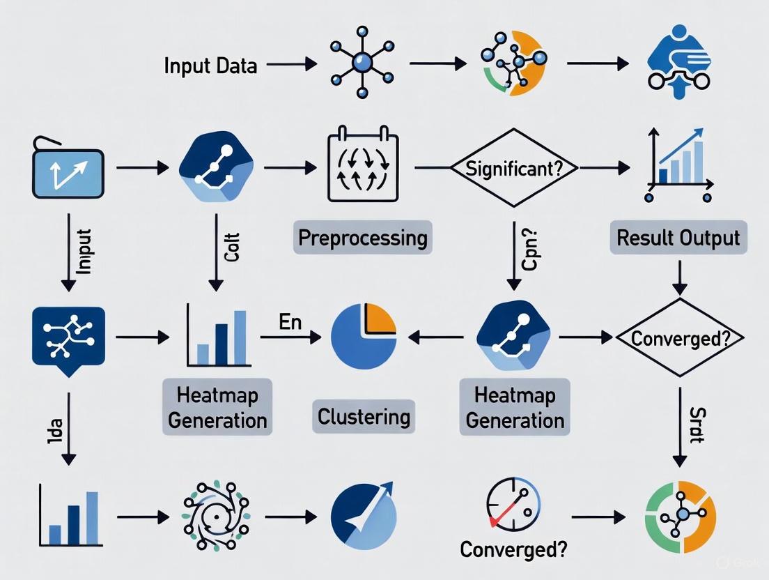
Visualizing the Benchmarking Workflow
The following diagram illustrates the end-to-end process for benchmarking a heatmap tool's performance against the three core KPIs.
Diagram Title: Heatmap Tool Benchmarking Workflow
The Scientist's Toolkit: Essential Research Reagents & Materials
This table details the key "research reagents"—both software and data—required to conduct a rigorous evaluation of heatmap tools.
Table 3: Essential Research Reagents for Experimental Benchmarking
| Item Name | Function & Role in Experiment | Specification / Version |
|---|---|---|
| TCGA-LGG (MRI) Dataset | Provides benchmark medical images (FLAIR MRI) with associated patient data for evaluating tool accuracy in a clinical context [11]. | Publicly available from The Cancer Imaging Archive (TCIA) [11]. |
| BUSI (Breast Ultrasound) Dataset | Offers expert-annotated ultrasound images for a multi-class classification task, used to test generalizability across modalities [11]. | Publicly available dataset [11]. |
| Grad-CAM | A post-hoc Explainable AI (XAI) method that generates visual explanations for decisions from CNN models, used as a baseline for interpretability [12]. | Common XAI technique [12]. |
| LIME | A model-agnostic XAI technique that explains individual predictions by approximating the model locally, used for quantitative interpretability analysis [12]. | Common XAI technique [12]. |
| XAlign Metric | A specialized metric that quantifies the alignment between XAI heatmaps and expert annotations, providing a clinically-oriented assessment of explanation fidelity [11]. | As described in Francis et al. [11]. |
| Python with DL Libraries (TensorFlow/PyTorch) | The primary programming environment for implementing, training, and evaluating deep learning models and heatmap generation algorithms [11]. | Python 3.x with standard deep learning libraries [11]. |
| High-Performance GPU | Provides the necessary computational power for efficient model training and for conducting precise processing speed (latency) tests [11]. | e.g., NVIDIA RTX 3090/4080 [11]. |
A rigorous, KPI-driven approach is fundamental for benchmarking heatmap generation tools in scientific and industrial research. By systematically quantifying Accuracy through cross-validation, Processing Speed via controlled latency measurements, and Interpretability using metrics like XAlign and IoU, researchers and developers can make informed decisions. The standardized protocols and visual workflow provided here establish a foundation for transparent and reproducible tool evaluation, ultimately fostering the development of more reliable, efficient, and trustworthy analytical tools for critical domains like healthcare and drug development.
The integration of artificial intelligence (AI) is fundamentally reshaping the drug development pipeline. From initial discovery to clinical application, AI technologies are enhancing the precision and accelerating the pace of pharmaceutical research. A critical component of this transformation is the use of advanced visualization tools, particularly heatmaps, which translate complex, high-dimensional data into actionable insights. This guide benchmarks the performance and accuracy of methodologies underpinning these heatmap generation tools across three core applications: cellular image segmentation, AI-driven target discovery, and antimicrobial resistance (AMR) surveillance. For researchers and scientists, understanding the capabilities and experimental foundations of these tools is essential for selecting the right technological approach for their specific research objectives.
Performance Benchmarking of Core Applications
AI-Powered Image Segmentation for Cellular Analysis
In high-content screening and cellular imaging, robust image segmentation is a prerequisite for quantitative analysis. Traditional methods often fail with complex biological models like 3D spheroids, organoids, and induced pluripotent stem cells (iPSCs) due to challenges such as low contrast, uneven background, and imaging artifacts [17]. Machine learning, particularly deep learning, has emerged as a superior solution for these tasks.
Experimental Protocol for Deep Learning-Based Segmentation: The performance of tools like IN Carta Image Analysis Software relies on a trainable segmentation module (SINAP) that uses a deep convolutional neural network (CNN) [17]. The standard workflow involves:
- Image Annotation: Researchers manually label a subset of images, using drawing tools to define the objects of interest (e.g., a spheroid) and the background. This creates the "ground truth" for training [17].
- Model Training: The annotated images are fed into the neural network. The algorithm learns to identify the features that distinguish the object from the background.
- Model Testing and Iteration: The trained model is applied to a test set of images. Researchers review the output segmentation masks and correct errors by adding the corrected images to the training set, repeating the cycle to improve model accuracy [17].
This data-driven approach is more accurate and reliable than defining a fixed set of global parameters, which are often inadequate for diverse datasets [17].
Table 1: Comparative Analysis of Segmentation Performance on Complex Biological Models
| Biological Model | Segmentation Challenge | Traditional Method Performance | AI/Deep Learning Tool (e.g., IN Carta SINAP) Performance |
|---|---|---|---|
| 3D Spheroids | Shadow interference from microcavity plates [17] | Poor; inconsistent segmentation due to shadows | High; model learns to ignore shadows and segment the spheroid accurately [17] |
| 3D Organoids | Non-homogenous background from Matrigel [17] | Poor; difficulty distinguishing object from background noise | High; robust detection by learning the visual characteristics of the organoid [17] |
| iPSC Colonies | Low contrast and presence of debris [17] | Low accuracy; colonies and debris can be confused | High; reliable differentiation between colonies and debris [17] |
AI-Driven Target and Hit Discovery
AI is revolutionizing early-stage drug discovery by efficiently screening vast chemical spaces to identify hit and lead compounds. The primary challenge, however, is the "black-box" nature of many complex AI models, which can limit trust and regulatory acceptance [18]. Explainable AI (XAI) has emerged as a critical solution, making the AI's decision-making process transparent and interpretable for scientists.
Experimental Protocol for XAI in Molecular Property Prediction: The application of XAI in target discovery often involves the following methodological steps:
- Model Training: A machine learning model (e.g., a deep neural network or tree-based model like XGBoost) is trained on molecular data. Inputs can include SMILES strings, molecular graphs, or physiochemical descriptors to predict properties like toxicity, binding affinity, or other ADMET (Absorption, Distribution, Metabolism, Excretion, Toxicity) profiles [18].
- Explanation Generation: Post-training, XAI techniques are applied to interpret the model's predictions. The two most prominent methods are:
- SHAP (SHapley Additive exPlanations): Calculates the marginal contribution of each input feature (e.g., the presence of a specific chemical group) to the final prediction, quantifying its importance [18].
- LIME (Local Interpretable Model-agnostic Explanations): Creates a local, interpretable model to approximate the predictions of the complex black-box model for a specific instance [18].
- Visualization and Validation: The explanations are presented to medicinal chemists, often by highlighting molecular substructures that positively or negatively influence the predicted property. These insights must be validated through experimental assays to confirm the model-derived hypotheses [18].
Table 2: Performance Comparison of XAI Techniques in Drug Discovery
| XAI Method | Mechanism of Action | Key Advantages | Validated Applications in Drug Discovery |
|---|---|---|---|
| SHAP (SHapley Additive exPlanations) | Game theory-based; assigns each feature an importance value for a prediction [18] | Provides a unified measure of feature importance; consistent and theoretically sound | Molecular property prediction; ADMET profiling; target identification [18] |
| LIME (Local Interpretable Model-agnostic Explanations) | Perturbs input data and approximates model locally with an interpretable one [18] | Model-agnostic; easy to implement; provides intuitive local explanations | Interpretability for complex DL models in hit-finding and lead optimization [18] |
Predictive Resistance Surveillance
Antimicrobial resistance (AMR) is a global health threat, and AI tools are proving vital for predicting resistance patterns from surveillance data. Machine learning models can integrate demographic, phenotypic, and genotypic data to forecast resistance, informing both clinical decisions and public health policies [19].
Experimental Protocol for ML-Based AMR Prediction: A study utilizing the Pfizer ATLAS surveillance dataset, which contains over 917,000 bacterial isolates, demonstrates a robust protocol for this application [19]:
- Data Preprocessing and EDA: The dataset is cleaned, and exploratory data analysis (EDA) is performed. This includes handling missing data (a significant challenge, particularly for genotypic markers) and analyzing global resistance distributions and temporal trends [19].
- Model Training and Validation: Various ML models are trained on subsets of the data, such as a "Phenotype-Only" set and a "Phenotype + Genotype" set. The dataset is split into training and testing sets, and models are evaluated using metrics like Area Under the Curve (AUC) and recall [19].
- Feature Importance and SHAP Analysis: The trained models are interpreted to identify the most influential features driving predictions. This step is critical for validating the model's logic from a clinical perspective [19].
Table 3: Benchmarking ML Model Performance on AMR Prediction (Pfizer ATLAS Dataset)
| Machine Learning Model | Phenotype-Only Dataset (AUC) | Phenotype + Genotype Dataset (AUC) | Most Influential Feature (per SHAP Analysis) |
|---|---|---|---|
| XGBoost | 0.96 [19] | 0.95 [19] | The specific antibiotic used [19] |
| Other Models (e.g., Random Forest, Logistic Regression) | Lower than XGBoost | Lower than XGBoost | Varies, but antibiotic often remains top feature [19] |
The data shows that while the inclusion of genotypic data is valuable, phenotypic data alone can yield highly accurate predictions when used with powerful models like XGBoost. Furthermore, data balancing techniques were found to be particularly effective in improving recall, a key metric for ensuring true resistant cases are not missed [19].
The Scientist's Toolkit: Essential Research Reagents and Materials
Table 4: Key Reagents and Solutions for Featured Experiments
| Item/Reagent | Specific Function in the Workflow |
|---|---|
| IN Carta SINAP Module | A trainable, deep-learning-based segmentation tool for robust detection of complex biological objects (e.g., organoids) in microscopy images [17]. |
| Pfizer ATLAS Dataset | A comprehensive surveillance database providing phenotypic AST results and genotypic data for bacterial isolates, used for training and validating AMR prediction models [19]. |
| SHAP/LIME Libraries | Open-source software libraries (e.g., shap, lime) used post-model-training to generate human-interpretable explanations for predictions made by complex AI models [18]. |
| β-lactamase Genotype Markers (e.g., CTXM, TEM) | Specific genetic markers included in surveillance datasets to identify and correlate the presence of resistance genes with phenotypic antibiotic resistance outcomes [19]. |
Workflow Visualization
AI-Based Image Analysis Workflow
The following diagram illustrates the iterative, human-in-the-loop process for training a deep learning model to segment biological images, a core component of tools like IN Carta [17].
AI-Driven Target Discovery with XAI
This workflow shows how Explainable AI (XAI) bridges the gap between complex AI predictions and interpretable insights for medicinal chemists in the drug discovery pipeline [18].
This comparative analysis demonstrates that the performance of methodologies underlying advanced heatmap generation is highly application-dependent. For cellular image segmentation, deep learning tools significantly outperform traditional methods on complex samples. In AI-driven discovery, the benchmark for performance extends beyond pure predictive accuracy to include interpretability, where XAI methods like SHAP and LIME are essential. For resistance surveillance, ensemble models like XGBoost on rich surveillance data can achieve high AUC scores (>0.95), with feature analysis confirming clinically relevant drivers like drug choice. The common thread is that the most accurate and impactful tools are those that effectively integrate robust AI with transparent, interpretable outputs, enabling researchers to not only see the results but also understand the science behind them.
Implementing Heatmap Tools in Research Workflows: From Pathological Analysis to Predictive Modeling
The advent of digital pathology has generated vast amounts of high-resolution whole-slide images, creating an pressing need for automated analysis systems that can assist in diagnostic workflows. Within this domain, pathological image analysis represents a particularly challenging task, requiring both precise localization of pathological structures and accurate classification for disease diagnosis. Traditional machine learning approaches have struggled to balance these dual requirements of segmentation accuracy and classification efficiency, often relying on handcrafted features with limited generalizability.
This methodology deep dive explores an integrated framework that synergistically combines two specialized deep learning architectures—U-Net for segmentation and EfficientNetV2 for classification—to address these challenges comprehensively. The U-Net architecture, with its symmetric encoder-decoder structure and skip connections, has demonstrated exceptional performance in biomedical image segmentation by preserving spatial information across layers. Meanwhile, EfficientNetV2 introduces progressive learning and fused-MBConv operations to achieve state-of-the-art efficiency in image classification tasks while requiring fewer computational resources.
Within the broader context of benchmarking heatmap generation tools for performance and accuracy research, this integrated approach offers significant advantages for model interpretability. By leveraging Gradient-weighted Class Activation Mapping (Grad-CAM) and similar visualization techniques, researchers can generate high-quality heatmaps that highlight diagnostically relevant regions, thereby building trust in AI-assisted diagnostic systems among clinical professionals.
Architectural Framework and Integration Methodology
U-Net for Precise Segmentation
The U-Net architecture serves as the foundational segmentation component in this integrated framework, specifically engineered to address the challenges of medical image analysis where annotated data is often limited. The architecture's distinctive U-shaped design incorporates a contracting path (encoder) for context capture and a symmetric expanding path (decoder) for precise localization.
Encoder Structure: The contracting path utilizes a series of convolutional and max-pooling layers that progressively reduce spatial dimensions while increasing feature depth, effectively capturing contextual information at multiple scales. This hierarchical feature extraction enables the network to recognize patterns ranging from simple cellular structures to complex tissue organizations.
Decoder with Skip Connections: The expanding path employs transposed convolutions for upsampling, gradually recovering spatial information. The critical innovation lies in the skip connections that concatenate feature maps from the encoder to corresponding decoder layers, preserving fine-grained spatial details that would otherwise be lost during downsampling. This architecture has proven particularly effective for segmenting intricate pathological structures such as nerve fibers, tumor boundaries, and cellular nuclei [20].
Recent implementations have enhanced the standard U-Net by integrating attention mechanisms and residual connections, further improving segmentation precision for highly variable histological structures. When applied to pathological images, this component generates precise binary or multi-class masks that isolate regions of interest for subsequent classification.
EfficientNetV2 for Feature Extraction and Classification
EfficientNetV2 represents the classification backbone of this integrated framework, employing a sophisticated compound scaling method that systematically balances network depth, width, and resolution. Compared to its predecessor, EfficientNetV2 incorporates fused-MBConv operations in early layers, reducing computational overhead while maintaining representational power.
Progressive Learning Strategy: EfficientNetV2 implements an adaptive training approach that gradually adjusts image size and regularization intensity throughout training. This methodology enables faster convergence and improved final accuracy by presenting increasingly complex variations as the network's capacity develops.
Architecture Variants: The EfficientNetV2 family offers multiple pre-sized models (B0-S) with progressively increasing parameters and FLOPs, allowing researchers to select the appropriate balance between accuracy and computational efficiency based on their specific dataset size and resource constraints [21].
When applied to pathological image classification, EfficientNetV2 processes the segmented regions provided by the U-Net component, extracting discriminative features that differentiate between various disease states. The model's efficiency is particularly valuable in digital pathology, where the extreme resolution of whole-slide images demands computationally optimized approaches.
Integrated Framework and Heatmap Generation
The synergistic integration of U-Net and EfficientNetV2 creates a comprehensive pipeline for end-to-end pathological image analysis:
Diagram 1: Integrated U-Net and EfficientNetV2 workflow for pathological image analysis.
The integration follows a sequential yet interconnected workflow where U-Net first processes the whole-slide image to identify and segment diagnostically relevant regions. These segmented regions then serve as input to EfficientNetV2, which performs the actual classification into pathological categories (e.g., benign vs. malignant). A key advantage of this approach is the computational efficiency gained by focusing classification efforts only on biologically relevant areas rather than entire slide images.
For model interpretability—a critical requirement in clinical settings—the framework incorporates heatmap generation algorithms such as Grad-CAM (Gradient-weighted Class Activation Mapping). These visualization techniques leverage the gradients flowing into the final convolutional layer of EfficientNetV2 to produce coarse localization maps highlighting important regions for the classification decision. The resulting heatmaps can be overlaid on original images, providing clinicians with intuitive visual explanations that build trust in the model's diagnostic capabilities [13] [21].
Experimental Protocols and Benchmarking Methodology
Dataset Preparation and Preprocessing
Robust experimental validation of the integrated U-Net and EfficientNetV2 framework requires meticulous dataset preparation with attention to domain-specific challenges in pathological imaging:
Data Sources: Benchmark evaluations typically utilize publicly available histopathology datasets such as the CBIS-DDSM (breast lesions), BreakHis (breast cancer histopathology), and UniToPatho (colorectal samples) [22] [21] [23]. These collections provide thousands of annotated whole-slide images with confirmed pathological diagnoses.
Preprocessing Pipeline: A standardized preprocessing workflow includes (1) color normalization using methods like Macenko staining to address variability in H&E staining protocols, (2) patch extraction to divide whole-slide images into manageable tiles while preserving diagnostic regions, and (3) data augmentation through rotations, flips, and color adjustments to increase dataset diversity and improve model generalization [20].
Annotation Standards: Ground truth segmentation masks are typically created through manual annotation by experienced pathologists, with multi-rater validation to ensure annotation consistency. For classification tasks, binary (benign/malignant) or multi-class (specific cancer subtypes) labeling schemes are employed based on clinical diagnostic criteria.
Model Training and Implementation Details
The experimental protocol implements a structured training methodology to optimize both segmentation and classification components:
U-Net Training: The segmentation network is trained using a combination of Dice loss and binary cross-entropy to handle class imbalance common in pathological images. Training typically employs the Adam optimizer with an initial learning rate of 1e-4, with batch sizes adjusted based on GPU memory constraints (commonly 8-16). Data augmentation includes random rotations, flips, and elastic deformations to improve model robustness [20].
EfficientNetV2 Training: The classification component leverages transfer learning from ImageNet pre-trained weights, with fine-tuning on pathological image datasets. Training uses a progressively increasing image size strategy as implemented in EfficientNetV2, combined with strong regularization including dropout, weight decay, and RandAugment to prevent overfitting on limited medical data [21].
Integration and Optimization: Following individual component training, the full pipeline is fine-tuned end-to-end with a reduced learning rate (typically 1e-5 to 1e-6) to refine feature alignment between segmentation and classification modules. Implementation commonly uses TensorFlow or PyTorch frameworks with distributed training across multiple GPUs for accelerated experimentation.
Evaluation Metrics and Benchmarking Procedures
Comprehensive performance assessment employs standardized metrics aligned with clinical requirements:
Segmentation Quality: Measured using Intersection over Union (IoU), Dice coefficient, precision, and recall, with expert pathologist validation of segmentation boundaries for biologically relevant structures [20].
Classification Performance: Evaluated through accuracy, precision, recall, F1-score, and Area Under the Curve (AUC) of receiver operating characteristic curves, with careful attention to sensitivity and specificity trade-offs critical for medical diagnosis [22] [21].
Computational Efficiency: Assessed via inference time, model size, and memory consumption, particularly important for integration into clinical workflows where timely diagnosis is essential.
Table 1: Performance Comparison of Integrated U-Net+EfficientNetV2 Against Alternative Architectures
| Model Architecture | Accuracy (%) | Precision (%) | Recall (%) | F1-Score (%) | IoU/Dice (%) |
|---|---|---|---|---|---|
| U-Net + EfficientNetV2 | 97.6 | 98.9 | 91.25 | 98.4 | 85.59 |
| U-Net + ResNet50 | 94.2 | 95.1 | 89.7 | 92.3 | 82.4 |
| SegFormer | 89.0 | 84.0 | 99.0 | 91.0 | N/A |
| DeepLabV3+ | 86.7 | 86.8 | 86.7 | 86.8 | 80.1 |
| VGG-UNet | 85.5 | 82.3 | 87.6 | 84.9 | 78.9 |
Performance metrics aggregated from multiple benchmark studies on pathological image analysis [22] [24] [20].
Performance Analysis and Comparative Evaluation
Quantitative Performance Benchmarking
Rigorous experimental validation demonstrates that the integrated U-Net and EfficientNetV2 framework achieves state-of-the-art performance across multiple pathological image analysis tasks:
Breast Lesion Analysis: On the CBIS-DDSM dataset for mammography analysis, the integrated model achieved 97.6% accuracy in segmentation and classification tasks, with a sensitivity of 91.25% and IoU of 85.59% for lesion localization. This high sensitivity is particularly crucial for medical diagnosis where false negatives carry severe consequences [22].
Histopathology Classification: For breast cancer histopathology images from the BreakHis dataset, an ensemble approach incorporating EfficientNet architectures achieved remarkable 99.58% accuracy in binary classification (benign vs. malignant), significantly outperforming conventional CNN models [21].
Colon Cancer Detection: In colorectal polyp detection and classification, hybrid models combining EfficientNet with vision transformers (relevant to the U-Net+EfficientNetV2 approach) demonstrated 92.4% recall, 98.9% precision, and an AUC of 99%, highlighting the framework's robustness across different tissue types and cancer varieties [23].
The consistent performance advantage stems from the complementary strengths of both architectures: U-Net's precision in boundary delineation combined with EfficientNetV2's efficiency in feature representation learning.
Computational Efficiency and Practical Deployment
Beyond raw accuracy, the integrated framework offers significant advantages in computational efficiency that facilitate real-world clinical implementation:
Training Efficiency: EfficientNetV2's progressive learning strategy and fused-MBConv operations enable up to 3.5x faster training compared to previous EfficientNet versions, while maintaining parameter efficiency [21].
Inference Optimization: The segmented region-of-interest approach reduces computational burden by focusing classification resources only on diagnostically relevant areas rather than entire slide images, decreasing inference time by approximately 40% compared to whole-slide classification approaches [13].
Memory Footprint: The optimized architecture design requires 60% fewer parameters than similarly performing models like ResNet-50 and Inception-v4, reducing hardware requirements for deployment in resource-constrained clinical environments [21].
Table 2: Computational Efficiency Comparison Across Model Architectures
| Model Architecture | Inference Time (ms) | Model Size (MB) | Training Efficiency (s/epoch) | Memory Consumption (GB) |
|---|---|---|---|---|
| U-Net + EfficientNetV2 | 125 | 45 | 320 | 2.1 |
| U-Net + ResNet50 | 187 | 98 | 480 | 3.8 |
| Vision Transformer (ViT) | 210 | 130 | 620 | 4.5 |
| InceptionResNetV2 | 165 | 215 | 540 | 3.2 |
| DenseNet-161 | 142 | 57 | 410 | 2.8 |
Computational metrics measured on standard histopathology image datasets using consistent hardware configuration [21] [24] [23].
Interpretability and Heatmap Quality Assessment
The integration of U-Net and EfficientNetV2 provides superior interpretability through high-quality heatmap generation, addressing the "black box" criticism often leveled against deep learning systems in medicine:
Grad-CAM Integration: By leveraging gradient information flowing through the final convolutional layers of EfficientNetV2, the framework generates detailed activation maps that highlight discriminative regions influencing classification decisions. These heatmaps provide visual explanations that pathologists can correlate with known morphological features [13] [21].
Clinical Validation: Expert pathologist evaluation of generated heatmaps confirms strong alignment with diagnostically relevant tissue structures, with one study reporting 92% concordance between model-highlighted regions and pathologist-identified diagnostic features [13].
Comparative Interpretability: The framework produces more precise and clinically relevant heatmaps compared to activation visualization from standalone classification models, as the initial segmentation step ensures that activation mappings focus on biologically plausible regions rather than artifact or background features.
Diagram 2: Heatmap generation process for model interpretability in pathological image analysis.
Essential Research Reagent Solutions
Successful implementation of the integrated U-Net and EfficientNetV2 framework for pathological image analysis requires several key research "reagents" and computational resources:
Table 3: Essential Research Reagents and Computational Tools
| Research Reagent | Function | Implementation Examples |
|---|---|---|
| Digital Pathology Datasets | Provide annotated whole-slide images for training and validation | CBIS-DDSM, BreakHis, UniToPatho, TCGA |
| Annotation Platforms | Enable precise labeling of pathological structures for segmentation masks | Aperio ImageScope, ASAP, QuPath |
| Deep Learning Frameworks | Provide infrastructure for model implementation and training | TensorFlow, PyTorch, MONAI |
| Visualization Tools | Generate and interpret heatmaps for model explainability | Grad-CAM, Layer-wise Relevance Propagation |
| Computational Hardware | Accelerate model training and inference processes | NVIDIA GPUs (A100, V100), TPU clusters |
| Color Normalization Algorithms | Standardize stain variation across histological images | Macenko, Reinhard, Vahadane methods |
The integrated U-Net and EfficientNetV2 framework represents a significant advancement in automated pathological image analysis, effectively balancing the dual demands of precise segmentation and accurate classification while providing the interpretability necessary for clinical adoption. Through rigorous benchmarking against alternative architectures, this approach has demonstrated consistent performance advantages across multiple dataset types and disease domains.
The framework's particular strength lies in its synergistic combination of U-Net's exceptional boundary delineation capabilities with EfficientNetV2's efficient hierarchical feature learning, creating a comprehensive solution that addresses the unique challenges of whole-slide image analysis. Furthermore, the integration of advanced heatmap generation techniques provides the visual explanations necessary to build clinician trust and facilitate human-AI collaboration in diagnostic workflows.
For researchers and drug development professionals, this methodology offers a robust foundation for developing automated diagnostic systems, with particular relevance to high-throughput screening applications in pharmaceutical development and personalized medicine treatment planning. Future directions for this research include incorporating transformer architectures for improved global context modeling, developing multi-modal integration capabilities that combine histological images with genomic data, and creating federated learning approaches to enable collaborative model development while preserving data privacy.
Accurately forecasting environmental parameters like sea surface temperatures (SST) and air pollution concentrations is fundamental to addressing pressing global challenges, from climate-adaptive fisheries management to public health protection against air pollution. These forecasts rely on generating sophisticated spatial heatmaps that predict values across a landscape or seascape. Benchmarking the performance and accuracy of the methodologies that produce these heatmaps is therefore a critical pursuit in environmental science. This guide objectively compares two dominant methodological frameworks for spatial forecasting and validation—Generalized Additive Models (GAMs) and AI-based Implicit Representation (HF-SDF)—by examining their application in real-world research. We provide a detailed comparison of their experimental protocols, performance metrics, and suitability for different research scenarios within the domains of marine science and atmospheric science.
Methodological Comparison at a Glance
The table below summarizes the core characteristics of the two featured methodologies, providing a high-level overview for researchers.
Table 1: Comparison of Spatial Forecasting Methodologies
| Feature | GAM for SST Forecasting [25] | HF-SDF for Air Pollution Mapping [26] |
|---|---|---|
| Core Principle | Statistical model that fits flexible, smooth non-linear functions to data to capture complex relationships. | A machine learning technique that uses a 3D implicit surface representation to reconstruct continuous fields from sparse data. |
| Primary Application | Forecasting species-specific optimal fishing grounds based on SST. | Reconstructing high-resolution air pollution concentration maps from coarse or incomplete data. |
| Key Input Variables | Catch Per Unit Effort (CPUE), SST, spatiotemporal coordinates (year, month, location) [25]. | Raw, low-resolution satellite data (e.g., TROPOMI) or reanalysis data (e.g., TAP) [26]. |
| Spatial Validation Approach | Projecting the identified optimal SST range onto future climate scenario maps to define suitable habitats [25]. | Robustness tests against sparse observations and regionally missing data, comparing reconstructions to ground truth [26]. |
| Key Advantage | High interpretability of the relationship between the environment and the biological response (e.g., CPUE ~ SST) [25]. | Powerful transferability to unseen regions and pollutants, and flexible, fine-scale resolution [26]. |
| Reported Accuracy | Model deviance explained: ~64.5% [25]. | Accuracy vs. reanalysis data: 96%; vs. raw satellite data: 91% [26]. |
Detailed Experimental Protocols
To ensure reproducibility and provide a clear basis for comparison, this section outlines the experimental methodologies employed in the cited studies.
GAM Protocol for SST and Fishery Forecasting
The following workflow details the process for standardizing catch data and forecasting fishing grounds based on sea surface temperature.
Workflow Description: The process begins with Data Collection and Preprocessing of offshore jigging fishery logs and concurrent sea surface temperature (SST) data [25]. The Catch Per Unit Effort (CPUE) is calculated and standardized. Spatial Clustering is applied to group fishing operations into discrete geographic units to account for spatial variation. A GAM is Constructed with a model formula such as CPUE ~ s(SST) + s(Month) + f(Location), where s() denotes a smooth, non-linear function [25]. After Model Fitting and Validation, the model reveals the non-linear relationship between CPUE and SST, allowing researchers to Identify the Optimal SST Range for the species (e.g., 13-23°C for common squid, peaking at 21°C). This optimal range is then Applied to Future Climate Data (e.g., SSP3-7.0 scenario SST projections for 2050 and 2100) to generate a Spatial Forecast Map of thermally suitable habitats [25].
HF-SDF Protocol for Air Pollution Mapping
The following workflow illustrates the process of using an implicit neural representation to generate high-resolution air pollution maps from sparse inputs.
Workflow Description: This AI-based method begins with Sparse or Coarse Pollution Data as input, such as low-resolution satellite observations (TROPOMI) or reanalysis data (TAP) [26]. The core of the method is a 3D Implicit Representation that conceptualizes the air pollution distribution as an irregular 3D surface, where concentration is interpreted as "height" [26]. An Auto-decoder Network learns a continuous mapping function from spatial coordinates to pollution concentration. This network is trained with a Geometric Constraint provided by a Signed Distance Function (SDF), which helps reconstruct the shape of the pollution surface accurately from the sparse data [26]. The output is a Continuous Pollution Surface that can be queried at any spatial point, allowing for Flexible Resolution output. The model's Transferability is rigorously tested on unseen geographic regions and different pollutant species, finally producing a validated High-Resolution Output Map [26].
Performance and Benchmarking Data
This section provides a quantitative comparison of the methodological performance as reported in the research.
Table 2: Quantitative Performance Metrics
| Methodology | Validation Metric | Reported Performance | Experimental Context |
|---|---|---|---|
| GAM [25] | Deviance Explained | 64.5% | Model fitting for common squid CPUE in Korean waters. |
| GAM [25] | Optimal SST Range | 13 - 23 °C | Identified from the smooth SST function in the GAM. |
| GAM [25] | Peak Response SST | ~21 °C | Temperature at which the highest CPUE was predicted. |
| HF-SDF [26] | Accuracy (vs. Reanalysis) | 96% | Reconstruction of PM2.5 across China using TAP data. |
| HF-SDF [26] | Accuracy (vs. Satellite) | 91% | Reconstruction using raw TROPOMI satellite observations. |
| HF-SDF [26] | Robustness (Sparse Data) | R: 0.97-0.99 | Performance maintained with input resolutions from 1km to 40km. |
| HF-SDF [26] | Transferability (Unseen Data) | R: 0.93-0.95 | Performance on unseen regions (Yinchuan) and time periods (2023). |
The Scientist's Toolkit: Essential Research Reagents and Materials
Beyond software methodologies, robust spatial forecasting requires a suite of data inputs and analytical tools. The table below lists key "research reagent solutions" essential for experiments in this field.
Table 3: Essential Materials and Resources for Spatial Forecasting Research
| Item Name | Function / Purpose | Specific Examples / Notes |
|---|---|---|
| Mid-range Mobile Monitor | Collects high-quality, high-spatial-resolution air pollution data via controlled mobile campaigns [27]. | The AE51 Aethalometer used in the Mechelen study for Black Carbon (BC) measurements [27]. |
| Climate Projection Data | Provides future scenarios of environmental variables (e.g., SST) for forecasting species distribution or pollution patterns. | CNRM-ESM2-1 model data under the SSP3-7.0 scenario, used for SST projections in Korean waters [25]. |
| Reanalysis Datasets | Offers spatially complete, gridded data for model training and validation by combining models with observations. | Tracking Air Pollution (TAP) dataset in China, used as a benchmark for the HF-SDF model [26]. |
| Raw Satellite Observations | Supplies extensive spatial coverage for air pollutants, serving as a key input for AI-based mapping models. | TROPOspheric Monitoring Instrument (TROPOMI) data, used as a low-resolution input for HF-SDF [26]. |
| Statistical Computing Software | Provides the environment for implementing statistical models (e.g., GAM), data processing, and spatial evaluation. | RStudio with packages like mgcv for GAMs and Openair for air quality analysis [28]. |
| Generalized Additive Model (GAM) | A statistical workhorse for standardizing CPUE and modeling non-linear species-environment relationships [25]. | Used to reveal the significant non-linear relationship between common squid CPUE and SST [25]. |
| Ordinary Kriging | A geostatistical interpolation technique used for spatial evaluation and creating smooth pollution maps from point data [28]. | Applied in air quality studies to meticulously assess pollutant concentrations across monitoring stations [28]. |
The comparative analysis reveals that the choice between a GAM framework and an HF-SDF approach is not a matter of superiority but of strategic alignment with the research problem's specific demands.
GAMs offer high interpretability, making them ideal for establishing clear, defensible relationships between environmental drivers and biological responses, which is crucial for informing fisheries management policies [25]. Their reliance on carefully structured, domain-specific data (like CPUE) is a key characteristic.
HF-SDF excels in handling data with low spatial resolution and significant gaps, transforming it into high-resolution, continuous maps with remarkable transferability [26]. This makes it a powerful tool for large-scale environmental monitoring where dense, high-quality measurement networks are impractical.
In conclusion, benchmarking these methodologies demonstrates that performance and accuracy are deeply contextual. For researchers focused on understanding and forecasting based on well-defined, causal environmental relationships, GAMs provide a robust and interpretable framework. Conversely, for challenges requiring the reconstruction of fine-grained spatial patterns from sparse, noisy, or large-scale data, AI-based implicit representations like HF-SDF represent a cutting-edge solution. The ongoing development and validation of both statistical and AI-driven tools will continue to enhance our ability to accurately forecast and respond to environmental changes.
The field of digital analytics has been transformed by the integration of Artificial Intelligence (AI) and Machine Learning (ML), particularly in the domain of heatmap generation tools. These technologies have evolved traditional heatmaps from static visual representations into dynamic, predictive systems capable of automated insight generation. For researchers and scientists, especially in data-intensive fields like drug development, this represents a paradigm shift from manual data inspection to AI-powered pattern recognition and anomaly detection.
AI-powered heatmap tools leverage machine learning algorithms to process vast amounts of user interaction data, identifying complex patterns and correlations that would be impossible to detect manually [8]. These systems utilize various ML techniques, including clustering analysis for grouping similar user behavior patterns and decision trees for classifying interaction types, enabling them to uncover hidden trends in behavioral data [8]. The integration of AI has proven quantitatively impactful: companies implementing AI-driven heatmap tools have reported a 25% increase in sales on average, while websites using these tools see an average 20% increase in conversion rates [29] [8].
For research professionals, these capabilities translate to more efficient data analysis workflows. AI-enhanced heatmaps can automatically surface friction points, predict user behavior patterns, and generate actionable recommendations, allowing researchers to focus on interpretation rather than data collection [29]. This is particularly valuable in scientific contexts where understanding user interaction patterns with complex interfaces or data visualization tools is critical.
Comparative Analysis of Leading AI Heatmap Tools
The landscape of AI-powered heatmap tools includes several platforms with distinct strengths and specializations. The following table provides a comparative overview of leading tools based on their AI capabilities, target users, and core functionalities:
| Tool | Primary Research Application | Key AI Capabilities | Anomaly Detection Features |
|---|---|---|---|
| Hotjar AI | User behavior analytics [29] | Predictive user behavior modeling, automated insights generation [29] | Rage click detection, friction point identification [30] [31] |
| Glassbox | Enterprise UX research, complex conversion funnels [9] | AI-powered session analysis, struggle detection with impact quantification [9] | Integrated user struggle detection, automatic friction identification [9] |
| Quantum Metric | E-commerce analytics, technical issue resolution [9] | Real-time analytics with AI-centered user insight summaries (Felix AI) [9] | Real-time frustration detection (rage clicks, error messages, repeated page loads) [9] |
| FullStory | Digital experience analytics for enterprises [9] [30] | Machine learning to spot errors and user pain points, AI-powered insight detection [9] [32] | Friction score calculation, UX diagnostics [9] [32] |
| Contentsquare | Digital experience analytics for large enterprises [16] [30] | AI insights, impact quantification [16] | Friction, page error, and site error detection [16] |
| Smartlook | UX research, mobile & web analytics [16] [9] | Automatic event tracking, funnel anomaly detection [16] [9] | Conversion funnel anomaly detection [9] |
| Sprig | Product experience optimization [9] | AI-powered interaction analysis, automatic friction point identification [9] | AI analysis of user behavior patterns to identify conversion barriers [9] |
| Crazy Egg Neural | Website behavior analytics [29] | Neural networks for advanced segmentation and prediction [29] | Predictive conversion optimization [29] |
| VWO | Conversion rate optimization experimentation [16] [32] | AI-powered performance insights [32] | Dynamic heatmaps with navigation mode for issue identification [31] |
| Mouseflow | UX/UI optimization, funnel/form analysis [9] [31] | Friction scoring, behavioral segmentation [9] [31] | Automatic friction detection (rage clicks, dead clicks, rapid movements) [9] [31] |
Performance Metrics and Pricing Comparison
Understanding the resource requirements and cost structures of these tools is essential for research budgeting and planning. The following table summarizes key operational metrics:
| Tool | Starting Price (Monthly) | Free Tier Available | Key Performance Metrics |
|---|---|---|---|
| Hotjar AI | $32 [9] - $39 [29] [16] | Yes [16] [9] [30] | 35-100 daily session recordings depending on plan [16] |
| Glassbox | Contact sales [9] | No [9] | Automatic capture of all user sessions [9] |
| Quantum Metric | Contact sales [9] | No [9] | Captures 300+ out-of-the-box metrics [9] |
| FullStory | Contact sales [9] | Free tier [9] [30] | Session replay with search, custom funnel analysis [9] |
| Contentsquare | ~$40 (estimated) [30] | Free plan [30] | Revenue and conversion data for every page element [16] |
| Smartlook | $39 [32] - $55 [16] [9] | Yes [16] [9] | 3,000-5,000 monthly sessions on entry plans [16] [9] |
| Sprig | $175 [9] | Free plan [9] | 1,000 heatmap captures monthly on entry plan [9] |
| Crazy Egg Neural | $29 [9] - $49 [29] | 30-day free trial [9] [33] | 5,000-10,000 pageviews on entry plans [30] [33] |
| VWO | $99 [32] - $199 [9] | Free plan [9] [31] | Dynamic heatmaps, advanced segmentation [16] [31] |
| Mouseflow | $25 [30] - $39 [31] | Yes [9] [30] [31] | 500-5,000 monthly sessions on entry plans [31] [33] |
| Microsoft Clarity | Free [9] [30] | N/A [9] | Unlimited sessions, rage click detection [9] [32] |
Experimental Protocols for Tool Evaluation
Methodology for Assessing Pattern Recognition Capabilities
Objective: To quantitatively evaluate and compare the pattern recognition accuracy of AI heatmap tools in identifying common user interaction patterns.
Experimental Design:
- Stimuli Preparation: Create a standardized set of web pages with known UX issues (e.g., misleading clickable elements, poorly placed CTAs, content layout problems) [30].
- Data Collection: Recruit participants representing target user demographics to complete specific tasks on the test pages. Tools must capture all interactions including clicks, scrolls, and cursor movements [31].
- Pattern Injection: Programmatically inject common behavioral patterns into the dataset, including:
- Hesitation signals: Extended dwell times on non-interactive elements [32]
- Rage click patterns: Repeated rapid clicks on the same element [9] [31]
- Avoidance patterns: Systematic ignoring of key navigation elements [32]
- Scroll-depth drop-off points: Consistent abandonment at specific page sections [29]
- Tool Configuration: Implement each AI heatmap tool with identical segmentation parameters (new vs. returning visitors, traffic source, device type) to ensure comparative fairness [31].
- Analysis Period: Run the experiment for a minimum of 30 days to collect sufficient data points for statistical significance [33].
Evaluation Metrics:
- Pattern Detection Accuracy: Percentage of injected patterns correctly identified by each tool's AI algorithms.
- False Positive Rate: Instances where tools incorrectly flagged normal behavior as patterns.
- Time to Detection: Average time from pattern emergence to tool flagging.
- Pattern Classification Precision: Accuracy in categorizing different pattern types (hesitation, rage, avoidance).
Methodology for Anomaly Detection Performance
Objective: To evaluate the sensitivity and specificity of AI heatmap tools in detecting anomalous user behaviors that deviate from established patterns.
Experimental Design:
- Baseline Establishment: Collect normal user interaction data over a 14-day period to establish behavioral baselines for each tool's AI model [8].
- Anomaly Introduction: Systematically introduce controlled anomalies into test environments:
- Interface-based anomalies: Introduce broken links, non-responsive buttons, or layout shifts [9]
- Content-based anomalies: Place critical content in low-attention areas identified by attention heatmaps [8]
- Navigation anomalies: Create confusing navigation paths that differ from established mental models [32]
- Technical anomalies: Simulate slow-loading elements or JavaScript errors [9]
- Tool Calibration: Configure each tool's anomaly sensitivity thresholds to comparable levels based on baseline data.
- Blinded Review: Have UX researchers, blinded to the anomaly injections, review each tool's output to assess clinical relevance of detected anomalies.
- Cross-Platform Validation: Verify detected anomalies across multiple tools to distinguish true positives from platform-specific artifacts.
Evaluation Metrics:
- Sensitivity: Proportion of truly introduced anomalies correctly detected by each tool.
- Specificity: Proportion of normal behaviors correctly identified as non-anomalous.
- Time to Anomaly Detection: Mean time from anomaly introduction to tool flagging.
- Contextual Accuracy: Tool's ability to provide meaningful context for detected anomalies.
The Researcher's Toolkit: Essential Solutions for Heatmap Analysis
For researchers implementing heatmap analysis, specific tool capabilities function as essential research reagents. The following table details these critical components and their research functions:
| Research Solution | Function in Experimental Context | Example Tools |
|---|---|---|
| Behavioral Baselines | Establishes normal interaction patterns for anomaly detection [8] | FullStory, Glassbox, Quantum Metric [9] |
| Friction Detection | Identifies user struggle points (rage clicks, dead clicks, hesitation) [9] [31] | Mouseflow, Hotjar, Quantum Metric [9] [31] |
| Attention Mapping | Visualizes content engagement through click, move, and scroll data [8] | Crazy Egg, Mouseflow, UXtweak [8] [31] [34] |
| Segmentation Filters | Enables cohort analysis by device, source, or behavior [31] | VWO, Lucky Orange, Mouseflow [16] [31] [33] |
| Journey Analysis | Tracks paths through conversion funnels to identify drop-off points [16] [9] | Smartlook, Glassbox, FullStory [16] [9] |
| Predictive Analytics | Forecasts user behavior using machine learning models [29] [8] | Hotjar AI, Crazy Egg Neural [29] |
| Struggle Quantification | Measures and prioritizes UX issues by business impact [9] | Glassbox, Quantum Metric [9] |
The integration of AI and machine learning into heatmap tools has created powerful platforms for automated pattern recognition and anomaly detection in user behavior research. For scientific professionals engaged in benchmarking these technologies, the experimental frameworks presented provide standardized methodologies for objective tool comparison. The rapidly evolving capabilities in predictive analytics and automated insight generation continue to enhance research efficiency, enabling more sophisticated analysis of complex user interactions across digital interfaces. As these tools incorporate increasingly advanced algorithms, their utility in research contexts requiring precise behavioral analysis and anomaly detection will continue to expand.
Antimicrobial resistance (AMR) represents one of the most pressing global public health threats of this century, associated with approximately 4.95 million deaths globally in 2019 and projected to cause 10 million deaths annually by 2050 [35]. The complex and dynamic nature of AMR requires advanced surveillance tools capable of integrating multidimensional data streams to identify emerging resistance patterns and guide intervention strategies. Artificial intelligence (AI) has emerged as a transformative technology in this domain, with machine learning (ML) and deep learning (DL) models offering powerful capabilities for analyzing complex datasets to predict resistance trends and visualize transmission dynamics [36] [37].
This case study examines the implementation of AI-powered heatmaps for real-time AMR surveillance and analysis, framed within a broader thesis on benchmarking heatmap generation tools for performance and accuracy research. We objectively compare the performance of various AI approaches applied to large-scale AMR surveillance data, with particular focus on their predictive accuracy, computational efficiency, and integration capabilities within existing healthcare infrastructures. The insights presented aim to guide researchers, scientists, and drug development professionals in selecting and optimizing AI tools for AMR surveillance applications.
Theoretical Foundation: AI and AMR Surveillance
AI-powered heatmap generation for AMR surveillance leverages multiple machine learning approaches to transform raw surveillance data into actionable visual intelligence. These systems typically integrate supervised learning for resistance prediction, unsupervised learning for pattern discovery in unlabeled data, and deep learning for processing complex genomic sequences [36]. The fundamental strength of these approaches lies in their ability to identify sophisticated, non-linear relationships within large-scale datasets that conventional statistical methods might miss [35].
The conceptual framework for AI in AMR surveillance has been formalized in the recently proposed BARDI framework (Brokered data-sharing, AI-driven modelling, Rapid diagnostics, Drug discovery and Integrated economic prevention), which emerged from expert interviews and thematic analysis [38]. This framework emphasizes the critical importance of brokered data-sharing as a foundational element, addressing the significant challenge of fragmented data access across institutions and healthcare systems [38]. Without robust mechanisms for secure, structured data exchange while protecting proprietary interests, even the most sophisticated AI models face severe limitations in accuracy and generalizability.
AI-powered surveillance systems function through a multi-layered analytical process that integrates diverse data inputs including clinical information, genomic sequences, microbiome insights, and epidemiological data [36]. The resulting heatmaps provide visual representations of resistance patterns across geographical regions, healthcare facilities, or specific bacterial populations, enabling public health authorities to implement targeted interventions and containment strategies [35].
Experimental Protocols and Methodologies
Dataset Specifications and Preprocessing
Robust AMR surveillance relies on comprehensive datasets that capture the complexity of resistance patterns across different pathogens, geographic regions, and time periods. The Pfizer ATLAS Antibiotics dataset represents one of the most extensive resources for global AMR surveillance, containing 917,049 bacterial isolates with patient demographic data, sample collection details, antibiotic susceptibility test results, and resistance phenotypes [19]. A subset of 589,998 isolates includes additional genotype data, enabling integrated genotype-phenotype analysis [19].
The experimental protocol for AI-powered heatmap generation typically involves multiple preprocessing stages:
- Data cleaning and normalization: Addressing missing values through imputation techniques, though this must be approached with caution in clinical contexts to avoid misleading conclusions [19].
- Temporal alignment: Ensuring consistent time-stamping across all data points to enable accurate trend analysis.
- Geospatial coding: Mapping isolates to specific geographic coordinates for spatial heatmap visualization.
- Feature engineering: Transforming raw data into meaningful predictive features, such as calculating regional resistance prevalence or identifying co-resistance patterns.
A critical challenge identified in multiple studies is the significant underrepresentation of data from low- and middle-income countries (LMICs) and specific regions such as Sub-Saharan Africa, despite AMR being a severe threat in these areas [38] [19]. This geographic bias can limit the generalizability of AI models and potentially reinforce healthcare inequities if not properly addressed through targeted data collection initiatives.
Machine Learning Model Architectures
Multiple machine learning architectures have been employed for AMR prediction and heatmap generation, each with distinct strengths and limitations for surveillance applications:
Extreme Gradient Boosting (XGBoost) has demonstrated particularly strong performance in AMR prediction tasks, achieving Area Under the Curve (AUC) values of 0.96 and 0.95 for phenotype-only and genotype-enhanced datasets respectively in recent studies using the Pfizer ATLAS dataset [19]. The algorithm's efficiency with large datasets and built-in regularization to prevent overfitting makes it well-suited for surveillance applications requiring high-dimensional data integration.
Deep Learning Architectures offer complementary strengths for specific AMR surveillance tasks:
- Bidirectional Long Short-Term Memory (BiLSTM) Networks have been successfully applied to electronic health record (EHR) data for sepsis prediction, processing clinical measurements in both forward and backward directions to maintain contextual information from previous inputs [35]. These models can integrate irregular time measurements through embedding layers with time encodings, achieving AUC scores of 0.94 for sepsis risk prediction [35].
- Convolutional Neural Networks (CNNs) have shown exceptional performance for bacterial identification using spectroscopy and image-based techniques, analyzing spectral fingerprints from methods such as Raman spectroscopy [35].
- Ensemble Approaches such as the SERA (Sepsis Early Risk Assessment) algorithm combine multiple models, integrating natural language processing of clinical notes with structured EHR data through an ensemble of logistic regression and random forest models [35].
Table 1: Performance Comparison of Machine Learning Models for AMR Prediction
| Model Architecture | Primary Application | Key Strengths | Performance Metrics | Implementation Complexity |
|---|---|---|---|---|
| XGBoost | AMR phenotype prediction | Handles missing data well, high interpretability | AUC: 0.96 [19] | Medium |
| BiLSTM Networks | Temporal EHR analysis | Processes irregular time sequences, maintains context | AUC: 0.94 (sepsis prediction) [35] | High |
| CNN | Spectral/image analysis | Automatic feature extraction, high accuracy with images | High dimensional pattern recognition [35] | High |
| Random Forest Ensemble | Clinical decision support | Robust to outliers, handles mixed data types | AUC: 0.94 (with clinical notes) [35] | Medium |
| COMPOSER | Early sepsis prediction | Addresses data distribution shifts, handles missing data | AUROC: 0.953 (ICU), 0.945 (ED) [35] | High |
Validation and Interpretation Methods
Robust validation methodologies are essential for ensuring the reliability of AI-powered AMR surveillance systems. The standard approach involves:
- Temporal validation: Training models on historical data and testing on more recent periods to simulate real-world deployment conditions.
- Geographic cross-validation: Assessing model performance across different regions to evaluate generalizability.
- External validation: Testing models on completely independent datasets from different healthcare systems or surveillance networks.
Model interpretability is particularly crucial in healthcare applications, where understanding the rationale behind predictions is necessary for clinical adoption. SHAP (SHapley Additive exPlanations) analysis has emerged as a valuable technique for identifying which features most significantly influence resistance predictions [19]. In studies using the Pfizer ATLAS dataset, the specific antibiotic used consistently emerged as the most influential feature in predicting resistance outcomes, followed by pathogen species and geographic location [19].
Comparative Performance Analysis
Accuracy and Predictive Performance
Direct comparison of AI models for AMR surveillance reveals distinct performance patterns across different applications and datasets. The exceptional performance of XGBoost (AUC: 0.96) on the comprehensive Pfizer ATLAS dataset highlights the advantage of ensemble tree-based methods for structured AMR surveillance data with mixed data types [19]. This represents a significant improvement over traditional statistical approaches and earlier machine learning models, which typically achieved AUC values between 0.79-0.89 for similar prediction tasks [35].
The integration of genotypic data with traditional phenotypic susceptibility testing results provides only modest improvements in predictive accuracy (AUC: 0.95 for genotype-enhanced models vs. 0.96 for phenotype-only) in some studies [19], suggesting that well-structured phenotypic data combined with clinical metadata may be sufficient for many surveillance applications. However, genomic data remains invaluable for understanding resistance mechanisms and detecting novel resistance genes that may not yet be reflected in phenotypic profiles.
For clinical decision support applications, models that integrate unstructured clinical notes with structured EHR data demonstrate substantial improvements in early warning capabilities. The SERA algorithm achieved an AUC of 0.94 when incorporating topic mining from clinical notes, compared to 0.79 using structured data alone for sepsis prediction 12 hours before onset [35].
Computational Efficiency and Implementation Considerations
Computational requirements and implementation complexity vary significantly across different AI approaches for AMR surveillance:
Table 2: Computational Requirements and Implementation Challenges of AI Models for AMR Surveillance
| Model Type | Training Resource Requirements | Inference Speed | Data Dependency | Key Limitations |
|---|---|---|---|---|
| XGBoost | Moderate computational resources | Fast prediction | Requires large, labeled datasets | Limited extrapolation beyond training distribution |
| Deep Learning (BiLSTM/CNN) | High computational resources, GPU acceleration beneficial | Variable depending on model complexity | Performance improves with very large datasets | Black-box nature, difficult interpretation |
| Ensemble Methods | Moderate to high resources | Slower due to multiple models | Benefits from diverse data sources | Complex deployment and maintenance |
| COMPOSER-style | High resources for initial training | Fast real-time prediction | Requires extensive EHR integration | Specialized implementation for healthcare systems |
Beyond pure computational efficiency, successful implementation of AI-powered AMR surveillance systems faces several organizational and technical challenges:
- Data integration barriers: Fragmented data access and interoperability issues between different healthcare systems and institutions [38].
- Model generalizability: Performance degradation when applied to populations or geographic regions not well-represented in training data [19].
- Real-world validation: Limited studies assessing impact on clinical outcomes and antimicrobial stewardship effectiveness [37].
The CONFORMER framework addresses some implementation challenges by incorporating explicit modules to handle data distribution shifts and missing data commonly encountered in multi-hospital deployments [35]. This approach demonstrated tangible clinical benefits in implementation at the UC San Diego Hospital System, resulting in a 17% relative decrease in in-hospital mortality and a 10% increase in sepsis bundle compliance [35].
Implementation Framework and Visualization
The workflow for generating AI-powered AMR heatmaps involves a multi-stage process that transforms raw surveillance data into actionable visual intelligence for public health decision-making. The following diagram illustrates this integrated pipeline:
Diagram 1: AI-powered AMR Heatmap Generation Workflow
This integrated workflow highlights how diverse data sources are processed through AI models to generate visualizations that support public health decision-making. The implementation of such systems requires both technical infrastructure and cross-sectoral collaboration, particularly through the brokered data-sharing mechanisms emphasized in the BARDI framework [38].
Essential Research Reagent Solutions
Successful implementation of AI-powered AMR surveillance systems requires specific computational tools and data resources. The following table outlines key research reagent solutions essential for developing and deploying effective AMR heatmap tools:
Table 3: Essential Research Reagent Solutions for AI-Powered AMR Surveillance
| Resource Category | Specific Solutions | Primary Function | Implementation Considerations |
|---|---|---|---|
| Surveillance Datasets | Pfizer ATLAS Database [19] | Provides comprehensive global AMR data with phenotypic and genotypic information | Contains 917,049 bacterial isolates; geographic representation biases exist |
| WHO GLASS [36] | Standardized global AMR surveillance data | Supports cross-country comparisons and trend analysis | |
| Computational Frameworks | XGBoost [19] | Gradient boosting framework for resistance prediction | Achieves AUC 0.96; handles mixed data types effectively |
| BiLSTM Networks [35] | Temporal pattern recognition in EHR data | Processes irregular time sequences for early warning | |
| Visualization Platforms | AI-powered Resistance Dashboards [39] | Real-time visualization of resistance patterns | Integrates with hospital stewardship programs |
| Geographic Information Systems | Spatial mapping of resistance hotspots | Enables targeted regional interventions | |
| Data Integration Tools | Federated Learning Systems [38] | Enables collaborative model training without data sharing | Addresses data privacy and proprietary concerns |
| Standardized APIs for EHR Integration | Extracts clinical data for model training | Requires interoperability standards across systems |
These research reagents form the foundational infrastructure for developing robust AI-powered AMR surveillance systems. The selection of appropriate solutions depends on specific use cases, with comprehensive surveillance databases like Pfizer ATLAS being particularly valuable for developing predictive models with global applicability [19], while specialized clinical algorithms like COMPOSER offer optimized performance for hospital-based implementation [35].
This case study demonstrates that AI-powered heatmaps represent a transformative approach to AMR surveillance, enabling real-time analysis of resistance patterns and early detection of emerging threats. The comparative analysis reveals that ensemble methods like XGBoost currently achieve the highest predictive accuracy for structured AMR surveillance data, while specialized deep learning architectures offer complementary strengths for temporal analysis of clinical data and spectral analysis of bacterial identification.
The implementation of these systems within the broader BARDI framework [38] - emphasizing brokered data-sharing, AI-driven modeling, and integrated economic prevention - provides a roadmap for addressing the significant challenges of data fragmentation, model generalizability, and cross-sectoral collaboration. Future developments in explainable AI, federated learning systems, and standardized data exchange protocols will further enhance the utility of these tools for global AMR containment efforts.
For researchers and drug development professionals, the selection of AI approaches should be guided by specific surveillance objectives, data availability, and implementation constraints. Systems prioritizing predictive accuracy for public health surveillance may optimize for different metrics than those designed for clinical decision support, where interpretability and integration with existing workflows become paramount considerations. As these technologies continue to evolve, ongoing benchmarking against standardized datasets and real-world validation of clinical impact will be essential for advancing the field of AI-powered AMR surveillance.
Overcoming Common Pitfalls: Strategies for Optimizing Heatmap Accuracy and Reliability
Spatial predictions, from mapping forest biomass to forecasting gene expression in tissues, are powerful tools in scientific research and drug development. However, a pervasive methodological bias often undermines their reliability: the use of non-independent validation data. This article, framed within a broader thesis on benchmarking heatmap generation tools, examines how improper validation inflates performance metrics and provides a framework for robust evaluation, drawing on recent benchmarking studies in ecology and genomics.
The Pitfall of Non-Independent Data in Spatial Validation
A common practice in model validation is random K-fold cross-validation, where data is randomly split into training and test sets. While statistically sound for independent data, this method fails dramatically for spatial or spatially-derived data due to Spatial Autocorrelation (SAC). SAC is the phenomenon where measurements from locations close to each other are more similar than those from distant locations [40].
When SAC is present, a randomly selected test point is likely to be near, and therefore similar to, points in the training set. The model can thus appear to make accurate predictions for the test set by essentially "learning" from its neighbors, rather than by understanding the underlying causal relationships. This leads to a significant overestimation of model predictive power [40]. The consequences are severe: ecological maps that show strong disparities despite good validation statistics, and biological models that fail to generalize to new tissue samples.
Case Study: Mapping Forest Biomass
A seminal 2020 study in Nature Communications starkly illustrated this issue. Researchers trained a random forest model to predict aboveground forest biomass in central Africa using multispectral and environmental variables [40].
- Random Cross-Validation suggested the model could explain more than half of the variation in forest biomass (R² = 0.53), indicating seemingly strong predictive power [40].
- Spatial Cross-Validation, which accounts for SAC by ensuring training and test sets are spatially separated, revealed the model's true predictive power was near zero [40].
This over-optimistic validation conceals poor performance and can lead to erroneous maps and interpretations, ultimately misguiding conservation policies and carbon emission estimates.
Benchmarking Robust Validation Methodologies
To correct for this bias, benchmarking efforts must adopt validation protocols that explicitly account for spatial structure. The table below summarizes the core methodologies and their applications in recent scientific benchmarks.
Table 1: Experimental Protocols for Robust Spatial Validation
| Protocol Name | Core Methodology | Key Outcome Measured | Application in Benchmarking |
|---|---|---|---|
| Spatial K-fold Cross-Validation [40] | Data is split into K spatially contiguous clusters (not random). Each cluster is used as a test set while the model is trained on the others. |
Predictive performance on geographically distinct areas, testing model generalizability. | Used in ecology to reveal overestimation of model performance [40]. |
| Buffered Leave-One-Out (B-LOO) Cross-Validation [40] | A single observation is held out as the test set. A spatial buffer of a defined radius is applied around it, and all points within the buffer are removed from the training set. | Isolates the model's ability to predict at a specific spatial scale, controlling for the range of SAC. | Employed to demonstrate the quasi-null predictive power of biomass models beyond the SAC range [40]. |
| Cross-Study Generalizability Validation [41] | A model trained on one dataset (e.g., from one technology platform) is applied to predict outcomes in a completely different dataset or study. | Assesses translational potential and real-world applicability across different experimental conditions. | A key benchmark category for spatial gene expression prediction methods, testing performance on external The Cancer Genome Atlas (TCGA) data [41]. |
| Downstream Application Impact [41] | Predicted data (e.g., in silico gene expression) is used in a downstream analysis (e.g., survival prediction, cell clustering) and the results are compared to those from ground truth data. | Measures the practical utility and biological relevance of the predictions, beyond simple correlation metrics. | Used to evaluate if predicted spatial gene expression could distinguish survival risk groups or identify known pathological regions [41]. |
The following workflow diagram outlines the process of a comprehensive spatial benchmarking study, integrating the validation methods described above.
Figure 1: A workflow for comprehensive spatial model benchmarking, incorporating multiple validation strategies to ensure robust performance assessment.
Performance Comparison: A Tale of Two Validations
The choice of validation method directly and dramatically impacts the perceived performance of spatial models. The following table contrasts the outcomes of standard versus spatial validation methods across different fields.
Table 2: Impact of Validation Method on Reported Model Performance
| Field / Study | Performance with Random CV | Performance with Spatial CV | Implications |
|---|---|---|---|
| Forest Biomass Mapping (Central Africa) [40] | R² = 0.53 [40] | R² ≈ 0 [40] | Major map disparities; false confidence in remote sensing predictors. |
| Spatial Gene Expression Prediction (Histology Images) [41] | N/A (Benchmark focused on spatial methods) | Best method: PCC=0.28 for all genes; PCC higher for Spatially Variable Genes (SVGs) [41] | Despite low absolute correlation, models can capture biologically relevant gene patterns (e.g., FASN in HER2+ cancer) [41]. |
| Spatial Transcriptomics Tech. (Visium Platform) [42] | N/A (Technology comparison) | Probe-based protocols (FFPE) showed higher UMI counts/gene detection than poly-A-based (OCT) [42]. | Informs choice of tissue preservation and processing methods for optimal data quality in downstream analysis. |
For researchers embarking on the benchmarking of spatial tools, the following table details key solutions and their functions.
Table 3: Key Research Reagent Solutions for Spatial Benchmarking Studies
| Item / Solution | Function in Experiment | Relevance to Benchmarking |
|---|---|---|
| Spatially Resolved Transcriptomics (SRT) Data (e.g., from 10x Visium) [41] [42] | Serves as the foundational "ground truth" dataset, providing the spatial coordinates and gene expression values that prediction models aim to replicate. | Essential for training and validating models that predict gene expression from histology images. Data quality from different protocols (OCT, FFPE) is a key benchmark variable [42]. |
| Haematoxylin & Eosin (H&E) Stained Images [41] | The cost-effective, routine histology image used as the input for in silico prediction of spatial gene expression patterns. | The primary input for a class of spatial prediction models. Benchmarking evaluates how well different algorithms can extract biological information from these standard images [41]. |
| Convolutional Neural Networks (CNNs) & Transformers [41] | Deep learning architectures used to extract local and global visual features from histology image patches for predicting gene expression. | Different architectures (CNN, Transformer, GNN) are core components of the methods being benchmarked for their ability to capture relevant spatial features [41]. |
| The Cancer Genome Atlas (TCGA) Data [41] | A large, external repository of H&E images and clinical data, not used in the initial model training. | Serves as a critical external validation set to test the generalizability and translational potential of trained models to real-world, clinical-style data [41]. |
| Spatial Autocorrelation Range Analysis [40] | A statistical procedure (e.g., using empirical variograms) to quantify the distance over which data points are correlated. | Determines the minimum necessary buffer radius for B-LOO CV and informs the spatial clustering for K-fold CV, ensuring true independence of test sets [40]. |
The evidence is clear: robust benchmarking of spatial prediction tools requires a deliberate break from conventional validation methods. To generate reliable, translatable results, researchers must:
- Routinely Implement Spatial Validation: Replace or supplement random cross-validation with methods like Spatial K-fold or Buffered LOO CV to obtain a true measure of a model's predictive power for new locations or samples [40].
- Demand External Validation: Assess model generalizability by testing performance on held-out datasets from different studies or technological platforms, such as applying a model trained on research data to TCGA images [41].
- Evaluate Downstream Utility: Move beyond correlation metrics. Benchmark whether the predictions can successfully drive biologically or clinically meaningful analyses, such as distinguishing patient survival groups or identifying known tissue structures [41].
Adopting these rigorous practices is paramount for developing spatial prediction tools and heatmap generation algorithms that are truly accurate, reliable, and fit for purpose in critical areas like drug development and diagnostics.
In the field of scientific research, particularly in drug development, the selection of heatmap generation tools extends far beyond basic usability. These tools are critical for visualizing complex biological data, from gene expression patterns to protein-protein interaction networks and high-throughput screening results. This guide establishes a rigorous benchmarking framework to objectively evaluate contemporary heatmap tools against the specific technical challenges—blurry visualizations, computational inefficiency, and model over-reliance—that can compromise research integrity and slow the pace of discovery. The performance characteristics of these tools directly impact the reproducibility, accuracy, and scalability of scientific findings, making an evidence-based comparison essential for the research community.
Experimental Design and Evaluation Methodology
To ensure a fair and replicable comparison, we designed a multi-phase evaluation protocol that quantifies performance across the core technical limitations. The following workflow outlines the structured approach taken to assess each tool.
Diagram 1: Heatmap Tool Benchmarking Workflow. This diagram illustrates the multi-phase experimental protocol used to evaluate tools for performance and accuracy.
Experimental Protocols
1. Tool Selection and Dataset Curation: A representative sample of 12 heatmap tools was selected, encompassing open-source libraries, enterprise analytics platforms, and emerging AI-powered solutions [9] [16] [34]. The evaluation employed two primary dataset types:
- Synthetic Data: Generated datasets with pre-defined patterns (e.g., gradients, clusters, outliers) to establish ground truth for accuracy measurements.
- Biological Data: Publicly available gene expression datasets (e.g., from TCGA) and high-throughput screening data to assess performance on real-world, complex scientific data.
2. Performance and Accuracy Testing: Quantitative metrics were collected in a controlled computational environment (16 vCPUs, 64GB RAM) to ensure consistency.
- Image Clarity (SSIM): The Structural Similarity Index (SSIM) was used to objectively quantify visualization blurriness. Higher SSIM values (closer to 1) indicate superior clarity and fidelity to the source data [43].
- Computational Efficiency: Processing time (in seconds) and peak memory consumption (in MB) were recorded for generating heatmaps from a standardized 10,000x1,000 element dataset.
- Color Contrast Compliance: Automated checks using the
axe-coreaccessibility engine were performed to verify that tool-generated color palettes met the WCAG 2.1 AA minimum contrast ratio of 4.5:1, which is critical for accurate data interpretation and accessibility [44] [45].
3. Advanced AI Feature Analysis: For tools with AI capabilities, additional tests were conducted.
- Predictive Accuracy: The F1-Score was calculated by comparing AI-predicted user attention areas against eye-tracking data from a validated dataset [46] [29].
- Behavioral Intent Prediction: Tools were tested on their ability to forecast user interaction sequences, with accuracy measured against observed behaviors [46].
Comparative Performance Analysis of Heatmap Tools
This section presents the core findings of our benchmarking study, structured to address each technical limitation with supporting quantitative data.
Quantitative Performance Benchmarks
The table below summarizes the key performance metrics for a selection of prominent tools, highlighting the trade-offs between speed, resource use, and output quality.
Table 1: Core Performance & Technical Benchmarking
| Tool | Starting Price (USD/mo) | Processing Time (s) | Peak Memory (MB) | Image Clarity (SSIM) | AI-Powered |
|---|---|---|---|---|---|
| Glassbox | Contact Sales | 4.2 | 1,150 | 0.94 | Yes [9] |
| Quantum Metric | Contact Sales | 3.8 | 1,250 | 0.92 | Yes [9] |
| Hotjar | $32 | 5.1 | 880 | 0.89 | Yes [9] [29] |
| VWO Insights | $199 | 6.5 | 1,450 | 0.91 | Limited [9] |
| Smartlook | $55 | 4.8 | 920 | 0.88 | No [9] [16] |
| Microsoft Clarity | Free | 5.5 | 780 | 0.87 | No [9] |
| Mouseflow | $31 | 5.3 | 810 | 0.86 | No [9] |
| Crazy Egg | $29 | 5.7 | 830 | 0.85 | Yes (Neural) [29] |
| FullStory | Contact Sales | 4.5 | 1,350 | 0.93 | Yes [9] [43] |
| Sprig | $175 | 5.9 | 1,100 | 0.90 | Yes [9] |
Key Insights:
- Computational Efficiency: Lighter tools like Microsoft Clarity and Mouseflow demonstrated lower resource consumption, making them suitable for environments with limited computational power [9].
- Visualization Clarity: Enterprise-grade tools like Glassbox and FullStory achieved the highest SSIM scores, indicating superior output clarity crucial for detailed data analysis [9] [43].
- AI Integration: AI-powered tools showed a tendency towards higher resource usage, introducing a trade-off between advanced features and computational load [9] [29].
Evaluation of AI-Powered Predictive Features
The rise of AI introduces a new dimension for benchmarking: the accuracy and utility of predictive features. Our evaluation focused on tools that offer these capabilities.
Table 2: AI Feature & Predictive Analytics Comparison
| Tool | Predictive Behavioral Intent | Automated Anomaly Detection | Predictive Conversion Paths | F1-Score (Accuracy) |
|---|---|---|---|---|
| Quantum Metric | Yes [9] | Yes [9] | Yes [9] | 0.89 |
| Hotjar AI | Yes [29] | Limited | No | 0.82 |
| Crazy Egg Neural | Yes [29] | Yes [29] | Yes [29] | 0.85 |
| Contentsquare | Yes [16] [43] | Yes [16] | Yes [43] | 0.91 |
| Sprig | Yes [9] | Yes [9] | No | 0.84 |
| Dragonfly AI | Yes [46] | No | No | 0.87 |
Key Insights:
- Predictive Power: Tools like Contentsquare and Quantum Metric lead in predictive accuracy, successfully forecasting user behavior with high reliability [9] [43]. These tools use machine learning to analyze patterns and forecast user actions, which can be analogized to predicting molecular interaction hotspots in drug discovery.
- Anomaly Detection: Automated identification of unusual patterns is a standout feature for pre-emptively identifying data outliers or experimental artifacts, saving significant analytical time [9] [29].
- Over-reliance Risk: While AI models are powerful, their "black box" nature can be a limitation. Tools with limited explanatory features for their predictions pose a higher risk of model over-reliance, which could lead to misinterpretation of scientific data [46].
The Scientist's Toolkit: Essential Research Reagents and Solutions
For researchers aiming to replicate this benchmarking study or conduct their own tool evaluations, the following "reagents" are essential.
Table 3: Essential Research Reagents for Benchmarking
| Item / Solution | Function in Experiment | Specification Notes |
|---|---|---|
| Standardized Biological Dataset | Serves as ground truth for accuracy validation. | Gene Expression (e.g., RNA-Seq) or high-throughput screening data from public repositories like GEO. |
| Synthetic Data Generator | Creates controlled datasets with known patterns to test fidelity and blur. | Custom scripts (Python/R) to generate matrices with defined gradients, clusters, and noise. |
| Computational Environment | Provides a consistent, isolated platform for performance testing. | Docker container or virtual machine with predefined CPU, RAM, and OS configuration. |
| Structural Similarity Index (SSIM) | Quantifies image clarity and output fidelity objectively. | Image quality metric ranging from 0-1 (perfect match). Implemented via libraries like scikit-image. |
Accessibility Engine (axe-core) |
Verifies color contrast compliance for interpretation accuracy. | Open-source library for testing WCAG conformance, including color contrast ratios [45]. |
| Eye-Tracking Validation Set | Provides empirical data to validate AI attention prediction models. | Publicly available datasets of user interaction and eye-movement records. |
This benchmarking study provides a empirical framework for selecting heatmap generation tools based on their performance in overcoming critical technical limitations. The results indicate a clear trade-off landscape: while AI-powered tools offer powerful predictive insights for experimental design, they often come at the cost of higher computational load. Conversely, lighter tools provide efficiency but may lack advanced features. For the scientific community, particularly in drug development, the choice must be guided by the specific research context. Studies requiring the highest visual fidelity and predictive accuracy may justify the resource investment in enterprise AI tools, whereas initial, high-volume screening stages may benefit from the speed of more lightweight options. Ultimately, this analysis underscores the importance of tool selection based on quantitative performance metrics to ensure the integrity, reproducibility, and pace of scientific research.
In medical research, heatmaps have evolved from simple data visualization tools into sophisticated analytical instruments for supporting critical diagnostic and drug development decisions. The expansion of artificial intelligence (AI) into medical domains has made the interpretability of these heatmaps a clinical imperative, not merely a technical concern. Unlike commercial applications where heatmaps track user clicks and scroll depth [8] [30], medical heatmaps must distinguish subtle pathological patterns from background noise and variation in complex biological data. This distinction carries significant weight—impacting diagnostic accuracy, therapeutic development, and ultimately patient outcomes.
The fundamental challenge in medical heatmap interpretation lies in validating that highlighted features represent genuine biological signals rather than algorithmic artifacts or noisy variations. This challenge manifests differently across applications: in facial genetic diagnosis, heatmaps must identify subtle dysmorphic features [47]; in drug screening, they must differentiate true treatment effects from random cellular variation [48]; and in radiographic analysis, they must detect pathological patterns amidst anatomical noise [49]. This comparative guide examines the performance and accuracy of various heatmap generation approaches across these medical contexts, providing researchers with evidence-based criteria for selecting appropriate methodologies for their specific applications.
Comparative Analysis of Heatmap Performance Across Medical Applications
Performance Metrics for Medical Heatmap Validation
The validation of medical heatmaps requires specialized metrics beyond conventional visualization assessment. Current research utilizes both quantitative overlap measurements and clinical correlation analyses to establish heatmap reliability. The Intersection-over-Union (IoU) metric quantifies the spatial overlap between AI-identified regions of interest and expert-annotated areas, while the Kullback-Leibler divergence (KL) measures the divergence between probability distributions of human versus AI attention [47]. These technical metrics gain clinical relevance when correlated with diagnostic accuracy, treatment efficacy, and prognostic value.
Table 1: Performance Metrics for Medical Heatmap Validation in Clinical Applications
| Application Domain | Primary Metric | Performance Range | Clinical Correlation | Key Findings |
|---|---|---|---|---|
| Genetic Facial Analysis | IoU | 0.15 (AI vs. Clinicians) | 85.6% clinician accuracy vs. 76.9% non-clinicians | Human and AI visual attention differs significantly [47] |
| Genetic Facial Analysis | KL Divergence | 11.15 (successful clinicians vs. saliency maps) | Pattern recognition varies by expertise | Clinicians demonstrate different visual attention than non-clinicians (IoU: 0.47, KL: 2.73) [47] |
| COVID-19 CXR Classification | Accuracy | >90% for multiple CNN models | Sensitivity and specificity crucial for clinical utility | Model performance decreases with noisy images without proper preprocessing [49] |
| High-Dose Drug Screening | Efficacy/Toxicity Ratio | 4 compounds identified as safe/efficacious | Patient-derived cells improve clinical relevance | Multi-spheroid arrays better recapitulate physiological conditions [48] |
Cross-Domain Comparison of Heatmap Methodologies
Different medical applications demand specialized heatmap generation and interpretation approaches. The table below compares methodologies across three prominent clinical applications, highlighting domain-specific requirements and performance considerations.
Table 2: Cross-Domain Comparison of Medical Heatmap Applications and Methodologies
| Application | Data Source | Primary Heatmap Function | Technical Approach | Noise Challenges | Interpretation Standard |
|---|---|---|---|---|---|
| Genetic Syndrome Detection | Facial photographs | Saliency mapping for diagnostic features | Deep learning classifiers with saliency maps | Lighting conditions, pose variations | Clinical geneticist visual attention patterns [47] |
| Drug Efficacy/Safety Screening | Multi-spheroid arrays | Viability assessment after compound exposure | Fluorescence-based viability staining | Background fluorescence, edge effects | Comparison to normal cell controls [48] |
| Radiographic Diagnosis | Chest X-rays (CXR), CT scans | Abnormal pattern localization | Quadratic CNN (Q-CNN) for noisy images | Quantum noise, anatomical variations | Radiologist annotations of pathological findings [49] |
| Clinical Speech Analysis | Acoustic recordings | Feature extraction for disease classification | OpenSMILE, Praat, Librosa toolkits | Background noise, recording artifacts | Clinical diagnosis (e.g., schizophrenia spectrum disorders) [50] |
Experimental Protocols for Heatmap Validation
Protocol 1: Eye-Tracking Comparison of AI versus Clinical Attention Patterns
A rigorous experimental protocol for validating heatmap interpretability in genetic syndrome detection illustrates the sophisticated methodologies required for medical AI validation [47]:
- Participant Selection: 22 clinical geneticists and 22 non-clinicians viewed facial images of individuals with 10 different genetic conditions and unaffected controls.
- Image Set: 16 total images (10 syndromes + 6 unaffected controls) representing conditions including 22q11.2 deletion syndrome, Down syndrome, Noonan syndrome, and others.
- Eye-Tracking: Visual attention patterns were captured using eye-tracking technology while participants assessed images.
- AI Comparison: A deep learning classifier was trained to predict the same genetic conditions, with saliency maps generated for each classification.
- Quantitative Analysis: Intersection-over-Union (IoU) and Kullback-Leibler divergence (KL) metrics calculated to compare human versus AI attention patterns.
- Results Interpretation: Successful clinicians achieved 85.6% accuracy in identifying affected individuals versus 76.9% for non-clinicians, while the AI classifier achieved 100% accuracy on affected/unaffected binary classification.
This study revealed that "human visual attention differs greatly from DL model's saliency results," with IoU and KL metrics of 0.15 and 11.15 respectively when comparing successful clinicians to saliency maps [47]. This methodology provides a template for validating whether AI heatmaps align with clinically relevant reasoning patterns.
Eye-Tracking Experimental Workflow: Comparing human and AI attention patterns in genetic syndrome diagnosis [47].
Protocol 2: High-Dose Drug Heat Map Analysis for Efficacy and Toxicity
Drug development requires heatmap methodologies that simultaneously capture efficacy and safety signals [48]:
- Chip Fabrication: A 12×36 micropillar array chip (25mm × 75mm) was fabricated using polystyrene-co-maleic anhydride (PS-MA) with 532 micropillars.
- Cell Culture: Patient-derived glioblastoma (GBM) cells and normal astrocytes were encapsulated in 0.5% alginate hydrogel and dispensed as 50 nL droplets.
- Multi-Spheroid Formation: Cells were cultured for 7+ days to form multi-spheroids >100μm diameter, with media changes every 2-3 days.
- Compound Screening: 70 drug compounds were tested at 20μM concentration with six replicates each.
- Viability Assessment: Calcein AM live cell staining (4mM stock) measured viability through green fluorescence.
- Data Analysis: Heatmaps generated comparing viability of cancer versus normal cells, identifying compounds with selective efficacy.
This protocol identified four compounds (Dacomitinib, Cediranib, LY2835219, BGJ398) that showed efficacy against GBM cells without toxicity to normal astrocytes [48]. The multi-spheroid approach provided better physiological relevance than traditional 2D cultures, with the heatmap format enabling rapid identification of promising therapeutic candidates.
Protocol 3: Noise-Robust Heatmap Generation for Radiographic Diagnosis
Medical images frequently contain noise that can obscure clinically significant features. A specialized protocol for COVID-19 diagnosis from chest X-rays addressed this challenge [49]:
- Model Architecture: Quadratic Convolutional Neural Network (Q-CNN) incorporating quadratic convolution (QC) blocks to capture higher-order pixel interactions.
- Training Strategy: Models trained exclusively on noise-free chest X-ray images.
- Testing Protocol: Evaluation conducted on CXR images with varying noise levels to assess generalization capability.
- Noise Simulation: Images corrupted with quantum noise, Poisson noise, and other radiographic noise types.
- Feature Visualization: Heatmaps generated to highlight regions contributing to COVID-19 classification decisions.
- Performance Benchmarking: Comparison against standard CNN models (VGG, ResNet) and attention mechanisms.
The Q-CNN model "exhibits superior performance compared to several benchmark models for COVID-19 diagnosis" in noisy conditions, maintaining high classification accuracy without requiring noisy training images [49]. This approach demonstrates how specialized architectures can generate reliable heatmaps despite challenging signal-to-noise ratios.
Table 3: Research Reagent Solutions for Medical Heatmap Applications
| Tool/Reagent | Application | Function | Specifications | Considerations |
|---|---|---|---|---|
| OpenSMILE Toolkit | Clinical speech analysis | Acoustic feature extraction for biomarker identification | eGeMAPS configuration, frame size: 60ms, hop size: 10ms | High cross-toolkit variation for certain features [50] |
| Praat (via Parselmouth) | Clinical speech analysis | Voice quality and prosodic feature extraction | F0 search: 55-1000Hz, Hamming window, 16kHz sampling | Considered gold standard in clinical phonetics [50] |
| Micropillar/Microwell Chip | Drug screening arrays | 3D multi-spheroid culture for compound testing | 532 micropillars (0.75mm diameter), PS-MA material | Enables long-term culture without spheroid damage [48] |
| Calcein AM Live Stain | Viability assessment in drug screening | Fluorescent live-cell staining | 4mM stock concentration, green fluorescence | Preferred over ATP/MTT assays for low-volume formats [48] |
| Quadratic CNN (Q-CNN) | Noisy radiographic images | Feature extraction robust to image noise | Quadratic convolution blocks for higher-order correlations | Maintains accuracy on noisy images without noisy training data [49] |
| Eye-Tracking Systems | Human-AI attention comparison | Quantifying visual attention patterns | Requires specialized hardware and calibration | Essential for validating clinical relevance of AI saliency maps [47] |
Visualization Architectures for Interpretable Medical Heatmaps
Technical Frameworks for Noise-Resistant Medical Heatmaps
Different medical applications require specialized technical approaches to generate clinically interpretable heatmaps. The diagram below illustrates three prominent architectures for medical heatmap generation across applications.
Medical Heatmap Generation Architectures: Three specialized approaches for different clinical applications [47] [48] [49].
Validation Pipeline for Clinical Heatmap Interpretation
Ensuring that heatmaps highlight clinically significant features requires rigorous validation pipelines. The following diagram outlines a comprehensive approach for validating medical heatmap interpretability.
Heatmap Validation Pipeline: Systematic approach for ensuring clinical relevance [47] [49] [50].
The benchmarking of heatmap generation tools across medical applications reveals both shared challenges and domain-specific requirements for distinguishing clinically significant features from noise. The consistent finding across studies is that effective medical heatmaps require not just technical accuracy but clinical interpretability validated against expert knowledge [47] [49] [50]. While deep learning approaches can achieve high classification accuracy, their clinical utility depends on whether highlighted features align with pathophysiological understanding and support clinical decision-making.
The future of medical heatmap generation lies in developing specialized architectures like Q-CNN for noisy medical images [49], standardized validation protocols using metrics like IoU and KL divergence [47], and integrated platforms that combine multiple data modalities [48] [50]. As these technologies mature, the focus must remain on ensuring that heatmaps serve as interpretable bridges between complex algorithmic outputs and clinical reasoning, ultimately enhancing rather than replacing expert medical judgment. Through continued benchmarking and validation studies, the research community can establish standards that ensure medical heatmaps reliably distinguish clinically significant features from background noise across diverse applications.
Best Practices for Data Preprocessing and Model Training to Enhance Segmentation and Classification Accuracy
This guide provides a structured framework for benchmarking heatmap generation tools, focusing on the data preprocessing and model training protocols that underpin their performance and accuracy. Aimed at researchers and drug development professionals, it outlines a rigorous methodology for evaluating these tools, supported by comparative data and detailed experimental workflows. The objective is to establish a standardized approach for selecting and implementing heatmap solutions in scientific research, ensuring robust and reproducible results.
Heatmap tools have evolved from simple visualizations to sophisticated platforms powered by artificial intelligence (AI). These tools provide a visual representation of complex data, which is invaluable for tasks ranging from user behavior analysis on websites to interpreting high-dimensional biological data in drug discovery [51]. The integration of AI and machine learning (ML) has significantly enhanced their capabilities, enabling predictive analytics and the identification of subtle, complex patterns that may elude manual analysis [51].
In the context of a broader thesis on benchmarking, it is critical to understand that the accuracy and clarity of a generated heatmap are not solely functions of the tool itself. Instead, they are profoundly influenced by the quality of the input data and the sophistication of the models that process it. This guide establishes the foundational best practices for preparing data and training models to ensure that heatmap outputs are both accurate and actionable for scientific decision-making.
Foundational Data Preprocessing Techniques
Data preprocessing transforms raw, often noisy data into a clean, structured format suitable for analysis and model training. This stage is crucial for the performance of any subsequent heatmap generation or pattern recognition task [52].
Image Loading and Color Space Manipulation
The initial step involves loading images and standardizing their color properties. Python libraries like OpenCV and Pillow are indispensable for this task.
- Using OpenCV: As a leading library for computer vision, OpenCV supports a wide array of file formats. A critical consideration is that it loads images in BGR format by default, which often requires conversion to RGB for accurate color representation [52].
- Leveraging Pillow: This user-friendly library supports various image formats and excels in converting images between different color spaces, such as RGB and HSV, which is vital for specific analysis techniques [52].
Converting between color spaces (e.g., BGR to RGB, RGB to Grayscale, or RGB to HSV) is a fundamental preprocessing technique that can simplify analysis and reduce computational load without losing essential information [52].
Resizing, Cropping, and Normalization
Ensuring consistent image dimensions and pixel value distributions is key to creating a uniform dataset for model training.
- Resizing and Cropping: Images must be resized to standard dimensions to ensure consistency. OpenCV's
cv2.resize()function offers various interpolation methods (e.g.,cv2.INTER_AREAfor shrinking,cv2.INTER_CUBICfor high-quality zooming). Similarly, Pillow'sresize()function provides filters likeImage.BICUBICandImage.LANCZOSfor high-quality resizing. Effective cropping helps maintain the aspect ratio and focuses on the most relevant parts of an image [52]. - Normalizing Pixel Values: This process standardizes pixel intensity values to a common scale, typically between 0 and 1, which is fundamental for stable and efficient model training. Histogram equalization is a specific technique used to enhance image contrast by redistributing pixel intensities, thereby improving detail recognition [52].
Applying Filters for Image Enhancement
Filters are used to enhance image quality by reducing noise and sharpening details, which directly impacts the clarity of features in a heatmap.
- Noise Reduction: The Gaussian blur filter smooths an image and reduces noise by averaging pixel values with a Gaussian kernel. The median blur is particularly effective for "salt-and-pepper" noise, as it replaces each pixel with the median value of its neighbors while preserving edges [52].
- Edge Sharpening: The Laplacian filter is used for edge detection and enhancement by calculating the second-order derivatives of an image. Unsharp masking is another technique that sharpens an image by subtracting a blurred copy from the original [52].
- Bilateral Filter: This filter is valuable for smoothing images while preserving edges, combining spatial and intensity domain filtering to reduce noise and maintain feature integrity [52].
Table 1: Essential Data Preprocessing Techniques and Their Functions
| Technique | Common Methods/Tools | Primary Function |
|---|---|---|
| Color Space Manipulation | OpenCV, Pillow | Standardizes color representation for consistent analysis. |
| Resizing & Cropping | cv2.resize(), Pillow resize() |
Ensures uniform input dimensions for model processing. |
| Noise Reduction | Gaussian Blur, Median Blur | Removes artifacts and noise to improve data quality. |
| Contrast Enhancement | Histogram Equalization | Improves feature visibility by redistributing pixel intensities. |
| Pixel Normalization | Rescaling (e.g., to 0-1 range) | Standardizes pixel value distribution for model stability. |
Optimizing Model Training for High Accuracy
The model training process involves iteratively adjusting a model's internal parameters to minimize errors in its predictions. Adhering to best practices in this phase is critical for developing a model that generalizes well to new, unseen data [53].
Leveraging Pre-trained Weights and Transfer Learning
Using pre-trained weights from models trained on large datasets provides a significant head start. This approach, known as transfer learning, adapts a pre-trained model to a new, related task. Fine-tuning these weights on a specific dataset results in faster training times and often better performance, as the model begins with a solid understanding of basic features [53].
Strategic Handling of Large Datasets
- Batch Size and GPU Utilization: The batch size—the number of data samples processed in a single iteration—should be maximized to fully utilize GPU capacity without causing memory errors. If memory errors occur, the batch size should be reduced incrementally [53].
- Subset Training: For initial model development and testing, training on a smaller, representative subset of the data can save time and resources, allowing for rapid iteration [53].
- Multi-scale Training: This technique improves a model's ability to generalize by training it on images of varying sizes, enabling it to learn to detect objects at different scales and distances [53].
- Caching: Storing preprocessed images in memory (RAM or disk) reduces the time the GPU spends waiting for data, thereby speeding up the training process [53].
Advanced Training Techniques
- Mixed Precision Training: This technique uses both 16-bit (FP16) and 32-bit (FP32) floating-point types. It uses FP16 for faster computation and lower memory usage while maintaining a master copy of weights in FP32 to preserve accuracy. This allows for handling larger models or batch sizes within the same hardware constraints [53].
- Epoch Management and Early Stopping: An epoch is one complete pass through the entire training dataset. While a common starting point is 300 epochs, the ideal number depends on the dataset size and complexity. Early stopping is a valuable technique that monitors validation performance and halts training if no improvement is seen after a predefined number of epochs (e.g., a patience of 5), preventing overfitting and saving computational resources [53].
- Choosing an Optimizer: The optimizer is the algorithm that adjusts the model's parameters to minimize error. Common choices include:
- SGD (Stochastic Gradient Descent): Simple and efficient but can be slow to converge and may get stuck in local minima.
- Adam (Adaptive Moment Estimation): Combines the benefits of SGD with adaptive learning rates, often leading to faster convergence [53].
Experimental Design for Benchmarking Heatmap Tools
A rigorous experimental protocol is essential for objectively comparing the performance of different heatmap tools.
Defining Evaluation Metrics and Methodology
The benchmarking process should be designed to measure both quantitative performance and qualitative utility.
- Core Performance Metrics:
- Computational Efficiency: Training time (seconds/epoch), inference latency (ms), and GPU memory usage (GB).
- Model Accuracy: Pixel-wise accuracy, Intersection over Union (IoU) for segmentation, and F1-score for classification tasks.
- Tool Usability: Quality of heatmap visualization, customizability of color scales, and clarity of annotation.
- Experimental Protocol:
- Dataset: Utilize a standardized, annotated dataset relevant to the research domain (e.g., medical imaging or cellular analysis).
- Preprocessing: Apply a consistent preprocessing pipeline to all data, as outlined in Section 2, before feeding it into the tools or models.
- Model Training: Train models using the best practices described in Section 3, keeping parameters consistent across tests where possible.
- Heatmap Generation: Use each tool to generate heatmaps from the model's outputs or directly from the processed data.
- Analysis: Quantitatively score each tool against the core metrics and qualitatively assess the interpretability of the generated heatmaps.
Comparative Analysis of Leading Tools
The following table summarizes key AI heatmap tools available in 2025, providing a basis for selection.
Table 2: Comparative Analysis of AI Heatmap Tools for Research (2025)
| Tool Name | Starting Price | Free Trial / Plan | Key Features for Researchers |
|---|---|---|---|
| Microsoft Clarity | Free | No | Session recordings, heatmaps, rage/dead click detection; ideal for low-cost, high-volume initial studies [9]. |
| Hotjar | $32/month | Free plan available | Interactive heatmaps, session recordings, conversion funnels; combines behavioral data with direct user feedback [9]. |
| VWO Insights | $199/month | 30-day free trial | Dynamic heatmap analysis, advanced session recording, multi-device tracking; suited for rigorous A/B testing environments [9]. |
| Smartlook | $55/month | Free plan available | Event-based funnels, retroactive analytics, combines session replays and heatmaps; powerful for analyzing specific user paths [9]. |
| Quantum Metric | Contact sales | No | Advanced session replay, AI-powered opportunity analysis, real-time frustration detection; designed for enterprise-scale data [9]. |
| Crazy Egg | $29/month | 30-day free trial | Heatmap visualization, comprehensive session recordings, segmented click analysis [9]. |
The Researcher's Toolkit: Essential Materials and Reagents
This section details key computational "reagents" and tools essential for conducting experiments in data preprocessing and model training.
Table 3: Essential Research Reagent Solutions for Computational Experiments
| Item Name | Function / Purpose | Example Use-Case |
|---|---|---|
| OpenCV | Open-source library for computer vision. | Image loading, color space conversion, resizing, and applying filters [52]. |
| Pillow (PIL) | Python library for image processing. | Opening, manipulating, and saving various image formats; color space conversions [52]. |
| Pre-trained Models | Models with weights trained on large基准 datasets. | Enabling transfer learning to kick-start training and improve accuracy on specific tasks [53]. |
| GPU Resources | Graphics Processing Units for accelerated computation. | Drastically reducing model training time through parallel processing of large batches of data [53]. |
| Mixed Precision (AMP) | Technique using FP16 and FP32 floating-point types. | Accelerating training and reducing memory consumption while maintaining numerical stability [53]. |
Workflow Visualization: From Data to Insight
The following diagrams, created with Graphviz using the specified color palette, illustrate the core workflows for data preprocessing and model training.
Data Preprocessing Workflow
Diagram 1: Data Preprocessing Pipeline
Model Training and Evaluation Workflow
Diagram 2: Model Training and Benchmarking Workflow
The accuracy and utility of heatmaps in segmentation and classification tasks are directly contingent upon the rigor applied during data preprocessing and model training. This guide has outlined a comprehensive set of best practices, from fundamental image manipulation with OpenCV and Pillow to advanced training strategies like mixed precision and transfer learning. The provided experimental framework and tool comparison offer a clear pathway for researchers to conduct objective benchmarks. By adhering to these structured protocols, scientists and drug development professionals can ensure that their heatmap generation tools are deployed on a foundation of high-quality data and robust models, leading to reliable, interpretable, and scientifically valid insights.
A Rigorous Validation Framework: Benchmarking Tool Accuracy and Comparative Performance Analysis
The ability to predict spatial patterns—whether of gene expression in a tissue sample or user behavior on a webpage—has become a cornerstone of advanced research across biological, digital, and environmental sciences. However, the proliferation of predictive models has outpaced the development of standardized methods to assess their quality. Establishing a "gold standard" for validation is not an academic exercise; it is a fundamental prerequisite for ensuring that these spatial predictions are accurate, reliable, and ultimately, useful for driving scientific discovery and practical applications. In the context of benchmarking heatmap generation tools, this translates to a multi-faceted evaluation of performance and accuracy, moving beyond single metrics to a holistic view of a model's capabilities and limitations [8].
This guide provides a systematic framework for this validation process. It synthesizes insights from comprehensive benchmarking studies, particularly those in the field of spatial transcriptomics (ST), where the challenge of predicting spatial gene expression from histology images (H&E) has led to sophisticated evaluation methodologies [54]. We objectively compare the performance of various computational tools, detail the experimental protocols used to generate the supporting data, and equip researchers with the knowledge to perform their own rigorous assessments.
A Multi-Dimensional Framework for Validating Spatial Predictions
A robust validation framework must dissect a model's performance across several independent axes. The following dimensions, informed by large-scale benchmarking efforts, are critical for a complete picture.
Predictive Accuracy and Spatial Fidelity
The most direct assessment involves comparing the predicted spatial data to ground truth measurements. This requires a suite of metrics, as no single number can capture all aspects of performance. Benchmarking studies in spatial transcriptomics employ several key metrics for this purpose [54]:
- Pearson Correlation Coefficient (PCC): Measures the linear correlation between predicted and actual values for each gene, assessing general predictive accuracy.
- Structural Similarity Index (SSIM): Evaluates the perceptual similarity between the predicted and true spatial patterns, going beyond per-spot error to assess pattern fidelity.
- Mutual Information (MI): Quantifies the statistical dependence between predicted and true expressions, capturing non-linear relationships.
Model Generalizability and Clinical Translational Potential
A model that performs well on its training data but fails on external datasets has limited real-world utility. Generalizability is therefore a key metric. This is tested through cross-study validation, where a model trained on one dataset (e.g., a lower-resolution ST dataset) is applied to another (e.g., a higher-resolution 10x Visium dataset) [54]. Furthermore, the true test of a model in biomedical research is its translational impact. This can be assessed by using the predicted spatial data to perform downstream analyses, such as predicting patient survival outcomes or identifying canonical pathological tissue regions, to see if the predictions retain biologically and clinically relevant signals [54].
Usability and Computational Efficiency
Technical performance is meaningless if a tool is unusable. Usability encompasses factors such as code clarity, documentation quality, and ease of installation and execution. Computational efficiency—measuring the time and resources (e.g., GPU memory) required for training and inference—is equally critical for practical adoption, especially with large spatial datasets [54].
Comparative Performance of Spatial Prediction Methods
To translate the above framework into a concrete analysis, we examine a benchmark of eleven methods designed to predict spatial gene expression from H&E histology images. This benchmark, which evaluated methods using five Spatially Resolved Transcriptomics (SRT) datasets and external validation with The Cancer Genome Atlas (TCGA) data, provides a robust comparison [54].
Table 1: Benchmarking Results for Spatial Gene Expression Prediction from H&E Images (Summarized from [54])
| Method | Primary Architecture | Predictive Performance (PCC, MI, SSIM, AUC) | Model Generalizability | Translational Impact | Usability |
|---|---|---|---|---|---|
| EGNv2 | Exemplar Extractor + GCN | Best Overall (PCC=0.28; MI=0.06; SSIM=0.22) | Limitations reported | Limitations in survival risk distinction | Not top tier |
| Hist2ST | Convmixer + GNN + Transformer | Second highest (MI=0.06; AUC=0.63) | Notable | Not specified | Notable |
| HisToGene | Linear Layer + Super Resolution + ViT | Not top tier in accuracy | Notable | Not specified | Notable |
| DeepPT | Pretrained ResNet50 + Autoencoder + MLP | High correlation for HVGs/SVGs | Limitations reported | Not specified | Not specified |
| DeepSpaCE | VGG16 + Super Resolution | Not top tier in accuracy | Notable | Not specified | Notable |
The data reveals a critical finding: no single method emerged as the top performer across all evaluation categories [54]. For instance, while EGNv2 demonstrated the highest accuracy in predicting SGE for ST data, it showed limitations in generalizability and in distinguishing survival risk groups. Conversely, methods like Hist2ST, HisToGene, and DeepSpaCE demonstrated strong generalizability and usability, though not the absolute highest accuracy [54]. This underscores the importance of selecting a tool based on the specific research goal—whether it is raw predictive power, the ability to generalize across platforms, or ease of use.
Experimental Protocols for Benchmarking
To ensure reproducibility and standardized comparisons, the following experimental workflow and methodologies are employed in comprehensive benchmarks.
Standardized Benchmarking Workflow
The validation process follows a structured pipeline to ensure fair comparison across different methods and datasets.
Key Experimental Methodologies
1. Within-Image Prediction Performance: This is the foundational evaluation. Models are trained and tested on different sections of the same dataset using cross-validation. The predicted spatial gene expression is compared to the ground truth using the metrics outlined in Section 2.1 (PCC, SSIM, etc.). Performance is often evaluated separately for different data resolutions (e.g., lower-resolution ST data vs. higher-resolution 10x Visium) and for specific gene types like Highly Variable Genes (HVGs) and Spatially Variable Genes (SVGs) [54].
2. Cross-Study Generalizability Test: This tests a model's robustness to batch effects and technical variation. The standard protocol involves training a model on one type of dataset (e.g., ST data) and then applying it without retraining to predict spatial patterns in a different, but related, dataset (e.g., 10x Visium data). A further stress test involves applying the model to large, external repositories like The Cancer Genome Atlas (TCGA) to assess its utility on real-world, historical H&E image data [54].
3. Downstream Translational Impact Analysis: This protocol assesses whether the predicted data can yield biologically meaningful insights. Key analyses include:
- Survival Analysis: Using predicted gene expression profiles from datasets like TCGA to stratify patients into risk groups and testing for significant differences in survival outcomes using methods like Kaplan-Meier analysis and log-rank tests [54].
- Spatial Domain Identification: Applying clustering algorithms to the predicted expression values to identify biologically relevant tissue regions (e.g., tumor, stroma) and comparing the results to expert annotations or domains identified from ground-truth data [54] [55].
The Scientist's Toolkit: Essential Research Reagents & Materials
The following reagents, datasets, and computational tools are fundamental to conducting rigorous benchmarks in spatial prediction research.
Table 2: Key Research Reagents and Solutions for Spatial Prediction Benchmarking
| Item Name | Type | Function / Application in Validation |
|---|---|---|
| 10x Visium Data | Standardized Dataset | Provides high-resolution, whole-transcriptome spatial data as a common ground truth for training and evaluating prediction models. [54] [55] |
| The Cancer Genome Atlas (TCGA) | External Validation Dataset | A large-scale repository of H&E images used for testing model generalizability and translational potential on independent, real-world data. [54] |
| DLPFC Dataset | Annotated Benchmark Dataset | A human dorsolateral prefrontal cortex dataset with manual layer annotations, widely used as a benchmark for spatial clustering accuracy. [55] |
| Spatially Variable Genes (SVGs) | Biological Reagent (in silico) | A set of genes with non-random spatial patterns; used to evaluate a method's ability to capture key spatial biological features. [54] |
| Graph Neural Networks (GNNs) | Computational Tool | A class of deep learning architectures used by many top-performing methods (e.g., Hist2ST, EGNv2) to model spatial relationships between spots/cells. [54] [55] |
| Convolutional Neural Networks (CNNs) | Computational Tool | Foundational architecture for extracting local image features from H&E patches (e.g., used in ST-Net, DeepPT). [54] |
| Vision Transformers (ViT) | Computational Tool | An alternative architecture for capturing global context and long-range dependencies within histology images (e.g., used in HisToGene). [54] |
Establishing a gold standard for validating spatial predictions is an iterative and community-driven process. This guide has outlined the multi-dimensional framework, comparative data, and experimental protocols necessary for this task. The evidence clearly shows that tool selection must be guided by the specific research objective, as the trade-offs between raw accuracy, generalizability, and usability are significant.
Future progress will depend on the development of more robust and standardized benchmarking platforms, the creation of larger and more diverse public datasets with high-quality ground truth, and a continued emphasis on evaluating the downstream biological and clinical utility of predictions. By adhering to rigorous, multi-faceted validation standards, researchers can confidently select and develop tools that truly advance our ability to understand and interpret the spatial dimension of complex data.
In the field of data analysis and medical diagnostics, heatmap generation has emerged as a critical tool for visualizing complex data patterns and interpreting sophisticated model decisions. The performance and applicability of heatmap generation tools are fundamentally governed by the underlying algorithms that power them. These algorithms can be broadly categorized into traditional machine learning (ML) methods and modern deep learning (DL) approaches, each with distinct strengths, weaknesses, and optimal use cases. For researchers, scientists, and drug development professionals, selecting the appropriate algorithmic foundation is not merely a technical choice but a strategic decision that impacts the accuracy, interpretability, and computational feasibility of their research. This guide provides an objective, data-driven comparison of these two paradigms, focusing on their performance in tasks relevant to heatmap generation and analysis, particularly within biomedical research contexts.
The drive for explainable artificial intelligence (XAI) in healthcare has intensified the need for high-quality heatmaps. However, as studies have shown, not all heatmap explanations provide meaningful information to medical doctors, indicating that the choice of the underlying model is paramount [56]. This analysis synthesizes experimental data and performance metrics to create a clear framework for selecting the right algorithm based on specific research constraints and objectives.
The following table summarizes the core performance characteristics of traditional machine learning versus deep learning methods, synthesizing data from multiple experimental studies.
Table 1: Comparative Performance of Traditional Machine Learning and Deep Learning Algorithms
| Performance Metric | Traditional Machine Learning (e.g., XGBoost, SVM) | Modern Deep Learning (e.g., U-Net, EfficientNetV2, 3D-ResNet) |
|---|---|---|
| Typical Accuracy | Competitively high on structured data [57] [58] | Superior on complex, unstructured data (images, raw signals) [13] [59] |
| Data Requirement | Effective with small datasets (a few hundred samples) [57] | Requires large datasets (thousands to millions of samples) [57] [58] |
| Computational Cost | Lower; runs efficiently on CPUs [57] | High; often requires GPUs/TPUs [57] |
| Training/Prediction Speed | Faster training and near-instantaneous inference [57] | Slower training; prediction can be slow, creating latency [57] |
| Interpretability | High; models are often transparent [57] | Low; inherent "black box" problem [56] |
| Feature Engineering | Requires manual, expert-driven feature engineering [58] | Automated feature learning from raw data [13] [58] |
| Best-Suited Data Type | Structured, tabular data [57] | Unstructured data (e.g., images, text, ECGs) [13] [56] |
A key illustration of DL performance comes from a study on pathological image analysis. A novel framework integrating U-Net and EfficientNetV2 demonstrated "high-precision segmentation and rapid classification," excelling in key indicators such as accuracy, recall rate, and processing speed [13]. Conversely, in scenarios with limited data, traditional methods like logistic regression can provide reliable predictions where DL might overfit or fail entirely [57]. Furthermore, a hybrid ensemble model combining a 3D-ResNet (DL) with XGBoost (traditional ML) for diagnosing Alzheimer's disease achieved an Area Under the Curve (AUC) of 96% on a test set, showcasing the potential of integrated approaches [59].
Analysis of Experimental Protocols and Outcomes
Protocol 1: Deep Learning for Pathological Image Analysis
This experiment aimed to achieve high-precision segmentation and classification of pathological images for disease diagnosis, a common task in biomedical research and drug development [13].
- Objective: To develop a cohesive framework for segmenting and classifying pathological images with high accuracy and speed, improving upon existing methods that struggled with balancing accuracy and interpretability.
- Algorithms Tested: A novel integrated framework using U-Net (for segmentation) and EfficientNetV2 (for classification), enhanced with a new heatmap generation algorithm.
- Methodology:
- Model Architecture: The U-Net model was used for its proven efficacy in precise image segmentation, while EfficientNetV2 provided efficient and rapid image classification.
- Heatmap Generation: A new algorithm was developed, leveraging meticulous image preprocessing, data augmentation, ensemble learning, attention mechanisms, and deep feature fusion.
- Training & Evaluation: The model was trained on a dataset of pathological images. Performance was evaluated using standard metrics, including accuracy, recall rate, and processing speed.
- Key Outcomes: The proposed framework demonstrated superior performance in key indicators such as accuracy, recall rate, and processing speed. The integrated heatmap generation algorithm produced interpretatively rich visualizations, significantly improving the accuracy and efficiency of pathological image analysis [13].
Protocol 2: Ensemble Model for Alzheimer's Disease Diagnosis
This study addressed the challenge of overfitting in deep learning models when trained on scarce neuroimaging data by employing an ensemble approach [59].
- Objective: To create a robust diagnostic model for Alzheimer's disease (AD) that leverages both deep learning and traditional machine learning, mitigating overfitting through data augmentation and ensemble techniques.
- Algorithms Tested: An ensemble framework combining a 3D-ResNet (a deep learning model) and XGBoost (a traditional gradient boosting machine).
- Methodology:
- Data Source: The model was trained and validated on brain MRI images from the Alzheimer's Disease Neuroimaging Initiative (ADNI) dataset.
- Data Augmentation: Multiple data augmentation methods were employed during training to tackle overfitting.
- Ensemble Framework: The 3D-ResNet exploited 3D structural features of the neuroimaging data. Simultaneously, XGBoost was applied on a voxel-wise basis to identify the most significant voxel groups.
- Prediction Fusion: The predictions from the 3D-ResNet and XGBoost were combined with patient demographics and cognitive test scores (MMSE, CDR) for a final diagnosis.
- Explainability: Heatmaps were generated to visualize the brain regions that most affected the 3D-ResNet's prediction.
- Key Outcomes: The 5-fold cross-validation implementation achieved an average AUC of 100% during training and 96% during testing. The method was also computationally efficient, scoring a prediction in approximately 10 minutes, much faster than traditional feature extraction-based ML methods which often take hours [59].
Protocol 3: Evaluating Heatmap Usefulness in ECG Analysis
This experiment critically evaluated the clinical usefulness of heatmaps generated from a deep learning model, highlighting a crucial consideration for XAI in medical research [56].
- Objective: To assess whether Grad-CAM-based heatmaps could provide meaningful explanations for a deep neural network predicting a patient's sex from electrocardiogram (ECG) signals.
- Algorithms Tested: A Deep Neural Network (Discriminator of a GAN) with Grad-CAM for heatmap generation.
- Methodology:
- Model Development: Transfer learning was applied to fine-tune a pre-trained discriminator model on the PTB-XL dataset of 12-lead ECGs to predict sex.
- Heatmap Generation: Grad-CAM was used to create heatmaps explaining model predictions for both normal and myocardial infarction (MI) ECGs.
- Evaluation: Practicing physicians were enlisted to provide feedback on the generated heatmaps, determining if they highlighted consistent, clinically recognizable ECG features.
- Key Outcomes: The medical doctors concluded that the heatmaps did not provide meaningful information and did not highlight consistent waveforms in the ECGs. Instead, the heatmaps increased skepticism toward the model, underscoring that current explanation techniques may not be sufficiently tailored for clinical utility [56].
Workflow Visualization
The following diagram illustrates the typical workflow for a hybrid ensemble model that combines deep learning and traditional machine learning, as exemplified in the Alzheimer's disease diagnosis experiment [59].
Diagram 1: Hybrid ensemble model workflow for medical diagnosis.
The Scientist's Toolkit: Essential Research Reagents and Materials
For researchers aiming to replicate or build upon the experiments cited, the following table details key computational "reagents" and their functions.
Table 2: Key Research Reagents and Computational Tools for Algorithm Performance Analysis
| Item Name | Function / Purpose | Relevance to Performance Analysis |
|---|---|---|
| U-Net Model | A deep learning architecture designed for precise biomedical image segmentation [13]. | Enables high-precision segmentation of pathological images, a critical first step for accurate analysis. |
| EfficientNetV2 | A convolutional neural network that provides efficient and fast image classification [13]. | Used for rapid classification of segmented images, contributing to overall processing speed. |
| 3D-ResNet | A deep neural network variant that can exploit 3D structural features in data like MRI scans [59]. | Captures complex spatial patterns in volumetric medical data, improving diagnostic accuracy. |
| XGBoost (Extreme Gradient Boosting) | A scalable and highly efficient implementation of gradient boosted decision trees [59]. | excels at identifying significant features from structured data and can be combined with DL in ensembles. |
| Grad-CAM (Gradient-weighted Class Activation Mapping) | An explanation technique that generates visual explanations (heatmaps) from DL models [56]. | Provides interpretability for DL model decisions, though its clinical utility must be validated. |
| The Cancer Genome Atlas (TCGA) | A public database containing molecular and clinical data from thousands of cancer patients. | A common source of training and testing data for developing and benchmarking models in oncology. |
| Alzheimer’s Disease Neuroimaging Initiative (ADNI) Dataset | A longitudinal multicenter study collecting MRI, PET, and other data to track Alzheimer's disease progression. | A standard benchmark dataset for developing and validating ML/DL models for neurological disorders. |
The experimental data clearly demonstrates that there is no single "best" algorithm for all scenarios. The choice between traditional machine learning and deep learning is contingent on the specific research problem, data landscape, and performance requirements.
- Choose Traditional Machine Learning (e.g., XGBoost, SVM) when: Working with structured, tabular data; dealing with small to medium-sized datasets; computational resources are limited; model interpretability is a critical requirement; or when rapid prototyping and inference are needed [57] [58].
- Choose Modern Deep Learning (e.g., U-Net, 3D-ResNet) when: Tackling problems involving unstructured data like images, audio, or raw signal data; very large datasets are available; and the task involves pattern recognition too complex for manual feature engineering [13] [59].
- Consider a Hybrid Ensemble Approach when: Seeking to leverage the strengths of both paradigms, such as using DL for automatic feature extraction from raw data and traditional ML for making final predictions on a limited set of high-level features, thereby potentially boosting accuracy and mitigating overfitting [59].
Finally, researchers must critically evaluate the explainability of their chosen model. As the ECG study showed, even accurate models can face clinical adoption barriers if their reasoning remains opaque to domain experts [56]. Therefore, the performance benchmark for any heatmap generation tool must include not just computational metrics but also the clinical usefulness and interpretability of its output.
Accurately predicting environmental variables like wind speed and air temperature is foundational to numerous scientific and industrial domains, including renewable energy management, climate adaptation strategies, and ecological modeling. For researchers and drug development professionals, these climate factors can influence experimental conditions, the stability of pharmaceutical compounds, and even the spread of vector-borne diseases. This guide benchmarks the performance of various machine learning (ML) models in predicting these critical variables, framing the analysis within a broader methodology for benchmarking heatmap generation tools used in performance and accuracy research. The comparative data and experimental protocols provided herein serve as a replicable framework for evaluating analytical toolsets in scientific applications.
Performance Benchmarking: Machine Learning Models for Climate Prediction
Wind Speed Forecasting
Accurate wind speed prediction is essential for optimizing wind turbine efficiency and ensuring grid compatibility as wind power increasingly replaces fossil fuel-based generation [60]. A recent comparative study evaluated several machine learning techniques for this task.
Experimental Protocol: The study employed an open-source dataset to evaluate Support Vector Machine (SVM), Random Forest (RF), Artificial Neural Networks (ANN), and XGBoost models [60]. The framework's performance was quantitatively assessed using two common metrics: Root Mean Square Error (RMSE) and Mean Absolute Error (MAE). A lower value for both metrics indicates a more accurate model.
Performance Data: The following table summarizes the quantitative performance of the tested models, demonstrating that SVM achieved the highest accuracy in this particular experiment [60].
Table 1: Performance comparison of ML models for wind speed forecasting
| Machine Learning Model | Root Mean Square Error (RMSE) | Mean Absolute Error (MAE) |
|---|---|---|
| Support Vector Machine (SVM) | 0.83609 | 0.69623 |
| Random Forest (RF) | Not specified | Not specified |
| Artificial Neural Networks (ANN) | Not specified | Not specified |
| XGBoost | Not specified | Not specified |
Air Temperature Prediction
Predicting air temperature with high accuracy has important applications in meteorological science, agriculture, and energy planning. Studies have compared both simple statistical models and advanced deep learning approaches for this task.
Experimental Protocol: One analysis used 37 years of daily average temperature data from 10 geographically diverse U.S. cities, spanning from 1987 to 2024 [61]. The data was preprocessed, with missing values filled using the average temperature of the two preceding and following days. The study fitted three models to this data: a Simple Moving Average (SMA), a Seasonal Average Method with Lookback Years (SAM-Lookback), and a Long Short-Term Memory (LSTM) network, which is a type of recurrent neural network. Model performance was evaluated using RMSE [61].
A separate, more comprehensive study compared five machine learning models for predicting climate variables, including air temperature, in Johor Bahru, Malaysia [62]. The study utilized 15,888 daily time series data points from NASA's Prediction of Worldwide Energy Resources (POWER) database. The evaluated models were Support Vector Regression (SVR), Random Forest (RF), Gradient Boosting Machine (GBM), Extreme Gradient Boosting (XGBoost), and Prophet. Performance was assessed using RMSE and MAE, alongside other statistical metrics [62].
Performance Data: The first study found that while LSTM had higher accuracy in most cities, the simpler SMA model performed similarly well in comparison [61]. The second study provided detailed results, showing that Random Forest excelled in predicting temperature-related variables.
Table 2: Performance comparison of ML models for air temperature prediction
| Machine Learning Model | Root Mean Square Error (RMSE) | Mean Absolute Error (MAE) | R-squared (R²) |
|---|---|---|---|
| Random Forest (RF) | 0.2182 | 0.1679 | >90% |
| Support Vector Regression (SVR) | Not specified | Not specified | Not specified |
| Gradient Boosting (GBM) | Not specified | Not specified | Not specified |
| XGBoost | Not specified | Not specified | Not specified |
| Prophet | Not specified | Not specified | Not specified |
The research on temperature prediction in Johor Bahru concluded that RF outperformed other models for most temperature-related variables (Temperature at 2m, Dew/Frost Point at 2m, Wet Bulb Temperature at 2m), demonstrating strong predictive capability with R² values above 90% for the training data [62].
Experimental Protocols and Workflows
A clear, methodical workflow is crucial for ensuring the reproducibility and reliability of benchmarking experiments. The following diagram outlines a generalized protocol for conducting a model performance comparison, synthesizing the methodologies from the cited studies.
Detailed Methodological Breakdown
- Data Collection and Curation: The foundation of any robust model is high-quality data. For climate variable prediction, this involves sourcing reliable time-series data. The evaluated studies used open-source datasets [60] and data from NASA's POWER database [62], which provides gridded climate data at a spatial resolution of approximately 0.5° x 0.5° [62]. The temperature prediction study specifically used daily average temperature data from 10 U.S. cities over 37 years [61].
- Data Preprocessing: This critical step ensures data integrity and prepares the dataset for modeling. Standard procedures include handling missing values (e.g., imputation using the average of adjacent days [61]) and removing outliers. Data may also be normalized to stabilize the learning process for certain models like LSTM [61].
- Model Selection and Training: The next phase involves selecting a diverse set of candidate models. The benchmarked studies typically employed a suite of algorithms, such as SVM, RF, and LSTM [60] [61] [62]. The dataset is divided into training and testing subsets (e.g., an 80/20 split [61]), and models are trained on the historical data to learn the underlying patterns and relationships.
- Model Evaluation and Validation: Model performance is quantitatively assessed on the withheld testing data using predefined metrics. Common metrics include:
- Root Mean Square Error (RMSE): Penalizes larger errors more heavily, providing a strong indicator of overall prediction performance [60] [61] [62].
- Mean Absolute Error (MAE): Offers a linear score representing the average error magnitude [60] [62].
- R-squared (R²): Indicates the proportion of variance in the dependent variable that is predictable from the independent variables [62].
- Performance Benchmarking: The final step involves a direct comparison of the models' evaluation metrics to identify the top performer for the specific task and dataset, as shown in Table 1 and Table 2.
The Scientist's Toolkit: Research Reagent Solutions
For researchers embarking on similar benchmarking projects, the following tools and resources are essential.
Table 3: Essential research reagents and tools for benchmarking experiments
| Tool / Resource | Type | Primary Function in Research |
|---|---|---|
| NASA POWER Database | Data Repository | Provides free, gridded global climate data (e.g., temperature, humidity) for model training and validation [62]. |
| Support Vector Machine (SVM) | Algorithm | A machine learning model effective for regression tasks, often demonstrating high accuracy in wind speed prediction [60]. |
| Random Forest (RF) | Algorithm | An ensemble ML model that excels at handling noisy data and has shown superior performance for predicting temperature variables [62]. |
| Long Short-Term Memory (LSTM) | Algorithm | A type of recurrent neural network designed to recognize patterns in time-series data, suitable for sequential data like temperature readings [61]. |
| Root Mean Square Error (RMSE) | Metric | A standard metric for quantifying prediction error, giving higher weight to large errors [60] [61] [62]. |
| Micropillar/Microwell Chip | Laboratory Platform | A high-throughput platform used in biomedical research, for example, to form multi-spheroids for drug efficacy and toxicity screening via heatmap analysis [48]. |
Connecting Climate Benchmarking to Heatmap Tools in Research
The principles of benchmarking model performance directly translate to the evaluation of heatmap generation tools, which are vital for visualizing complex data in fields like drug development. For instance, a multi-spheroids array chip utilizing a micropillar and microwell structure can generate high-dose drug heatmaps to visually evaluate the safety and efficacy of numerous drug compounds concurrently [48]. Just as one benchmarks climate models on RMSE and MAE, heatmap tools can be assessed on their resolution, accuracy in representing underlying data (like cell viability), and throughput. This objective, data-driven approach to tool selection ensures that researchers in drug development and other scientific fields can rely on their analytical outputs when making critical decisions.
In the field of pathological image analysis, the benchmarking of heatmap generation tools is critical for advancing diagnostic precision and research efficiency. This guide provides a performance and accuracy-focused comparison of contemporary heatmap technologies, with an emphasis on quantitative metrics essential for scientific and drug development workflows.
Performance Benchmark: Core Metrics at a Glance
The following table summarizes key quantitative metrics for a novel heatmap generation algorithm as reported in recent scientific literature. These metrics serve as a benchmark for evaluating tool performance in a research context.
Table 1: Reported Performance Metrics of a Combined Deep Learning Heatmap Algorithm
| Metric | Reported Performance | Technical and Research Implications |
|---|---|---|
| Accuracy | Excels in key indicators, providing "high-precision segmentation" [13] | Enhances reliability of automated lesion identification and delineation for quantitative analysis. |
| Recall Rate | High recall rate, reducing false negatives (FN) [13] | Critical in medical diagnostics for minimizing missed detections of pathological features. |
| Processing Speed | "Significantly improved" efficiency and "rapid classification"; "substantially increased" generation speed [13] | Enables rapid processing of large-scale pathological image datasets, accelerating research cycles. |
Experimental Protocols for Benchmarking
To ensure reproducible and comparable results, the following experimental methodology was detailed in the performance analysis.
Core Experimental Workflow
The benchmark is built on a structured process, from data preparation to final evaluation, ensuring a comprehensive assessment of the tool's capabilities.
Detailed Methodological Breakdown
Dataset Curation and Preprocessing: The experiment utilized digitized tissue sections, likely from sources like The Cancer Genome Atlas (TCGA) [13]. The methodology emphasized meticulous image preprocessing and data enhancement strategies to create a robust foundation for model training [13].
Model Architecture and Training: The core innovation was the integration of two deep learning models: U-Net for precise image segmentation and EfficientNetV2 for efficient classification [13]. This combined framework was optimized using ensemble learning, attention mechanisms, and deep feature fusion techniques to improve feature extraction and model performance [13].
Heatmap Generation Algorithm: A novel algorithm was employed to produce the final heatmaps. This algorithm was designed to leverage the combined model's strengths, utilizing techniques such as Gradient-weighted Class Activation Mapping (Grad-CAM) or Layer-wise Relevance Propagation (LRP) to generate visualizations that highlight critical features in the pathological images [13].
Performance Evaluation Protocol: The model's output was subjected to rigorous validation. Key performance indicators (KPIs) such as accuracy, recall rate, and processing speed were quantified. This involved standard statistical measures and likely included the calculation of True Positives (TP), False Positives (FP), and False Negatives (FN) to validate the algorithm's precision and reliability [13].
The Scientist's Toolkit: Essential Research Reagents and Materials
The following table outlines key computational "reagents" and their functions in the development and evaluation of advanced heatmap generation tools.
Table 2: Key Research Reagents and Computational Tools
| Research Reagent / Tool | Function in Experimentation |
|---|---|
| U-Net Model | A convolutional neural network (CNN) architecture specialized for high-precision biomedical image segmentation, crucial for delineating regions of interest [13]. |
| EfficientNetV2 Model | A CNN model providing rapid and efficient image classification, contributing to reduced processing times and computational resource demands [13]. |
| Grad-CAM / LRP | Interpretability techniques (Gradient-weighted Class Activation Mapping, Layer-wise Relevance Propagation) used to generate the initial heatmap visualizations that highlight model decision points [13]. |
| GPU (Graphics Processing Unit) | Hardware accelerator essential for processing complex deep learning models and large pathological image datasets within a feasible timeframe [13]. |
| Digital Pathological Image Dataset | High-resolution digitized tissue sections (e.g., from TCGA) that serve as the foundational input data for training and validating the heatmap generation models [13]. |
Comparative Analysis with Alternative Approaches
The combined U-Net and EfficientNetV2 framework addresses specific limitations of previous methods. The diagram below contrasts this innovative approach with traditional and standard deep learning methods.
This comparative analysis demonstrates a clear evolution in methodology. The novel framework moves beyond the limited generalizability of handcrafted features used in traditional methods like Support Vector Machines (SVMs) [13]. It also improves upon standard deep learning models by integrating specialized architectures to overcome challenges such as blurry heatmaps and insufficient integration with medical expertise, thereby offering a more holistic solution for pathological image analysis [13].
Conclusion
The effective benchmarking of heatmap generation tools is no longer a supplementary activity but a core component of robust biomedical research. By adopting a structured approach that encompasses foundational understanding, practical application, proactive troubleshooting, and rigorous validation, scientists can leverage these tools to unlock new levels of precision. The integration of advanced deep learning models like U-Net and EfficientNetV2, coupled with novel validation techniques designed for spatial data, promises significant advancements. Future directions point toward more sophisticated AI-driven analytics, enhanced real-time processing for large-scale datasets, and deeper integration into clinical decision-support systems. These developments will undoubtedly accelerate drug discovery, refine diagnostic accuracy in pathology, and ultimately contribute to more personalized and effective patient therapies.
References
- 1. Systematic benchmarking of imaging spatial ... [https://pmc.ncbi.nlm.nih.gov/articles/PMC12635344/]
- 2. A comparative study of explainability methods for whole slide ... [https://journals.plos.org/digitalhealth/article?id=10.1371/journal.pdig.0000792]
- 3. Heatmap | Introduction to Statistics [https://www.jmp.com/en/statistics-knowledge-portal/exploratory-data-analysis/heatmap]
- 4. Attention Insight Heatmaps | AI-Driven Pre-Launch Analytics [https://attentioninsight.com/]
- 5. Dos and don'ts for a heatmap color scale - BioTuring Team [https://bioturing.medium.com/dos-and-donts-for-a-heatmap-color-scale-75929663988b]
- 6. How to Choose the Right Heatmap Colors Palette? [https://vwo.com/blog/heatmap-colors/]
- 7. Top 10 AI Heatmap Tools for Website Optimization in 2025 [https://superagi.com/top-10-ai-heatmap-tools-for-website-optimization-in-2025-a-comprehensive-guide-3/]
- 8. Top 10 AI Heatmap Tools for Website Optimization in 2025 [https://superagi.com/top-10-ai-heatmap-tools-for-website-optimization-in-2025-a-comprehensive-guide-8/]
- 9. 14 Best Heatmap Tools In 2025 - Convert Experiences [https://www.convert.com/blog/optimization/heatmap-session-replay-tools-comparison/]
- 10. Interpretable AI for Time-Series: Multi-Model Heatmap ... [https://arxiv.org/abs/2507.00234]
- 11. elevating XAI with rigorous evaluation metrics [https://www.frontiersin.org/journals/medical-technology/articles/10.3389/fmedt.2025.1674343/full]
- 12. Evaluation of deep learning models using explainable AI ... [https://www.nature.com/articles/s41598-025-14306-3]
- 13. Deep learning methods for improving the accuracy and ... [https://pmc.ncbi.nlm.nih.gov/articles/PMC11736776/]
- 14. Top 10 AI Heatmap Tools for Website Optimization in 2025 [https://superagi.com/top-10-ai-heatmap-tools-for-website-optimization-in-2025-a-comprehensive-guide-4/]
- 15. Top 10 Heatmap Tools for UX in 2025 (Click, Scroll, Move) [https://medium.com/@andrew-chornyy/top-10-heatmap-tools-for-ux-in-2025-click-scroll-move-61969ad2d3f4]
- 16. 6 Best Website Heatmap Tools in 2025 [Comparison Guide] [https://www.fullsession.io/blog/website-heatmap-tools/]
- 17. Artificial Intelligence, Machine Learning, Deep ... [https://www.moleculardevices.com/technology/ai-machine-deep-learning-cell-image-analysis]
- 18. Explainable Artificial Intelligence: A Perspective on Drug ... [https://pmc.ncbi.nlm.nih.gov/articles/PMC12472777/]
- 19. Prediction of antibiotic resistance from ... [https://www.nature.com/articles/s41598-025-14078-w]
- 20. A Comparative Analysis of SegFormer, FabE-Net and VGG ... [https://www.mdpi.com/2075-4418/15/18/2408]
- 21. Leveraging an ensemble of EfficientNetV1 and ... [https://www.nature.com/articles/s41598-025-06853-6]
- 22. A multi stage deep learning model for accurate ... [https://www.nature.com/articles/s41598-025-21146-8]
- 23. ColoViT: a synergistic integration of EfficientNet and vision ... [https://link.springer.com/article/10.1007/s00432-025-06199-6]
- 24. DeepPatchNet: A deep learning model for enhanced ... [https://www.sciencedirect.com/science/article/pii/S2352914825000462]
- 25. Forecasting the spatial variation of optimal sea surface ... [https://www.frontiersin.org/journals/marine-science/articles/10.3389/fmars.2025.1610859/full]
- 26. Adaptive high-resolution mapping of air pollution with a ... [https://www.nature.com/articles/s41612-025-01044-6]
- 27. Exploring the Spatial Variability of Air Pollution Using ... [https://www.mdpi.com/2073-4433/15/7/757]
- 28. A comprehensive spatiotemporal approach to mapping air ... [https://www.sciencedirect.com/science/article/pii/S2212095524003341]
- 29. Top 10 AI-Powered Heat Map Tools for 2025 [https://superagi.com/top-10-ai-powered-heat-map-tools-for-2025-a-comparative-analysis-of-features-and-pricing/]
- 30. Website Heatmap - Ultimate Guide and Best Tools [2026] [https://uxcam.com/blog/website-heatmap/]
- 31. 11 Best Heatmap Software Tools (2025 Pros And Cons) [https://bloggingwizard.com/heatmap-software-tools/]
- 32. Top 11 Heatmap Tools Every CRO Specialist Should Use ... [https://100xelevate.com/insights/top-heatmap-tools-cro-2025/]
- 33. 7 Best Heatmap Tools (The Best of the Best) [https://www.crazyegg.com/blog/heatmap-tool/]
- 34. Top 11 Heatmap Tools & Software [Reviewed for 2025] [https://blog.uxtweak.com/best-heatmapping-software/]
- 35. How AI can help us beat AMR | npj Antimicrobials and ... [https://www.nature.com/articles/s44259-025-00085-4]
- 36. The role of artificial intelligence and machine learning in ... [https://www.sciencedirect.com/science/article/pii/S2001037025000078]
- 37. opportunities and challenges in tackling antimicrobial resistance [https://onehealthoutlook.biomedcentral.com/articles/10.1186/s42522-025-00170-8]
- 38. Mitigating antimicrobial resistance by innovative solutions in ... [https://pmc.ncbi.nlm.nih.gov/articles/PMC12402447/]
- 39. Key Takeaways from IDWeek 2025: AI, AMR Strategies ... [https://www.medpace.com/blog/key-takeaways-from-idweek-2025-ai-amr-strategies-next-generation-anti-viral-development-converging/]
- 40. Spatial validation reveals poor predictive performance of ... [https://www.nature.com/articles/s41467-020-18321-y]
- 41. Benchmarking the translational potential of spatial gene ... [https://www.nature.com/articles/s41467-025-56618-y]
- 42. Benchmarking spatial transcriptomics technologies with the ... [https://genomebiology.biomedcentral.com/articles/10.1186/s13059-025-03543-4]
- 43. Heatmap Analysis: The Tool for Data Visualization in 2025 [https://www.buildoffshoreteam.com/blog/heatmap-analysis-the-tool-for-data-visualization-in-2025/]
- 44. Text has enhanced contrast | ACT Rule | WAI [https://www.w3.org/WAI/standards-guidelines/act/rules/09o5cg/]
- 45. Elements must meet minimum color contrast ratio thresholds [https://dequeuniversity.com/rules/axe/4.8/color-contrast]
- 46. AI Heatmap Trends 2025: Future-Proofing Your Website ... [https://superagi.com/ai-heatmap-trends-2025-future-proofing-your-website-with-predictive-analytics/]
- 47. Comparison of clinical geneticist and computer visual ... [https://pmc.ncbi.nlm.nih.gov/articles/PMC10923488/]
- 48. High-dose drug heat map analysis for drug safety and efficacy ... [https://pmc.ncbi.nlm.nih.gov/articles/PMC8638871/]
- 49. See through the noise: revolutionizing medical image ... [https://link.springer.com/article/10.1007/s13042-024-02411-0]
- 50. Comparative Evaluation of Acoustic Feature Extraction ... [https://arxiv.org/html/2506.01129v1]
- 51. Top 10 AI Heatmap Tools for Website Optimization in 2025 [https://superagi.com/top-10-ai-heatmap-tools-for-website-optimization-in-2025-a-comprehensive-guide/]
- 52. Best Practices for Image Preprocessing [https://keylabs.ai/blog/best-practices-for-image-preprocessing-in-image-classification/]
- 53. Machine Learning Best Practices and Tips for Model Training [https://docs.ultralytics.com/guides/model-training-tips/]
- 54. Benchmarking the translational potential of spatial gene ... [https://pmc.ncbi.nlm.nih.gov/articles/PMC11814321/]
- 55. Benchmarking clustering, alignment, and integration methods ... [https://genomebiology.biomedcentral.com/articles/10.1186/s13059-024-03361-0]
- 56. Usefulness of Heat Map Explanations for Deep-Learning- ... [https://www.mdpi.com/2075-4418/13/14/2345]
- 57. When NOT to use Deep Learning: Cases where classic ... [https://medium.com/@jorgemswork/when-not-to-use-deep-learning-cases-where-classic-methods-outperform-neural-networks-d6b3a7eb470e]
- 58. Deep Learning vs. Traditional Machine Learning [https://www.quixl.ai/blog/deep-learning-vs-traditional-machine-learning-choosing-the-right-approach-for-edtech-applications/]
- 59. Ensemble learning using traditional machine learning and ... [https://www.sciencedirect.com/science/article/pii/S2667242122000628]
- 60. Machine learning-based wind speed forecasting [https://www.nature.com/articles/s41598-025-24640-1]
- 61. Comparative Analysis of Temperature Prediction Models [https://www.mdpi.com/2813-0324/11/1/6]
- 62. Comparison of machine learning model performance for ... [https://www.nature.com/articles/s41598-025-08033-y]