How to Read a PCA Biplot for RNA-seq Data: A Complete Guide for Biomedical Researchers
This guide provides a comprehensive framework for interpreting Principal Component Analysis (PCA) biplots in the context of RNA-seq data analysis.
How to Read a PCA Biplot for RNA-seq Data: A Complete Guide for Biomedical Researchers
Abstract
This guide provides a comprehensive framework for interpreting Principal Component Analysis (PCA) biplots in the context of RNA-seq data analysis. Tailored for researchers, scientists, and drug development professionals, it bridges the gap between statistical theory and practical application. The article covers foundational concepts of PCA as a dimensionality reduction technique for high-dimensional transcriptomic data, delivers a step-by-step methodology for reading biplots to extract biological insights, addresses common troubleshooting scenarios and optimization strategies, and explores validation techniques through comparison with other visualization methods. By mastering PCA biplot interpretation, researchers can effectively identify sample clusters, detect outliers, understand gene-driven patterns, and generate robust, biologically meaningful conclusions from complex RNA-seq datasets.
Understanding PCA and Its Role in RNA-seq Exploratory Analysis
What is PCA? A Brief on Dimensionality Reduction and the 'Curse of Dimensionality' in Transcriptomics
Principal Component Analysis (PCA) serves as a fundamental dimensionality reduction technique in computational biology, particularly for addressing the "curse of dimensionality" in transcriptomic studies. This technical guide explores PCA's mathematical foundations, computational implementation, and critical application in RNA-seq data analysis. Framed within the context of interpreting PCA biplots for biological insight, we provide researchers with comprehensive methodologies for visualizing high-dimensional gene expression data, identifying sample clusters, and detecting technical artifacts. Through a detailed examination of PCA workflows and visualization techniques, this review equips scientists with essential tools for extracting meaningful patterns from complex transcriptomic datasets.
Transcriptomics technologies, particularly RNA sequencing (RNA-seq), generate massively high-dimensional datasets where the number of features (genes) far exceeds the number of observations (samples). This imbalance creates computational and statistical challenges collectively known as the "curse of dimensionality" [1]. As the number of features increases, data becomes increasingly sparse in the dimensional space, distance metrics become less meaningful, and the risk of overfitting machine learning models grows substantially [1] [2].
Principal Component Analysis (PCA) addresses these challenges by transforming potentially correlated variables into a smaller set of uncorrelated variables called principal components that retain most of the original information [1]. First developed by Karl Pearson in 1901 and popularized with the advent of computational power, PCA reduces dataset complexity while preserving essential patterns, making it indispensable for modern transcriptomic analysis [1].
Table 1: Challenges of High-Dimensional Data in Transcriptomics
| Challenge | Impact on Analysis | PCA's Solution |
|---|---|---|
| Data Sparsity | Distance measures become unreliable | Projects data into denser subspace |
| Multicollinearity | Statistical instability in models | Creates uncorrelated components |
| Computational Burden | Slow processing and high memory usage | Reduces feature count while preserving information |
| Overfitting | Models fail to generalize to new data | Reduces noise and redundant features |
| Visualization Difficulty | Cannot plot >3 dimensions directly | Enables 2D/3D visualization of high-dimensional data |
Mathematical Foundation of PCA
The PCA Algorithm: A Step-by-Step Framework
PCA operates through a systematic linear algebra process that transforms the original variables into a new coordinate system:
Data Standardization - Standardize the dataset to have a mean of zero and standard deviation of one for each variable, ensuring equal contribution from all features regardless of their original measurement scales [2]. The standardization formula applies:
Z = (X - μ)/σwhere μ represents the feature mean and σ represents the standard deviation [2].Covariance Matrix Computation - Calculate the covariance matrix to identify correlations between all pairs of variables [1] [2]. The covariance between two features x₁ and x₂ is given by:
cov(x₁,x₂) = Σ(x₁ᵢ - x̄₁)(x₂ᵢ - x̄₂)/(n-1)[2] The resulting symmetric matrix reveals relationships through positive (correlated), negative (inversely correlated), or near-zero (uncorrelated) values [1].Eigen decomposition - Compute the eigenvectors and eigenvalues of the covariance matrix [1] [2]. Eigenvectors represent the principal components (directions of maximum variance), while eigenvalues quantify the amount of variance captured by each component [1]. The eigenvector equation solves:
AX = λXwhere A is the covariance matrix, X represents eigenvectors, and λ denotes eigenvalues [2].Component Selection - Rank eigenvectors by their eigenvalues in descending order and select the top k components that capture sufficient variance [1] [2]. Scree plots visually represent the proportion of variance explained by each component, with the "elbow point" typically indicating the optimal number of components to retain [1] [3].
Data Transformation - Project the original data onto the selected principal components to create a new, lower-dimensional dataset while preserving the essential structural information [1] [2].
Scree Plot Interpretation for Component Selection
Scree plots display the variance captured by each principal component, enabling informed decisions about how many components to retain [3]:
- Elbow Method: Identify the point where the eigenvalue curve bends (the "elbow") as the cutoff for meaningful components [1] [3].
- Kaiser Rule: Retain components with eigenvalues greater than 1 [3].
- Variance Threshold: Select components that collectively explain at least 80% of total variance [3].
In RNA-seq applications, the first 2-3 components typically capture the majority of systematic variation, enabling effective 2D/3D visualization [3].
Advanced Applications in Transcriptomics
Trajectory Analysis
PCA forms the foundation for more advanced single-cell RNA-seq analyses, including pseudotime trajectory inference [4]. By reducing dimensionality while preserving continuous patterns, PCA enables identification of differentiation pathways and cellular transition states [4]. Methods like TSCAN apply minimum spanning trees to PCA-reduced spaces to reconstruct developmental trajectories and order cells along pseudotime continua [4].
Multi-Study Integration
PCA facilitates integration of multiple RNA-seq datasets by identifying major axes of variation that transcend individual studies. When analyzing combined datasets from different sources, PCA can reveal whether samples cluster primarily by biological condition or by technical batch effects, guiding appropriate normalization strategies.
Limitations and Considerations
While powerful, PCA has important limitations for transcriptomic applications:
- Linearity Assumption: PCA captures linear relationships but may miss important non-linear patterns [1] [2].
- Interpretation Challenge: Principal components represent mathematical constructs that may not align with biological mechanisms [2].
- Scale Sensitivity: Results depend heavily on proper data standardization, with different scaling approaches producing different component structures [2].
- Information Loss: Aggressive dimension reduction may discard biologically relevant variation present in lower-variance components [2].
For datasets with strong non-linear structures, researchers may consider alternatives such as t-SNE, UMAP, or kernel PCA [1] [3].
PCA remains an indispensable tool for addressing the curse of dimensionality in transcriptomics, enabling efficient visualization, quality assessment, and pattern discovery in high-dimensional RNA-seq data. Through proper implementation and thoughtful interpretation of PCA biplots, researchers can extract meaningful biological insights from complex gene expression datasets, distinguish technical artifacts from biological signals, and generate robust hypotheses for further experimental validation. The integration of expression-based PCA with quality metrics like TIN scores provides a comprehensive framework for ensuring analytical rigor in transcriptomic studies.
Why Use PCA for RNA-seq? From Count Matrices to Visualizing Sample Similarity
In the analysis of RNA-seq data, researchers are immediately confronted with a fundamental challenge: the curse of dimensionality. A typical transcriptomic dataset measures the expression levels of tens of thousands of genes (representing the variables or dimensions, denoted as P) across a much smaller number of biological samples or cells (the observations, denoted as N) [5]. This creates a scenario where P ≫ N, presenting significant computational, analytical, and visualization difficulties [5]. In this high-dimensional space, the data becomes sparse, making it difficult to identify patterns, perform clustering, or visualize relationships intuitively. Principal Component Analysis (PCA) serves as a powerful statistical technique to overcome these challenges by performing dimensionality reduction. It transforms the original high-dimensional gene expression data into a new set of uncorrelated variables, the principal components, which capture the fundamental structure of the data without the need for a prior model [6]. This process facilitates the visualization of sample similarities and differences, the identification of batch effects, and the discovery of biological patterns in a reduced, more manageable dimensional space.
The Mathematics of PCA: From Covariance to Component
The mathematical foundation of PCA lies in linear algebra. The goal is to identify a new coordinate system for the data where the greatest variances are captured by the first axis (the first principal component), the second greatest variances by the next axis (the second principal component), and so on. These new axes are linear combinations of the original genes and are orthogonal to each other, ensuring they capture non-redundant information.
The process begins with the data preparation. The raw RNA-seq count matrix, typically of dimensions N (samples) × P (genes), must be preprocessed. This includes normalization to account for library size differences and often a transformation, such as a log2 transformation, to stabilize the variance across the range of expression values. The data may also be centered by subtracting the mean expression of each gene and scaled to unit variance, ensuring that highly expressed genes do not dominate the analysis simply due to their magnitude.
The core computational steps of PCA are as follows:
- Compute the Covariance Matrix: The first step is to calculate the P × P covariance matrix of the preprocessed data. This symmetric matrix captures the relationships between all pairs of genes, indicating how they vary together.
- Perform Eigen decomposition: The covariance matrix is then decomposed into its eigenvalues and corresponding eigenvectors. Each eigenvector represents a principal component axis, providing the direction of maximum variance. The associated eigenvalue quantifies the amount of variance captured by that principal component.
- Project the Data: The original data is projected onto the new principal component axes. This is done by multiplying the preprocessed data matrix by the matrix of eigenvectors (often called the rotation or loadings matrix). The result is a new matrix, the scores matrix, where each row represents a sample and each column represents its coordinate along a principal component.
The proportion of the total variance explained by each principal component is calculated by dividing its eigenvalue by the sum of all eigenvalues. The first few components often capture the majority of the biological signal present in the data.
A Practical Workflow for RNA-seq PCA
Implementing PCA effectively for RNA-seq analysis requires a structured workflow. The diagram below illustrates the key steps from raw data to biological insight.
Diagram 1: A sequential workflow for performing Principal Component Analysis on RNA-seq data.
Data Preprocessing
The initial step is critical, as the quality of the input data directly determines the validity of the PCA results. The raw count matrix is an integer table of sequencing reads mapped to each gene in each sample.
- Normalization: This corrects for differences in total read depth between samples. Methods like TMM (Trimmed Mean of M-values) or DESeq2's median-of-ratios are commonly used to ensure comparisons are not biased by library size.
- Transformation: A log2 transformation (e.g., log2(counts + 1)) is applied to make the data more homoscedastic. This means the variance of a gene's expression becomes more stable across its mean expression level, preventing highly variable genes from dominating the PCA simply because they are highly expressed.
- Centering and Scaling: Centering (subtracting the mean) is required for PCA. Scaling (dividing by the standard deviation) is often recommended for RNA-seq data. It ensures that each gene contributes equally to the analysis, regardless of its absolute expression level. This prevents a small set of highly expressed genes from overshadowing the signal from many lower-expressed but potentially important genes.
Interpreting PCA Outputs
After performing the PCA, three primary plots are used for interpretation.
- Scree Plot: This plot shows the variance explained by each consecutive principal component. It helps determine the number of meaningful components to retain. The "elbow" of the plot, where the explained variance starts to plateau, often indicates the cutoff beyond which components may represent more noise than signal [6].
- PCA Scores Plot: This is the primary visualization for assessing sample similarity. It plots the samples in the 2D (or 3D) space defined by the first two (or three) principal components. Samples that cluster closely together have similar gene expression patterns across the thousands of genes that contributed to those PCs. Conversely, samples that are far apart are biologically distinct. This plot can reveal sample groupings by condition, cell type, or the presence of outliers and batch effects.
- Biplot: A biplot overlays the scores plot with the loadings, which are represented as vectors or arrows [7]. Each arrow corresponds to a gene's contribution to the principal components shown. The direction of the arrow indicates which group of samples that gene is highly expressed in, and the length of the arrow is proportional to the gene's contribution to the variance in those components. This allows for the direct interpretation of which genes are driving the separation of sample groups seen in the scores plot.
The Scientist's Toolkit for PCA
To effectively implement the described workflow, researchers rely on a combination of statistical programming environments, specialized bioinformatics packages, and visualization tools. The table below details key resources.
Table 1: Essential Research Reagent Solutions for PCA in RNA-seq Analysis.
| Item Name | Type/Category | Brief Function Description |
|---|---|---|
| R Statistical Environment | Programming Language | An open-source platform for statistical computing and graphics, providing the foundation for most bioinformatics analysis tools [8]. |
| Python (with scikit-learn) | Programming Language | A general-purpose programming language with extensive data science libraries; scikit-learn provides a robust PCA module [7]. |
PCAtools (R package) |
Bioinformatics Package | A Bioconductor package specifically designed for the comprehensive analysis of high-throughput genomic data, including enhanced PCA visualization and diagnostics [6]. |
prcomp & biplot (R) |
Core Statistical Function | The base R functions for performing PCA (prcomp) and generating combined scores/loadings plots (biplot) [8] [9]. |
factoextra (R package) |
Visualization Package | An R package dedicated to simplifying the extraction and visualization of results from multivariate data analyses, including elegant PCA graphs [9]. |
| ggplot2 (R package) | Visualization Package | A powerful and flexible plotting system for R, used to create publication-quality PCA scores plots with custom coloring and labeling [8]. |
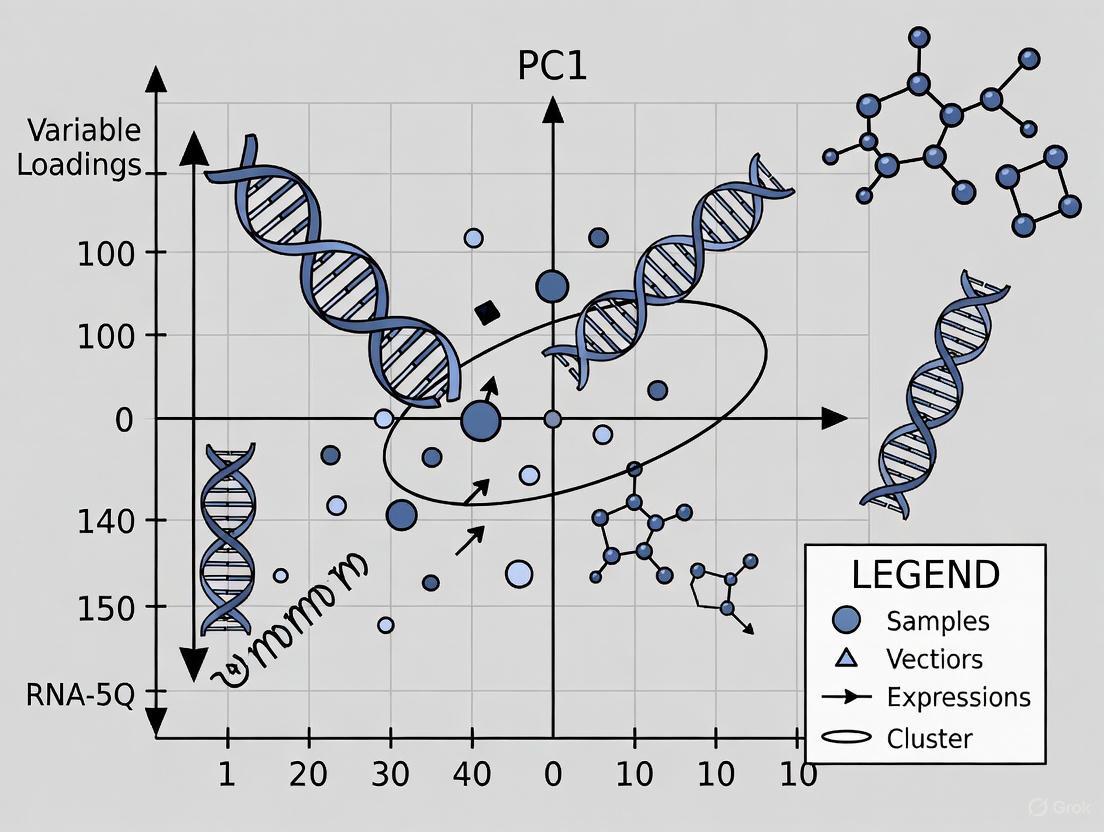
Reading a Biplot for Biological Insight
The biplot is the most information-dense visualization resulting from a PCA, and learning to read it is crucial for extracting biological meaning. It simultaneously displays both the samples (as points) and the genes (as vectors) in the space of the principal components [7].
To interpret a biplot effectively, follow these guidelines:
- Sample Proximity: The positions of the sample points relative to each other indicate their similarity. Two samples that are close together have a very similar global gene expression profile. Distinct clusters of samples suggest distinct biological groups (e.g., treated vs. control, different cell types).
- Gene Vector Direction: The direction of a gene vector points towards the group of samples where that gene is most highly expressed. For example, a gene vector pointing directly to a cluster of tumor samples implies that gene is upregulated in that tumor subtype.
- Gene Vector Length: The length of the vector is proportional to the gene's contribution to the variance in the displayed components. A long vector means the gene's expression varies considerably across the samples and is a strong driver of the sample separation seen in the plot. A short vector indicates a gene with relatively stable expression that contributes little to the differences captured by these PCs.
- Angle Between Vectors: The cosine of the angle between two gene vectors approximates their correlation across the samples. A small acute angle indicates a positive correlation (genes are co-expressed). An angle of 90 degrees indicates no correlation, and an obtuse angle indicates a negative correlation.
Table 2: A guide to interpreting the key elements of a PCA biplot.
| Biplot Element | What to Look For | Biological Interpretation |
|---|---|---|
| Sample Points (Scores) | Clusters and outliers. | Samples forming a tight cluster are biologically similar. Isolated points may be technical outliers or unique biological states. |
| Gene Vectors (Loadings) | Direction and length. | Long vectors pointing toward a sample cluster represent genes that are strong markers for that sample group. |
| Axes (PC1, PC2) | Percentage of variance explained. | Indicates how much of the total global gene expression pattern is captured by the plot. A high percentage (e.g., >70%) means the plot is a faithful summary. |
Principal Component Analysis is an indispensable technique in the RNA-seq analysis pipeline. It provides a powerful, model-free method to tackle the curse of dimensionality inherent in transcriptomic data [5] [6]. By reducing tens of thousands of genes into a few principal components, PCA transforms an intractable high-dimensional dataset into an intuitive visualization of sample relationships. Mastering the generation and, more importantly, the interpretation of PCA plots and biplots enables researchers to perform quality control, identify batch effects, discover novel sample groupings, and generate hypotheses about the key genes driving biological differences. Ultimately, a rigorous PCA serves as a critical first step in the journey from a raw count matrix to meaningful biological discovery.
Principal Component Analysis (PCA) serves as a critical dimensionality reduction technique in computational biology, particularly for interpreting high-dimensional RNA-seq data. This whitepaper provides an in-depth technical examination of the four fundamental components of PCA output: scores, loadings, variance, and eigenvalues. By deconstructing their mathematical relationships and practical interpretations, we establish a framework for accurately reading PCA biplots within the context of RNA-seq research. This guide empowers researchers to transform complex gene expression matrices into actionable biological insights, identify sample outliers, and validate experimental quality through rigorous dimensional analysis.
RNA-seq experiments generate vast datasets where each sample represents a point in a high-dimensional space with tens of thousands of genes (dimensions). Principal Component Analysis (PCA) simplifies this complexity by transforming the original variables into a new set of uncorrelated variables called principal components (PCs) that capture the maximum variance in the data [10]. The first principal component (PC1) is the axis along which the data shows the highest variance, followed by PC2, which is orthogonal to PC1 and captures the next highest variance, and so on [1] [11]. This transformation allows researchers to visualize global gene expression patterns in a two-dimensional plot, typically PC1 versus PC2, revealing clusters, outliers, and batch effects that might otherwise remain hidden in the high-dimensional data [12] [13].
The interpretation of a PCA biplot for RNA-seq data hinges on understanding four interconnected mathematical constructs: eigenvalues (representing the variance explained by each component), variance (the proportion and cumulative percentage of total information captured), loadings (the influence of original genes on the new components), and scores (the projected positions of samples in the new component space) [14]. This whitepaper deconstructs each element to provide a comprehensive framework for biological interpretation.
Mathematical Foundations of PCA
The PCA Transformation
Mathematically, PCA is an orthogonal linear transformation that projects data to a new coordinate system [15]. For a data matrix X with n samples (rows) and p genes (columns), centered to have zero mean, the principal components are derived from the covariance matrix XᵀX. The transformation is defined by:
T = XW
where T is the matrix of principal component scores, and W is a p × p matrix whose columns are the eigenvectors of XᵀX [15]. These eigenvectors are the principal axes (directions), and the eigenvalues correspond to the variances along these axes.
Eigenvalues and Explained Variance
Eigenvalues (λ₁, λ₂, ..., λₚ) are fundamental to PCA, representing the variances of the principal components [14]. The proportion of total variance explained by the i-th principal component is calculated as:
Proportion for PCᵢ = λᵢ / (λ₁ + λ₂ + ... + λₚ)
The cumulative proportion for the first k components is the sum of their individual proportions [14] [10]. This quantifies how much information is retained when reducing dimensions.
The following diagram illustrates the workflow from raw data to PCA interpretation:
Core Components of PCA Output
Eigenvalues and Variance Explained
Eigenvalues quantify the variance captured by each principal component, serving as the primary metric for determining component significance [14]. A higher eigenvalue indicates that a component captures more information from the original dataset. The "scree plot," which visualizes eigenvalues in descending order, helps determine the optimal number of components to retain—components before the sharp elbow in the plot typically contain the most meaningful information [1] [14].
The proportion and cumulative variance provide critical context for dimensionality reduction decisions. For RNA-seq analysis, the first 2-3 components often capture sufficient variance to reveal major biological patterns, though the exact percentage varies by dataset [13] [10].
Table 1: Eigenvalue and Variance Interpretation from a Sample PCA on RNA-seq Data
| Principal Component | Eigenvalue | Proportion of Variance | Cumulative Proportion | Interpretation in RNA-seq Context |
|---|---|---|---|---|
| PC1 | 3.55 | 0.443 (44.3%) | 0.443 (44.3%) | Captures largest source of variation, often major biological factor (e.g., treatment vs. control) |
| PC2 | 2.13 | 0.266 (26.6%) | 0.710 (71.0%) | Represents next largest variation source, potentially batch effects or secondary biological signal |
| PC3 | 1.04 | 0.131 (13.1%) | 0.841 (84.1%) | May capture additional structured variation; often retention cutoff for analysis |
| PC4 | 0.53 | 0.066 (6.6%) | 0.907 (90.7%) | Diminishing returns; typically explains minimal biological signal |
Loadings: Interpreting Variable Influence
Loadings (eigenvectors) represent the weight of each original variable (gene) in constituting the principal components [14]. They indicate both the direction and magnitude of each variable's contribution, with larger absolute values indicating stronger influence on the component.
In RNA-seq analysis, examining genes with high loadings for a particular component can reveal biological interpretation. For instance, if PC1 separates treatment from control groups, genes with extreme PC1 loadings are likely those most responsive to the treatment [16] [13].
Table 2: Interpreting Loadings from a Sample PCA on RNA-seq Data
| Gene | PC1 Loading | PC2 Loading | Interpretation |
|---|---|---|---|
| Gene A | 0.985 | 0.126 | Strong positive correlation with PC1; primary driver of sample separation along PC1 axis |
| Gene B | 0.782 | -0.605 | Strong positive correlation with PC1, strong negative with PC2; complex influence on both components |
| Gene C | 0.365 | 0.294 | Moderate influence on both components |
| Gene D | 0.142 | 0.150 | Minimal influence on either component; contributes little to observed sample variation |
Scores: Visualizing Sample Relationships
Scores are the projected coordinates of each sample in the new principal component space [14]. They represent linear combinations of the original variables weighted by the loadings, calculated as T = XW [15]. When plotted (typically PC1 vs. PC2), scores reveal sample clustering patterns, outliers, and group separations [12].
In RNA-seq applications, similar samples cluster together in the score plot, while outliers may indicate poor RNA quality, sample mishandling, or unique biological characteristics [13]. For example, in a prostate cancer RNA-seq dataset, pre-ADT and post-ADT treatment samples may separate along PC1, revealing treatment-responsive transcriptomes [12].
Integrating Components: The PCA Biplot in RNA-seq
The PCA biplot simultaneously visualizes both scores (samples as points) and loadings (genes as vectors) on the same coordinate system [15]. This integration enables researchers to interpret both sample clustering and the gene expression patterns driving those clusters.
Reading a Biplot for Biological Insight
In a biplot, the position of each sample point represents its score, while the direction and length of loading vectors indicate each gene's contribution to the components. Genes with longer vectors have greater influence on the component axes, while the angle between vectors approximates their correlation—acute angles indicate positive correlation, obtuse angles negative correlation, and right angles little to no correlation [16].
For RNA-seq data, this visualization can identify:
- Batch effects: Systematic separation of samples by processing date rather than biological group
- Outliers: Samples distant from main clusters that may represent quality issues
- Biological subgroups: Subtle clustering within primary sample groups
- Driver genes: Genes whose expression patterns most influence sample separation
Case Study: RNA-seq Quality Assessment
A 2018 study demonstrated how PCA biplots assess RNA-seq data characteristics and quality [13]. Researchers performed PCA on both gene expression values (FPKM) and transcript integrity numbers (TIN scores) from breast cancer samples. The gene expression PCA revealed sample associations, while the TIN score PCA provided a quality map—effectively discriminating low-quality samples that could lead to misinterpretation in differential expression analysis [13].
Samples showing divergent positions in gene expression PCA but not in TIN score PCA suggested biologically distinct cell populations, while those outliers in both plots indicated potential RNA quality issues [13]. This approach enables researchers to identify and address sampling errors before proceeding with downstream analysis.
Experimental Protocol: PCA for RNA-seq Data Analysis
Data Preprocessing and Standardization
Prior to PCA, RNA-seq data requires specific preprocessing to ensure valid results. Begin with raw count data, then:
- Filter low-expression genes: Remove genes with minimal counts across samples (e.g., <10 reads total) to reduce noise [12]
- Normalize for sequencing depth: Apply methods such as DESeq2's median-of-ratios or trimmed mean of M-values (TMM) normalization
- Transform the data: Apply variance-stabilizing transformation (VST) or log₂ transformation to minimize mean-variance dependence
- Standardize variables: Center each gene to mean zero and scale to unit variance so all genes contribute equally to variance calculation [11]
Standardization is critical as PCA is sensitive to variable scales; without it, highly expressed genes would dominate the analysis regardless of biological importance [11].
PCA Implementation and Visualization
The computational implementation follows a standardized workflow in R or Python:
In R, use the prcomp() function on the transposed expression matrix (samples as columns, genes as rows). For the prostate cancer RNA-seq example [12], the code structure would be:
The Scientist's Toolkit: Essential Research Reagents and Computational Tools
Table 3: Essential Research Reagents and Computational Tools for PCA in RNA-seq Analysis
| Tool/Reagent | Function | Application in PCA Workflow |
|---|---|---|
| RSeQC | RNA-seq quality control | Calculates transcript integrity numbers (TIN) for quality assessment PCA [13] |
| DESeq2 | Differential expression analysis | Performs data normalization and transformation prior to PCA [12] |
| ggplot2 | Data visualization | Creates publication-quality PCA score plots and biplots [12] |
| STAR aligner | Read alignment | Generates mapped read files (BAM) for expression quantification [13] |
| Trimmomatic | Read preprocessing | Removes low-quality sequences that could introduce noise in PCA [13] |
| Cufflinks/Cuffnorm | Expression quantification | Calculates FPKM values for gene expression matrix input to PCA [13] |
Deconstructing PCA output into its elemental components—scores, loadings, variance, and eigenvalues—provides a rigorous framework for interpreting RNA-seq data. Through systematic examination of each element and their interrelationships, researchers can transform high-dimensional gene expression data into biologically meaningful insights. The PCA biplot serves as a powerful integrative visualization, revealing sample relationships and their transcriptional drivers simultaneously. As RNA-seq technologies continue to evolve, mastery of PCA interpretation remains an indispensable skill for extracting robust conclusions from complex transcriptomic datasets, ultimately advancing drug development and precision medicine initiatives.
Principal Component Analysis (PCA) serves as a critical dimensionality reduction technique in high-dimensional biological research, particularly in RNA-seq data analysis. This technical guide provides an in-depth examination of the scree plot methodology for determining the optimal number of principal components to retain, framed within the broader context of interpreting PCA biplots for transcriptomic studies. We present a comprehensive framework incorporating multiple statistical criteria, practical implementation protocols, and specialized considerations for genomic data, enabling researchers to make informed decisions about dimension reduction while preserving biologically relevant variation. Our systematic approach integrates quantitative evaluation metrics with visual diagnostics to address the critical trade-off between data compression and information retention, ultimately enhancing the reliability of downstream analyses in drug development and biomarker discovery.
RNA-sequencing experiments generate profoundly high-dimensional data, with expression values for tens of thousands of genes across multiple samples [10]. Principal Component Analysis (PCA) has emerged as an essential tool for exploring this complexity by transforming the original variables (genes) into a smaller set of uncorrelated principal components (PCs) that capture the maximum variance in the data [17]. The first principal component (PC1) represents the axis of greatest variance, with each subsequent component capturing the next highest variance under the constraint of orthogonality to previous components [10]. This transformation allows researchers to visualize global expression patterns, identify batch effects, detect outliers, and assess sample relationships in two or three dimensions.
Within transcriptomics, PCA provides a crucial bridge between raw expression data and biological interpretation. By projecting samples into a reduced-dimensionality space defined by principal components, researchers can quickly assess whether experimental groupings (e.g., treatment vs. control) separate meaningfully in the principal component space, thus validating experimental design and data quality before proceeding to more sophisticated analyses [13]. The technique effectively distills the essential information from thousands of gene expression measurements into a visually interpretable format while minimizing information loss.
The challenge of determining how many principal components to retain sits at the heart of effective PCA application. Retaining too few components risks discarding biologically meaningful variation, while retaining too many incorporates noise and diminishes the utility of dimension reduction. This guide focuses specifically on the scree plot methodology for addressing this critical decision point, contextualized within the comprehensive interpretation of PCA biplots for RNA-seq research.
The Scree Plot: Theoretical Foundation
Definition and Origin
A scree plot is a graphical representation that displays the eigenvalues of principal components in descending order of magnitude [18]. The term "scree" derives from geology, where it describes the accumulation of rocky debris at the base of a cliff; in PCA context, the cliff represents the important components while the debris represents the negligible ones [19]. The plot typically shows component numbers on the x-axis and corresponding eigenvalues (or proportion of variance explained) on the y-axis, creating a characteristic downward curve that guides component selection decisions [20].
The scree plot was introduced by Raymond B. Cattell in 1966 as a subjective yet intuitive method for determining the number of meaningful components in factor analysis and PCA [18]. The method leverages the expected behavior of eigenvalues in multivariate data: the first few components capture substantial systematic variance, while subsequent components explain progressively smaller amounts of variance, eventually reaching a point where they represent only random noise. The visual identification of this transition point forms the basis of the scree test.
Mathematical Underpinnings
Eigenvalues in PCA represent the amount of variance captured by each principal component. For a dataset with p variables, the sum of all eigenvalues equals p when based on a correlation matrix, or the total variance when based on a covariance matrix [19]. The proportion of variance explained by the k-th principal component is calculated as:
where λ~k~ is the eigenvalue of the k-th component and the denominator represents the sum of all eigenvalues [10]. The cumulative variance explained by the first m components is the sum of their individual proportions [10]. These proportional values form the basis for the y-axis in most scree plot implementations and provide the quantitative framework for decisions about component retention.
Table 1: Key Mathematical Concepts in Scree Plot Interpretation
| Concept | Formula | Interpretation | Application in RNA-Seq |
|---|---|---|---|
| Eigenvalue (λ~k~) | - | Variance captured by k-th PC | Indicates strength of expression pattern |
| Proportion of Variance | λ~k~ / Σλ~i~ | Fraction of total variance explained | Quantifies biological signal captured |
| Cumulative Variance | Σ~i=1~^m^ λ~i~ / Σλ~i~ | Total variance explained by first m PCs | Determines sufficiency of reduced dimensions |
| Eigenvalue Criterion | λ~k~ ≥ 1 | Kaiser-Guttman rule for component retention | Identifies components stronger than average variable |
Scree Plot Interpretation Methodology
The Elbow Rule
The primary interpretive approach for scree plots is identification of the "elbow" or point of maximum curvature in the eigenvalue curve [18]. This elbow represents the transition from components that capture substantial systematic variance to those that represent mostly random noise. In practice, researchers visually scan the descending curve of eigenvalues and identify the point where the steep decline transitions to a more gradual slope [20] [3]. All components preceding this elbow are considered meaningful and retained for further analysis, while those following the elbow are typically discarded.
The elbow criterion is inherently subjective, as the point of maximum curvature may not be unequivocally defined, particularly with complex biological datasets [18]. Some scree plots may display multiple elbows, further complicating interpretation. Nevertheless, the method remains widely used due to its intuitive appeal and ease of application. In RNA-seq analysis, where biological effect sizes vary considerably, the elbow often corresponds to the point where components cease capturing coherent expression programs and begin representing stochastic variation or technical artifacts.
Supplementary Decision Criteria
To address the subjectivity of the elbow test, researchers often employ supplementary criteria for component retention:
Kaiser-Guttman Criterion: This rule retains components with eigenvalues greater than 1 when PCA is performed on standardized data [20] [3]. The rationale stems from the fact that each standardized variable contributes a variance of 1, so components with eigenvalues exceeding 1 capture more variance than a single original variable. For RNA-seq data, which is typically normalized before PCA, this criterion provides an objective threshold, though it may retain too many components in high-dimensional transcriptomic studies.
Proportion of Variance Explained: Researchers may set a predetermined threshold for cumulative variance explained (often 70-90%) and retain the minimum number of components required to reach this threshold [3]. This approach ensures sufficient preservation of original data structure while still achieving dimension reduction. In transcriptomics, where the first few components often capture dominant biological signals, this method balances information retention with reduction goals.
Broken-Stick Model: This statistical approach compares observed eigenvalues to those expected from random data [19]. Components explaining more variance than expected under the broken-stick null model are retained. The method calculates expected eigenvalues as (1/p)Σ(1/i) for i=k..p, where p is the number of variables [19]. This approach provides a rigorous statistical foundation for component retention, particularly valuable when analyzing novel datasets without established expectations.
Table 2: Component Retention Criteria Comparison
| Criterion | Methodology | Advantages | Limitations | RNA-Seq Applicability |
|---|---|---|---|---|
| Scree Elbow | Visual identification of curve inflection | Intuitive, quick assessment | Subjective, multiple elbows possible | Moderate: Biological complexity can obscure elbow |
| Kaiser-Guttman | Retain PCs with eigenvalues >1 | Objective, easily automated | Often overestimates in high-dimensional data | Low: Tends to retain too many noise components |
| Variance Threshold | Retain PCs to reach cumulative variance target (e.g., 80%) | Ensures minimum information preservation | Arbitrary threshold setting | High: Allows biologically-informed threshold setting |
| Broken-Stick | Retain PCs explaining more than null expectation | Statistical rigor, minimizes overfitting | Computationally more intensive | High: Objective benchmark for meaningful components |
Scree Plot Limitations
Despite its utility, the scree plot approach has recognized limitations. The subjectivity of elbow detection introduces inter-rater variability, particularly with complex curves displaying multiple inflection points [18]. Additionally, the visual appearance of scree plots can be influenced by axis scaling, with different presentations potentially leading to different interpretations of the same data [18]. In transcriptomic applications, where data dimensionality is extreme and biological effects may be distributed across many components, traditional scree plot interpretation may require adaptation through experience and domain knowledge.
Integrating Scree Plots with PCA Biplot Interpretation
The PCA Biplot Framework
A PCA biplot simultaneously displays both sample positions (scores) and variable influences (loadings) in principal component space [3]. This dual representation enables researchers to visualize not only sample clustering patterns but also the genetic drivers of these patterns. In RNA-seq analysis, biplots reveal which genes contribute most strongly to sample separation along each component, connecting visualization directly to biological interpretation.
The biplot integrates two distinct elements: the score plot showing samples as points in reduced dimension space, and the loading plot showing variables as vectors [3]. The angles between variable vectors indicate their correlations, with small angles suggesting positive correlation, large angles (approaching 180°) indicating negative correlation, and perpendicular vectors suggesting no correlation [3]. For transcriptomic studies, this reveals co-regulated gene sets and expression programs that distinguish sample groups.
Strategic Component Selection for Biplot Visualization
The scree plot directly informs effective biplot construction by identifying the components that capture biologically meaningful variance. When the first two components explain sufficient cumulative variance (typically >50-70% in RNA-seq applications), a 2D biplot provides an adequate representation of the data structure [3] [10]. When variance is distributed more evenly across components, researchers may need to create multiple biplot pairs or consider 3D visualizations to capture essential biological patterns.
Diagram 1: Scree Plot to Biplot Integration Workflow - This diagram illustrates the sequential process from RNA-seq data through PCA and scree plot interpretation to final biplot creation for biological insight.
The integration of scree plot analysis with biplot interpretation creates a powerful feedback loop for quality assessment in RNA-seq studies. By confirming that the components retained based on scree plot analysis actually separate samples according to expected biological groups in the biplot, researchers validate both the technical quality of their data and the appropriateness of their component selection. Discrepancies between scree-based selection and biplot patterns may indicate issues with data quality or experimental design that require investigation before proceeding with downstream analyses.
RNA-Seq Specific Considerations
Data Quality Assessment
In RNA-seq analysis, PCA and scree plots serve dual purposes for both dimension reduction and data quality assessment. Research demonstrates that incorporating quality metrics like Transcript Integrity Number (TIN) scores into PCA visualization can effectively identify low-quality samples that might otherwise distort analyses [13]. By performing PCA on both expression values (FPKM/RPKM) and quality metrics, researchers can distinguish samples with genuine biological differences from those with technical quality issues.
The gene expression PCA plot reveals sample associations based on transcriptomic profiles, while the TIN score PCA plot provides a quality map of RNA-seq data [13]. Discrepancies between these visualizations flag problematic samples; for example, a sample positioned away from its group cluster in expression space but aligned in quality space may represent genuine biological variation, while a sample deviating in both may indicate technical artifacts [13]. This integrated quality assessment is particularly valuable when analyzing public datasets where laboratory protocols cannot be controlled.
Impact on Differential Expression Analysis
Component selection decisions directly influence downstream analyses, particularly identification of differentially expressed genes (DEGs). Studies demonstrate that inclusion of low-quality samples or those from spatially distinct regions significantly alters DEG identification, sometimes reducing detected signals by more than 50% [13]. The scree plot informs this process by guiding the retention of components that capture biological rather than technical variation.
When too few components are retained, biologically relevant expression patterns may be obscured, reducing statistical power for DEG detection. Conversely, retaining excessive noise components increases false discovery rates by incorporating stochastic variation into the analysis. In practice, the optimal number of components for RNA-seq analysis typically ranges from 2-10, depending on experimental complexity and data quality, with the scree plot providing crucial guidance for this determination.
Experimental Protocols
RNA-Seq PCA Workflow
A standardized protocol for scree plot analysis in RNA-seq studies includes the following steps:
Data Preprocessing: Generate normalized count data (e.g., FPKM, TPM, or variance-stabilized counts) from raw sequencing reads using established pipelines. Remove low-expression genes and apply appropriate normalization to correct for library size and composition biases.
Quality Assessment: Calculate quality metrics such as TIN scores using tools like RSeQC [13]. Perform initial sample-level clustering to identify potential outliers before PCA.
PCA Execution: Perform principal component analysis on the normalized expression matrix, typically using correlation-based PCA to standardize variable contributions. Most implementations center variables to mean zero, with scaling to unit variance optional depending on analysis goals.
Scree Plot Generation: Extract eigenvalues and calculate proportion of variance explained for each component. Create the scree plot with components on x-axis and eigenvalues or variance proportions on y-axis.
Component Retention Decision: Apply multiple criteria (elbow test, Kaiser-Guttman, variance threshold, broken-stick) to determine optimal component number. Resolve conflicts between criteria through consideration of biological expectations and data quality assessments.
Biplot Construction: Create biplots using retained components, incorporating sample groupings and variable loadings for biological interpretation.
Validation: Confirm that retained components separate samples according to expected biological groups and do not primarily reflect batch effects or technical artifacts.
Implementation in R
For researchers implementing this workflow in R, the following code provides a template for scree plot generation and interpretation:
Table 3: Essential Research Reagent Solutions for RNA-Seq PCA
| Tool/Software | Function | Application Context | Implementation |
|---|---|---|---|
| Factoextra R Package [21] | PCA visualization and scree plots | Generating publication-quality graphs | fviz_eig() for scree plots, fviz_pca_biplot() for biplots |
| RSeQC [13] | RNA-seq quality control | Calculating TIN scores for quality assessment | Python package for comprehensive quality metrics |
| FastQC [13] | Sequencing read quality | Initial data quality assessment | Java-based quality control tool |
| STAR Aligner [13] | Read mapping | Generating count matrices from raw reads | Spliced transcript alignment to reference genome |
| DESeq2 [17] | Count normalization and DEG analysis | Preparing expression matrices for PCA | Variance-stabilizing transformation for normalized counts |
The scree plot remains an essential diagnostic tool for determining principal component retention in RNA-seq studies, particularly when integrated with biplot interpretation within a comprehensive analytical framework. By combining visual elbow detection with supplementary quantitative criteria, researchers can make informed decisions that balance dimension reduction against biological information preservation. The specialized considerations for transcriptomic data—including quality assessment integration and downstream analysis implications—elevate scree plot interpretation from routine statistical practice to critical scientific decision-making.
As RNA-seq technologies evolve toward single-cell resolution and increasingly complex experimental designs, the principles of scree plot interpretation retain their relevance while requiring contextual adaptation. Future methodological developments may enhance objective elbow detection through algorithmic approaches, but the fundamental relationship between variance capture and biological meaning will continue to guide component selection decisions in transcriptional research.
A Step-by-Step Guide to Interpreting Your RNA-seq PCA Biplot
Principal Component Analysis (PCA) biplots serve as powerful visualization tools in high-dimensional biological research, particularly in transcriptomic studies such as RNA-seq data analysis. This technical guide provides a comprehensive examination of PCA biplot construction and interpretation, demonstrating how the simultaneous representation of sample scores and variable loadings enables researchers to identify patterns, clusters, and key drivers of variation in complex datasets. By framing biplot analysis within RNA-seq research contexts, we establish methodological protocols for evaluating sample similarities, detecting outliers, assessing data quality, and generating biological hypotheses. The integration of quantitative data visualization with practical research applications offers life scientists and drug development professionals an essential framework for extracting meaningful insights from high-throughput genomic data.
RNA-sequencing technologies generate high-dimensional datasets where the number of measured genes (variables) far exceeds the number of samples, creating significant analytical challenges [13]. Principal Component Analysis addresses this dimensionality problem by transforming original variables into a new set of uncorrelated variables called principal components (PCs), which are ordered such that the first component (PC1) captures the largest possible variance in the data, followed by the second component (PC2), and so on [22]. This linear transformation preserves global data structures while enabling visualization in reduced dimensions, making it particularly valuable for exploring RNA-seq data where researchers must identify strong patterns amid biological complexity [3] [13].
In practical RNA-seq applications, PCA serves multiple critical functions: it provides insights into sample associations and technical artifacts, helps identify batch effects, reveals natural clustering of samples based on experimental conditions, and detects outliers that may represent low-quality samples [13] [12]. The transcript integrity number (TIN) score PCA plot, for instance, can effectively discriminate low-quality RNA-seq samples that might otherwise lead to misinterpretations in differential expression analysis [13]. This quality assessment capability makes PCA an indispensable tool for ensuring robust genomic analyses.
Theoretical Foundation of PCA Biplots
Mathematical Underpinnings
PCA operates through a mathematical procedure that can be conceptualized through three complementary perspectives: as a rotation of the original variable space, as an eigenvalue decomposition of the covariance or correlation matrix, or as a linear combination procedure that creates new composite variables [23]. Formally, given a standardized data matrix Z with dimensions n×p (where n represents samples and p represents variables), PCA performs an eigenvalue decomposition of the correlation matrix to obtain eigenvectors (loadings) and eigenvalues (variances). The original data can then be expressed as the matrix product of principal component scores (U) and the transposed rotation matrix (V^T): Z = U V^T [23].
This decomposition produces two fundamental elements: (1) principal component scores, which represent the coordinates of samples in the new PC space and are calculated as U = Z V; and (2) loadings (or eigenvectors), which indicate the contribution of each original variable to the principal components and reflect how strongly each characteristic influences a given PC [3] [23]. The eigenvalues corresponding to each principal component represent the amount of variance captured by that component, providing a metric for assessing the relative importance of each dimension in explaining the overall data structure [22].
The Biplot Concept
A PCA biplot merges both the sample scores and variable loadings into a single visualization, creating a powerful tool for interpreting relationships between samples and variables simultaneously [3]. The biplot arrangement typically uses the bottom and left axes to display PC scores for samples (represented as points), while the top and right axes display the loadings of variables (represented as vectors) [3]. This dual representation enables researchers to assess both the positioning of samples relative to each other and the influence of original variables on the principal components that define the visualization space.
Table 1: Key Components of a PCA Biplot
| Component | Description | Interpretation |
|---|---|---|
| Sample Scores | Coordinates of samples in PC space | Similar samples cluster together; outliers appear distant from main clusters |
| Variable Loadings | Vectors representing original variables | Direction and length indicate influence on PCs |
| Component Axes | Principal components (PC1, PC2, etc.) | Each axis represents a linear combination of original variables |
| Eigenvalues | Variance captured by each PC | Indicates importance of each dimension |
| Angles Between Vectors | Spatial relationship between variable arrows | Reveals correlations between original variables |
Constructing PCA Biplots for RNA-seq Data
Data Preprocessing and Standardization
RNA-seq data requires careful preprocessing before PCA application. The initial steps involve generating a count matrix from aligned reads, followed by normalization to account for library size differences and other technical variations [12]. For RNA-seq datasets, the DESeq2 package offers a specialized variance stabilizing transformation (VST) that stabilizes variance across the mean-intensity range, making the data more suitable for PCA [12] [24]. This transformation is particularly important as it addresses the mean-variance relationship inherent in count-based sequencing data.
A critical decision in PCA implementation is whether to analyze data on the covariance matrix or correlation matrix. Standardizing variables to have mean=0 and variance=1 (as in PCA on correlation matrix) removes biases when variables are measured on different scales, creating unitless variables with similar variance [23] [22]. For RNA-seq data, where expression levels can vary dramatically across genes, standardization ensures that highly expressed genes do not disproportionately influence the principal components simply due to their magnitude rather than biological relevance.
PCA Implementation Workflows
Table 2: PCA Implementation in R and Python
| Step | R/DESeq2 Workflow | Python/sklearn Workflow |
|---|---|---|
| Data Input | DESeqDataSetFromMatrix() with raw counts |
pandas.read_csv() for normalized counts |
| Transformation | vst() or rlog() for variance stabilization |
StandardScaler().fit_transform() |
| PCA Computation | pca() from PCAtools package |
PCA().fit_transform() from sklearn |
| Result Extraction | biplot() function for visualization |
Access components_, explained_variance_ratio_ |
| Visualization | biplot(p, colby="condition") |
cluster.biplot() from bioinfokit |
The following workflow diagram illustrates the complete PCA biplot generation process for RNA-seq data:
Component Selection and Validation
Determining how many principal components to retain represents a crucial step in PCA interpretation. Several established methods guide this decision:
- Scree Plot Analysis: Visualizes the variance explained by each component, where the "elbow" point indicates optimal component retention [3] [22].
- Eigenvalue Criterion: Retains components with eigenvalues greater than 1, as these explain more variance than a single standardized variable [3] [22].
- Proportion of Variance: Keeps enough components to explain at least 70-95% of total variance [22].
- Cumulative Variance: Evaluates the cumulative variance explained by successive components.
For RNA-seq data, where the first 2-3 components typically capture the strongest biological signals, visualization in two or three dimensions is often sufficient to reveal major patterns and outliers [3] [12]. The following diagnostic plot illustrates component selection:
Interpreting RNA-seq PCA Biplots
Analyzing Sample Patterns
In RNA-seq PCA biplots, each point represents an individual sample, with similar samples appearing closer in the PC space. The spatial arrangement reveals critical biological and technical information:
- Sample Clusters: Groups of points forming distinct clusters often share biological characteristics (e.g., treatment vs. control, different disease subtypes, or similar tissue origins) [12]. In a prostate cancer RNA-seq dataset, samples typically cluster into pre-ADT and post-ADT treatment groups along the first principal component [12].
- Outliers: Samples positioned far from main clusters may indicate quality issues, such as the C3 sample identified in a breast cancer study that showed different RNA quality despite similar tissue origins [13]. These outliers warrant further investigation as they can significantly impact differential expression analysis results.
- Gradients and Continuums: Sometimes samples form gradients rather than discrete clusters, potentially representing continuous biological processes such as disease progression or differentiation trajectories.
Interpreting Variable Loadings
Variable loading vectors (typically representing genes in RNA-seq data) provide insights into what drives the observed sample patterns:
- Vector Direction: The direction of a variable vector indicates its relationship with the principal components. Variables pointing toward the positive end of a PC axis are positively correlated with that component, while those pointing toward the negative end are negatively correlated [3].
- Vector Length: Longer vectors indicate variables with stronger influence on the principal components displayed in the biplot [3]. In RNA-seq contexts, genes with longer loading vectors typically show greater expression variability across samples and often represent biologically significant genes.
- Angular Relationships: The angles between variable vectors reveal their intercorrelations. Small angles (vectors pointing in similar directions) indicate positive correlation, large angles (close to 180°) suggest negative correlation, and perpendicular vectors (90°) imply no correlation [3].
Integrated Interpretation
The true power of biplot analysis emerges when integrating sample and variable interpretations. By examining which variables align with specific sample clusters, researchers can hypothesize about biological mechanisms. For example, if a cluster of tumor samples aligns with vectors for cell proliferation genes, this suggests these genes may be drivers of the tumor phenotype.
Table 3: Biplot Interpretation Guide for RNA-seq Data
| Pattern | Interpretation | Biological Significance |
|---|---|---|
| Tight Sample Clusters | Low within-group variation | Homogeneous biological condition or cell type |
| Overlapping Sample Groups | Similar transcriptomic profiles | Related biological states or technical artifacts |
| Long Variable Vectors | High influence on shown PCs | Potential key drivers of variation |
| Short Variable Vectors | Low influence on shown PCs | Minimally varying genes across conditions |
| Variables Clustered Together | Coordinated expression | Possibly co-regulated genes or shared pathways |
| Outlier Samples | Potential quality issues or unique biology | Requires investigation of RNA quality metrics |
Practical Applications in RNA-seq Research
Quality Control and Outlier Detection
PCA biplots serve as essential quality control tools for RNA-seq data. Research demonstrates that incorporating TIN score PCA plots alongside gene expression PCA plots helps identify low-quality samples that might otherwise compromise analysis validity [13]. In one breast cancer study, the C3 sample appeared slightly outside the cancer cluster in gene expression space but was positioned far from other samples in RNA quality space, indicating potentially degraded RNA that could skew differential expression results [13]. Similarly, the N3 sample from adjacent normal tissue clustered with cancer samples in gene expression space, suggesting possible contamination with cancer cells [13].
Batch Effect Detection
Unintended technical variations (batch effects) represent major challenges in genomic research. PCA biplots effectively visualize these artifacts as sample groupings correlated with processing dates, sequencing lanes, or laboratory technicians rather than biological conditions. When such technical patterns dominate the first few principal components, researchers should employ batch correction methods before proceeding with biological interpretation.
Biological Hypothesis Generation
By revealing natural groupings in high-dimensional data, PCA biplots facilitate biological discovery. In cancer studies, they might reveal previously unrecognized molecular subtypes with distinct clinical behaviors. In developmental biology, they can trace differentiation trajectories. The visualization of gene vectors alongside sample positions enables immediate generation of testable hypotheses about molecular drivers behind observed sample groupings.
The Scientist's Toolkit: Essential Research Reagents and Computational Tools
Table 4: Essential Tools for PCA Biplot Analysis in RNA-seq Research
| Tool/Resource | Function | Application Context |
|---|---|---|
| DESeq2 | Differential expression analysis and data transformation | R-based RNA-seq analysis; provides variance stabilizing transformation |
| edgeR | Differential expression analysis | Alternative to DESeq2 for RNA-seq count data |
| PCAtools | PCA visualization and analysis | Specialized R package for PCA in genomic contexts |
| scikit-learn | Machine learning and PCA implementation | Python-based PCA computation and analysis |
| bioinfokit | Visualization utilities | Python package for generating PCA plots and biplots |
| ggplot2 | Advanced data visualization | R package for customizable publication-quality graphics |
| RColorBrewer | Color palette management | Ensures accessible color schemes for categorical variables |
| TCGAbiolinks | Data access and preparation | Facilitates download and preparation of TCGA RNA-seq data |
Methodological Protocols
Standard RNA-seq PCA Protocol
- Data Acquisition: Obtain raw count matrix from alignment files (e.g., HTSeq-count, featureCounts).
- Initial Filtering: Remove genes with low counts across samples (e.g., fewer than 10 counts total) to reduce noise [12].
- Data Transformation: Apply variance stabilizing transformation (DESeq2's
vst()) or regularized logarithm transformation to address mean-variance dependence [12]. - Data Standardization: Center and scale the transformed data to mean=0 and variance=1 for each gene.
- PCA Computation: Perform eigenvalue decomposition on the prepared data matrix.
- Component Selection: Determine the number of components to retain using scree plots and eigenvalue criteria.
- Biplot Generation: Create biplots displaying both sample scores and variable loadings.
- Interpretation: Analyze sample clusters, outliers, and variable influences to derive biological insights.
Quality Assessment Protocol
- Generate TIN Score PCA: Calculate transcript integrity numbers and perform PCA on TIN scores [13].
- Compare Expression and TIN Plots: Identify discrepancies between gene expression PCA and TIN score PCA [13].
- Investigate Outliers: Examine sample quality metrics (mapping rates, duplication levels) for samples identified as outliers.
- Assess Impact: Evaluate how outlier removal affects differential expression results [13].
Advanced Considerations and Limitations
While PCA biplots offer powerful visualization capabilities, researchers must acknowledge their limitations. PCA primarily captures linear relationships and may perform poorly with nonlinear data structures [22]. Additionally, the interpretation becomes challenging when many variables create dense vector fields that obscure patterns. In such cases, focusing on the top contributing variables or using alternative visualization methods like t-SNE or UMAP may be beneficial [22].
Color selection represents another critical consideration in biplot visualization. Employing hue variation for categorical variables (e.g., different experimental conditions) and luminance gradients for continuous variables enhances interpretability [25]. Researchers should select color palettes that maintain sufficient contrast and remain distinguishable under various forms of color vision deficiency [25] [26].
The following diagram illustrates the relationship between PCA and alternative dimensionality reduction methods:
PCA biplots represent an essential analytical tool in the RNA-seq researcher's toolkit, providing intuitive yet powerful visualization of complex transcriptomic data. By simultaneously representing sample relationships and variable influences, they bridge the gap between high-dimensional data and biological interpretation. When properly implemented within a rigorous analytical framework that includes quality assessment and appropriate preprocessing, PCA biplot analysis enables researchers to identify key patterns, detect technical artifacts, and generate novel biological hypotheses. As RNA-seq technologies continue to evolve, maintaining strong foundational skills in multivariate visualization techniques like PCA biplots will remain crucial for extracting meaningful insights from increasingly complex genomic datasets.
Principal Component Analysis (PCA) is a fundamental dimensionality reduction technique widely employed in the analysis of high-throughput RNA sequencing (RNA-seq) data. The core purpose of PCA is to transform high-dimensional gene expression data into a lower-dimensional space while minimizing the loss of information [10]. In RNA-seq studies, each sample is characterized by expression values for tens of thousands of genes, creating a multidimensional space that is difficult to visualize and interpret. PCA addresses this challenge by identifying new variables, termed principal components, which are linear combinations of the original genes. The first principal component (PC1) is the axis along which the data shows the maximum variance. The second principal component (PC2) is orthogonal to PC1 and captures the next highest amount of variance, and so on [27]. The resulting PCA biplot serves as a critical visualization tool, allowing researchers to observe global patterns in their data, assess reproducibility between biological replicates, identify potential batch effects, and detect outlier samples that may warrant further investigation [12] [28].
When working with RNA-seq data, it is crucial to recognize that PCA is typically performed on transformed and scaled data. The complex, multi-step protocols involved in RNA-seq data acquisition can introduce technical variations, while true biological differences can also contribute to extreme sample deviations [28]. The PCA biplot effectively visualizes these relationships, with the proportion of total variance explained by each principal component indicated in parentheses on the axes [10]. For example, a biplot where PC1 explains 45% of the variance and PC2 explains 20% would indicate that the two-dimensional representation captures 65% of the total variation present in the original high-dimensional gene expression data. The interpretation of these plots forms the foundation for quality assessment and hypothesis generation in transcriptomic studies.
Theoretical Foundations of PCA and Biplots
Mathematical Underpinnings
Principal Component Analysis operates on the principle of eigenvalue decomposition of the covariance matrix of the data. Given a gene expression matrix ( X ) with ( n ) samples (columns) and ( p ) genes (rows), where the data is typically centered (mean-zero) and scaled (unit variance), PCA identifies a set of new variables (principal components) that are linear combinations of the original genes. The first principal component is defined as ( PC1 = w{11}Gene1 + w{12}Gene2 + \cdots + w{1p}Genep ), where the weights ( w1 = (w{11}, w{12}, \ldots, w{1p}) ) are chosen to maximize the variance of PC1 subject to ( ||w_1||^2 = 1 ) [27]. Subsequent components are determined similarly under the constraint of being orthogonal to previous components.
The resulting principal components are ordered by the amount of variance they explain, with PC1 capturing the largest proportion and each subsequent component explaining progressively less. The eigenvalues of the covariance matrix correspond to the variances of the principal components, while the eigenvectors define the directions of these components and represent the loadings, which indicate the contribution of each original gene to the principal components [27]. The explained variance ratio for each principal component is calculated as the eigenvalue for that component divided by the sum of all eigenvalues, representing the proportion of total variance explained by that component [10].
Biplot Components and Interpretation
A PCA biplot is a sophisticated visualization that simultaneously represents both samples (observations) and variables (genes) in a reduced-dimensional space. The biplot consists of two fundamental elements: points (or symbols) representing individual samples, and vectors (arrows) representing genes [29] [7]. The position of each sample point along the principal component axes is determined by its principal component scores, which reflect the expression pattern of that sample in the reduced dimension. Samples with similar scores will cluster together in the biplot, indicating similar gene expression profiles.
The variable vectors, on the other hand, represent the loadings of each gene on the principal components. The direction of each vector indicates which principal component the gene is most strongly associated with, while the length of the vector corresponds to the amount of variance the gene contributes to the components displayed [29] [7]. A gene vector pointing primarily toward the right of the plot is strongly associated with PC1, while one pointing upward is more associated with PC2. Genes with longer vectors have a greater influence on the principal components than those with shorter vectors. The angle between gene vectors approximates the correlation between those genes, with small angles indicating positive correlation, right angles indicating no correlation, and angles approaching 180 degrees indicating negative correlation.
Table: Key Elements of a PCA Biplot and Their Interpretation
| Biplot Element | Representation | Interpretation Guide |
|---|---|---|
| Sample Points | Individual samples as points | Position shows coordinated expression pattern |
| Sample Clusters | Groups of points close together | Samples with similar global expression profiles |
| Outlier Samples | Points distant from main clusters | Technically problematic or biologically distinct samples |
| Gene Vectors | Arrows representing original variables | Direction and length show contribution to components |
| Vector Direction | Angle of arrow relative to axes | Which principal component the gene influences most |
| Vector Length | Magnitude of arrow | How much variance the gene contributes to components |
| Angle Between Vectors | Spatial relationship between genes | Correlation between genes (small angle = high correlation) |
Interpreting Sample Patterns in PCA Biplots
Cluster Identification and Analysis
Cluster identification is one of the most fundamental applications of PCA biplots in RNA-seq analysis. Clusters emerge when samples with similar gene expression patterns group together in the reduced dimensional space. In a well-controlled experiment, biological replicates should form tight, distinct clusters, with samples from the same experimental condition grouping closer to each other than to samples from different conditions [28]. For example, in an analysis of prostate cancer samples, pre- and post-androgen deprivation therapy (ADT) samples might form separate clusters, revealing a global transcriptional response to treatment [12].
The interpretation of clusters requires careful consideration of both the experimental design and the percentage of variance explained by the displayed principal components. When PC1 and PC2 explain a high cumulative percentage of variance (e.g., >70%), the cluster patterns in the 2D biplot provide a reliable representation of the major biological signals in the data. However, when the cumulative variance is low, apparent clusters in the PC1-PC2 plot might not represent true biological differences, and examination of additional components may be necessary [10]. The strength of clustering can be assessed by the distance between clusters relative to the spread within clusters, with greater separation indicating stronger differential expression patterns between conditions.
Outlier Detection and Interpretation
Outlier detection is another critical application of PCA biplots in quality control for RNA-seq studies. Outliers appear as samples that are spatially separated from the main clusters of samples in the biplot [28]. These outliers can arise from various sources, including technical artifacts during library preparation or sequencing, sample mislabeling, or genuine biological differences that make a sample distinct from others in the same group. The identification of outliers is particularly challenging in RNA-seq data due to the high-dimensionality of the data with few biological replicates, making robust statistical methods especially valuable [28].
The standard approach of visual inspection of PCA biplots for outlier detection has limitations, as it lacks statistical justification and may be influenced by unconscious biases [28]. To address this, robust PCA (rPCA) methods have been developed that are less influenced by outlying observations. These methods, such as PcaHubert and PcaGrid, use robust statistical techniques to obtain principal components that are not substantially influenced by outliers and to objectively identify anomalous observations [28]. Studies have demonstrated that rPCA methods can achieve 100% sensitivity and specificity in detecting outlier samples in RNA-seq data, outperforming classical PCA [28].
Table: Types of Outliers in RNA-seq PCA and Their Characteristics
| Outlier Type | Possible Causes | Position in Biplot | Recommended Action |
|---|---|---|---|
| Technical Outlier | Library preparation failures, sequencing errors, RNA degradation | Far from all other samples | Remove after confirmation |
| Biological Outlier | Unique pathophysiology, different cell type composition | Separated from own group but may cluster with unknown pattern | Investigate biology; may represent novel subgroup |
| Batch Effect | Processing in different batches, different operators | Clustered by processing batch rather than experimental group | Include batch in statistical model |
| Swapped Sample | Sample misidentification or mislabeling | Clusters with different group than expected | Verify sample identity; exclude if mislabeled |
Group Separations and Biological Meaning
The separation between predefined groups in a PCA biplot provides visual evidence of differential gene expression between experimental conditions. When samples from different conditions (e.g., treated vs. control, mutant vs. wildtype) form distinct clusters in the biplot, this suggests that global gene expression patterns differ substantially between these conditions. The magnitude of separation often correlates with the extent of transcriptional differences, with greater spatial separation indicating more profound biological differences [29]. For instance, in the analysis of Iris flower data, different species form distinct clusters in the PCA biplot, reflecting their characteristic morphological measurements [29].
The interpretation of group separations must consider the variance explained by the components showing the separation. A clear separation along PC1 indicates that the largest source of variation in the data corresponds to the differences between experimental groups, which is often the case in well-designed experiments with strong biological effects. However, when group separation occurs along later components (e.g., PC3 or PC4), this suggests that the experimental effect is not the dominant source of variation in the dataset, and researchers should investigate what biological or technical factors are driving the variation in earlier components [30]. In single-cell RNA-seq analysis, for example, PCA is used to reduce complexity and remove sources of noise before clustering cells based on their PCA scores, with each PC essentially representing a "meta-gene" that combines information across a correlated gene set [30].
Methodological Protocols for PCA in RNA-Seq
Data Preprocessing and Normalization
Proper data preprocessing is essential for meaningful PCA of RNA-seq data. The process typically begins with raw count data, which must be normalized to account for differences in sequencing depth and library composition between samples. For RNA-seq data, it is recommended to use variance-stabilizing transformations (such as the regularized logarithm transformation in DESeq2) or logarithmic transformation of normalized counts before performing PCA [12]. These transformations help to stabilize the variance across the dynamic range of expression levels and make the data more suitable for PCA, which is based on correlation or covariance matrices.
A critical step in preparing data for PCA is filtering lowly expressed genes, as these genes contribute mostly noise rather than biological signal. A common approach is to filter out genes with very low counts across all samples, such as those with fewer than 10 counts total [12]. Following transformation and filtering, the data is typically centered and scaled so that each gene has mean zero and unit variance, ensuring that highly expressed genes do not dominate the principal components simply because of their larger measurement scale [27]. This standardization is particularly important for RNA-seq data, as it prevents genes with naturally high expression levels from disproportionately influencing the analysis.
Implementation Using R and Bioconductor
The following code demonstrates a standard workflow for performing PCA on RNA-seq data using the DESeq2 package in R, which is specifically designed for handling count-based genomic data:
For more flexible PCA implementations, the FactoMineR and factoextra packages provide extensive functionality:
Color Schemes for Multiple Groups
When visualizing datasets with many groups in PCA biplots, careful selection of color schemes is essential for clear interpretation. For datasets with a large number of groups (e.g., 65 different conditions), manually specifying colors for each group is impractical. Instead, automated color generation approaches can be used:
It's important to note that distinguishing between a large number of colors (e.g., 65) can be challenging, and interpretation may require interactive plots with legend toggling or faceting of groups [31].
Advanced Topics and Methodological Considerations
Robust PCA for Outlier Detection
Robust PCA (rPCA) methods represent a significant advancement over classical PCA for accurately detecting outlier samples in RNA-seq data. While classical PCA is highly sensitive to outlying observations, often resulting in components that are attracted toward outliers, rPCA methods use robust statistical techniques to obtain principal components that better capture the variation of regular observations [28]. Two particularly effective rPCA methods for RNA-seq data are PcaHubert and PcaGrid, both implemented in the rrcov R package.
Studies comparing rPCA methods with classical PCA have demonstrated superior performance of rPCA in outlier detection. In analyses of RNA-seq data from conditional SnoN knockout mice, both PcaHubert and PcaGrid methods successfully detected the same two outlier samples, while classical PCA failed to identify any outliers [28]. The implementation is straightforward:
The removal of true technical outliers identified by rPCA can significantly improve the performance of differential gene expression analysis and downstream functional analysis, leading to more biologically relevant results [28].
Component Selection and Validation
Selecting the appropriate number of principal components to retain is a critical step in PCA that balances dimension reduction with information preservation. Several methods are available for determining the optimal number of components:
Elbow Plot: The most common approach, which involves plotting the variances (eigenvalues) of each principal component and looking for an "elbow" point where the explained variance drops dramatically [30]. In single-cell RNA-seq analysis, this elbow typically occurs around 50 PCs [30].
JackStraw Permutation Test: A computationally intensive but statistically rigorous method that randomly permutes a subset of the data and compares the observed PCA scores with those from permuted data to determine significant components [30].
Cumulative Variance Threshold: Retaining enough components to explain a predetermined percentage of total variance (e.g., 70-90%).
The following workflow demonstrates component selection:
Batch Effect Identification and Correction
Batch effects represent a major challenge in RNA-seq analysis and can profoundly impact the interpretation of PCA biplots. These technical artifacts arise when samples are processed in different batches, at different times, or by different operators, creating patterns of variation that can obscure biological signals [28]. In PCA biplots, batch effects are characterized by clustering of samples according to processing batch rather than biological group.
When batch effects are identified, several approaches can mitigate their impact:
Include Batch in Experimental Design: When possible, balance biological groups across processing batches.
Batch Correction Methods: Statistical approaches such as ComBat or removeBatchEffect can adjust for batch effects.
Include Batch as Covariate: In differential expression analysis, include batch as a covariate in the statistical model.
The following diagram illustrates the workflow for handling batch effects and outliers in RNA-seq PCA analysis:
Workflow Title: RNA-seq PCA Analysis with Batch Effect and Outlier Management
Table: Essential Computational Tools for PCA in RNA-Seq Analysis
| Tool/Package | Application Context | Key Functionality | Implementation |
|---|---|---|---|
| DESeq2 | Differential expression analysis | Variance-stabilizing transformation, PCA visualization | R/Bioconductor |
| FactoMineR | Multivariate data analysis | Comprehensive PCA implementation with supplementary variables | R/CRAN |
| factoextra | PCA visualization | ggplot2-based visualization of PCA results | R/CRAN |
| rrcov | Robust statistics | Robust PCA methods (PcaGrid, PcaHubert) for outlier detection | R/CRAN |
| Seurat | Single-cell RNA-seq analysis | PCA integration with clustering and dimension reduction | R/CRAN |
| PCAtools | General purpose PCA | Enhanced biplot creation with coloring options | R/Bioconductor |
Table: Key Diagnostic Measures in PCA Interpretation
| Diagnostic Measure | Calculation | Interpretation | Threshold Guidelines |
|---|---|---|---|
| Explained Variance | Eigenvalue / Total Variance | Proportion of total variance captured by a PC | Higher is better; PC1 typically >10% |
| Cumulative Variance | Sum of explained variances up to PCk | Total variance captured by first k components | >70% for reliable interpretation |
| Sample Cos2 | Square cosine of angle between sample and PC | Quality of representation of sample on PC | >0.75 (high), 0.50-0.75 (medium) |
| Variable Contribution | (Loading^2 * Eigenvalue) / Total Variance * 100 | Percentage contribution of variable to PC | >Mean contribution (100/p)% indicates important variable |
| Distance to Model | Orthogonal distance from robust PCA model | Measure of "outlierness" for each sample | Above cutoff based on chi-square distribution |
PCA biplots serve as an indispensable tool for exploratory data analysis in RNA-seq studies, providing a powerful means to visualize complex gene expression patterns in a reduced dimensional space. The interpretation of clusters, outliers, and group separations in these biplots enables researchers to assess data quality, identify technical artifacts, and generate biological hypotheses. Through proper implementation of preprocessing protocols, careful attention to variance explained, and application of robust statistical methods when appropriate, researchers can extract meaningful insights from their transcriptomic data. The integration of PCA with downstream analytical approaches, coupled with thoughtful consideration of color schemes for visualization and appropriate component selection, creates a comprehensive framework for understanding sample relationships and guiding subsequent analysis decisions in RNA-seq experiments.
Principal Component Analysis (PCA) biplots serve as indispensable tools for the exploratory analysis of high-dimensional biological data, such as RNA-seq datasets. These visualizations allow researchers to simultaneously observe the relationships between samples and the influence of thousands of genes in a reduced dimensional space. For scientists in drug development and biomedical research, accurately interpreting the variable vectors—which represent genes—is crucial for identifying biomarker candidates, understanding transcriptional drivers of disease, and assessing batch effects. This technical guide provides a comprehensive framework for interpreting these vectors within the context of RNA-seq research, detailing how to identify genes that exert the strongest influence on principal components and how these relationships inform biological interpretation. Through structured methodologies, visualization techniques, and practical applications, we equip researchers with the analytical rigor needed to extract meaningful insights from PCA biplots.
In RNA-seq bioinformatics, researchers regularly encounter datasets comprising expression values for thousands of genes across multiple samples. Principal Component Analysis (PCA) is a dimensionality reduction technique that transforms such high-dimensional data into a lower-dimensional space while preserving the maximum amount of variance [17]. A PCA biplot enhances this analysis by simultaneously displaying both the positions of samples (as points) and the contributions of original variables—in this case, genes (as vectors or arrows) [29] [32]. This dual representation makes biplots particularly powerful for visualizing the underlying structure of complex gene expression data.
The fundamental value of interpreting variable vectors in RNA-seq research lies in identifying which genes drive the separation between sample groups observed in the PCA plot. For drug development professionals, this can reveal transcriptional patterns associated with treatment response, disease subtypes, or experimental artifacts. When samples cluster according to biological conditions (e.g., treated vs. control) in a PCA, the genes whose vectors point toward those specific clusters are likely biologically relevant to the separation [33] [13]. Conversely, when separation aligns with technical factors (e.g., sequencing batch), those vectors may indicate unwanted technical variation requiring correction.
Theoretical Foundation: What Variable Vectors Represent
The Geometry of Loading Vectors
In a PCA biplot, each variable vector (arrow) corresponds to a gene and represents its loading values on the principal components displayed. Loadings are essentially the weights or coefficients that define the relationship between the original variables (genes) and the principal components [29] [34]. Mathematically, if we consider a data matrix X with n samples (rows) and m genes (columns), PCA decomposes this matrix to produce two key elements: (1) scores, which position the samples in the new PC space, and (2) loadings, which indicate how each original variable contributes to the principal components [17] [32].
The direction and magnitude of a gene's vector provide crucial information about its behavior in the reduced dimensional space. Vector direction indicates which principal component the gene most strongly influences, while vector length corresponds to the strength of its contribution to the variance captured by the displayed components [29] [35]. A gene vector pointing primarily along the PC1 axis predominantly influences the first principal component, while a vector oriented toward PC2 mainly affects the second principal component.
The Relationship Between Loadings and Variance
The loading values that define vector coordinates are derived from the eigenvectors of the covariance matrix of the original data [17] [32]. In computational terms, PCA typically employs Singular Value Decomposition (SVD) to obtain these eigenvectors and corresponding eigenvalues, with the latter representing the amount of variance explained by each principal component [17]. The proportion of total variance explained by each PC is calculated as the eigenvalue for that component divided by the sum of all eigenvalues, often expressed as a percentage [33] [12].
Table 1: Key Mathematical Components of PCA Biplots
| Component | Symbol | Description | Role in Biplot |
|---|---|---|---|
| Data Matrix | X | n × m matrix of expression values | Original RNA-seq data (samples × genes) |
| Loadings Matrix | L | m × k matrix of weights | Defines variable vector coordinates |
| Principal Components | PC₁, PC₂, ... | Linear combinations of original variables | Axes in the biplot display |
| Scores Matrix | S | n × k matrix of sample positions | Determines sample coordinates in biplot |
| Eigenvalues | λ₁, λ₂, ... | Variances of principal components | Determine percentage of variance explained |
Practical Interpretation of Variable Vectors
Direction and Magnitude Analysis
The interpretation of variable vectors in a PCA biplot follows specific geometric principles that translate to biological meaning:
Vector Direction: The direction in which a gene vector points indicates the gradient of increasing expression for that gene within the plot [29] [35]. Samples positioned in the direction the arrow points will typically have higher expression of that gene, while samples in the opposite direction will have lower expression. For example, in the classic iris dataset PCA, vectors for petal length, sepal length, and petal width all point in the same general direction as PC1, indicating positive correlation with this component [29].
Vector Length: The length of a variable vector is proportional to its contribution to the variance captured by the displayed principal components [29] [34]. Longer vectors represent genes with greater influence on the sample separation observed in the plot, while shorter vectors represent genes with minimal contribution. In RNA-seq analysis, genes with longer vectors are potential key drivers of the transcriptional differences between sample groups.
Angles Between Vectors: The cosine of the angle between two gene vectors approximates their correlation across samples [35]. Acute angles (vectors pointing in similar directions) indicate positive correlation, obtuse angles suggest negative correlation, and right angles imply no correlation. This relationship helps identify co-expressed gene modules that may function in related biological processes.
Relating Vectors to Sample Positions
A critical aspect of biplot interpretation involves understanding the relationship between variable vectors and sample positions:
When a gene vector points toward a specific cluster of samples, those samples typically exhibit higher expression of that gene compared to others in the dataset [36] [35]. This pattern helps identify marker genes characteristic of particular sample groups, such as disease subtypes or treatment responses.
The projection of sample points onto a gene vector (imagining a perpendicular line from the point to the vector line) approximates the relative expression of that gene in different samples [34]. This geometric property allows researchers to visually estimate which samples have high or low expression of particular genes directly from the biplot.
Table 2: Interpretation Guide for Variable Vector Characteristics
| Vector Characteristic | Geometric Meaning | Biological Interpretation |
|---|---|---|
| Long length | High variance contribution | Potential key driver gene |
| Short length | Low variance contribution | Less biologically relevant gene |
| Points along PC1 | Strong influence on primary separation | Major transcriptional regulator |
| Points along PC2 | Strong influence on secondary separation | Secondary transcriptional influence |
| Acute angle between vectors | Positive correlation | Possibly co-regulated genes |
| Obtuse angle between vectors | Negative correlation | Possibly antagonistic genes |
| Right angle between vectors | No correlation | Independently regulated genes |
Methodological Protocols for RNA-seq PCA
Data Preprocessing and Normalization
Proper preprocessing of RNA-seq data is essential for meaningful PCA interpretation. The following protocol outlines key steps:
Read Counting and Aggregation: Generate raw count data using alignment tools (e.g., STAR [13]) or pseudoalignment methods, followed by aggregation at the gene level.
Normalization: Account for differences in sequencing depth and RNA composition using established methods. The DESeq2 package implements a median of ratios method [12], while other approaches include Trimmed Mean of M (TMM) normalization or Counts Per Million (CPM) with log transformation [33] [36].
Filtering: Remove lowly expressed genes that contribute mostly noise rather than biological signal. A common threshold is to keep only genes with at least 10 reads total across all samples [12], though optimal thresholds may vary based on dataset size and experimental design.
Variance Stabilization: Apply transformations such as the regularized log transformation (rlog) in DESeq2 or log2(1+CPM) to reduce the mean-variance relationship and prevent highly expressed genes from dominating the PCA [36] [12].
PCA Implementation and Biplot Generation
The computational generation of PCA biplots involves several key decisions:
Center and Scale Variables: Typically, RNA-seq data should be centered (mean-zero) and often scaled (unit variance) to prevent arbitrary differences in measurement units from influencing results [17] [32]. However, debate exists about scaling for RNA-seq data, as it may inflate the importance of lowly expressed, noisy genes.
Select Top Variable Genes: For large RNA-seq datasets with thousands of genes, performing PCA on a subset of genes showing the highest variation across samples often improves signal-to-noise ratio [36]. Typically, 500-1000 of the most variable genes capture the primary biological signals.
Generate Biplot Coordinates: Use statistical programming environments to compute PCA and project both samples and genes into the same coordinate space. In R, functions like
prcomp()orprincomp()perform the core PCA calculations [32] [33], while visualization packages likeggplot2withggfortifyorfactoextracreate publication-quality biplots [12] [13].
Figure 1: RNA-seq PCA Biplot Generation Workflow
Identifying Genes That Drive Principal Components
Analytical Approaches for Driver Gene Identification
Systematically identifying which genes contribute most significantly to principal components involves both visual and quantitative methods:
Visual Inspection of Vector Length and Direction: The most straightforward approach examines which gene vectors have the greatest magnitude in the biplot display. Genes with vectors extending farthest from the origin contribute most to the variance captured by the displayed PCs [29] [34]. Similarly, genes whose vectors align closely with a specific PC axis are primary drivers of that component.
Loading Value Extraction and Ranking: For more rigorous analysis, directly extract and examine the loading values from the PCA results. Each gene receives a loading value for each principal component, representing its weight in that component's linear combination [29] [32]. Sorting genes by the absolute value of their loadings for a specific PC reveals which genes contribute most to that component.
Gene Selection by PC Contribution: Statistical approaches can identify genes that contribute disproportionately to each PC. One common method selects the top N genes with the highest absolute loadings for each component of interest [36]. For example, selecting the top 15 genes with positive loadings and top 15 with negative loadings for PC1 captures the primary drivers of variation along this axis.
Validation and Biological Interpretation
Once candidate driver genes are identified, additional steps ensure biological relevance:
Functional Enrichment Analysis: Input the list of driver genes into enrichment tools (e.g., Metascape [13]) to identify overrepresented biological processes, pathways, or molecular functions. Significant enrichment increases confidence that the PCA captures biologically meaningful variation.
Expression Pattern Verification: Examine the actual expression patterns of driver genes across sample groups using box plots or heatmaps to confirm that their expression aligns with the relationships suggested by the biplot [13].
Technical Artifact Assessment: Evaluate whether driver genes might represent technical artifacts rather than biological signals. For example, genes with exceptionally high mitochondrial or ribosomal content might indicate quality issues rather than biological phenomena [13].
Case Studies in RNA-seq Data Analysis
Batch Effect Detection and Correction
PCA biplots serve as powerful tools for detecting batch effects in RNA-seq data. In a study comparing ribosomal reduction (Ribo) and polyA enrichment (Poly) library preparation methods, PCA clearly separated samples by processing method rather than biological condition (UHR vs HBR) [33]. The variable vectors pointing toward each batch cluster represented genes differentially detected between library preparation methods rather than true biological differences.
After applying batch correction methods like ComBat-Seq, the PCA biplot showed improved clustering by biological condition, with variable vectors now reflecting genuine biological differences [33]. This case demonstrates how interpreting shifts in variable vectors before and after correction validates the effectiveness of batch adjustment methods.
Sample Quality Assessment
Research has shown that PCA biplots can identify low-quality RNA-seq samples when applied to transcript integrity number (TIN) scores rather than gene expression values [13]. In a breast cancer study, one sample (C3) positioned away from the main cancer cluster in both gene expression and TIN score PCA plots, indicating both transcriptional differences and poor RNA quality [13]. The variable vectors in the TIN score PCA represented genes with particularly degraded transcripts in the low-quality sample.
When the analysis excluded this low-quality sample based on PCA results, differentially expressed gene lists became more stable and biologically coherent [13]. This application highlights how PCA of quality metrics provides additional insights beyond expression-based PCA alone.
Table 3: Key Computational Tools for PCA Biplot Analysis
| Tool/Package | Application | Key Functions | Reference |
|---|---|---|---|
| DESeq2 | RNA-seq normalization and PCA | rlog(), plotPCA() |
[12] |
| edgeR | RNA-seq normalization | calcNormFactors(), cpm() |
[33] |
| factoextra | PCA visualization | fviz_pca_biplot() |
[32] |
| ggfortify | PCA visualization | autoplot() |
[13] |
| PCAtools | Comprehensive PCA analysis | pca(), biplot() |
[32] |
| RSeQC | RNA-seq quality metrics | tin.py |
[13] |
Advanced Applications and Methodological Considerations
Scaling and Data Representation Choices
The interpretation of variable vectors depends critically on data preprocessing decisions:
Centering and Scaling Implications: When variables are centered but not scaled, vector directions primarily reflect covariance patterns, preserving the natural units of measurement. When variables are both centered and scaled (standardized), vector directions reflect correlation patterns, giving equal weight to all variables regardless of their original variance [32]. For RNA-seq data, where highly expressed genes naturally exhibit greater variance, the choice to scale or not significantly impacts which genes appear as primary drivers in the biplot.
Handling Compositional Data: RNA-seq data本质上是组成型数据, as changes in one gene's expression necessarily affect the apparent expression of others. Specialized transformations like the centered log-ratio (CLR) transformation may be more appropriate than standard log transformation for such data, though this remains an area of methodological development.
Three-Dimensional and Interactive Biplots
While most PCA biplots display the first two principal components, significant biological signal may reside in higher components. Creating 3D biplots or interactive visualizations that allow rotation and inspection of multiple component pairs can reveal additional insights. Tools like the R package plotly can create interactive 3D biplots that facilitate exploring relationships between samples and genes across more dimensions.
Interpreting variable vectors in PCA biplots represents a critical skill for extracting biological meaning from high-dimensional RNA-seq data. By understanding that these vectors represent gene loadings—their weights in the principal components—researchers can identify which genes drive the observed sample separations. Through careful attention to vector direction, length, and angular relationships, coupled with appropriate statistical validation, these interpretations can reveal key transcriptional regulators, biomarker candidates, and technical artifacts.
The methodologies outlined in this guide provide a framework for rigorous biplot interpretation that moves beyond visual pattern recognition to biologically grounded insight. As RNA-seq technologies continue to evolve, producing increasingly complex datasets, the ability to accurately interpret PCA biplots will remain essential for researchers and drug development professionals seeking to translate transcriptional patterns into meaningful biological discoveries and therapeutic advances.
Within the framework of RNA-seq data research, Principal Component Analysis (PCA) biplots serve as a powerful tool for visualizing high-dimensional transcriptomic data. The angles between vectors on these biplots provide critical insights into gene-gene correlations, enabling researchers to identify co-expressed genes and infer potential functional relationships. This technical guide details the methodology for interpreting these angular relationships, grounded in the mathematical principles of PCA and their biological significance in transcriptome-wide studies. By mastering the interpretation of vector geometry, scientists and drug development professionals can extract meaningful patterns from complex RNA-seq datasets, supporting hypothesis generation in functional genomics and therapeutic development.
The Geometrical Foundation of PCA Biplots
A PCA biplot is a multidimensional scaling technique that simultaneously displays both sample clusters and variable relationships from high-dimensional data such as RNA-seq counts [3] [37]. In transcriptomics, this visualization represents samples as points and genes as vectors in a reduced-dimensional space, typically defined by the first two or three principal components (PCs) that capture the greatest variance in the dataset [38]. The geometrical properties of these vectors—particularly their relative angles—provide immediate visual cues about underlying correlations in gene expression patterns across samples.
The mathematical relationship between vector angles and correlation coefficients is straightforward: the cosine of the angle between any two gene vectors approximates their Pearson correlation coefficient across all samples in the dataset [3]. This fundamental principle enables rapid assessment of gene-gene relationships without statistical tables. When analyzing RNA-seq data, where expression levels for thousands of genes are measured across multiple experimental conditions, this geometric interpretation becomes invaluable for identifying co-regulated genes, potential functional modules, and novel biological insights.
For RNA-seq applications, the data preparation pipeline must be rigorously followed to ensure meaningful biplot interpretation. The process begins with raw read processing, including adapter trimming and quality control, followed by alignment to a reference genome and generation of a count matrix [13] [39]. This count data is then normalized and often variance-stabilized or log-transformed to minimize technical artifacts before PCA is performed [39] [40]. The resulting biplot visually represents the complex relationships in the transcriptomic data, with vector angles serving as direct indicators of gene expression correlations.
Interpreting Angular Relationships in Biplots
The angular relationships between vectors in a PCA biplot provide immediate visual insights into the correlation structure between genes. The interpretation follows these fundamental principles, which are consistent across RNA-seq studies and other omics datasets [3]:
Table 1: Interpretation of Vector Angles in PCA Biplots
| Angle Between Vectors | Correlation Interpretation | Biological Implication for RNA-seq |
|---|---|---|
| Small angle (acute) | Strong positive correlation | Genes potentially co-regulated or involved in related biological processes |
| 90° angle | No correlation | Genes with independent expression patterns across samples |
| Large angle (obtuse,接近180°) | Strong negative correlation | Genes potentially involved in opposing biological pathways or reciprocal regulation |
| 180° angle | Perfect negative correlation | Genes with perfectly inverse expression relationships |
These angular relationships enable rapid assessment of potential gene-gene interactions from RNA-seq data. For example, in a study of invasive ductal carcinoma, researchers used PCA biplots to identify samples with distinct transcriptional profiles, which would manifest as different clustering patterns in the biplot [13]. The vector angles between gene markers in such a plot would immediately reveal which genes tend to be co-expressed in the cancer samples versus normal adjacent tissue.
The following diagram illustrates these key angular relationships and their correlation interpretations:
Diagram 1: Angular Relationships Between Gene Vectors in PCA Biplots
Practical Application to RNA-seq Data Analysis
In RNA-seq research, PCA biplots serve multiple critical functions beyond correlation assessment. The gene expression PCA plot provides insights into the association between samples, revealing potential batch effects, outliers, or natural groupings in the data [13]. When combined with the angular interpretation of gene vectors, this creates a powerful framework for hypothesis generation about transcriptional networks.
A key application involves identifying potential co-regulated gene modules. For example, if multiple genes involved in a specific biological pathway (e.g., oxidative phosphorylation or immune response) appear as closely aligned vectors in the biplot, this suggests these genes respond similarly across experimental conditions. This approach was effectively used in a breast cancer transcriptome study, where PCA helped identify samples with distinct expression profiles despite being from the same tissue type [13]. The angular relationships between estrogen-responsive genes in such a plot would immediately reveal their co-regulation patterns.
The length of the vectors in a biplot also carries important information. Longer vectors indicate genes with greater influence on the principal components shown in the plot, meaning these genes contribute more significantly to the sample separation observed along those axes [3] [38]. When combined with angular assessment, this provides a comprehensive view of both the strength and relationship of gene contributions to the overall transcriptomic variation.
When interpreting these angular relationships, it's crucial to consider the variance explained by the displayed principal components. A scree plot should always accompany biplot analysis to determine what percentage of total transcriptomic variance is captured in the visualization [38]. If the first two PCs explain only a modest portion of total variance (e.g., 30-40%), the angular relationships may not fully represent the true correlation structure, requiring examination of additional components.
Experimental Protocol for RNA-seq PCA Biplot Analysis
RNA-seq Data Processing Pipeline
The following methodology outlines the complete workflow from raw RNA-seq data to PCA biplot visualization, with emphasis on steps critical for meaningful angle interpretation:
Table 2: Key Research Reagents and Computational Tools for RNA-seq PCA Analysis
| Resource Category | Specific Tool/Reagent | Function in Analysis |
|---|---|---|
| Quality Control | FastQC | Assessing sequencing quality and potential biases |
| Alignment | STAR | Mapping reads to reference genome |
| Quantification | HTSeq, Cufflinks | Generating gene-level count data |
| Normalization | DESeq2, VST | Removing technical artifacts and library size effects |
| PCA Implementation | prcomp() in R, scikit-learn in Python | Performing principal component analysis |
| Visualization | ggplot2, BioVinci | Creating publication-quality biplots |
Raw Data Processing: Begin with quality assessment of FASTQ files using tools like FastQC. Perform adapter trimming and quality filtering with Trimmomatic or similar tools [13].
Read Alignment and Quantification: Map reads to the appropriate reference genome (e.g., hg38 for human) using splice-aware aligners such as STAR. Generate gene-level count matrices using standardized annotations (e.g., GENCODE) [13].
Data Normalization and Transformation: Normalize raw counts to account for library size differences and variance heterogeneity. Approaches include variance stabilizing transformation (VST) in DESeq2 or transformations implemented in the WGCNA package for correlation analysis [40]. This step is critical for ensuring that technical variance doesn't dominate the PCA.
Principal Component Analysis: Perform PCA on the normalized expression matrix, typically using the
prcomp()function in R or equivalent implementations. Standard practice includes centering the data, and scaling may be appropriate when genes have substantially different expression ranges [38].Biplot Generation and Interpretation: Create the biplot using standardized packages that allow simultaneous visualization of sample positions and gene vectors. Critically assess the percentage of variance explained by each PC and focus interpretation on components that capture meaningful biological variation.
Workflow Visualization
The following diagram outlines the complete analytical pipeline from raw RNA-seq data to biological interpretation:
Diagram 2: RNA-seq PCA Biplot Analysis Workflow
Technical Considerations for Valid Interpretation
Several technical factors must be addressed to ensure the biological validity of angular interpretations in PCA biplots. Batch effects represent a major confounder in RNA-seq studies, as technical artifacts can create spurious correlations that manifest as specific angular relationships in the biplot [39]. Experimental design should minimize batch effects through randomization, and when unavoidable, statistical methods like ComBat should be applied before PCA.
Data transformation decisions significantly impact angular relationships. For RNA-seq count data, variance stabilizing transformations (as implemented in DESeq2) or log-transformation after adding a pseudocount are standard approaches to handle the mean-variance relationship inherent in count data [40]. The choice between Pearson and Spearman correlation should align with research objectives—Pearson captures linear relationships reflected in biplot angles, while Spearman captures monotonic non-linear relationships [40].
The stability of angular relationships should be assessed through sensitivity analysis. As demonstrated in chemostratigraphy studies, the stability of PCA results varies with sample size, with higher-order principal components requiring larger sample sizes for stable interpretation [41]. In RNA-seq contexts, bootstrap resampling can help determine the confidence intervals for vector angles, ensuring that interpreted correlations are robust.
When applying these methods to drug development contexts, particularly when comparing treated versus control samples, attention to sample quality is paramount. As shown in breast cancer transcriptomics, including degraded RNA samples can significantly alter PCA results and consequently the angular relationships between genes [13]. Quality metrics such as Transcript Integrity Number (TIN) should be incorporated into the analysis pipeline to flag potentially problematic samples before biplot generation.
Advanced Applications in Drug Development and Biomarker Discovery
For drug development professionals, the angular interpretation of PCA biplots enables several advanced applications. In mechanism of action studies, comparing vector angles between treatment conditions can reveal which genes respond similarly to compound exposure, potentially uncovering novel pathways affected by the therapeutic. Genes clustered with known markers of specific pathways likely share regulatory mechanisms affected by the treatment.
In biomarker discovery, the angular relationships can help identify gene signatures with coordinated expression across patient subgroups. Vectors that align strongly with the separation between responder and non-responder populations represent candidate biomarkers for further validation. This approach was effectively used in correlation analysis of bone cancer data, where BRCA1-NRF2 interplay was explored through co-expression patterns [40].
The integration of PCA biplot analysis with other omics datasets provides opportunities for multi-scale biological interpretation. When transcriptomic vectors align with specific metabolic or proteomic features in integrated biplots, this suggests multi-omic coordination that strengthens the evidence for functional relationships. Such integrated approaches are particularly valuable in pharmaceutical development, where comprehensive understanding of compound effects is necessary for target validation and safety assessment.
For these advanced applications, the fundamental interpretation of vector angles remains consistent, but the biological context enriches the conclusions drawn from the geometric relationships. By combining angular assessment with experimental metadata and functional annotations, researchers can move beyond correlation to generate testable hypotheses about causal relationships in transcriptional regulation.
Principal Component Analysis (PCA) is a foundational dimension reduction technique frequently employed in the exploratory analysis of high-dimensional genomic data, including RNA sequencing (RNA-seq) experiments [42]. In the context of RNA-seq, where datasets contain expression values for thousands of genes across multiple samples, PCA serves to extract the most critical patterns by transforming the original variables into a new set of uncorrelated variables called principal components (PCs) [3] [27]. These components are ordered such that the first principal component (PC1) captures the maximum variance in the data, the second (PC2) captures the next highest variance, and so on, with each subsequent component explaining progressively less variation [43] [27].
A PCA biplot enhances this analysis by merging two essential visualizations: a score plot that displays sample positions in the reduced dimensional space, and a loading plot that shows the influence of original variables (genes) on the principal components [3]. This dual representation allows researchers to simultaneously assess both sample clustering patterns and the genetic drivers behind those patterns, providing crucial insights for understanding transcriptional differences between experimental conditions, identifying batch effects, or detecting outliers [43] [42]. For researchers in drug development and biomedical sciences, properly interpreting these biplots can reveal molecular signatures of disease states, treatment responses, and other biologically meaningful patterns hidden within complex gene expression data.
Theoretical Foundations of PCA Biplots
Mathematical Underpinnings
Principal Component Analysis operates on the fundamental principle of identifying directions of maximum variance in high-dimensional data through eigenvalue decomposition of the covariance matrix or singular value decomposition (SVD) of the data matrix itself [44]. For an RNA-seq dataset structured as a matrix with rows representing samples and columns representing genes, PCA transforms the original correlated variables (gene expression values) into a new set of orthogonal variables—the principal components. These components are linear combinations of the original variables, weighted by what are known as loadings, which indicate the contribution of each original variable to each principal component [45].
The biplot technique effectively superimposes two different sets of information onto a single coordinate system [3]. The sample scores (coordinates of samples in PC space) are typically plotted as points, while the variable loadings (influence of genes on PCs) are represented as vectors or arrows [3] [45]. The scaling of these two elements requires careful consideration, as their relative magnitudes exist in different mathematical spaces. Proper implementation often involves applying a scaling factor to one set of coordinates to make them visually comparable on the same plot [46] [44].
Visual Elements and Their Interpretation
The interpretative power of a biplot stems from several key geometric relationships between its visual elements. The position of sample points relative to the PC axes indicates their expression profiles, with similar samples clustering together in the reduced space [3]. Samples located far from the origin typically exhibit more extreme expression patterns for genes that have strong influence on the displayed components.
The length and direction of variable vectors provide crucial information about gene behavior [3]. Vector length corresponds to the magnitude of a variable's contribution to the displayed components—longer vectors indicate genes with greater influence on the separation of samples along those particular PC directions. Perhaps most importantly, the angles between variable vectors reveal underlying correlations between genes [3]:
- Small angles (acute) between vectors indicate positive correlation between those genes
- Large angles (close to 180°) suggest negative correlation
- Right angles (90°) imply little to no correlation
Furthermore, the projection of sample points onto variable vectors can help identify which samples exhibit high expression of particular genes, as samples projecting far in the direction of a gene vector typically have elevated expression for that gene [3].
Table 1: Key Geometric Relationships in PCA Biplots and Their Interpretations
| Visual Element | Geometric Property | Biological Interpretation |
|---|---|---|
| Sample position | Distance from origin | Extremity of expression profile |
| Sample clustering | Proximity to other samples | Similarity in global expression patterns |
| Vector length | Magnitude of loading | Gene's influence on sample separation |
| Angle between vectors | Cosine similarity | Correlation between gene expression |
| Sample projection onto vector | Position along vector direction | Relative expression level of that gene |
RNA-seq Specific Workflow and Experimental Protocol
Data Preprocessing and Normalization
The application of PCA to RNA-seq data requires careful preprocessing to ensure meaningful results. The process begins with a count matrix, typically generated from tools like featureCounts or HTSeq, which contains raw read counts for each gene across all samples [42]. These raw counts exhibit technical variations related to sequencing depth and library composition that must be addressed before PCA can effectively capture biological signals.
A critical preprocessing step involves normalization to account for differences in sequencing depth between samples [12]. The DESeq2 package, widely used for RNA-seq analysis, employs a median-of-ratios method that calculates size factors for each sample by comparing counts to a pseudo-reference sample [12] [42]. Following normalization, transformation of the count data is necessary to stabilize variance across the mean expression range [43] [12]. Regularized-logarithm (rlog) or variance-stabilizing transformations (VST) are particularly recommended for RNA-seq data, as they effectively handle the mean-variance relationship inherent in count data while preventing noise from overwhelming the signal [43] [12].
Table 2: Essential Data Processing Steps Prior to PCA for RNA-seq Data
| Processing Step | Purpose | Common Methods/Tools |
|---|---|---|
| Count matrix generation | Quantify gene expression | featureCounts, HTSeq, tximport |
| Normalization | Account for sequencing depth differences | DESeq2's median-of-ratios, TMM |
| Transformation | Stabilize variance across expression range | rlog, VST, log2(normalized counts+1) |
| Gene filtering | Remove uninformative genes | Minimum count threshold (e.g., 10 reads total) |
| Data scaling | Standardize variables (optional) | Z-score transformation (center and scale) |
PCA Implementation and Biplot Generation
The following workflow outlines the complete process for generating and interpreting PCA biplots from RNA-seq data:
Step 1: Data Preparation
Begin with a normalized and transformed expression matrix. For RNA-seq data, it is recommended to use variance-stabilized counts such as those produced by DESeq2's rlog() or vst() functions [43] [12]. Filter out genes with low counts across samples (e.g., genes with fewer than 10 total counts) to reduce noise [12]. Transpose the matrix so that samples become rows and genes become columns, as required by most PCA functions [43].
Step 2: PCA Computation
In R, perform PCA using the prcomp() function from the stats package. The critical decision at this stage is whether to scale the variables (genes). Since genes naturally exhibit different expression ranges, scaling (standardizing to mean=0, variance=1) is generally recommended to prevent highly expressed genes from dominating the analysis purely due to their magnitude [43] [27]. However, in some cases where biological interest focuses on the most variable genes regardless of absolute expression level, scaling may be omitted.
Step 3: Biplot Creation
Generate the biplot using specialized functions that can simultaneously display sample scores and variable loadings. The fviz_pca_biplot() function from the factoextra package provides a ggplot2-based implementation with extensive customization options [27]. Alternatively, researchers can create custom biplots using ggplot2 by extracting the PCA results (pca_result$x for scores and pca_result$rotation for loadings) and plotting them together [46] [43].
Step 4: Visualization Enhancement To improve readability, especially with large RNA-seq datasets, employ techniques such as limiting the number of displayed gene vectors to those with the highest contributions, adjusting text labels for samples and genes, using colors to represent experimental groups, and maintaining equal aspect ratios to preserve geometric relationships [46] [43].
Case Study: Interpreting an RNA-seq Biplot
Experimental Context and Dataset
To illustrate practical interpretation of a PCA biplot, we examine a real RNA-seq dataset from a study investigating transcriptomic changes in human airway smooth muscle cells treated with dexamethasone, a common asthma therapy [43]. This dataset contains 8 samples representing 4 cell lines, each with treated and untreated conditions. After processing raw reads through a standard RNA-seq pipeline, counts were normalized using DESeq2's median-of-ratios method and transformed using the regularized log transformation (rlog) to stabilize variance [43].
PCA was performed on the transposed rlog-transformed count matrix using the prcomp() function with scaling enabled. The resulting biplot displays the first two principal components, which collectively capture the majority of the systematic variation in the dataset.
Visual Interpretation Guide
Sample Clustering and Separation In the case study biplot, samples clearly separate along PC1 based on treatment condition, with dexamethasone-treated samples clustering on the left side of the plot and untreated controls on the right [43]. This indicates that the treatment effect represents the largest source of transcriptional variation in the dataset (captured by PC1). The second principal component (PC2) appears to separate samples by cell line, suggesting that basal genetic differences between cell lines constitute the second largest source of variation.
Influential Genes and Biological Interpretation Gene vectors pointing predominantly toward the dexamethasone-treated cluster represent genes upregulated by treatment, while those pointing toward the control cluster represent downregulated genes. The length of these vectors indicates their contribution to the separation. In this asthma-related dataset, we would expect to see genes involved in inflammatory response and smooth muscle function among the influential variables [43].
Correlation Patterns Acute angles between gene vectors in the treated group suggest co-upregulated genes that may participate in related biological pathways. Conversely, genes whose vectors point in opposite directions (approximately 180° angle) are negatively correlated, potentially representing opposing biological processes affected by dexamethasone treatment.
Table 3: Essential Tools and Packages for RNA-seq PCA Analysis
| Tool/Package | Category | Primary Function | Application Notes |
|---|---|---|---|
| DESeq2 | R/Bioconductor Package | Differential expression analysis & data normalization | Provides robust normalization and variance-stabilizing transformations ideal for PCA |
| edgeR | R/Bioconductor Package | Differential expression analysis | Alternative to DESeq2 with TMM normalization |
| ggplot2 | R Visualization Package | Flexible graphing system | Create customizable PCA plots and biplots |
| factoextra | R Package | PCA visualization | Specialized functions for extracting and visualizing PCA results |
| pcaExplorer | R/Bioconductor Package | Interactive exploration | Shiny-based tool for dynamic exploration of PCA results |
| PRCOMP | R Base Function | PCA computation | Core algorithm for principal component analysis |
| tximport | R/Bioconductor Package | Import transcript-level estimates | Facilitates bringing kallisto/Salmon outputs into R |
| FactoMineR | R Package | Multivariate exploratory analysis | Comprehensive PCA implementation with supplementary variable support |
Advanced Applications and Methodological Considerations
Diagnostic Tools: Scree Plots and Variance Interpretation
A critical companion to the PCA biplot is the scree plot, which displays the proportion of total variance explained by each successive principal component [3] [27]. This diagnostic tool helps determine whether the components displayed in the biplot adequately represent the dataset's structure. In an ideal scenario, the first two or three components capture most of the biological signal, with subsequent components representing mostly noise [3].
The scree plot typically shows a steep curve that bends at an "elbow point" before flattening out—this elbow represents the optimal cutoff for components to retain [3]. Two common rules of thumb for component selection include the Kaiser rule (retaining components with eigenvalues >1) and the proportion of variance approach (retaining enough components to explain at least 80% of total variance) [3]. If too many components are required to capture sufficient variance, PCA may not be the ideal dimension reduction technique for the dataset, and alternatives such as t-SNE or UMAP might be considered.
Troubleshooting Common Biplot Challenges
RNA-seq researchers often encounter several challenges when interpreting PCA biplots:
Overplotting in Dense Datasets
Large-scale RNA-seq studies with hundreds of samples can produce biplots with overlapping points and unreadable gene labels. Solutions include using alternative visualization methods like interactive biplots that allow zooming and selection, or employing the ggrepel package for intelligent label placement [46]. For extremely dense plots, focusing on a subset of samples or genes may be necessary.
Dominant Variables Obscuring Patterns When a few genes with extremely high variance dominate the first principal components, they can mask more subtle biological signals. Addressing this may involve alternative transformation approaches, careful filtering of extremely high-variance genes that may represent technical artifacts, or using robust PCA variants less sensitive to outliers [46].
Aspect Ratio Preservation
The geometric interpretations of angles and distances in biplots depend critically on maintaining equal scaling for both axes [46] [43]. Using coord_fixed() in ggplot2 ensures that unit lengths on the x and y axes represent the same amount of variation, preserving the accuracy of angular relationships between vectors.
Integration with Functional Analysis
Advanced interpretation of RNA-seq biplots moves beyond visualizing individual genes to understanding the biological processes and pathways driving sample separation. By extracting genes with the highest loadings on components of interest (typically those showing clear separation of experimental conditions), researchers can perform functional enrichment analysis using tools like Gene Ontology, KEGG, or Reactome [42]. This integrated approach connects the patterns observed in the biplot to underlying biological mechanisms, generating testable hypotheses about molecular responses to experimental conditions.
The pcaExplorer package facilitates this integrated analysis by providing an interactive environment where researchers can select groups of genes directly from the biplot and immediately perform functional enrichment analysis [42]. This seamless workflow enhances the utility of PCA biplots from mere descriptive tools to hypothesis-generating engines for genomic discovery.
PCA biplots represent a powerful visualization technique for extracting meaningful biological insights from complex RNA-seq datasets. By simultaneously representing both samples and genes in a reduced-dimensional space, they reveal patterns of global transcriptomic similarity, identify influential genes driving experimental variation, and expose correlation structures within the data. The practical walkthrough presented here provides researchers with a comprehensive framework for generating, interpreting, and troubleshooting these visualizations within the context of real RNA-seq experiments.
When properly implemented and contextualized with experimental metadata and functional analysis, PCA biplots serve as an indispensable tool in the genomics research pipeline. They facilitate quality assessment, hypothesis generation, and communication of findings—essential functions for researchers and drug development professionals seeking to translate transcriptomic data into biological understanding and therapeutic insights.
Troubleshooting Your PCA: Addressing Common Pitfalls and Optimizing Results
Detecting and Handling Outlier Samples with Robust PCA (rPCA) Methods
Principal Component Analysis (PCA) is a fundamental technique for exploring high-dimensional biological data, such as RNA-sequencing (RNA-Seq) datasets. It operates by defining new variables, called principal components (PCs), which are weighted sums (linear combinations) of the original variables in the data. These components form a new coordinate system, created by rotating and scaling the original axes, where the first principal component is aligned with the direction of maximum variance in the data, the second component captures the next highest variance under the constraint of being orthogonal to the first, and so on [47]. For RNA-Seq research, this technique is invaluable for visualizing global gene expression patterns and assessing sample relationships.
A PCA biplot is a critical tool for this visual assessment. It simultaneously represents both the samples (as points) and the original variables—in this case, genes—(as vectors or loading arrows) projected onto the space defined by the first two or three principal components. When reading a biplot for RNA-Seq data:
- Sample Projections: The position of each sample point indicates its overall gene expression profile. Samples with similar expression patterns will cluster closely together.
- Gene Vectors: The direction and length of a gene's vector indicate its influence on the principal components. Genes with longer vectors have a greater influence on the sample separation seen in the plot.
- Angles: The angle between a gene vector and a PC axis approximates the correlation between that gene and the component.
However, a significant limitation arises when using classical PCA (cPCA): its high sensitivity to outlying observations. Outliers can disproportionately attract the first components, preventing them from capturing the variation of the regular observations and making the data reduction unreliable [28]. In the context of RNA-Seq, where studies often have few biological replicates (e.g., 2-6 per condition) and complex multi-step protocols can introduce technical variations, the "visual inspection" of cPCA biplots to determine outlier samples becomes subjective and potentially biased [28]. Robust PCA (rPCA) methods are designed to overcome this by using robust statistics to obtain principal components that are not substantially influenced by outliers and to objectively identify the outliers themselves [28].
The Principles of Robust PCA
Why Classical PCA is Sensitive to Outliers
Classical PCA is highly sensitive to outliers because its underlying mathematics are based on minimizing squared distances of the data points to the principal components. Remote outlier points can have very large squared distances, which heavily influences the calculation of the covariance matrix and the resulting eigenvectors that define the components [48]. Consequently, the principal components may be rotated toward these outlying points, providing a distorted view of the majority of the data. This is particularly problematic in RNA-Seq analysis, as an inaccurate projection can obscure true biological signals or lead to the misidentification of valid samples as outliers.
How Robust PCA Mitigates the Outlier Problem
Robust PCA refers to a family of algorithms that employ robust statistical techniques to provide a reliable decomposition of the data matrix, even in the presence of outliers. The core objective of these methods is to fit the majority of the data first and then flag data points that deviate from this majority pattern [28].
One powerful approach to rPCA involves decomposing the data matrix ( X ) into two parts: a low-rank matrix ( L ) that represents the systematic variation of the core data, and a sparse matrix ( S ) of residuals that contains the outliers and noise. The underlying mathematical formulation is ( X = L + S ). The algorithm performs this decomposition through a sequence of singular value decompositions (SVD) and thresholding steps. The thresholding is designed so that the residuals in ( S ) are either very large for outliers or very close to zero for non-outliers [49]. This method, as explored in Candès et al. (2009) and Lin et al. (2013), allows rPCA to capture the essential data structure without being swayed by anomalous points [49].
An alternative implementation uses a robust estimation of the covariance matrix, which is less sensitive to outliers. Instead of using the standard empirical covariance, robust estimators like the Minimum Covariance Determinant (MinCovDet) are used. The eigenvectors of this robust covariance matrix are then used to define the principal components, leading to a decomposition that closely resembles what would be obtained from the clean data without outliers [50].
Key rPCA Algorithms and Their Performance
Several algorithms have been developed for rPCA. Among the most prominent are PcaHubert (ROBPCA), PcaGrid, PcaCov, and PcaLocantore [28]. Previous comparative studies have indicated that PcaHubert often demonstrates the highest sensitivity for detecting outliers, while PcaGrid is notable for achieving the lowest estimated false positive rate [28].
The performance of these methods has been rigorously tested in bioinformatics. In one study, both PcaHubert and PcaGrid were applied to an RNA-Seq dataset profiling gene expression in the cerebellum of control and conditional SnoN knockout mice. Both rPCA methods successfully detected the same two outlier samples, whereas classical PCA (cPCA) failed to identify any [28]. Furthermore, the application of rPCA to simulated RNA-Seq data with positive control outliers demonstrated its remarkable accuracy.
Table 1: Performance of PcaGrid on Simulated RNA-Seq Data with Positive Control Outliers [28]
| Type of Simulated Outlier | Divergence from Baseline (Error Rate) | Sensitivity | Specificity |
|---|---|---|---|
| OutlierH (Distinct DEG set) | Varying (0.01 to 0.2) | 100% | 100% |
| OutlierL (50% DEG overlap) | Varying (0.01 to 0.2) | 100% | 100% |
This high level of accuracy makes rPCA, particularly the PcaGrid method, exceptionally well-suited for high-dimensional data with small sample sizes, a common scenario in RNA-Seq experiments [28].
A Practical Workflow for rPCA Outlier Detection in RNA-Seq Data
The following workflow outlines the steps for detecting and handling outlier samples in an RNA-Seq experiment using Robust PCA. This process integrates data preparation, rPCA analysis, biplot interpretation, and downstream validation.
Diagram 1: A workflow for detecting and handling outliers with rPCA in RNA-seq data.
Experimental Protocol and Reagent Solutions
The following table details key computational tools and their functions in an rPCA-based RNA-Seq analysis pipeline.
Table 2: Research Reagent Solutions for rPCA in RNA-Seq Analysis
| Tool/Resource | Function in Analysis | Implementation |
|---|---|---|
| PcaGrid / PcaHubert | Core rPCA algorithms for robust dimension reduction and outlier detection. | R (rrcov package) [28] |
| rrcov R Package | Provides a common interface for multiple rPCA functions (PcaGrid, PcaHubert, etc.) for computation and visualization [28]. | R [28] |
| MinCovDet (sklearn) | A robust covariance estimator used to build a custom rPCA pipeline that is insensitive to outliers [50]. | Python (sklearn.covariance) [50] |
| Polyester R Package | Simulates RNA-Seq count data for controlled testing and benchmarking of rPCA performance [28]. | R [28] |
Reading an rPCA Biplot for Outlier Detection
After applying an rPCA algorithm, generating a biplot is the next critical step. The interpretation of an rPCA biplot follows the same general principles as a cPCA biplot but with greater confidence that the displayed structure reflects the majority of the data.
- Identify Outlier Samples: Look for sample points that are spatially isolated from the main cluster of samples belonging to the same experimental condition. In Diagram 1's "Interpret rPCA biplot" step, this would correspond to points far from the dense central cloud. Because rPCA is robust, these distant points are genuine outliers that were not used to define the component axes, unlike in cPCA where the axes might be pulled towards them.
- Assess Gene Influences: The gene vectors show which genes are driving the sample separation. A sample outlier that aligns with a specific gene vector may have an extreme expression value for that gene.
- Cross-Reference with Metrics: The spatial position in the biplot should be correlated with the statistical output of the rPCA algorithm, such as robust distance measures, which quantitatively flag the outlying samples [28].
Post-Outlier Detection Procedures
Once potential outliers are identified, a careful investigation is required before removal.
- Investigate Causes: Determine if the outlier status is due to a technical reason (e.g., RNA degradation, library preparation failure) or a genuine biological phenomenon (e.g., a severe disease subtype, a unique immune response) [28].
- Make a Decision: As shown in Diagram 1, if the cause is technical, removal is generally justified. If it is biological, the decision is more complex; removal might lead to an underestimation of natural biological variance, and it may be more appropriate to keep the sample and account for it in the model [28].
- Evaluate Impact on DEG Analysis: The ultimate test of effective outlier management is the improvement in downstream analysis. Research has shown that removing technical outliers identified by rPCA can significantly improve the performance of differential gene expression (DEG) detection, leading to more biologically relevant results that are better validated by methods like quantitative reverse transcription PCR (qRT-PCR) [28].
Robust PCA provides a powerful, statistically rigorous framework for detecting outlier samples in RNA-Seq data. By mitigating the influence of outliers on the principal components, methods like PcaGrid and PcaHubert offer an objective and accurate alternative to the subjective visual inspection of classical PCA biplots. Integrating rPCA into a standard RNA-Seq analysis workflow, from data preprocessing to final DEG validation, ensures that the identified biological signals are robust and reliable, thereby strengthening the conclusions drawn from complex and costly genomic studies.
In the analysis of high-dimensional RNA-sequencing data, Principal Component Analysis (PCA) has become an indispensable tool for exploratory data analysis, quality control, and visualization. The interpretation of PCA biplots directly influences critical research decisions in biomedical research and drug development, from identifying sample outliers to understanding biological patterns. However, the crucial preprocessing decisions made before PCA—specifically whether and how to scale the data—profoundly impact the resulting biplots and their biological interpretation. Within the context of a broader thesis on interpreting PCA biplots for RNA-seq research, this technical guide examines the fundamental considerations surrounding data scaling through the lens of experimental evidence and computational best practices. The question of "to scale or not to scale" transcends technical minutiae to become a fundamental determinant of analytical validity, particularly for RNA-seq data where technical artifacts and measurement biases can obscure biological signals [51].
Theoretical Foundations of PCA in Bioinformatics
Mathematical Principles of PCA
Principal Component Analysis operates on a simple yet powerful mathematical foundation: it identifies new uncorrelated variables (principal components) that successively maximize variance in high-dimensional datasets [52]. These new variables are linear combinations of the original variables and are derived from solving an eigenvalue/eigenvector problem. Formally, given a data matrix X with n observations (samples) and p variables (genes), PCA finds a set of loading vectors a₁, a₂, ..., aₚ that transform the original variables into principal components through the operation Xa [52]. The first PC captures the greatest possible variance, with each subsequent component capturing the remaining variance under the constraint of being orthogonal to previous components.
The computational implementation typically involves either an eigendecomposition of the covariance matrix or the singular value decomposition (SVD) of the column-centered data matrix [52]. In the context of RNA-seq data, where datasets commonly contain thousands of genes (variables) measured across far fewer samples (observations), this dimensionality reduction is not merely convenient but computationally essential [5].
The Curse of Dimensionality in RNA-seq Data
RNA-seq datasets exemplify the "curse of dimensionality" problem, where each gene represents a dimension in the measurement space [5]. With typical experiments measuring 20,000+ genes across fewer than 100 samples, the data occupies a tiny fraction of the possible gene expression space, creating analytical and visualization challenges. This high-dimensional context makes PCA particularly valuable for identifying the dominant patterns of variation, but simultaneously heightens the importance of appropriate preprocessing to ensure these patterns reflect biology rather than technical artifacts.
Table 1: Data Structure in RNA-seq Experiments
| Component | Typical Scale | Description |
|---|---|---|
| Observations (N) | Dozens to hundreds | Biological samples (cells, individuals) |
| Variables (P) | 20,000+ genes | Measured gene expression levels |
| Data Structure | N × P matrix | Each row a sample, each column a gene |
| Dimensionality Challenge | P ≫ N | High-dimensional data space |
Data Preprocessing: The Foundation of Valid PCA
The Preprocessing Pipeline for RNA-seq Data
RNA-seq data undergoes multiple transformation steps before PCA, each potentially influencing downstream interpretation. The typical workflow includes:
- Normalization - Correcting for technical variations (e.g., library size, gene length)
- Transformation - Addressing mean-variance relationships (e.g., log transformation)
- Scaling - Standardizing variance across genes
- Centering - Shifting data to zero mean
Different normalization methods can be broadly categorized as within-sample (e.g., TPM, FPKM) versus between-sample (e.g., TMM, RLE) approaches, with the latter generally preferred for cross-sample comparisons [53]. The choice between these approaches systematically affects the correlation structures that PCA operates upon [54].
The Scaling Decision: Technical Considerations
The decision to scale RNA-seq data hinges on whether the analysis should prioritize genes with higher absolute expression (no scaling) versus giving equal weight to all genes regardless of expression level (with scaling). When data is not scaled, the principal components will be dominated by highly expressed genes, as they naturally exhibit greater absolute variation [55]. Scaling standardizes each gene to unit variance, allowing genes with lower expression levels but high relative variability to contribute substantially to the components.
In practice, centering (subtracting the mean) is always recommended for PCA, as the technique is focused on explaining variance around the mean [52]. The more contentious decision involves whether to also scale each gene's variance to unity, which fundamentally changes which patterns PCA will identify as most important.
Figure 1: RNA-seq Data Preprocessing Workflow for PCA. The critical scaling decision point determines which biological patterns will be emphasized in the final biplot.
Experimental Evidence: How Scaling Impacts Interpretation
Normalization Method Effects on PCA Outcomes
Recent benchmarking studies have systematically evaluated how normalization choices impact PCA results. Research comparing twelve different normalization methods found that while PCA score plots often appear similar regardless of normalization method, the biological interpretation of the models can depend heavily on the normalization approach [54]. This suggests that the apparent stability of visual patterns may mask important differences in how genes contribute to these patterns.
Between-sample normalization methods (RLE, TMM, GeTMM) tend to produce more stable PCA results with lower variability compared to within-sample methods (TPM, FPKM) [53]. Specifically, when reconstructing personalized metabolic models from RNA-seq data, between-sample normalization methods yielded more consistent model sizes and identified more biologically plausible affected pathways.
Table 2: Normalization Method Comparison for RNA-seq PCA
| Normalization Method | Type | Effect on PCA Stability | Biological Interpretation |
|---|---|---|---|
| TPM, FPKM | Within-sample | Higher variability in model sizes | Less consistent pathway identification |
| RLE, TMM, GeTMM | Between-sample | Lower variability across samples | More biologically consistent results |
| Covariate-adjusted versions | Enhanced | Reduced confounding effects | Improved specificity for disease signals |
Scaling Effects on Gene Contribution Patterns
The fundamental impact of scaling becomes evident when examining how genes contribute to principal components. Without scaling, highly expressed genes dominate the early components regardless of their biological interest, as they naturally exhibit larger absolute variations [55]. With scaling, each gene contributes more equally to the component determination, potentially revealing subtler but biologically important patterns.
This effect is particularly important when studying non-coding RNAs alongside protein-coding genes, as the former typically have lower expression levels and would be effectively invisible in unscaled PCA [55]. The distortion introduced by not scaling can be substantial enough to corrupt gene-gene correlation estimations and statistical tests between subpopulations [51].
Practical Implementation Protocols
Recommended Protocol for RNA-seq PCA
Based on experimental evidence, the following protocol provides a robust approach to PCA preprocessing for RNA-seq data:
- Normalization: Apply between-sample normalization (RLE, TMM, or GeTMM) to account for library size differences [53]
- Transformation: Perform log transformation (log₂(x + c)) to stabilize variance and reduce the influence of extreme values [55] [51]
- Centering: Always center the data by subtracting gene means to focus PCA on variation around the mean [52]
- Scaling: In most cases, scale to unit variance to allow equal contribution from all genes
- Covariate Adjustment: Consider adjusting for technical covariates (age, gender, batch effects) when relevant [53]
For the scaling step, the specific implementation in R using the prcomp() function would be:
Validation and Quality Assessment
After performing PCA, several validation steps ensure appropriate interpretation:
- Scree Plot Examination: Assess the proportion of variance explained by each component to determine how many components warrant biological interpretation
- Batch Effect Detection: Color samples by technical batches to identify potential confounding technical variation
- Positive Control Verification: Check whether known biological groups separate as expected in the principal component space
- Gene Loading Inspection: Examine which genes contribute most to each component to assess biological plausibility
Unexplained dominance of early components by known technical factors suggests the need for additional preprocessing or covariate adjustment.
The Scientist's Toolkit: Essential Research Reagents
Table 3: Essential Computational Tools for RNA-seq PCA
| Tool/Resource | Function | Application Context |
|---|---|---|
| DESeq2 (R package) | Normalization (RLE) and transformation | Differential expression with PCA visualization |
| EdgeR (R package) | Normalization (TMM) | RNA-seq count data normalization |
| PCAtools (R package) | Enhanced PCA visualization | Biplot creation and interpretation |
| FactoMineR (R package) | Comprehensive PCA implementation | Multivariate exploratory data analysis |
| ggplot2 (R package) | Visualization of PCA results | Customizable publication-quality plots |
| Refine.bio | Data retrieval and processing | Access to normalized public RNA-seq datasets |
The decision to scale or not scale RNA-seq data before PCA represents a fundamental choice that directs the analytical focus toward different biological questions. For most applications, particularly those seeking to identify multivariate patterns across the full transcriptome, scaling to unit variance after appropriate normalization and transformation provides the most biologically insightful results. This approach prevents highly expressed genes from dominating the analysis simply due to their abundance and allows potentially important but lower-expression genes to contribute meaningfully to the pattern recognition.
However, researchers studying processes potentially dominated by high-expression genes, or those specifically interested in absolute expression differences, may legitimately choose not to scale. Critically, the interpretation of PCA biplots must always be informed by the preprocessing decisions, with explicit acknowledgment of how these choices shape the apparent biological conclusions. Within the broader thesis of reading PCA biplots for RNA-seq research, recognizing that preprocessing creates the lens through which biological patterns become visible is essential for valid scientific inference.
Principal Component Analysis (PCA) biplots serve as powerful tools for visualizing high-dimensional data, such as RNA-seq datasets, by simultaneously representing both sample clusters and variable contributions. However, researchers frequently encounter uninformative biplots that fail to reveal meaningful biological patterns. This technical guide examines the root causes of uninformative biplots within the context of genomic research and provides a systematic framework for diagnosis and resolution. By integrating theoretical principles with practical protocols, we equip scientists with methodologies to transform ambiguous visualizations into biologically insightful representations, thereby enhancing the interpretability of transcriptomic data in drug development and basic research.
Principal Component Analysis (PCA) has become indispensable in the exploratory analysis of RNA-seq data, where researchers routinely handle datasets with thousands of genes (variables) across limited samples (observations) [5]. The curse of dimensionality presents significant challenges in such genomic studies, where the number of variables (P) dramatically exceeds the number of observations (N), creating mathematical and visualization complications [5]. PCA addresses this by creating new, uncorrelated variables (principal components) that successively maximize variance, effectively reducing dimensionality while preserving essential information [52].
A PCA biplot enhances this analysis by combining two fundamental elements: the PCA score plot showing sample projections, and the loading plot displaying variable influences [3]. In RNA-seq contexts, this enables researchers to visualize both sample clustering patterns based on gene expression and the specific genes driving these patterns. The interpretation hinges on understanding that distances between sample points indicate similarity, while vector direction and length represent variable contributions and correlations [3]. When functioning optimally, biplots reveal strong patterns, clusters, and relationships that advance biological insight—but frequently, researchers encounter uninformative biplots that obscure rather than illuminate data structure.
Diagnostic Framework: Identifying Causes of Uninformative Biplots
Systematic Characterization of Failure Modes
Uninformative biplots manifest in several distinct patterns, each indicating specific underlying issues. Through analysis of PCA implementations and RNA-seq applications, we have categorized primary failure modes and their technical bases.
Table 1: Diagnostic Framework for Uninformative Biplots
| Failure Mode | Visual Manifestation | Primary Causes | RNA-seq Context |
|---|---|---|---|
| Diffuse Clustering | Samples form amorphous cloud without distinct grouping | High technical variance overshadowing biological signal; insufficient sample size; missing covariates | Batch effects dominating biological variation; insufficient replicates per condition |
| Compressed Variance | Points clustered tightly near origin; limited spread along PCs | Inadequate variance preservation in early PCs; incorrect scaling; low signal-to-noise ratio | Most variation in later components; housekeeping genes dominating expression profiles |
| Artefactual Axes | Dominant PC correlates with technical parameters rather than biology | Strong batch effects; library preparation artifacts; confounding experimental variables | PC1 driven by sequencing depth, library type, or institution-specific protocols |
| Uninterpretable Loadings | Gene vectors extremely short or randomly oriented | Incorrect centering/scaling; high dropout events in sparse data; too many low-variance genes | Single-cell RNA-seq with high zero-inflation; improper filtering of low-expression genes |
Quantitative Assessment Metrics
Beyond visual inspection, quantitative metrics provide objective assessment of biplot quality. The scree plot displays how much variation each principal component captures, with an ideal pattern showing a steep curve that bends at an "elbow" before flattening out [3]. The proportion of variance explained by the first two PCs should ideally exceed 50-70% for effective 2D visualization. The Kaiser rule (eigenvalues ≥1) and cumulative variance threshold (typically 80%) offer additional benchmarks for determining whether the first few PCs adequately represent the dataset [3].
Root Causes and Computational Solutions
Data Preprocessing and Transformation Issues
The foundation of an informative biplot lies in appropriate data preprocessing. RNA-seq count data requires specific transformations before PCA application, as the technique assumes continuous, normally distributed data with stable variance [32].
Variance-Stabilizing Transformations: Raw count data exhibits mean-variance dependence, where highly expressed genes show higher variability. This can dominate early PCs without representing biological signal. Implement variance-stabilizing transformation (VST) for negative binomial data or regularized log-transformation to address this issue.
Gene Filtering Protocol:
- Calculate mean expression and variance for all genes
- Remove genes with expression below minimum threshold (e.g., <10 counts across all samples)
- Eliminate genes with zero variance (non-informative)
- Retain genes showing highest coefficient of variation (top 1000-5000 genes)
- Validate that retained genes include known biologically relevant markers
Normalization Methods: Address library size differences using techniques like DESeq2's median-of-ratios or TMM normalization to prevent technical variation from dominating biological signal.
Technical Artifacts and Confounding Variables
Technical artifacts represent the most common cause of uninformative biplots in RNA-seq analysis. The dominance of technical covariates can mask biological signals, leading to misleading interpretations.
Table 2: Common Technical Confounders and Mitigation Strategies
| Confounder | Impact on Biplot | Detection Method | Solution |
|---|---|---|---|
| Batch Effects | Samples cluster by processing date/group rather than biology | PCA correlation with batch variables; PVCA analysis | ComBat, limma removeBatchEffect, or inclusion as covariate |
| Library Size Variation | PC1 correlates strongly with total read count | Correlation analysis between PC scores and library size | Proper normalization; include as covariate in linear models |
| RNA Quality Metrics | Separation driven by RIN scores or degradation | Color points by quality metrics in biplot | Quality-aware filtering; RIN as covariate in model |
| Cell Type Heterogeneity | Clustering reflects unknown cell type proportions | Correlation with known markers; deconvolution | Include estimated cell proportions as covariates in analysis |
Dimensionality and Scaling Considerations
PCA implementations vary in their default scaling approaches, significantly impacting biplot interpretation. Base R's prcomp() function defaults to scale = FALSE, while many specialized packages apply automatic scaling [32]. For RNA-seq data, where expression ranges vary dramatically across genes, scaling is essential to prevent highly expressed genes from dominating the variance structure.
Standardization Protocol:
Scaling ensures each gene contributes equally to the covariance structure, though this approach weights rare and highly expressed genes equally, potentially amplifying technical noise. The alternative approach of using the correlation matrix rather than covariance matrix provides similar standardization.
The HJ-Biplot method addresses scaling limitations by maximizing the quality of representation for both variables and individuals simultaneously, unlike standard approaches that optimize one at the expense of the other [56]. This technique, implemented in specialized packages, can be particularly valuable for RNA-seq data where both sample clustering and gene importance require clear visualization.
Experimental Protocols for Biplot Optimization
Systematic Biplot Generation Workflow
The following standardized protocol ensures methodical approach to biplot generation and troubleshooting:
Diagram 1: Systematic Workflow for Biplot Generation
Alternative Visualization Strategies
When biplots remain uninformative despite optimization attempts, complementary visualization approaches can provide additional insights:
Scree Plot Analysis: Plot eigenvalues against component number to identify the "elbow" point indicating optimal component retention. A scree plot where the first two components capture minimal variance suggests fundamental data structure issues.
Heatmap Integration: Create a heatmap of the expression patterns for genes with highest loadings on the first two PCs to validate whether these genes show biologically meaningful patterns.
3D PCA Visualization: Extend beyond two dimensions when the third PC captures substantial additional variance, though interpretation complexity increases.
Alternative Algorithms: Consider non-linear dimensionality reduction techniques (t-SNE, UMAP) when PCA assumptions of linearity are violated, particularly for complex transcriptional landscapes.
The Scientist's Toolkit: Essential Research Reagents and Computational Solutions
Table 3: Essential Computational Tools for Biplot Analysis
| Tool/Platform | Primary Function | Application Context | Implementation |
|---|---|---|---|
| BioVinci | Drag-and-drop PCA visualization | Rapid exploratory analysis without coding | Graphical interface [3] |
| FactoMineR | Comprehensive PCA implementation | Advanced multivariate analysis in R | R package with PCA() function [32] |
| PCAtools | Enhanced PCA visualization | Biplot customization and annotation | R package with pca() function [32] |
| ggbiplot | ggplot2-based biplot generation | Publication-quality visualization | R package extension [32] |
| LearnPCA | Educational PCA implementation | Methodological understanding and debugging | R package with comparative insights [32] |
| HJ-Biplot Packages | Simultaneous row/column optimization | Maximum representation quality for both axes | Specialized R implementations [56] |
Case Study: Rescuing an Uninformative Biplot in a Drug Response Study
To illustrate the practical application of these principles, consider a transcriptomic study investigating drug response in cancer cell lines, where initial biplots showed diffuse clustering with no clear separation between responsive and resistant lines.
Initial Conditions: RNA-seq data for 48 cell lines, 20,000 genes, PCA performed on VST-transformed counts without additional filtering.
Problem Identification: Scree plot showed variance distributed across many components (PC1: 18%, PC2: 12%), with no visual separation in biplot. Gene vectors were predominantly short and randomly oriented.
Resolution Protocol:
- Applied coefficient of variation filtering to retain top 2000 most variable genes
- Detected strong batch effect correlated with sequencing date using PVCA
- Applied ComBat batch correction with sequencing date as covariate
- Re-ran PCA with scaling enabled and assessed variance distribution
Outcome: Post-optimization, PC1 variance increased to 32%, PC2 to 22%, with clear separation of responsive and resistant clusters. Loading analysis identified known resistance pathways as primary drivers of separation, validating biological relevance.
Uninformative PCA biplots in RNA-seq analysis typically stem from identifiable issues in data preprocessing, technical artifacts, or methodological misapplication. By implementing the systematic diagnostic and optimization framework presented herein, researchers can significantly enhance biplot interpretability and biological insight. Future methodological developments likely involve integration of sparse PCA techniques to handle high-dimensional genomic data more effectively, and hybrid approaches combining PCA with machine learning for enhanced pattern recognition. As RNA-seq technologies evolve toward single-cell applications and multi-omics integration, PCA biplot methodology will continue to adapt, maintaining its essential role in exploratory genomic data analysis for drug development and basic research.
The analysis of high-dimensional data presents a fundamental challenge in modern biological research, particularly in transcriptomics. The curse of dimensionality refers to the computational, analytical, and visualization problems that emerge when dealing with data spaces comprising hundreds or thousands of variables. In RNA-sequencing (RNA-seq) studies, it is common to measure the expression levels of over 20,000 genes across relatively few biological samples, creating a scenario where the number of variables (P, genes) vastly exceeds the number of observations (N, samples). This P≫N situation creates mathematical complications for analysis and makes direct visualization impossible, as the human brain cannot perceive beyond three spatial dimensions [5].
Principal Component Analysis (PCA) serves as a powerful dimensionality reduction technique that addresses these challenges by transforming the original high-dimensional data into a new coordinate system comprised of principal components (PCs). These PCs are linear combinations of the original variables that capture decreasing amounts of variation in the data. By focusing on the first two or three PCs, researchers can visualize the strongest patterns and structures within their dataset in a two-dimensional or three-dimensional space, enabling the identification of sample clusters, outliers, and technical artifacts [5] [3].
Within the context of RNA-seq research, PCA biplots provide an indispensable tool for quality control, exploratory data analysis, and the communication of findings. By framing RNA-seq data analysis within the PCA biplot framework, researchers can extract meaningful biological insights from what would otherwise be an overwhelming volume of gene expression measurements.
Theoretical Foundations of PCA and Biplots
Mathematical Underpinnings of PCA
Principal Component Analysis operates through a mathematical process that identifies the directions of maximum variance in high-dimensional data. The technique begins with a data matrix X with dimensions n×p, where n represents the number of observations (samples) and p represents the number of variables (genes). After centering the data by subtracting the mean of each variable, PCA computes the covariance matrix of the centered data, which captures how variables vary together [5].
The core of PCA involves performing an eigen decomposition of this covariance matrix, which produces eigenvectors (defining the directions of maximum variance, called principal components) and eigenvalues (representing the magnitude of variance along each direction). The resulting principal components are ordered such that the first PC (PC1) captures the largest possible variance in the data, the second PC (PC2) captures the next largest variance while being orthogonal to PC1, and so on. This transformation can be expressed as T = XW, where T represents the transformed data (scores) and W contains the eigenvectors (loadings) [5].
The Biplot: Integrating Scores and Loadings
A PCA biplot is a specialized visualization that merges two different types of information onto a single display. It combines the PCA score plot, which shows the projected samples in the reduced dimensional space, with the loading plot, which shows how the original variables contribute to the principal components. This dual representation creates a powerful interpretive tool for understanding the relationships between samples and variables simultaneously [3].
In a biplot visualization:
- The positions of points represent the PCA scores for each sample along the chosen principal components
- The vectors (arrows) represent the loadings for each variable, showing their contribution to the principal components
- The angles between vectors indicate correlations between variables (small angles suggest positive correlation, large angles near 180° suggest negative correlation, and 90° angles suggest no correlation)
- The length of each vector reflects the amount of variance the variable contributes to the displayed components [3]
This integrated visualization enables researchers to trace back patterns observed in sample clusters to the specific variables (genes) that drive these patterns, making it particularly valuable for identifying biomarker genes in RNA-seq studies.
Methodological Framework for RNA-seq PCA
Experimental Workflow from FASTQ to PCA
The process of transforming raw RNA-seq data into an interpretable PCA biplot requires multiple computational steps with specific quality control checkpoints. The following workflow outlines the standard pipeline:
Research Reagent Solutions for RNA-seq Analysis
Table 1: Essential Computational Tools for RNA-seq Data Processing and PCA Visualization
| Tool Name | Function | Application Context |
|---|---|---|
| FastQC | Quality control of raw sequencing reads | Identifies quality issues, adapter contamination, and biases in raw FASTQ files prior to alignment [57] |
| Trimmomatic | Read trimming and adapter removal | Removes low-quality bases and adapter sequences to improve alignment rates [57] |
| HISAT2 | Read alignment to reference genome | Maps sequencing reads to a reference genome or transcriptome [57] |
| SAMtools | Processing alignment files | Manipulates SAM/BAM alignment files, including sorting, indexing, and format conversion [57] |
| featureCounts | Gene-level quantification | Counts the number of reads mapping to each gene feature [57] |
| DESeq2 | Normalization and differential expression | Normalizes count data and identifies statistically significant differentially expressed genes [57] |
| ggplot2 | Data visualization | Creates publication-quality PCA biplots and other visualizations in R [57] |
Implementation Code for PCA and Biplot Generation
The following R code demonstrates the complete process from count matrix to customized PCA biplot:
For creating a comprehensive biplot that includes variable loadings:
Strategic Color Optimization for Visualization Clarity
Color Palette Selection for Categorical Data
Effective color selection is crucial for creating interpretable PCA biplots, particularly when distinguishing between multiple sample groups or experimental conditions. Qualitative palettes are specifically designed for categorical variables and should be used when the variable mapped to color has distinct, non-ordered categories such as cell types, treatment groups, or patient cohorts [58].
The strategic application of color in PCA biplots follows these key principles:
- Limit palette size to ten or fewer colors to avoid visual confusion and difficulty in discrimination [58]
- Prioritize distinct hues for the primary categorical variable of interest, with additional visual encoding through shape for secondary groupings
- Leverage cultural and domain-specific color associations where appropriate (e.g., using red for treatment groups and blue for controls based on established conventions in your field) [59]
- Maintain color consistency across multiple visualizations in the same study to facilitate reader comprehension [58]
Table 2: Color Palette Types and Their Applications in RNA-seq Visualization
| Palette Type | Data Structure | RNA-seq Application | Example Colors |
|---|---|---|---|
| Qualitative | Categorical, non-ordered groups | Sample types, experimental conditions, cell lineages | #EA4335, #4285F4, #FBBC05, #34A853 |
| Sequential | Numerical, ordered values | Gene expression levels, statistical significance | #F1F3F4, #34A853 (light to dark) |
| Diverging | Numerical with meaningful center | Log-fold changes, z-scores | #EA4335, #FFFFFF, #34A853 |
Accessibility and Technical Implementation
Color accessibility must be a primary consideration when designing PCA biplots for scientific publication. Approximately 4% of the population has some form of color vision deficiency (CVD), with red-green confusion being most prevalent [58]. The following strategies enhance accessibility:
- Incorporate lightness and saturation variations in addition to hue differences to ensure discrimination for viewers with CVD [58]
- Use simulated CVD visualization tools like Color Oracle or Coblis to evaluate and refine color choices [58] [60]
- Implement redundant encoding by combining color with shape or texture distinctions for critical groupings [60]
Technical implementation of custom colors in R builds upon the standard biplot functionality:
Interpretation Framework for RNA-seq PCA Biplots
Systematic Approach to Biplot Analysis
Interpreting a PCA biplot for RNA-seq data requires a structured analytical approach to extract meaningful biological insights. The following step-by-step framework ensures comprehensive interpretation:
Assess Sample Clustering Patterns: Examine the relative positions of sample points to identify natural groupings, outliers, or batch effects. Samples that cluster together exhibit similar gene expression profiles across the most variable genes in the dataset [3].
Evaluate Variance Explained: Check the proportion of variance captured by each principal component, typically displayed on the axis labels. The first two components should capture a substantial portion of total variance (ideally >50% combined) for the visualization to be trustworthy [3].
Analyze Variable Loadings: Identify the genes (vectors) that contribute most strongly to each principal component by examining their distance from the origin and direction. Longer vectors indicate variables with greater influence on the component structure [3].
Examine Variable Correlations: Analyze the angles between variable vectors to identify positively correlated (small angles), negatively correlated (angles near 180°), or uncorrelated (90° angles) genes [3].
Connect Sample Positions to Variable Influences: Determine which variables are driving the separation of specific sample clusters by projecting sample positions onto the variable vectors [3].
The following diagram illustrates the key interpretive elements of a PCA biplot:
Case Study: Interpreting TGF-β Stimulated Airway Epithelial Cells
Consider a published RNA-seq dataset examining airway epithelial cells stimulated with TGF-β versus control conditions [57]. After processing the data through the standard workflow and generating a PCA biplot, the following interpretive observations might be made:
- Sample clustering shows clear separation between TGF-β treated and control samples along PC1, which explains 68% of the variance
- Loading analysis reveals that genes associated with epithelial-mesenchymal transition (FN1, VIM, ZEB1) form a cluster of vectors pointing toward the TGF-β treated samples
- Vector angles show that these genes are positively correlated with each other (small angles between vectors) and negatively correlated with epithelial marker genes (CDH1, OCLN) which point in the opposite direction
- Biological insight: TGF-β treatment induces an epithelial-mesenchymal transition in airway epithelial cells, characterized by coordinated downregulation of epithelial markers and upregulation of mesenchymal markers
This systematic interpretation directly links the visual patterns in the PCA biplot to underlying biological processes, demonstrating the power of this visualization technique for RNA-seq data exploration.
Advanced Applications in RNA-seq Research
Temporal and Spatial Transcriptomics
PCA biplots can be adapted to address more complex experimental designs in modern RNA-seq applications. For time-series RNA-seq data, points can be colored by timepoint and connected with arrows to show trajectories of gene expression changes. In spatial transcriptomics, PCA biplots can reveal whether spatial location explains a significant portion of transcriptional variation, with point colors representing spatial coordinates or tissue zones [61].
For single-cell RNA-seq (scRNA-seq) data, PCA represents a critical first step before non-linear dimensionality reduction techniques like t-SNE or UMAP. The PCA biplot helps identify major cell populations and the genes that define these populations, guiding downstream clustering analysis [61].
Troubleshooting and Quality Assessment
Beyond biological discovery, PCA biplots serve as essential tools for quality assessment in RNA-seq studies. Technical artifacts often manifest as strong patterns in PCA plots:
- Batch effects typically appear as separation of samples along principal components that is correlated with sequencing date, library preparation batch, or other technical factors
- Outlier samples appear as isolated points distant from the main cluster of samples and warrant investigation for potential technical issues
- RNA quality correlations can be assessed by coloring points by RNA integrity number (RIN) and checking for gradients along principal components
When technical artifacts are identified, the variable loadings can help determine whether specific genes or gene types (e.g., mitochondrial genes, ribosomal genes) are driving these technical patterns, guiding appropriate normalization or batch correction strategies.
PCA biplots represent an essential visualization technique for extracting meaningful biological insights from high-dimensional RNA-seq data. By implementing the strategic color optimization, methodological frameworks, and interpretation guidelines outlined in this technical guide, researchers can transform overwhelming gene expression matrices into intuitive visual narratives that reveal sample relationships, key driver genes, and underlying biological processes. The continued advancement of RNA-seq technologies, including single-cell and spatial applications, ensures that PCA biplots will remain a cornerstone of exploratory data analysis in transcriptomics, serving as a critical bridge between raw sequencing data and biological discovery.
Validating Biplot Insights and Comparing PCA with Other Visualization Tools
Integrating Biplot Clusters with Differential Expression Analysis
This technical guide provides a comprehensive framework for integrating Principal Component Analysis (PCA) biplots and cluster interpretation with differential gene expression (DGE) analysis in RNA-seq research. We detail methodologies for extracting meaningful biological insights from multivariate data patterns, focusing on practical implementation for researchers and drug development professionals. The protocols outlined enable robust identification of sample subgroups, batch effect detection, and functional characterization of gene clusters within the context of DGE workflows.
Principal Component Analysis (PCA) serves as a fundamental dimensionality reduction technique in transcriptomic studies, where datasets typically contain thousands of genes (variables) measured across relatively few samples (observations). This high-dimensionality presents significant challenges for visualization, analysis, and interpretation [5]. PCA transforms these numerous variables into a smaller set of principal components (PCs) that capture the greatest amounts of variation in the dataset [62]. The first principal component (PC1) explains the largest proportion of variance, followed by PC2, and so forth, allowing researchers to identify dominant patterns and sources of variation in their RNA-seq data [62].
In differential expression analysis, PCA provides critical quality control assessment before proceeding with statistical testing for DGE. It enables researchers to answer fundamental questions about their dataset: Which samples are similar to each other and which are different? Does the observed clustering fit experimental design expectations? What are the major sources of variation in the dataset? [62] Proper interpretation of PCA results, particularly through biplots and cluster analysis, can reveal sample mislabeling, batch effects, technical artifacts, and biologically meaningful subgroups that might influence differential expression results or warrant further investigation.
Fundamentals of PCA Biplot Interpretation
Components of a PCA Biplot
A PCA biplot merges two essential graphical representations of multivariate data: the PCA score plot and the loading plot [3]. The score plot displays samples as points in the reduced dimensional space (typically PC1 vs. PC2), where the coordinates of each point represent the principal component scores for that sample. The loading plot overlays variable influences as vectors (arrows), with their coordinates derived from the eigenvectors of the covariance matrix [34] [3].
The biplot arrangement contains four key axes: the bottom axis represents PC1 scores, the left axis represents PC2 scores, the top axis shows loadings on PC1, and the right axis shows loadings on PC2 [3]. This dual coordinate system enables simultaneous assessment of both sample relationships and variable contributions within the same visualization. The interpretation centers on understanding that samples located close together have similar expression profiles across all genes, while arrows (variables) indicate both direction and magnitude of influence on the principal components.
Interpreting Variable Arrows and Directions
The arrow vectors in a biplot represent the loadings or eigenvectors, which indicate how strongly each original variable (gene) influences the principal components [3]. Several key relationships can be discerned from these vectors:
- Arrow Length: Longer arrows represent variables (genes) with greater influence on the displayed principal components, indicating they contribute more significantly to the observed sample separation [3].
- Arrow Direction: Arrows point in the direction of increasing values for that variable. When following the direction of an arrow, samples encountered will have progressively higher expression values for that gene [63].
- Angular Relationships: The angles between arrows provide information about correlations between variables. A small angle between two vectors indicates positive correlation between those genes; a 90° angle suggests no correlation; and angles approaching 180° indicate negative correlation [3].
For example, in a biplot analyzing RNA-seq data, if the arrow for Gene A points toward the cluster of tumor samples while the arrow for Gene B points toward normal samples with nearly opposite direction, this suggests these genes are negatively correlated and may have opposing biological roles in the compared conditions.
Sample Clustering Patterns
Sample clusters in PCA biplots reveal subgroups with similar gene expression profiles. In an ideal experimental setup, biological replicates should cluster closely together, while different experimental conditions should form distinct, separated clusters [62]. The separation along specific principal components indicates which conditions contribute most to the variance captured by those components.
When interpreting sample clusters:
- Samples clustered near the origin (0,0) have expression profiles close to the overall mean across all variables.
- Samples positioned along the direction of a variable arrow have higher values for that variable.
- The distance between clusters indicates the magnitude of expression differences between sample groups.
- Outliers (samples far from their expected clusters) may indicate sample contamination, mislabeling, or unique biological characteristics worthy of further investigation [62].
Table 1: Interpreting PCA Biplot Patterns
| Pattern | Interpretation | Biological Significance |
|---|---|---|
| Tight replicate clustering | Low technical variance | High data quality and reproducibility |
| Separation along PC1 by experimental condition | Strong treatment effect | Major biological signal detected |
| Separation along PC2 by batch | Batch effect present | Need for statistical correction |
| Outlier samples | Potential sample issues | Requires investigation of RNA quality |
| Long variable arrows | High influence genes | Potential biomarker candidates |
Differential Gene Expression Analysis Framework
RNA-seq Normalization Methods
Normalization is a critical first step in DGE analysis to account for technical variations that could confound biological signal. RNA-seq data requires specific normalization approaches to handle differences in sequencing depth, gene length, and RNA composition between samples [62]. Several methods have been developed with specific strengths and applications:
- CPM (Counts Per Million): Simple scaling by total counts, suitable only for comparisons between replicates of the same sample group, not for differential expression analysis [62].
- TPM (Transcripts Per Kilobase Million): Accounts for both sequencing depth and gene length, enabling comparisons within samples or between samples of the same group [62].
- DESeq2's Median of Ratios: Uses sample-specific size factors determined by the median ratio of gene counts relative to the geometric mean per gene, accounting for both sequencing depth and RNA composition. Recommended for between-sample comparisons and DE analysis [62].
- EdgeR's TMM (Trimmed Mean of M-values): Applies a weighted trimmed mean of log expression ratios between samples, accounting for sequencing depth and RNA composition. Also recommended for between-sample comparisons and DE analysis [62].
Table 2: DGE Analysis Tools and Their Characteristics
| DGE Tool | Distribution Model | Normalization Method | Key Features |
|---|---|---|---|
| DESeq2 | Negative binomial | DESeq method | Shrinkage variance with variance-based and Cook's distance pre-filtering |
| edgeR | Negative binomial | TMM | Empirical Bayes estimate and generalized linear model |
| limma | Log-normal | TMM | Generalized linear model with voom transformation for RNA-seq |
| NOIseq | Non-parametric | RPKM | Non-parametric test based on signal-to-noise ratio |
| SAMseq | Non-parametric | Internal | Mann-Whitney test with Poisson resampling |
DGE Workflow Integration with PCA
PCA should be incorporated at multiple stages in the DGE analysis workflow to ensure data quality and guide analytical decisions. The standard workflow proceeds through these stages:
- Raw Count Preprocessing: Filtering low-expression genes and handling missing data.
- Normalization: Applying appropriate methods (Table 2) to remove technical biases.
- Quality Control: Using PCA to identify sample outliers, batch effects, and overall data structure.
- Differential Expression Testing: Applying statistical models to identify significantly differentially expressed genes.
- Functional Interpretation: Pathway analysis and biological context evaluation of results.
PCA specifically enhances the QC stage by providing visual assessment of data structure before proceeding with statistical testing. When samples cluster by experimental condition along primary principal components, this indicates a strong biological signal that should be detectable in DGE analysis. Conversely, when samples cluster by technical factors (batch, processing date) rather than experimental conditions, this signals potential confounding that should be addressed statistically before DGE testing [62].
Integrating Biplot Clusters with DGE Analysis
Analytical Workflow
The integration of biplot clusters with DGE analysis follows a systematic workflow that leverages the strengths of both exploratory and statistical approaches. The workflow proceeds through distinct phases that transform raw data into biological insights.
Protocol: Cluster-Driven DGE Analysis
Objective: To identify differentially expressed genes that drive sample clustering patterns observed in PCA biplots.
Materials:
- Normalized RNA-seq count matrix
- Sample metadata (experimental conditions, batches, covariates)
- Statistical software with PCA and DGE capabilities (R/Bioconductor recommended)
Procedure:
Data Preprocessing:
- Filter genes with low expression (e.g., <10 counts across all samples)
- Apply appropriate normalization method (DESeq2 median of ratios or edgeR TMM)
- Log2-transform normalized counts for PCA
PCA and Cluster Identification:
- Perform PCA on normalized, log-transformed count matrix
- Generate biplot visualizing both samples and variable loadings
- Identify sample clusters based on spatial grouping in PC space
- Annotate clusters using metadata (e.g., treatment groups, patient subtypes)
Cluster-Specific DGE Analysis:
- For each distinct cluster, perform DGE analysis comparing against:
- Other clusters of interest
- All other samples combined
- Apply multiple testing correction (Benjamini-Hochberg FDR control)
- Filter results for statistical significance (e.g., FDR < 0.05) and biological relevance (e.g., |log2FC| > 1)
- For each distinct cluster, perform DGE analysis comparing against:
Validation and Interpretation:
- Cross-reference DGE results with biplot variable loadings
- Verify that genes with high loadings in cluster direction show significant differential expression
- Perform functional enrichment analysis on cluster-specific DEGs
- Generate heatmaps visualizing expression patterns of top DEGs across clusters
Troubleshooting:
- If technical batches drive clustering, include batch as covariate in DGE model
- If no clear clusters emerge, consider whether PCA reveals continuous gradients instead of discrete groups
- If sample groups separate along PC2 instead of PC1, ensure DGE analysis focuses on appropriate comparisons
Case Study: Identifying Batch Effects in RNA-seq Data
A practical application of PCA biplot integration comes from detecting and addressing batch effects in RNA-seq datasets. In one case study, a researcher analyzed RNA-seq data from two sequencing batches where each sample was technically replicated across both batches [64]. The PCA biplot revealed that technical replicates (e.g., T1337 from batch 1 and T2337 from batch 2) clustered closely together in the biplot space, indicating minimal batch effect [64].
This finding was biologically significant because:
- It confirmed that technical variation between batches was minimal compared to biological variation
- It validated the approach of concatenating FASTQ files from technical replicates
- It ensured that downstream DGE analysis would not be confounded by batch effects
When such analysis reveals significant batch effects (samples clustering primarily by batch rather than condition), researchers should apply statistical correction methods such as including batch as a covariate in the DGE model or using specialized batch correction algorithms before proceeding with differential expression testing.
Advanced Biplot Applications in Biomarker Discovery
Stratified Patient Subgroup Identification
PCA biplots facilitate the discovery of molecularly distinct patient subgroups within seemingly homogeneous clinical populations. By analyzing gene expression patterns, researchers can identify clusters corresponding to potential disease subtypes with different therapeutic responses or prognostic outcomes. The protocol involves:
- Performing PCA on expression data from patient samples
- Identifying patient clusters in the biplot that correlate with clinical outcomes
- Extracting genes with high loadings that define each cluster
- Validating cluster-specific gene signatures in independent cohorts
- Integrating with DGE analysis to compare molecular profiles between subgroups
This approach has proven valuable in oncology research, where tumor heterogeneity often underlies differential treatment responses. By first identifying natural clustering in the data, then performing targeted DGE analysis between subgroups, researchers can discover biomarker signatures that might be obscured in bulk analyses of heterogeneous populations.
Time-Series and Longitudinal Analysis
For experiments with temporal components (e.g., treatment time courses, disease progression studies), PCA biplots can reveal dynamic patterns in gene expression. When samples are colored by time points, the biplot may show trajectories that reflect coordinated changes in gene expression programs. Integration with DGE in this context involves:
- Performing PCA on time-course expression data
- Observing temporal trajectories in the biplot
- Identifying genes with loading patterns that align with temporal axes
- Performing DGE analysis between critical time points
- Validating the temporal expression patterns of key genes
This approach helps distinguish transient expression changes from sustained responses and can identify master regulators that drive temporal programs.
The Scientist's Toolkit: Essential Research Reagents and Computational Tools
Table 3: Essential Reagents and Tools for Biplot-Integrated DGE Analysis
| Category | Item | Function/Application |
|---|---|---|
| Wet Lab Reagents | TRIzol/RNA extraction kits | High-quality RNA isolation for RNA-seq |
| Poly-A selection kits | mRNA enrichment for transcriptome sequencing | |
| rRNA depletion kits | Ribosomal RNA removal for total RNA sequencing | |
| Library preparation kits | cDNA library construction for sequencing | |
| Quality control reagents | RNA integrity assessment (Bioanalyzer) | |
| Computational Tools | R/Bioconductor | Statistical computing and analysis |
| DESeq2 | DGE analysis using negative binomial models | |
| edgeR | DGE analysis with TMM normalization | |
| limma/voom | Linear models for RNA-seq data | |
| ggplot2 | Visualization of PCA biplots and results | |
| EnhancedVolcano | Publication-quality volcano plots | |
| Quality Assessment | FastQC | Raw sequence data quality control |
| MultiQC | Aggregate QC reports across samples | |
| IGV | Visual exploration of read alignments |
The integration of PCA biplot clusters with differential expression analysis provides a powerful framework for extracting meaningful biological insights from complex RNA-seq datasets. By combining the pattern recognition capabilities of PCA with the statistical rigor of DGE testing, researchers can move beyond simple group comparisons to discover nuanced molecular signatures, identify patient subgroups, and detect subtle technical artifacts. The protocols and methodologies outlined in this guide provide a comprehensive approach for implementing this integrated analysis strategy, enabling more informed biological interpretations and accelerating biomarker discovery in pharmaceutical development.
In the analysis of high-dimensional biological data, such as RNA-sequencing (RNA-seq) results, Principal Component Analysis (PCA) biplots serve as a foundational tool for visualizing sample relationships and key variables driving variation [10]. When a PCA biplot reveals a compelling pattern—such as clear separation of treatment groups—researchers must employ complementary visualization techniques to cross-validate these findings and ensure robust biological interpretation. This technical guide outlines an integrated approach, framing heatmaps, volcano plots, and scatterplot matrices as essential companions to PCA biplot analysis within RNA-seq research. This multi-plot validation strategy is crucial for researchers and drug development professionals who must make high-stakes decisions based on complex genomic data.
PCA itself is a dimensionality reduction technique that transforms high-dimensional data into principal components (PCs), with the first component (PC1) explaining the largest possible variance and subsequent components (PC2, PC3, etc.) explaining progressively less variance under the constraint of orthogonality [65] [10]. When visualized through a biplot, PCA results simultaneously display both sample clustering and the influence of original variables (genes) on the component axes [7]. However, relying solely on this single visualization risks overlooking important patterns, technical artifacts, or subtleties in the data.
Theoretical Foundation of PCA and Complementary Plots
The Mathematics Behind PCA Biplots
Principal Component Analysis operates on the fundamental principle of identifying orthogonal directions of maximum variance in centered data. For a data matrix X with n observations (samples) and m variables (genes), the centered data matrix Y is obtained by subtracting the mean of each variable [65]. The covariance matrix Σ is computed as:
Σ = 1/(n-1) (Y^TY)
PCA then involves solving the eigenvalue problem for this covariance matrix:
Σ vk = λk v_k
Where λ1 ≥ λ2 ≥ ... ≥ λm ≥ 0 are eigenvalues representing the variance explained by each principal component, and vk are the corresponding eigenvectors (principal components) [65]. The projection of the original data onto the principal components is given by:
A = YV
Where V is the matrix of eigenvectors [65]. In the context of RNA-seq data, which typically contains expression values for tens of thousands of genes across multiple samples, PCA allows researchers to project this high-dimensional data onto just two or three dimensions for visualization [10].
A PCA biplot extends this fundamental concept by simultaneously representing both the projected samples (as points) and the original variables (as vectors) in the same reduced-dimension space [7]. The angles between variable vectors indicate their correlations, while the projection of sample points onto these vectors shows the influence of specific variables on each sample [7].
The Curse of Dimensionality in RNA-seq Data
RNA-seq data exemplifies the "curse of dimensionality" problem, where the intrinsic complexity of high-dimensional data can obscure meaningful patterns [66]. Single-cell RNA-seq data presents additional challenges as "high-dimensional, noisy, and sparse data" [67]. Dimension reduction is therefore not merely a visualization convenience but a computational necessity for effective analysis.
Table 1: Key Challenges in RNA-seq Data Analysis
| Challenge | Description | Impact on Analysis |
|---|---|---|
| High Dimensionality | Tens of thousands of genes (variables) measured across relatively few samples | Increased risk of overfitting; difficulty in visualization |
| Data Sparsity | Many genes show zero or near-zero expression (dropout events in scRNA-seq) | Can distort distance metrics and similarity measures |
| Technical Noise | Library preparation, sequencing depth, and batch effects | May obscure biological signals; requires careful normalization |
Integrated Experimental Framework
The following workflow diagram illustrates the integrated approach to cross-validating PCA biplot findings with complementary visualizations:
Data Preprocessing and Normalization Protocols
Prior to visualization, RNA-seq data requires careful preprocessing. The example R code below demonstrates proper data normalization and preparation for a typical RNA-seq dataset:
This protocol utilizes the DESeq2 package for normalization, specifically applying a variance-stabilizing transformation to account for the mean-variance relationship common in count data [12] [43].
Cross-Validation Methodology
PCA Biplot Generation and Interpretation
To generate a PCA biplot from normalized RNA-seq data:
For a comprehensive biplot that includes variable loadings:
In this visualization, the direction and length of the blue vectors (genes) indicate how strongly each gene contributes to the principal components, while the position of points (samples) shows their expression patterns [7] [68].
Heatmap Validation of PCA Patterns
When a PCA biplot suggests sample clustering, a heatmap provides validation by visualizing gene expression patterns directly. To create a complementary heatmap:
The heatmap confirms PCA clustering patterns by showing coordinated gene expression across sample groups. If samples cluster by treatment in the PCA biplot, this should correspond to clear blocks of differentially expressed genes in the heatmap.
Volcano Plot Analysis of Key Drivers
When the PCA biplot suggests specific genes as potential drivers of variation (through their vector position and length), a volcano plot validates these findings by showing both statistical significance and magnitude of change:
A volcano plot divides results into four key quadrants [69]:
- Upper right: Statistically significant genes with increased expression
- Upper left: Statistically significant genes with decreased expression
- Lower right: Genes with large fold changes but lacking statistical significance
- Lower left: Genes with minimal changes and no statistical significance
Genes identified as strong contributors in the PCA biplot (long vectors) should appear in the significant quadrants of the volcano plot, validating their biological importance.
Scatterplot Matrix for Relationship Validation
A scatterplot matrix provides a comprehensive view of relationships between key variables and principal components:
This visualization helps verify linear and non-linear relationships between key variables and confirms that PCA components adequately capture these relationships.
Essential Research Reagents and Computational Tools
Table 2: Key Research Reagent Solutions for RNA-seq Visualization
| Tool/Reagent | Function | Application Context |
|---|---|---|
| DESeq2 | Differential expression analysis and data normalization | Provides variance-stabilizing transformation for PCA input [12] |
| ggplot2 | Flexible data visualization | Creation of publication-quality PCA biplots, volcano plots [12] [43] |
| pheatmap | Heatmap generation | Validation of cluster patterns suggested by PCA [68] |
| FactoMineR | Comprehensive PCA implementation | Alternative PCA algorithm with additional diagnostics [44] |
| EnhancedVolcano | Specialized volcano plot creation | Enhanced labeling and visualization of significant genes [43] |
| Scanpy | Single-cell RNA-seq analysis | Dimensionality reduction specifically optimized for sparse scRNA-seq data [66] |
Case Study: Prostate Cancer RNA-seq Dataset
To illustrate this cross-validation approach, consider a prostate cancer dataset containing 175 RNA-seq samples from 20 patients with prostate cancer, including pre- and post-androgen deprivation therapy (ADT) samples [12]. The analytical workflow would proceed as follows:
PCA Biplot Analysis: Initial PCA reveals separation between pre-ADT and post-ADT samples along PC1, with specific genes (e.g., androgen-responsive genes) showing strong directional vectors.
Heatmap Validation: A heatmap of the top 100 most variable genes shows clear blocks of coordinated gene expression that correspond to the treatment groups separated in the PCA.
Volcano Plot Confirmation: Differential expression analysis between pre- and post-ADT samples identifies statistically significant genes with large fold changes, including those highlighted as strong contributors in the PCA biplot.
Scatterplot Matrix Examination: Relationships between key androgen pathway genes and principal components confirm the biological interpretation of the separation pattern.
This multi-plot approach cross-validates the initial PCA findings and provides robust evidence for biological conclusions.
Advanced Considerations and Methodological Limitations
While the integrated visualization approach strengthens interpretation, researchers should remain aware of several advanced considerations:
Methodological Limitations of PCA
PCA has inherent limitations when applied to RNA-seq data:
- Linearity Assumption: PCA assumes linear relationships between variables, while gene regulatory networks often exhibit non-linear behavior [66].
- Sensitivity to Scaling: PCA results are sensitive to data scaling decisions; without proper normalization, high-expression genes may dominate components regardless of biological importance [43].
- Sparsity Challenges: Single-cell RNA-seq data contains numerous zero values (dropouts) that can distort PCA results [67].
Alternative Dimensionality Reduction Methods
For data where PCA performs suboptimally, consider these alternatives:
Table 3: Comparison of Dimensionality Reduction Methods
| Method | Key Features | Best Applications | Limitations |
|---|---|---|---|
| t-SNE | Non-linear; preserves local structure | Single-cell data visualization; identifying fine-grained clusters [66] [67] | Computational intensity; difficulty interpreting axes |
| UMAP | Non-linear; preserves global and local structure | Large single-cell datasets; trajectory inference [66] [67] | Parameter sensitivity; complex implementation |
| ZIFA | Explicitly models dropout events | Single-cell data with high zero-inflation [67] | Computational complexity; limited software support |
The following diagram illustrates the decision process for selecting appropriate dimensionality reduction methods:
Cross-validating PCA biplot findings with heatmaps, volcano plots, and scatterplot matrices provides a robust framework for interpreting RNA-seq data. This multi-plot approach transforms individual visualizations from isolated observations into a coherent analytical narrative, where each plot reinforces and validates insights from the others. For researchers in drug development and biomedical science, this integrated methodology offers protection against technical artifacts and overinterpretation while strengthening biological conclusions. By implementing this comprehensive visualization strategy, analysts can navigate the complexity of high-dimensional genomic data with greater confidence, ensuring that patterns identified in reduced dimensions accurately reflect underlying biology rather than computational artifacts.
In the analysis of high-throughput transcriptomic data, such as RNA sequencing (RNA-seq) and single-cell RNA sequencing (scRNA-seq), dimensionality reduction is an indispensable step. These technologies generate datasets where each sample or cell is described by the expression levels of thousands of genes, creating a high-dimensional space that is computationally challenging and visually incomprehensible [67]. Dimensionality reduction techniques transform this complex data into a lower-dimensional space while preserving essential biological information, enabling visualization, clustering, and further analysis. Principal Component Analysis (PCA), t-Distributed Stochastic Neighbor Embedding (t-SNE), and Uniform Manifold Approximation and Projection (UMAP) represent three widely adopted approaches with distinct mathematical foundations and applications. This technical guide provides an in-depth comparison of these methods, framed within the context of interpreting PCA biplots for RNA-seq research, to equip scientists and drug development professionals with the knowledge to select and apply appropriate techniques for their analytical objectives.
Core Concepts and Mathematical Foundations
Principal Component Analysis (PCA): A Linear Approach
PCA is a linear dimensionality reduction technique that identifies the principal axes of variation in the data. The core objective of PCA is to find a new set of variables, the Principal Components (PCs), which are uncorrelated linear combinations of the original genes, ordered by the amount of variance they explain [10] [70]. The first principal component (PC1) is the axis that captures the maximum variance in the data. The second component (PC2) is orthogonal to PC1 and captures the next greatest variance, and so on. The transformation is linear, invertible, and relies on orthogonal PCs, ensuring the total variance remains unchanged from the original space. Prior to analysis, data is typically centered (so the mean for each gene is zero) and often scaled to unit variance to prevent variables with larger scales from dominating the analysis [70]. The result is a reorientation of the data into a coordinate system where the axes of greatest variance are aligned with the new components, facilitating the identification of dominant patterns and sample relationships based on overall gene expression.
t-SNE and UMAP: Non-Linear Manifold Learning
In contrast to PCA, t-SNE and UMAP are non-linear techniques designed to capture complex, curved relationships in data.
t-SNE is a probabilistic method that focuses on preserving local data structure. It converts high-dimensional Euclidean distances between data points into conditional probabilities representing similarities. The algorithm then minimizes the Kullback–Leibler divergence between the probability distribution in the high-dimensional space and a Student's t-distribution in the low-dimensional embedding [71] [67]. This emphasis on local similarities makes t-SNE exceptionally powerful for revealing fine-grained cluster structures.
UMAP is grounded in Riemannian geometry and topological data analysis. It constructs a fuzzy topological structure of the data by creating a weighted k-neighbor graph. The algorithm then finds a low-dimensional representation that has the closest possible equivalent fuzzy topological structure [67]. UMAP's theoretical foundations allow it to preserve more of the global data structure compared to t-SNE, while maintaining strong local preservation, and it typically offers superior runtime performance, making it suitable for larger datasets [72].
Table 1: Fundamental Algorithmic Characteristics
| Characteristic | PCA | t-SNE | UMAP |
|---|---|---|---|
| Linearity | Linear | Non-linear | Non-linear |
| Primary Strength | Capturing global variance | Revealing local cluster structure | Balancing local & global structure |
| Stochasticity | Deterministic | Stochastic (requires random seed) | Stochastic (requires random seed) |
| Computational Scalability | Fast and efficient | Computationally expensive, slower | Faster than t-SNE, good for large datasets |
| Theoretical Basis | Covariance matrix decomposition | Probability distribution matching | Riemannian geometry & topology |
Performance Comparison and Benchmarking
Quantitative Evaluation Across scRNA-seq Datasets
Rigorous benchmarking studies have evaluated these dimensionality reduction methods across multiple real and simulated scRNA-seq datasets, assessing accuracy, stability, and computational cost.
Clustering Performance: Evaluations using metrics like the Silhouette Score, which measures intra-cluster cohesion versus inter-cluster separation, consistently show that UMAP and t-SNE achieve high scores, confirming their strong ability to maintain distinct clusters [71]. In one comprehensive benchmark of 10 methods, t-SNE yielded the highest accuracy, while UMAP exhibited the highest stability with moderate accuracy [67] [73].
Trajectory Preservation: For analyses focused on developmental processes, preserving continuous biological trajectories is crucial. Diffusion Maps, a method specialized for this task, and UMAP often perform well in revealing pseudotemporal organization [71]. A novel metric, the Trajectory-Aware Embedding Score (TAES), which jointly evaluates clustering and trajectory preservation, has shown that UMAP and Diffusion Maps generally achieve the highest scores, indicating a superior balance between these objectives [71].
Runtime and Stability: PCA is consistently the fastest method. Among non-linear techniques, UMAP demonstrates a significant speed advantage over t-SNE and shows higher stability across multiple runs, meaning its results are less variable under different initializations [67] [72].
Table 2: Performance Summary from Comparative Studies
| Evaluation Metric | PCA | t-SNE | UMAP | Diffusion Maps |
|---|---|---|---|---|
| Clustering (Silhouette Score) | Lower | High | High | Variable (dataset-dependent) |
| Trajectory Preservation | Limited | Good, smooth gradients | Good, smooth gradients | Excellent for continuous transitions |
| Computational Speed | Very Fast | Slow | Moderate to Fast | Moderate |
| Stability / Reproducibility | Highly Reproducible | Sensitive to hyperparameters & seed | Sensitive to hyperparameters & seed | Deterministic |
| TAES Score | Lowest | High | Highest (with Diffusion Maps) | Highest (with UMAP) |
A Workflow for Dimensionality Reduction Analysis
The following diagram illustrates a typical analytical workflow integrating PCA, t-SNE, and UMAP, commonly employed in single-cell or bulk RNA-seq analysis pipelines.
Genomics Dimensionality Reduction Workflow
Practical Protocols and Implementation
Protocol: Generating a PCA Biplot from RNA-seq Data
The following protocol describes how to perform PCA and create a biplot using R, based on the prcomp() function, which offers greater control and insight than some built-in functions [45].
- Data Preprocessing and Input: Begin with a normalized gene expression matrix (e.g., TMM-normalized log-CPMs from
edgeRor variance-stabilized counts fromDESeq2). Ensure genes are in rows and samples are in columns. Avoid using TPM values directly for statistical analyses; they are more suitable for visualization [45]. - PCA Computation: Use the
prcomp()function in R. Center the data to a mean of zero for each gene. Scaling (standardizing to unit variance) is a critical decision: it prevents highly expressed genes from dominating the PCs simply due to their scale, but may not be necessary if all genes are on a similar scale (e.g., with logged data). A common command ispca_results <- prcomp(t(expression_matrix), center = TRUE, scale. = FALSE)[12] [45]. - Visualization - Scree Plot: Create a scree plot to visualize the proportion of variance explained by each principal component. This helps decide how many PCs to retain for downstream analysis. Use
plot(pca_results$sdev^2 / sum(pca_results$sdev^2), xlab="Principal Component", ylab="Proportion of Variance Explained", type='b'). - Visualization - Biplot: Create a biplot showing the first two PCs (PC1 vs. PC2). Samples are plotted as points, and the original genes (variables) are represented as vectors (loadings). The
ggfortifypackage in R can simplify this:library(ggfortify); autoplot(pca_results, label = TRUE, label.size = 3)[12]. The proximity of samples indicates similar expression profiles, and the direction and length of loading vectors show which genes contribute most to the separation seen along the PCs.
Protocol: Executing t-SNE and UMAP Projections
For non-linear projections, it is standard practice to first reduce dimensionality using PCA to denoise the data before applying t-SNE or UMAP [72].
- Input Preparation: Use the top principal components (e.g., the first 50 PCs) from the PCA analysis as input, rather than the full gene expression matrix. This step reduces noise and computational burden [72].
- Hyperparameter Setting: These methods are sensitive to hyperparameters. Key parameters include:
- Perplexity (t-SNE): Balances attention between local and global data aspects. Typical values are between 5 and 50.
- Number of Neighbors (UMAP): Controls the balance between local and global structure. Lower values emphasize local structure.
- Random Seed: Both algorithms are stochastic. Always set a random seed (e.g.,
set.seed(123)) for reproducible results [72].
- Execution and Visualization: Run the algorithm and plot the resulting 2D embedding.
- t-SNE in R:
library(Rtsne); tsne_out <- Rtsne(pca_matrix[, 1:50], perplexity=30); plot(tsne_out$Y) - UMAP in R:
library(umap); umap_out <- umap(pca_matrix[, 1:50], n_neighbors=15); plot(umap_out$layout)
- t-SNE in R:
The Scientist's Toolkit: Essential Research Reagents
Table 3: Key Software and Analytical Tools
| Tool / Reagent | Category | Function in Analysis | Platform |
|---|---|---|---|
| DESeq2 | R Package | Differential expression analysis; data normalization and transformation for PCA input. | R |
| edgeR | R Package | Differential expression analysis; data normalization (TMM) for PCA input. | R |
| scater / scanpy | Toolkit | Comprehensive single-cell RNA-seq analysis pipelines, including quality control and normalization. | R / Python |
| ggfortify | R Package | Streamlines visualization of PCA results and other statistical models with ggplot2. |
R |
| Rtsne | R Package | Efficient implementation of the t-SNE algorithm for dimensionality reduction. | R |
| umap-learn | Python Library | Reference implementation of the UMAP algorithm for dimensionality reduction. | Python |
| Seurat | R Toolkit | Comprehensive toolkit for single-cell genomics, integrates all three dimensionality methods. | R |
Interpreting PCA Biplots and Comparative Visualizations
A Guide to Reading a PCA Biplot
A PCA biplot is a rich visualization that overlays two types of information: the scores (positions of samples in the PC space) and the loadings (contributions of original variables to the PCs). When reading a PCA biplot for RNA-seq data:
- Sample Clustering: The proximity of two sample points on the plot reflects the overall similarity of their gene expression profiles. Samples that cluster tightly together are biologically similar under the experimental conditions [70].
- Explained Variance: The percentage of variance explained by PC1 and PC2 is always indicated on the axes. A high cumulative explained variance (e.g., >70%) means the 2D plot faithfully represents the major patterns in the original data. A lower percentage suggests significant biological information may be captured in higher PCs [10].
- Loading Vectors: Each gene is represented by a vector (arrow) from the origin. The direction of the vector indicates which group of samples that gene is most highly expressed in. The length of the vector is proportional to the gene's contribution to the variance captured by the two displayed PCs—longer vectors have a greater influence on the sample separation [45].
- Angles Between Vectors: The cosine of the angle between two gene vectors approximates their correlation across all samples. An acute angle indicates positive correlation, an obtuse angle indicates negative correlation, and a right angle indicates no correlation.
Comparative Interpretation with t-SNE and UMAP
Understanding the outputs of t-SNE and UMAP requires a different mindset than for PCA:
- Cluster Interpretation: In t-SNE and UMAP plots, the relative sizes of clusters and the distances between clusters are not directly meaningful [72]. t-SNE is designed to preserve local neighborhoods, so within-cluster distances can be interpreted, but global distances are distorted. UMAP preserves more global structure than t-SNE, making inter-cluster relationships somewhat more interpretable, but they are still not directly comparable to Euclidean distances in a PCA plot.
- Axis Interpretation: The axes in t-SNE and UMAP plots are abstract and lack units. They do not represent measures of variance like in PCA. The plots should be interpreted as a "map" where the spatial arrangement reveals structure, but the coordinates themselves are not individually analyzable.
- Qualitative vs. Quantitative: PCA is a quantitative tool; the components can be used in downstream statistical models. In contrast, t-SNE and UMAP are primarily qualitative, visualization-focused tools. Their strength lies in revealing complex cluster structures that linear methods like PCA might obscure.
The choice between PCA, t-SNE, and UMAP is not a matter of identifying a single "best" method, but rather of selecting the right tool for the specific analytical goal and biological question.
- Use PCA for initial data exploration, assessing overall data quality (e.g., identifying batch effects or outliers), and as a preprocessing step for noise reduction before applying non-linear methods. It is fast, deterministic, and its components can be used in further statistical modeling. Its biplot provides a direct, interpretable link back to the original genes [72] [45].
- Use t-SNE when the primary goal is to visualize and identify fine-grained subpopulations or clusters in small to medium-sized datasets, particularly when local structure is of utmost importance. Be mindful of its computational cost and sensitivity to parameters [67] [72].
- Use UMAP for visualizing both small and large datasets when a balance between local and global structure is desired. Its superior speed and ability to better preserve continuous trajectories make it an excellent general-purpose choice for modern transcriptomic atlas projects and for understanding developmental processes [71] [72].
A robust analytical strategy often involves a hybrid approach: using PCA for initial analysis and denoising, followed by UMAP (or t-SNE) for detailed visualization and cluster exploration. This leverages the strengths of both linear and non-linear paradigms, providing a comprehensive understanding of the complex transcriptomic landscapes under investigation.
Principal Component Analysis (PCA) serves as a critical first step in RNA-seq data exploration, providing a powerful dimensionality reduction technique that transforms high-dimensional gene expression data into a lower-dimensional space while preserving major sources of variation. In RNA-seq studies, where researchers typically analyze thousands of genes across limited samples, PCA offers an intuitive visualization of sample similarity and identifies potential outliers [5]. The technique works by identifying axes of maximum variance in the data: the first principal component (PC1) captures the largest source of variation, followed by PC2, which is orthogonal to PC1 and captures the next largest variation, and so on [10]. The explained variance ratio indicates how much of the original data's information each principal component retains, allowing researchers to assess how well their 2D or 3D visualizations represent the complete dataset [10].
The interpretation of PCA plots, particularly biplots that overlay sample positions with variable contributions, forms a foundational skill for modern genomic researchers. When framed within a broader thesis on interpreting PCA biplots for RNA-seq research, this case study emphasizes the crucial transition from computational observation to biological validation. While PCA can reveal compelling patterns—such as distinct sample clustering or separation between experimental conditions—these findings remain hypothetical until confirmed through orthogonal biological methods like quantitative PCR (qPCR). This validation pipeline ensures that statistical patterns observed in high-throughput sequencing data reflect genuine biological phenomena rather than technical artifacts or analytical anomalies, thereby bridging the gap between bioinformatic discovery and wet-laboratory confirmation in drug development and basic research.
Theoretical Foundation of PCA and Biplot Interpretation
Mathematical and Conceptual Basis of PCA
Principal Component Analysis operates on the fundamental principle of identifying directions of maximum variance in high-dimensional data through eigenvector decomposition of the covariance matrix. The process begins with data standardization, which is particularly crucial for RNA-seq data where expression levels may vary dramatically across genes. The centered data matrix undergoes singular value decomposition, producing eigenvectors (principal components) and eigenvalues (variances) [44]. The eigenvectors represent new orthogonal axes oriented along directions of maximal variance, while the eigenvalues quantify the amount of variance captured by each corresponding principal component.
The computational process transforms an original data matrix X (with n samples and m genes) into a new coordinate system where the greatest variance lies on the first coordinate (PC1), the second greatest variance on the second coordinate (PC2), and so forth. This transformation achieves dimensionality reduction by projecting the original data onto a subset of principal components that capture the most significant patterns while discarding components assumed to represent noise. In mathematical terms, if X is the mean-centered data matrix, the principal components are obtained from the eigenvectors of the covariance matrix XᵀX, with the eigenvalues λ₁ ≥ λ₂ ≥ ... ≥ λₘ ≥ 0 representing the variances [44].
Interpreting PCA Biplots in Biological Context
A PCA biplot provides a dual representation that displays both sample relationships and variable contributions simultaneously. In RNA-seq analysis, the sample coordinates (scores) reveal clustering patterns that may correspond to experimental conditions, biological replicates, or batch effects, while the variable coordinates (loadings) indicate which genes contribute most significantly to the observed separation [7]. The angles between loading vectors reflect correlations between genes, with acute angles indicating positive correlation, obtuse angles indicating negative correlation, and right angles suggesting no correlation.
When interpreting a PCA biplot for RNA-seq data, several key observations warrant biological validation. First, distinct clustering of samples based on experimental conditions (e.g., treated vs. control) suggests consistent transcriptomic differences that may underlie phenotypic outcomes. Second, outliers—samples that fall outside expected clusters—may indicate technical artifacts, sample contamination, or biologically relevant subpopulations [13]. Third, the specific genes (loadings) that drive separation along influential principal components represent candidate biomarkers or mechanistic drivers. Finally, the proportion of variance explained by each principal component indicates the robustness of the observed patterns; a high cumulative variance for the first two components (e.g., >50-70%) provides greater confidence that the 2D visualization accurately represents the major biological effects in the dataset [10].
Table 1: Key Elements of PCA Biplot Interpretation in RNA-seq Analysis
| Biplot Element | Interpretation | Biological Significance |
|---|---|---|
| Sample Clustering | Grouping of samples with similar gene expression profiles | May indicate shared biological condition, treatment response, or cell type |
| Inter-cluster Distance | Degree of separation between sample groups | Suggests magnitude of transcriptomic differences between conditions |
| Outlier Samples | Samples positioned far from main clusters | Potential technical artifacts, sample contamination, or biologically distinct subpopulations |
| Loading Vectors | Direction and magnitude of gene contributions to PCs | Identify genes most influential in driving sample separation patterns |
| Variance Explained | Percentage of total variance captured by each PC | Induces how well the 2D/3D representation reflects the complete dataset |
PCA Case Study in RNA-seq Analysis
Experimental Design and PCA Implementation
A compelling case study demonstrating the critical importance of PCA in RNA-seq analysis comes from research involving prostate cancer patients undergoing androgen deprivation therapy (ADT) [12]. This dataset comprised 175 RNA-seq samples from 20 patients, including pre-ADT biopsies and post-ADT prostatectomy specimens—a typical design in translational cancer research. The initial PCA was performed using standard bioinformatics workflows in R, utilizing the DESeq2 package for normalization and PCA computation, followed by visualization with ggplot2 [12].
Prior to PCA, the data underwent essential preprocessing steps including read count normalization and filtering of lowly expressed genes (typically those with fewer than 10 counts across all samples) to reduce noise. The analysis then focused on identifying the principal components that captured the greatest variance, with particular attention to the separation between pre-ADT and post-ADT samples. The resulting PCA plot provided immediate visual insights into the overall structure of the transcriptomic data, revealing both expected patterns (separation by treatment) and unexpected findings (outliers and subclusters) that warranted further investigation.
Identification of Critical Patterns Requiring Validation
The PCA analysis revealed several critical patterns demanding biological validation. Most notably, the visualization showed partial but incomplete separation between pre-ADT and post-ADT samples along the first principal component, suggesting a treatment-induced transcriptomic shift [12]. However, the overlap between groups indicated heterogeneous treatment responses—a finding with significant clinical implications. Additionally, the presence of outlier samples that clustered separately from their expected groups raised questions about potential sampling errors, technical artifacts, or biologically distinct subpopulations.
Another revealing finding came from the variance distribution across principal components. In this dataset, the first two principal components captured a moderate proportion of total variance (typically 30-60% in complex biological systems), indicating that while major trends were visible in the 2D plot, additional dimensions contained biologically relevant information [10]. The genes contributing most strongly to the separation along PC1 represented candidate biomarkers for treatment response, whose biological relevance required confirmation through targeted validation methods.
Biological Validation Methodology
Bridging PCA Findings to qPCR Assay Design
The transition from PCA-based discovery to targeted validation requires careful experimental design to ensure biologically meaningful conclusions. The first step involves selecting candidate genes from the PCA loadings that demonstrate strong contributions to the principal components separating sample groups. These typically include genes with the highest absolute loading values on PC1 or PC2, particularly those positioned directionally toward specific sample clusters. Additionally, including both expected marker genes (based on prior knowledge) and novel candidates strengthens the validation approach.
qPCR validation requires careful attention to technical considerations including RNA quality assessment, reverse transcription efficiency, primer specificity, and amplification efficiency. The experimental workflow must include appropriate controls—both positive (known expression patterns) and negative (no-template)—to ensure technical reliability. Normalization against validated reference genes (e.g., GAPDH, ACTB, or other stable housekeeping genes confirmed for the specific experimental context) is essential for accurate quantification [13]. The entire process follows a structured workflow from PCA-based gene selection to confirmatory qPCR analysis.
Diagram 1: Experimental workflow for validating PCA findings with qPCR
Quantitative Analysis and Correlation Assessment
The correlation between RNA-seq and qPCR findings requires both directional consistency and statistical significance assessment. For each candidate gene, expression patterns should demonstrate concordance in both fold-change direction (upregulation or downregulation) and statistical separation between experimental groups. The standard approach involves calculating Pearson or Spearman correlation coefficients between normalized RNA-seq counts (typically variance-stabilized or log-transformed) and qPCR ∆Ct values across all samples. A strong positive correlation (typically r > 0.7 with p < 0.05) supports the technical validity of the RNA-seq results.
Beyond individual gene validation, the overall biological pattern observed in PCA should reflect in the qPCR data. This can be confirmed by performing hierarchical clustering or principal component analysis specifically on the qPCR results—if the same sample separation emerges using independently measured expression values of key driver genes, this provides compelling evidence for the biological reality of the initial PCA findings. Such confirmation is particularly important when PCA reveals unexpected sample groupings or potential novel subtypes, as these discoveries may represent significant biological insights rather than technical artifacts.
Table 2: Essential Reagents and Tools for PCA-Guided qPCR Validation
| Category | Specific Items | Purpose/Role in Validation |
|---|---|---|
| RNA Quality Control | Bioanalyzer/RIN assessment, Qubit Fluorometer | Ensure input RNA integrity and accurate quantification for reliable results |
| Reverse Transcription | High-Capacity cDNA Reverse Transcription Kit | Convert RNA to cDNA with high efficiency and minimal bias |
| qPCR Reagents | SYBR Green Master Mix, TaqMan Probes | Enable accurate quantification of gene expression with high sensitivity |
| Reference Genes | GAPDH, ACTB, RPLP0, B2M | Provide stable normalization controls for technical variation |
| Primer Sets | Validated primer pairs for target genes | Specifically amplify genes of interest with high efficiency |
| Analysis Software | LinRegPCR, qBase+, SDHA | Calculate amplification efficiency, normalize data, and perform statistical analysis |
Integrated Case Study Results
PCA Reveals Sample Heterogeneity and Quality Issues
A critical demonstration of PCA's utility in quality assessment comes from a breast cancer study analyzing transcriptomes from invasive ductal carcinoma and adjacent normal tissues [13]. Researchers performed two complementary PCA approaches: one based on gene expression (FPKM values) to evaluate biological similarity, and another based on transcript integrity numbers (TIN scores) to assess RNA quality. Surprisingly, the gene expression PCA revealed that some cancer samples (C0 and C3) clustered separately from the main cancer group, suggesting either distinct biology or technical issues [13].
The TIN-based PCA provided crucial explanatory power: sample C3 appeared as a clear outlier in the quality assessment, indicating degraded RNA that could compromise interpretation, while sample C0 showed good RNA quality but distinct transcriptomics, potentially representing a legitimate biological subtype [13]. This dual PCA approach enabled researchers to make informed decisions about sample inclusion for subsequent differential expression analysis, highlighting how PCA serves not only for pattern discovery but also for quality control. When these findings were validated through additional methods including visualization of read coverage over housekeeping genes, the PCA-based quality assessments proved accurate, preventing misinterpretation of degraded samples as biological discoveries.
Impact of Sample Selection on Biological Interpretation
The breast cancer case study further demonstrated how PCA-informed sample selection dramatically influences downstream biological conclusions. When researchers performed differential expression analysis using different sample combinations based on PCA findings, the results varied substantially [13]. Inclusion of the low-quality sample (C3) significantly reduced the number of differentially expressed genes identified, potentially obscuring important cancer-related pathways. Similarly, incorporating the biologically distinct but high-quality sample (C0) also altered the differential expression profile, though in different ways [13].
This finding has profound implications for study design, particularly in clinical genomics where sample availability is often limited. The case study demonstrated that sampling errors—selecting samples that do not accurately represent the biological population of interest—can lead to markedly different biological interpretations and conclusions. When the researchers used PCA to identify and remove problematic samples prior to differential expression analysis, they obtained more robust and reproducible gene lists. Subsequent qPCR validation of selected differentially expressed genes confirmed that the PCA-curated results showed stronger concordance between RNA-seq and qPCR measurements than analyses including outlier samples, supporting the critical role of PCA in guiding appropriate sample selection for definitive biological validation.
Best Practices and Implementation Framework
Methodological Considerations for Robust PCA
Implementing PCA effectively in RNA-seq analysis requires attention to several methodological considerations. First, data preprocessing decisions significantly impact results—appropriate normalization (e.g., DESeq2's median of ratios or edgeR's TMM) accounts for library size differences, while filtering low-count genes reduces noise without eliminating biological signal [12]. Second, the choice between analyzing all genes versus a subset of highly variable genes represents a trade-off between comprehensiveness and focus; for large datasets, using the top most variable genes (e.g., 1000-5000) often sharpens biological patterns. Third, data scaling (standardization) determines whether analysis emphasizes correlation structure (gene-wise standardization) or covariance structure (no standardization), with the former giving equal weight to all genes regardless of expression level.
The stability of PCA results deserves particular consideration in study design. Research in chemostratigraphy has demonstrated that while primary principal components (PC1 and PC2) stabilize with approximately 100 samples, higher-order components may require thousands of samples for consistent interpretation [41]. This finding has direct relevance to RNA-seq studies, suggesting that interpretations of PC3 and beyond should be treated with appropriate caution in smaller datasets. Additionally, the implementation details of PCA algorithms—which vary across software packages—can influence results in subtle ways, recommending consistent use of well-validated tools and transparent reporting of computational methods [44].
Strategic Framework for Correlation with Biological Validation
Based on the case studies and methodological considerations, we propose a systematic framework for correlating PCA findings with biological validation:
Comprehensive Quality Assessment: Implement dual PCA approaches assessing both expression patterns and quality metrics (e.g., TIN scores) to identify technical artifacts masquerading as biological findings [13].
Iterative Pattern Investigation: Use initial PCA to guide sample quality review, then reperform PCA after quality control to identify robust biological patterns requiring validation.
Strategic Gene Selection: Prioritize candidate genes for qPCR validation based on both statistical criteria (highest loadings on separating components) and biological relevance (pathway representation, literature support).
Validation Study Design: Ensure qPCR experiments include sufficient biological replicates (guided by PCA's sample clustering) and technical controls to confidently confirm or refute PCA-based hypotheses.
Concordance Assessment: Evaluate success through both statistical correlation (RNA-seq vs. qPCR measurements) and biological concordance (confirmation of expected patterns in new measurements).
This framework emphasizes that PCA should not be treated as a definitive endpoint but rather as a hypothesis-generating tool that guides targeted validation. The most compelling biological insights emerge when computational patterns observed in high-dimensional data are confirmed through orthogonal measurement methods in a carefully designed validation pipeline. This approach leverages the respective strengths of discovery science (RNA-seq) and targeted quantification (qPCR), providing a robust foundation for scientific conclusions in genomics and drug development.
Conclusion
Mastering the interpretation of PCA biplots is an indispensable skill for extracting meaningful biological narratives from complex RNA-seq data. This guide synthesizes the journey from foundational concepts—understanding how PCA reduces dimensionality to reveal sample clustering—through practical, step-by-step biplot interpretation of both samples and genes, to advanced troubleshooting and validation techniques. By integrating these skills, researchers can move beyond black-box analysis, confidently identify technical artifacts and biological outliers, uncover key driver genes, and generate robust, data-supported hypotheses. The future of clinical RNA-seq application hinges on such rigorous, interpretable analytics, paving the way for discovering novel biomarkers, understanding disease mechanisms, and advancing personalized medicine. Future directions will involve the integration of PCA with single-cell and spatial transcriptomics, further enhancing our resolution of biological systems.
References
- 1. What Is Principal Component Analysis (PCA)? [https://www.ibm.com/think/topics/principal-component-analysis]
- 2. Principal Component Analysis (PCA) [https://www.geeksforgeeks.org/data-analysis/principal-component-analysis-pca/]
- 3. How to read PCA biplots and scree plots | by BioTuring Team [https://bioturing.medium.com/how-to-read-pca-biplots-and-scree-plots-186246aae063]
- 4. Chapter 10 Trajectory Analysis | Advanced Single-Cell ... [https://bioconductor.org/books/3.14/OSCA.advanced/trajectory-analysis.html]
- 5. Exploring Principal Component Analysis (PCA) [https://bioinformaticamente.com/2025/03/11/exploring-principal-component-analysis-pca/]
- 6. PCAtools: Everything Principal Components Analysis - bioc [https://bioc.r-universe.dev/PCAtools]
- 7. What are PCA Loadings, and How To Effectively Use Biplots? [https://medium.com/data-science-collective/what-are-pca-loadings-and-how-to-effectively-use-biplots-fb6ea1208bda]
- 8. How to set colours in biplot PCA analysis in R [https://stackoverflow.com/questions/30080719/how-to-set-colours-in-biplot-pca-analysis-in-r]
- 9. Principal Components Analysis (PCA) - Color Labeled Biplot [https://community.alteryx.com/t5/Alteryx-Designer-Desktop-Discussions/Principal-Components-Analysis-PCA-Color-Labeled-Biplot/td-p/879084]
- 10. Principal Component Analysis (PCA) in RNA-Seq Analysis [https://olvtools.com/en/rnaseq/help/principal-component-analysis]
- 11. Principal Component Analysis (PCA): Explained Step-by- ... [https://builtin.com/data-science/step-step-explanation-principal-component-analysis]
- 12. PCA Visualization - RNA-seq - GitHub Pages [https://alexslemonade.github.io/refinebio-examples/03-rnaseq/dimension-reduction_rnaseq_01_pca.html]
- 13. A Simple Guideline to Assess the Characteristics of RNA- ... [https://pmc.ncbi.nlm.nih.gov/articles/PMC6241233/]
- 14. Interpret all statistics and graphs for Principal Components ... [https://support.minitab.com/en-us/minitab/help-and-how-to/statistical-modeling/multivariate/how-to/principal-components/interpret-the-results/all-statistics-and-graphs/]
- 15. Principal component analysis [https://en.wikipedia.org/wiki/Principal_component_analysis]
- 16. 11.4 - Interpretation of the Principal Components | STAT 505 [https://online.stat.psu.edu/stat505/lesson/11/11.4]
- 17. 05 Assessing the quality of RNA - seq experiments – Introduction to... [https://scienceparkstudygroup.github.io/rna-seq-lesson/05-descriptive-plots/index.html]
- 18. Scree plot [https://en.wikipedia.org/wiki/Scree_plot]
- 19. Guidelines for retaining principal components - The DO Loop [https://blogs.sas.com/content/iml/2017/08/02/retain-principal-components.html]
- 20. Scree Plot. Principal Component Analysis (PCA) is a… [https://sanchitamangale12.medium.com/scree-plot-733ed72c8608]
- 21. fviz_pca: Quick Principal Component Analysis data ... [https://www.sthda.com/english/wiki/fviz-pca-quick-principal-component-analysis-data-visualization-r-software-and-data-mining]
- 22. ( Principal ) and component using Python... analysis PCA visualization [https://www.reneshbedre.com/blog/principal-component-analysis.html]
- 23. Principal Component Analysis: a brief intro for biologists [https://www.statforbiology.com/2021/stat_multivar_pca/]
- 24. GitHub - hamidghaedi/ RNA - seq -differential-expression: Differential... [https://github.com/hamidghaedi/RNA-seq-differential-expression]
- 25. Choosing color palettes - Seaborn - PyData | [https://seaborn.pydata.org/tutorial/color_palettes.html]
- 26. Set custom seaborn color palette using hex codes, and ... [https://stackoverflow.com/questions/52652264/set-custom-seaborn-color-palette-using-hex-codes-and-name-the-colors]
- 27. PCA - Principal Component Analysis Essentials - Articles [https://www.sthda.com/english/articles/31-principal-component-methods-in-r-practical-guide/112-pca-principal-component-analysis-essentials/]
- 28. Robust principal for accurate outlier sample... component analysis [https://bmcbioinformatics.biomedcentral.com/articles/10.1186/s12859-020-03608-0]
- 29. for Biplot Explained (Example & Tutorial) - How to Interpret PCA [https://statisticsglobe.com/biplot-pca-explained]
- 30. UCD Bioinformatics Core Workshop [https://ucdavis-bioinformatics-training.github.io/2023-December-Single-Cell-RNA-Seq-Analysis/data_analysis/04-dimensionality_reduction_fixed]
- 31. How to add color scheme for many groups in PCA using R? [https://www.biostars.org/p/9505394/]
- 32. Principal Component Analysis and biplots. A Back-to- ... [https://arxiv.org/html/2404.15115v1]
- 33. Batch Correction Analysis | Griffith Lab [https://rnabio.org/module-03-expression/0003/06/02/Batch-Correction/]
- 34. What do the arrows in a PCA biplot mean? - Cross Validated [https://stats.stackexchange.com/questions/27080/what-do-the-arrows-in-a-pca-biplot-mean]
- 35. multivariate analysis - How to interpret this PCA ? biplot [https://stats.stackexchange.com/questions/137240/how-to-interpret-this-pca-biplot]
- 36. PCA with direction arrows showing genes associated ... [https://stackoverflow.com/questions/79686262/pca-with-direction-arrows-showing-genes-associated-with-samples]
- 37. Visualizing Data Using Circular Heatmaps and Biplots ... [https://www.cancer.gov/about-nci/organization/cbiit/news-events/blog/2023/visualizing-data-using-circular-heatmaps-and-biplots-pro-tips-nci-researchers]
- 38. Exploring transcriptome-wide changes using PCA [https://tavareshugo.github.io/data-carpentry-rnaseq/03_rnaseq_pca.html]
- 39. A Beginner's Guide to Analysis of RNA Sequencing Data [https://pmc.ncbi.nlm.nih.gov/articles/PMC6096346/]
- 40. Correlation AnalyzeR: functional predictions from gene co ... [https://bmcbioinformatics.biomedcentral.com/articles/10.1186/s12859-021-04130-7]
- 41. Best practices of utilizing principal component analysis in ... [https://www.sciencedirect.com/science/article/pii/S0883292725000782]
- 42. pcaExplorer: an R/Bioconductor package for interacting with ... [https://bmcbioinformatics.biomedcentral.com/articles/10.1186/s12859-019-2879-1]
- 43. Creating and modifying scatter plots: PCA and Volcano [https://bioinformatics.ccr.cancer.gov/docs/btep-training-2024/ScatterPlots_ggplot2/ScatterPlots_PCA_Volcano/]
- 44. It's a long way to the top (if you wanna biplot) [https://link.springer.com/article/10.1007/s11135-025-02266-9]
- 45. PCA in a RNA seq analysis [https://www.biostars.org/p/280615/]
- 46. R - how to make PCA biplot more readable [https://stackoverflow.com/questions/17055291/r-how-to-make-pca-biplot-more-readable]
- 47. Chapter 21 Principal component analysis | Data Visualization [https://andrewirwin.github.io/data-visualization/pca.html]
- 48. An Introduction to Using PCA for Outlier Detection [https://medium.com/data-science/using-pca-for-outlier-detection-afecab4d2b78]
- 49. Robust PCA Outliers [https://www.jmp.com/support/help/en/19.0/jmp/robust-pca-outliers.shtml]
- 50. Robust PCA [https://nirpyresearch.com/robust-pca/]
- 51. Correcting scale distortion in RNA sequencing data [https://bmcbioinformatics.biomedcentral.com/articles/10.1186/s12859-025-06041-3]
- 52. Principal component analysis: a review and recent ... [https://pmc.ncbi.nlm.nih.gov/articles/PMC4792409/]
- 53. A benchmark of RNA-seq data normalization methods for ... [https://www.nature.com/articles/s41540-024-00448-z]
- 54. Normalization of gene counts affects principal components ... [https://www.sciencedirect.com/science/article/pii/S1874939924000543]
- 55. Scale and Center [normalized] RNA-seq expression counts ... [https://www.biostars.org/p/131940/]
- 56. HJ-BIPLOT: A Theoretical and Empirical Systematic ... [https://www.mdpi.com/2227-7390/13/12/1913]
- 57. A Guide to Basic RNA Sequencing Data Processing and ... [https://pmc.ncbi.nlm.nih.gov/articles/PMC12067304/]
- 58. How to choose colors for data visualizations [https://www.atlassian.com/data/charts/how-to-choose-colors-data-visualization]
- 59. A detailed guide to colors in data vis style guides [https://www.datawrapper.de/blog/colors-for-data-vis-style-guides]
- 60. Crafting an effective data visualization color palette [https://observablehq.com/blog/crafting-data-colors]
- 61. Exploring RNA-Seq Data Analysis Through Visualization ... [https://www.mdpi.com/2306-5354/12/1/56]
- 62. Differential gene expression (DGE) analysis | Training-modules [https://hbctraining.github.io/Training-modules/planning_successful_rnaseq/lessons/sample_level_QC.html]
- 63. Introduction to Social Epi Methods [https://bookdown.org/danieljcarter/socepi/biplots-and-interpretation.html]
- 64. r - Interpreting this PCA plot for RNA - seq - Bioinformatics Stack... [https://bioinformatics.stackexchange.com/questions/10397/interpreting-this-pca-plot-for-rna-seq]
- 65. Chapter 13 Principal Components Analysis | Linear Algebra ... [https://shainarace.github.io/LinearAlgebra/pca.html]
- 66. 9. Dimensionality Reduction [https://www.sc-best-practices.org/preprocessing_visualization/dimensionality_reduction.html]
- 67. A Comparison for Dimensionality Reduction Methods of ... [https://www.frontiersin.org/journals/genetics/articles/10.3389/fgene.2021.646936/full]
- 68. PCA and Heatmap [https://nbisweden.github.io/workshop-plotting-in-r/2109/lab_pca_hmap.html]
- 69. Interpreting a Volcano Plot [https://support.basepairtech.com/support/solutions/articles/14000146147-interpreting-a-volcano-plot]
- 70. Chapter 6 Dimensionality reduction for visualisation [https://bioinformatics-core-shared-training.github.io/CrukCiScRnaSeqMatDev/AnaWiSce/AnaCourse1/BookDownCourse1/dimRedForVizTop.html]
- 71. A comparative study of manifold learning methods for ... [https://www.nature.com/articles/s41598-025-14301-8]
- 72. PCA vs UMAP vs t-SNE [https://biostatsquid.com/pca-umap-tsne-comparison/]
- 73. A Comparison for Dimensionality Reduction Methods of ... [https://pmc.ncbi.nlm.nih.gov/articles/PMC8021860/]