How to Select Genes for a Differential Expression Heatmap: A Strategic Guide for Biomedical Researchers
This article provides a comprehensive guide for researchers and drug development professionals on strategically selecting genes for differential expression heatmaps, a critical step in transcriptomic data analysis.
How to Select Genes for a Differential Expression Heatmap: A Strategic Guide for Biomedical Researchers
Abstract
This article provides a comprehensive guide for researchers and drug development professionals on strategically selecting genes for differential expression heatmaps, a critical step in transcriptomic data analysis. It covers foundational concepts of heatmaps and dendrograms, methodological approaches using established tools like DESeq2 and edgeR, troubleshooting for common pitfalls like false positives and normalization, and validation techniques to ensure robust, reproducible findings. By integrating current best practices and addressing key challenges such as accounting for donor effects and choosing appropriate statistical methods, this guide aims to enhance the biological interpretability and clinical relevance of gene expression visualizations.
Understanding Heatmaps and the 'Why' Behind Gene Selection
Differential expression heatmaps are powerful visualization tools that transform complex transcriptomic data into intuitive, color-coded matrices, revealing profound biological insights into gene regulation across experimental conditions. These visualizations serve as critical bridges between raw sequencing data and biological interpretation, enabling researchers to identify patterns of co-regulated genes, discern functional pathways, and validate experimental hypotheses. This protocol details comprehensive methodologies for constructing biologically meaningful differential expression heatmaps, focusing specifically on strategic gene selection—a pivotal step that determines the analytical depth and biological validity of the resulting visualization. We provide step-by-step protocols for data processing, normalization, statistical analysis, and visualization, incorporating both established and cutting-edge computational tools. Designed for researchers and drug development professionals, these guidelines emphasize reproducible analysis workflows while highlighting common pitfalls in visual representation and biological interpretation.
Differential expression (DE) analysis identifies genes whose expression levels change significantly between biological conditions, such as treatment versus control or healthy versus diseased states. While statistical tests output numerical results, the differential expression heatmap serves as an indispensable tool for visualizing these patterns across multiple samples and genes simultaneously. A well-constructed heatmap does more than display data; it reveals underlying biological narratives, including co-regulated gene clusters, sample-to-sample relationships, and potential biomarkers.
The process begins with raw count data derived from RNA sequencing (RNA-seq) or microarray platforms. Strategic gene selection for heatmap visualization is paramount, as including all measured genes often obscures meaningful patterns with excessive noise. Instead, researchers typically focus on statistically significant differentially expressed genes (DEGs) or genes exhibiting high variability across conditions, as these are most likely to drive biological phenomena of interest. The resulting visualization, when properly executed, provides an intuitive summary of complex dataset, facilitating hypothesis generation and experimental validation.
Data Preparation and Processing
Input Data Formats and Quality Control
The foundation of a reliable differential expression heatmap is high-quality input data. Analysis typically begins with a count matrix, where rows represent genes and columns represent samples, with integer values indicating read counts aligned to each gene [1] [2]. For Nanostring GeoMx DSP data, raw data comes in DCC files, a PKC file, and an XLSX annotation file, which are consolidated into a "GeoMxSet Object" for analysis [3].
Essential Quality Control (QC) Steps:
- Library Size Assessment: Check total read counts per sample to identify potential outliers.
- Distribution Examination: Use boxplots and density plots to visualize expression value distributions across samples.
- Sample-Level Clustering: Perform hierarchical clustering and Principal Component Analysis (PCA) to assess overall similarity between samples and identify batch effects or outliers [2].
PCA is particularly valuable for identifying major sources of variation in the dataset. In ideal experiments, replicates for each sample group cluster together, while sample groups separate clearly, with the experimental condition representing a primary source of variation [2].
Normalization Methods
Normalization accounts for technical variations (e.g., sequencing depth, RNA composition) to enable accurate biological comparisons. The table below summarizes common normalization methods and their appropriate applications:
Table 1: Common Normalization Methods for Gene Expression Data
| Normalization Method | Description | Accounted Factors | Recommended Use |
|---|---|---|---|
| CPM (Counts Per Million) | Counts scaled by total number of reads | Sequencing depth | Gene count comparisons between replicates of the same sample group; NOT for DE analysis |
| TPM (Transcripts per Kilobase Million) | Counts per length of transcript (kb) per million reads mapped | Sequencing depth and gene length | Gene count comparisons within a sample or between samples of the same group; NOT for DE analysis |
| RPKM/FPKM | Similar to TPM | Sequencing depth and gene length | Not recommended for between-sample comparisons due to incomparable total normalized counts between samples [2] |
| DESeq2's Median of Ratios | Counts divided by sample-specific size factors | Sequencing depth and RNA composition | Recommended for DE analysis and comparisons between samples [2] |
| EdgeR's TMM (Trimmed Mean of M-values) | Weighted trimmed mean of log expression ratios between samples | Sequencing depth, RNA composition | Recommended for DE analysis and comparisons between samples [2] |
For differential expression analysis specifically, DESeq2's median of ratios and EdgeR's TMM methods are most appropriate as they account for both sequencing depth and RNA composition, which is crucial when samples have different expression profiles [2].
Differential Expression Analysis
Differential expression analysis identifies genes with statistically significant expression changes between conditions. Multiple statistical frameworks are available:
- limma-voom: Uses linear models with precision weights for RNA-seq data [3] [4]
- DESeq2: Employs negative binomial generalized linear models with shrinkage estimators for fold changes [3] [1] [4]
- edgeR: Utilizes negative binomial models with empirical Bayes estimation [3]
These tools generate statistical outputs including p-values and log2 fold changes, which form the basis for selecting genes to include in heatmap visualizations.
Table 2: Key Differential Expression Analysis Tools
| Tool | Statistical Approach | Primary Application |
|---|---|---|
| limma | Linear models with empirical Bayes moderation | Microarray data; RNA-seq data (with voom transformation) [4] |
| DESeq2 | Negative binomial generalized linear models | RNA-seq data [4] |
| edgeR | Negative binomial models with empirical Bayes estimation | RNA-seq data [3] |
Gene Selection Strategies for Heatmaps
Strategic gene selection is crucial for creating informative heatmaps that reveal meaningful biological patterns rather than visual noise.
Statistical Significance-Based Selection
The most common approach selects genes based on statistical significance thresholds:
- Adjusted p-value (q-value): Typically < 0.05 or < 0.01 to control false discovery rate
- Log2 fold change: Often > 1 or < -1 (2-fold change) to focus on biologically relevant effects
Many analysis tools, including GEO2R, provide ranked lists of differentially expressed genes based on these statistical measures, facilitating the selection process [4].
Alternative Selection Methods
- Top N Most Variable Genes: Selects genes with highest variance across samples, useful for exploratory analysis when specific hypotheses are lacking [3]
- Pathway or Functional Group-Based Selection: Focuses on genes belonging to specific biological pathways or functional categories relevant to the research question
- Custom Gene Sets: Researcher-defined lists based on prior knowledge or specific hypotheses
For specialized applications like single-cell RNA-seq, methods like scRDEN convert unstable gene expression values into stable gene-gene interactions and differential expression orders, providing alternative selection criteria [5].
Heatmap Generation and Visualization Protocols
Data Transformation and Scaling
Before visualization, normalized count data often undergoes transformation:
- Z-score Scaling: Calculated for each gene across samples (mean-centered and divided by standard deviation) to emphasize expression patterns relative to the average [3]
- Log Transformation: Applied to normalized counts to moderate variance and improve visualization of expression differences
Clustering Analysis
Clustering organizes genes and samples with similar expression patterns:
- K-means Clustering: Partitions genes into k clusters based on expression similarity; the optimal k is often determined using the "elbow method" [3]
- Hierarchical Clustering: Builds a tree structure of similarities using distance metrics (e.g., Euclidean, Manhattan) and linkage methods (e.g., complete, average)
The DgeaHeatmap package implements Z-score scaling with k-means clustering to generate customizable heatmaps [3].
Color Scheme Selection
Appropriate color selection is critical for accurate data interpretation:
- Sequential Color Scales: Single-hue progressions from light to dark, ideal for non-negative values like raw TPM [6]
- Diverging Color Scales: Progress from one hue through a neutral color to a second hue, suitable for standardized values showing up-regulation and down-regulation [6]
Color Selection Guidelines:
- Avoid rainbow scales due to inconsistent perception and misleading magnitude representation [6]
- Use color-blind-friendly combinations (e.g., blue & orange, blue & red, blue & brown) [6]
- Ensure sufficient color contrast (minimum 3:1 ratio) for accessibility [7] [8]
- Maintain simplicity with 3-4 consecutive hues from a basic color wheel [6]
Experimental Protocols
Protocol 1: Basic Differential Expression Heatmap Using DgeaHeatmap
Application: Creating publication-quality heatmaps from normalized count data
Materials and Reagents:
- Normalized count matrix (CSV format)
- R statistical environment (version 4.0 or higher)
- DgeaHeatmap R package [3]
- RStudio IDE (recommended)
Procedure:
- Install and load required packages:
Import and prepare count data:
Filter and preprocess data:
Determine optimal cluster number:
Generate heatmap:
Troubleshooting Tip: If heatmap patterns appear weak, adjust the number of top variable genes or apply more stringent filtering based on statistical significance.
Protocol 2: End-to-End Analysis of Nanostring GeoMx DSP Data
Application: Processing raw Nanostring GeoMx data through to heatmap visualization
Materials and Reagents:
- Nanostring GeoMx DCC files
- PKC (probe kit configuration) file
- XLSX sample annotation file
- R environment with GeoMxTools and DgeaHeatmap packages [3]
Procedure:
- Load raw data files:
Create and preprocess GeoMxSet object:
Extract count and annotation data:
Perform differential expression analysis:
Generate annotated heatmap:
Note: For experiments with limited sample material, consider targeted capture approaches to enrich for transcripts of interest, which can improve detection of differentially expressed genes [9].
Protocol 3: Interactive Analysis with GEO2R and GENAVi
Application: Web-based differential expression analysis and heatmap generation
Materials and Reagents:
- GEO dataset accession number (e.g., GSEXXXXX)
- GENAVi web application or local installation [10]
Procedure for GEO2R [4]:
- Navigate to NCBI GEO and enter Series accession number
- Define sample groups (e.g., "treatment" and "control")
- Assign samples to appropriate groups
- Click "Analyze" with default parameters
- Download full results table for significant DEGs
- Use selected DEGs for heatmap generation in other tools
Procedure for GENAVi [10]:
- Access GENAVi: Visit https://junkdnalab.shinyapps.io/GENAVi/ or run locally
- Upload data: Provide count matrix and metadata table
- Select normalization: Choose appropriate method (e.g., DESeq2's median of ratios)
- Perform DE analysis: Configure statistical parameters and run analysis
- Generate visualizations: Create heatmaps using significant DEGs
Advantage: Web-based tools like GENAVi provide accessible interfaces for researchers without programming expertise, while offering flexibility through multiple normalization and analysis options [10].
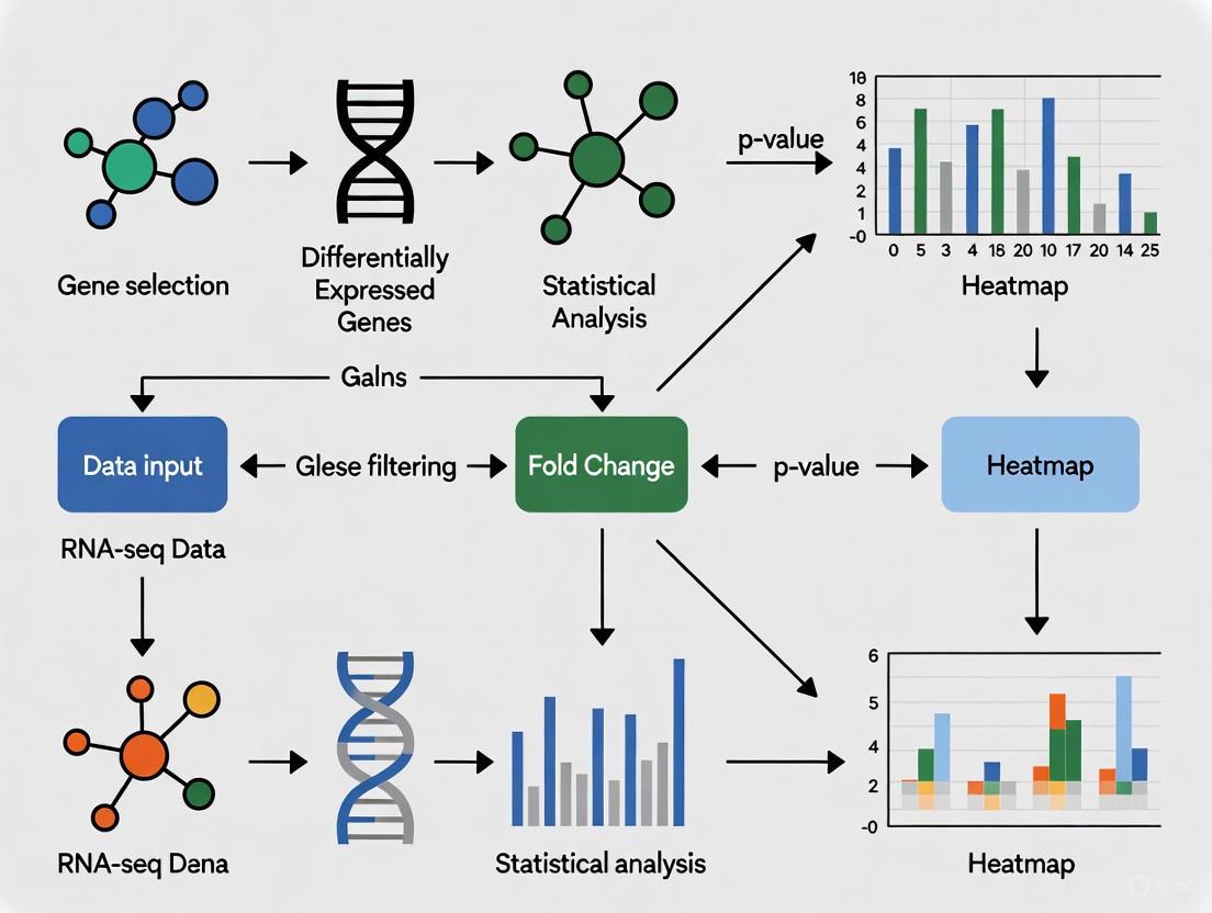
Visualization and Workflow Diagrams
Differential Expression Heatmap Workflow
Diagram 1: Differential expression heatmap workflow from raw data to biological interpretation.
Gene Selection Decision Framework
Diagram 2: Gene selection strategy decision framework based on analysis goals.
Research Reagent Solutions
Table 3: Essential Reagents and Computational Tools for Differential Expression Heatmap Analysis
| Category | Item | Specification/Function | Application Notes |
|---|---|---|---|
| RNA-seq Platforms | Illumina Sequencing | High-throughput mRNA sequencing | Generate raw read data; polyA-selection for eukaryotic mRNA [9] |
| Spatial Transcriptomics | Nanostring GeoMx DSP | Spatial profiling of RNA in tissue sections | Combine with DgeaHeatmap for spatial gene expression analysis [3] |
| rRNA Depletion Kits | NEBNext rRNA Depletion Kit | Remove ribosomal RNA | Essential for prokaryotic samples or host-pathogen studies [9] |
| Targeted Enrichment | Custom Capture Panels | Hybridization-based transcript enrichment | Critical for low-abundance organisms in multi-species studies [9] |
| Differential Expression Tools | DESeq2 R Package | Negative binomial models for DE analysis | Recommended for RNA-seq count data [1] [4] [2] |
| Differential Expression Tools | limma R Package | Linear models for microarray/RNA-seq | Suitable for microarray data and RNA-seq (with voom) [4] |
| Visualization Packages | DgeaHeatmap R Package | Specialized heatmap generation | Optimized for Nanostring GeoMx data [3] |
| Web-Based Tools | GEO2R | Online differential expression analysis | Access through NCBI GEO; uses DESeq2 for RNA-seq [4] |
| Web-Based Tools | GENAVi | Shiny app for normalization and DE analysis | User-friendly interface; multiple normalization methods [10] |
Differential expression heatmaps serve as powerful tools for transforming complex transcriptomic data into biologically interpretable visual patterns. The critical step of gene selection—whether based on statistical significance, variability, or functional relevance—directly determines the analytical insights that can be derived from these visualizations. By following the detailed protocols outlined in this document, researchers can systematically progress from raw data to meaningful biological interpretations, avoiding common pitfalls in visualization and analysis. The integration of established statistical methods with appropriate visualization techniques ensures that differential expression heatmaps reveal genuine biological patterns rather than technical artifacts, ultimately supporting robust conclusions in transcriptomics research and drug development.
In differential gene expression research, the heatmap serves as a critical visual tool for analyzing complex transcriptomic data. It transforms a numerical matrix of gene expression values into a color-shaded matrix display, allowing researchers to quickly identify patterns of up-regulation and down-regulation across experimental conditions [11]. The core components—color scale, dendrograms, and clusters—work in concert to reveal the underlying biological narrative. When properly configured, these elements can identify novel cell sub-populations, elucidate differentiation pathways, and pinpoint potential marker genes, thereby forming an indispensable part of the modern genomic scientist's toolkit [5].
The Color Scale: A Visual Legend for Gene Expression
Function and Implementation
The color scale translates continuous gene expression values (e.g., log-fold changes) or normalized counts into a spectrum of colors, creating an intuitive visual representation of the data. This translation allows for the immediate identification of genes with high (often upregulated) and low (often downregulated) expression levels across different samples or conditions [11].
The selection of an appropriate color scale is paramount. A typical and effective scheme uses a divergent color palette, where one color (e.g., red) represents high expression values, another color (e.g., blue) represents low expression values, and a neutral color (e.g., white or black) represents median or baseline expression [5] [12]. This approach helps in quickly distinguishing genes that are over-expressed or under-expressed in specific sample groups.
Table 1: Common Color Schemes for Differential Expression Heatmaps
| Color Scheme | Best Use Case | Data Representation | Example |
|---|---|---|---|
| Sequential (Single-Hue) | Representing expression levels or magnitude (e.g., from low to high). | Intensity increases from light to dark shades of one color. | d3.interpolateBuGn [13] |
| Divergent (Dual-Hue) | Highlighting deviation from a median or zero point (e.g., log-fold change). | Two distinct hues represent positive and negative deviations from a neutral center. | Red (High) -- White (Mid) -- Blue (Low) [12] |
| Spectral (Multi-Hue) | Displaying a wide range of values or categories. | Uses multiple colors from the visual spectrum. | d3.schemeRdYlBu [12] |
Technical Protocol: Creating a Robust Color Scale
Procedure:
- Data Normalization: Normalize the expression matrix (e.g., Z-score normalization per row/gene) to ensure colors represent relative expression across samples.
- Define the Scale Domain: Calculate the minimum and maximum values in the normalized dataset. For log-fold change data, center the domain around zero.
- Select a Color Palette: Choose a perceptually uniform and colorblind-friendly palette. Tools like
d3-scale-chromaticprovide predefined, robust schemes [12] [13]. - Create the Scale Function: Use a function like
d3.scaleSequential()ord3.scaleDiverging()to map the numerical domain to the color range. - Include a Legend: Always render a legend showing the color gradient and its corresponding numerical values to enable accurate interpretation [13].
Figure 1: Workflow for creating and applying a color scale to a gene expression matrix.
Dendrograms: Revealing the Hierarchical Structure
Function and Interpretation
A dendrogram, or tree diagram, is the visual output of a hierarchical clustering algorithm. It reveals the relatedness of rows (genes) and/or columns (samples) in the dataset [11]. In differential expression analysis, dendrograms are crucial for identifying sample subgroups with similar expression profiles and genes that exhibit co-expression patterns, potentially indicating co-regulation or shared functional pathways.
The length of the branches in a dendrogram represents the distance or dissimilarity between clusters. Shorter branches indicate that two clusters (of samples or genes) are more similar to each other, while longer branches indicate greater dissimilarity [11]. The structure helps in objectively determining the natural groupings within the data, which is foundational for identifying distinct cell types, disease subtypes, or functional gene modules.
Technical Protocol: Constructing Dendrograms
Procedure:
- Calculate Distance Matrix: For both rows (genes) and columns (samples), compute a pairwise distance matrix. Common distance metrics include:
- Euclidean: Straight-line distance between points.
- Manhattan: Sum of absolute differences.
- Correlation: 1 - Pearson correlation coefficient between profiles.
- Perform Hierarchical Clustering: Apply a clustering algorithm to the distance matrix. Key choices for the linkage function (which defines how the distance between clusters is calculated) are:
- Complete Linkage: Distance between clusters is the max distance between any two points in the different clusters. Tends to create compact clusters.
- Average Linkage: Distance is the average distance between all pairs of points in the two clusters. A balanced approach.
- Ward's Method: Minimizes the variance within clusters. Often produces very evenly sized clusters.
- Visualize the Dendrogram: The resulting hierarchical tree structure is drawn alongside the heatmap, typically above the columns and/or to the left of the rows.
Table 2: Common Hierarchical Clustering Linkage Methods
| Linkage Method | Description | Impact on Cluster Shape | Use Case in Genomics |
|---|---|---|---|
| Complete | Uses the maximum distance between objects in two clusters. | Tends to find compact, spherical clusters. | Identifying very distinct sample groups or gene sets. |
| Average | Uses the average distance between all pairs of objects in two clusters. | A compromise method; finds clusters of various shapes. | General-purpose clustering for samples and genes. |
| Ward's | Minimizes the total within-cluster variance. | Tends to find clusters of relatively equal size and shape. | Clustering when expecting similarly sized groups (e.g., cell types). |
Figure 2: The procedural workflow for generating a dendrogram from an expression matrix.
Clusters: Defining Biological Groups and Patterns
Function and Biological Significance
Clusters are the final output of the cluster analysis process, representing groups of objects (genes or samples) that are more similar to each other than to objects in other groups [14]. In the context of a gene expression heatmap, the combination of dendrograms and color scaling reveals these clusters as contiguous blocks of color.
The biological significance is profound:
- Sample Clusters (Column Clusters): Often represent distinct biological states, such as different cell types (e.g., monocyte, dendritic cell progenitors, pre-dendritic cells) [5], disease subtypes, or responses to treatment.
- Gene Clusters (Row Clusters): Represent sets of co-expressed genes. These genes frequently participate in common biological pathways or are regulated by the same transcriptional mechanisms, providing direct candidates for further functional validation [5] [11]. For instance, a cluster of genes showing high expression in one sample group may serve as a marker gene set for that specific cell population or condition.
Technical Protocol: Extracting and Interpreting Clusters
Procedure:
- Cut the Dendrogram: The hierarchical tree from clustering is "cut" at a specific height to define discrete clusters. The choice of where to cut determines the number and granularity of the clusters. This can be informed by:
- Biological Knowledge: Cutting to obtain a known number of cell types.
- Statistical Heuristics: Using methods like the "elbow method" on the within-cluster sum of squares.
- Dynamic Tree Cutting: Algorithms that allow for flexible cluster shapes and sizes.
- Validate Clusters: Assess the stability and quality of the clusters. Techniques include:
- Silhouette Analysis: Measures how similar an object is to its own cluster compared to other clusters.
- Functional Enrichment Analysis: Use tools like DAVID or Enrichr to test if the genes in a cluster are significantly enriched for specific Gene Ontology (GO) terms or KEGG pathways. This is a critical step for biological interpretation [5].
- Profile and Annotate: Characterize each cluster by its average expression profile and identify potential key driver genes (e.g., transcription factors) or marker genes within the cluster.
Figure 3: The process of defining and biologically interpreting clusters from a dendrogram.
The Scientist's Toolkit: Essential Research Reagents and Materials
Table 3: Key Research Reagent Solutions for Differential Expression Heatmap Analysis
| Item / Reagent | Function / Application |
|---|---|
| Single-Cell RNA-Seq Kit (e.g., 10x Genomics) | Generation of the primary gene expression matrix from complex tissues by measuring transcriptomes in individual cells [5]. |
Clustering Algorithm Software (e.g., hclust in R, scRDEN) |
Performs the hierarchical clustering of genes and samples to identify patterns and groups within the expression data [14] [5]. |
Color Palette Library (e.g., d3-scale-chromatic, viridis) |
Provides perceptually uniform and accessible color schemes for accurately encoding expression values in the heatmap [12] [13]. |
| Functional Enrichment Tool (e.g., DAVID, Enrichr) | Statistically tests clusters of genes for over-representation of biological pathways, providing functional interpretation [5]. |
Visualization Library (e.g., ggplot2, ComplexHeatmap, D3.js) |
Creates the final, publication-quality heatmap visualization, integrating the color scale, dendrograms, and cluster annotations [15] [13]. |
Differential gene expression analysis is a cornerstone of modern molecular biology, enabling researchers to decipher the functional changes underlying biological processes. The selection of genes for a heatmap is a critical step that directly determines the clarity and impact of the research findings. This protocol provides a structured framework for defining analytical goals and selecting appropriate gene subsets for differential expression heatmaps based on three common research objectives: biomarker discovery, treatment effect demonstration, and novel biological insight generation. By aligning gene selection criteria with specific research questions, investigators can enhance the biological relevance and interpretability of their transcriptional data visualizations. The following sections outline definitive experimental strategies, data processing protocols, and visualization standards to ensure rigorous and reproducible heatmap design.
Application Notes & Experimental Protocols
Goal 1: Finding Reproducible Biomarkers
Experimental Protocol for Biomarker Discovery
Dataset Collection & Pre-processing: Collect multiple independent datasets from public repositories (e.g., GEO, ArrayExpress) or generate new datasets with consistent experimental conditions. For the pre-processing of microarray data, perform robust multi-array average (RMA) normalization and log2 transformation to minimize technical variability [16]. For RNA-seq data, implement count normalization using methods such as the "median of ratios" to account for differences in sequencing depth and RNA composition [17].
Differential Expression Analysis: Conduct meta-analysis across all datasets to identify consistently dysregulated genes. Apply cross-validation techniques (e.g., leave-one-out cross-validation) to assess the stability of identified gene signatures and minimize overfitting [16]. For single-cell RNA-seq data, perform pseudobulk analysis by aggregating counts per individual and per cell type before differential testing to account for within-individual correlations [18].
Biomarker Validation: Validate candidate biomarkers using orthogonal methods such as quantitative real-time PCR (qPCR). Use the 2−ΔΔCt method to calculate relative fold changes in gene expression, with GAPDH or ACTB typically serving as reference genes [16]. Establish significance thresholds (e.g., p-value < 0.05 and fold change > 2) for declaring biomarker candidacy.
Table 1: Exemplar Biomarker Genes from Hypertension Research
| Gene Symbol | Protein Name | Expression Direction | Reported Fold Change | Biological Function |
|---|---|---|---|---|
| ADM | Adrenomedullin | Upregulated | >2.0 | Vasodilation, cardiovascular homeostasis |
| EDN1 | Endothelin-1 | Upregulated | >2.0 | Vasoconstriction, vascular smooth muscle cell proliferation |
| ANGPTL4 | Angiopoietin-related protein 4 | Upregulated | >2.0 | Lipid metabolism, angiogenesis |
| CEBPD | CCAAT/enhancer-binding protein delta | Downregulated | Variable | Transcription factor, inflammatory response |
Goal 2: Showing Treatment Effects
Experimental Protocol for Treatment Effect Analysis
Experimental Design: Implement a controlled intervention study with appropriate sample sizes calculated for sufficient statistical power. Include randomized treatment and control groups, preferably with replicate measurements (recommended n ≥ 3 biological replicates per group) to account for biological variability.
Quality Control & Normalization: Perform rigorous quality control on raw expression data. For RNA-seq data, utilize visualization tools such as parallel coordinate plots or scatterplot matrices from the R package
bigPintto identify potential normalization issues, batch effects, or outlier samples that could confound treatment effect interpretations [19] [20].Focused Gene Selection: Prioritize genes from pathways known to be mechanistically related to the treatment. For example, when studying antihypertensive compounds, focus on genes within the renin-angiotensin-aldosterone system (RAAS) pathway such as ACE, AGT, and AGTR1 [16]. This targeted approach increases the signal-to-noise ratio for detecting bona fide treatment effects.
Statistical Analysis & Interpretation: Apply appropriate statistical models (e.g., negative binomial models for RNA-seq count data) to identify genes with significant expression changes between treatment and control groups. Adjust for multiple testing using false discovery rate (FDR) control methods (e.g., Benjamini-Hochberg procedure). Report both statistical significance (adjusted p-value) and biological magnitude (fold change).
Goal 3: Unveiling New Biology
Experimental Protocol for Novel Biological Insight
Unbiased Clustering & Subpopulation Identification: Process single-cell RNA-seq data using pipelines such as DIscBIO, which integrates clustering algorithms (k-means or model-based clustering) to identify novel cellular subpopulations without pre-existing markers [17]. Determine the optimal number of clusters (k) by identifying the minimal cluster number at the saturation level of the gap statistics [17].
Differential Expression & Functional Enrichment: Perform differential expression analysis between newly identified clusters to find marker genes. Subsequently, conduct gene enrichment analysis using tools like EnrichR to infer biological knowledge by comparing the gene set to annotated gene sets from over 160 libraries [17].
Network Analysis & Visualization: Construct protein-protein interaction networks using resources such as STRING to identify hub genes and functional modules within the differentially expressed gene set [17]. Visualize results using dimensionality reduction techniques (t-SNE, UMAP) to reveal underlying biological structures.
Validation Through Meta-Analysis: Apply non-parametric meta-analysis methods such as SumRank across multiple independent datasets to prioritize genes exhibiting reproducible differential expression patterns, thereby distinguishing robust biological signals from study-specific noise [18].
Table 2: Analytical Approaches for Different Research Goals
| Research Goal | Primary Gene Selection Strategy | Optimal Analysis Method | Key Validation Approach |
|---|---|---|---|
| Biomarker Discovery | Cross-study reproducible DEGs | Meta-analysis of multiple datasets | Orthogonal validation (qPCR) & cross-validation |
| Treatment Effects | Known pathway-focused genes | Controlled intervention analysis | Statistical testing with FDR correction |
| New Biology | Unbiased clustering-based markers | Single-cell clustering & DEG analysis | Functional enrichment & independent cohort validation |
Visualization Guidelines for Differential Expression Heatmaps
Color Scale Selection
Sequential vs. Diverging Scales: Use sequential color scales (e.g., ColorBrewer Blues or Viridis) when representing raw expression values (all non-negative). Use diverging color scales when displaying standardized values (e.g., z-scores) to effectively distinguish between up-regulated and down-regulated genes, with a neutral color representing the baseline or average value [6].
Color-Blind-Friendly Palettes: Implement accessible color combinations such as blue & orange or blue & red to accommodate color vision deficiencies. Avoid problematic combinations including red-green, green-brown, and blue-purple [6].
Avoid Rainbow Scales: Refrain from using "rainbow" color scales as they create misperceptions of data magnitude through non-uniform luminance and artificially abrupt transitions between hues [6].
Interactive Visualization Implementation
Utilize specialized R packages such as Rvisdiff to create interactive heatmaps that enable exploratory data analysis. These tools allow researchers to connect differential expression results with source expression data, facilitating the identification of patterns and potential artifacts through features like zooming, hovering, and dynamic linking between visualizations [21].
The Scientist's Toolkit: Research Reagent Solutions
Table 3: Essential Reagents and Computational Tools for Differential Expression Analysis
| Reagent/Tool | Function/Application | Example/Source |
|---|---|---|
| Affymetrix Microarrays | Genome-wide expression profiling using cDNA datasets for biomarker discovery | Human Genome U133 Plus 2.0 Array [16] |
| ERCC Spike-In Controls | External RNA controls for accounting for cell-to-cell technical variation in scRNA-seq | Thermo Fisher Scientific ERCC RNA Spike-In Mix [17] |
| DESeq2 | Differential expression analysis of RNA-seq count data using negative binomial distribution | Bioconductor Package [18] [21] |
| DIscBIO | Integrated pipeline for single-cell RNA-seq analysis including clustering and biomarker discovery | R Package on CRAN [17] |
| bigPint | Interactive visualization of differential expression results with quality control plots | R Package on GitHub [19] [20] |
| Rvisdiff | Interactive visualization and exploration of differential expression results | Bioconductor Package [21] |
| STRING Database | Online resource for protein-protein interaction network analysis | string-db.org [17] |
| EnrichR | Gene set enrichment analysis against annotated libraries from over 160 sources | Ma'ayan Lab [17] |
In differential expression (DE) analysis, the heatmap serves as a fundamental tool for visualizing complex gene expression patterns across multiple samples. However, the biological validity and visual clarity of a heatmap are entirely dependent on the initial step of gene selection. Choosing genes based on arbitrary statistical thresholds or convenience often leads to uninterpretable or, worse, biologically misleading conclusions. This article details a rigorous, hypothesis-driven framework for selecting genes for DE heatmaps, ensuring that the resulting visualizations accurately reflect the underlying biology and provide genuine insight for research and drug development.
Core Principles of Gene Selection
The process of gene selection bridges raw statistical output from DE analysis and a meaningful biological story. The following principles are critical for making informed choices.
Defining the Selection Objective
Before selecting any genes, explicitly define the goal of the heatmap. Common objectives include:
- Cell Type or Cluster Annotation: Identifying a minimal set of genes that robustly define and distinguish biological cell types present in the data [22].
- Pathway or Process Visualization: Selecting genes that belong to a specific biological pathway (e.g., glycolysis, apoptosis) or have a known functional relationship to interrogate their coordinated response.
- Phenotype Association: Highlighting genes that are associated with a specific phenotype, such as treatment response, disease severity, or survival.
A clearly defined objective dictates the subsequent selection strategy, preventing a "garbage-in, garbage-out" scenario.
Moving Beyond Arbitrary Thresholding
Traditional gene selection often involves applying universal thresholds for significance (e.g., adjusted p-value < 0.05) and effect size (e.g., absolute log2Fold Change > 1). While useful for initial filtering, this approach has significant limitations:
- Bias Toward Highly Variable Genes: It tends to favor genes with inherently high expression variance, potentially overlooking constrained genes where even small changes are biologically critical [23].
- Ignoring Biological Context: A uniform fold-change threshold may be too stringent for key regulatory genes and too lenient for noisy, highly expressed genes.
Advanced recalibration methods, such as weighting a gene's observed fold change against its natural dosage variation in the human population, can help prioritize functionally relevant genes over merely variable ones [23].
Gene Selection Methodologies and Protocols
This section provides actionable protocols for the primary gene selection strategies.
Protocol 1: Selection for Cell Type or Cluster Annotation
This protocol is designed to identify a concise marker gene set that defines the cellular identities within a dataset, suitable for annotation and validation.
Experimental Workflow: Cell Type Marker Selection
1. Differential Expression Testing:
- Method: Apply a statistical test comparing each cluster to all other clusters (one-vs-rest). Benchmarking studies indicate that the Wilcoxon rank-sum test and Student's t-test are highly effective for this task [22].
- Tools: Execute using standard frameworks like Seurat or Scanpy.
2. Statistical Filtering:
- Apply an adjusted p-value threshold (e.g., Benjamini-Hochberg < 0.05) to account for multiple testing.
- Implement a minimum log2 fold-change filter (e.g., |log2FC| > 0.5) to focus on genes with meaningful effect sizes.
3. Gene Ranking and Selection:
- Rank genes within each cluster based on a combination of statistical significance (p-value) and effect size (log2FC).
- Select the top N genes (typically 5-20) per cluster. The exact number depends on the complexity of the dataset and the need for a minimal yet definitive gene set.
4. Specificity Evaluation (Optional but Recommended):
- Calculate metrics like the area under the ROC curve (AUC) to quantify how well each gene distinguishes the target cluster from all others.
- Tools like
Cepocan identify genes that are consistently expressed in a specific cell type [22].
Protocol 2: Hypothesis-Driven Selection for Functional Analysis
This protocol is used when investigating a predefined biological question, such as the behavior of a specific pathway.
1. Define the Biological Hypothesis:
- Formulate a clear question (e.g., "How is the TGF-beta signaling pathway altered in treated versus control samples?").
2. Gene Set Compilation:
- Source: Obtain relevant gene lists from curated databases such as MSigDB, KEGG, or Reactome.
- Custom Lists: Use genes identified from prior experiments or literature reviews.
3. Filter and Prioritize:
- Intersect the predefined gene list with the results of the DE analysis.
- Filter for genes that show statistically significant changes under the experimental conditions.
- Prioritize genes based on the magnitude of change and their known central role in the pathway.
Protocol 3: Machine-Learning Assisted Selection
For discovery-based research, machine learning (ML) can help identify minimal gene sets with high predictive power for a condition of interest.
1. Feature Selection:
- Tool: Utilize a library like
gSELECT, which is designed for evaluating the classification performance of gene sets [24]. - Input: Provide the expression matrix and corresponding group labels (e.g., disease vs. healthy).
2. Model Training and Evaluation:
gSELECTcan use mutual information ranking, random sampling, or custom gene lists as a starting point.- It employs multilayer perceptrons with cross-validation to assess how well a gene set separates the conditions [24].
3. Identify Minimal Gene Combinations:
- Use the tool's "greedy" or "exhaustive" strategies to find the smallest number of genes that yield high predictive accuracy, providing a powerful, compact set for visualization [24].
Quantitative Benchmarking of Selection Methods
The choice of statistical method for marker gene selection significantly impacts the quality of the resulting gene list. The table below summarizes the performance of commonly used methods based on a comprehensive benchmark of 59 methods across 14 real and 170 simulated scRNA-seq datasets [22].
Table 1: Benchmarking of Common Marker Gene Selection Methods
| Method | Overall Efficacy | Key Characteristics | Best Use-Case |
|---|---|---|---|
| Wilcoxon Rank-Sum Test | High | Robust to outliers, effective for one-vs-rest comparisons. | General-purpose cluster annotation. |
| Student's t-test | High | Powerful for normally distributed data. | Cell type annotation with large, well-separated clusters. |
| Logistic Regression | High | Models log-odds of cluster membership, can adjust for covariates. | When technical confounders (e.g., batch) are a concern. |
| Cepo | High | Identifies consistent marker genes for cell type identity. | Defining stable cell type signatures. |
| NSForest | Medium | Uses random forest to identify minimal marker sets. | Selecting a minimal gene panel for experimental validation. |
Visualization and Interpretation Guidelines
A poorly constructed heatmap can obscure the patterns that careful gene selection sought to reveal. Adhere to the following best practices for visualization.
Color Palette Selection for Accessibility
Color is the primary channel for encoding expression data in a heatmap. Its misuse is a major source of interpretability failure.
- Avoid Non-Accessible Palettes: The common red-green colormap is indistinguishable for individuals with red-green color vision deficiency (CVD), which affects up to 8% of men [25] [26].
- Adopt Accessible Schemes: Use a blue-white-red diverging palette. For individuals with CVD, blue and red remain distinguishable [27]. Alternatively, a single-hue sequential palette (e.g., light to dark blue) is universally safe [26].
- Leverage Light vs. Dark: If using red and green is mandatory, ensure significant contrast in lightness (value) between them—for example, a dark red and a light green [25].
Table 2: Colorblind-Friendly Heatmap Color Palettes
| Palette Type | Example Colors (Low-Mid-High) | CVD-Friendly? | Use Case |
|---|---|---|---|
| Diverging | #2166AC #F7F7F7 #B2182B |
Yes (Blue/Red) | Showing up/down-regulation from a central point. |
| Sequential | #F1F3F4 #FBBC05 #EA4335 |
Yes (Light to Dark) | Displaying expression levels from low to high. |
| Sequential (Single Hue) | #DEEBFF #4292F4 #08306B |
Yes | Emphasizing a magnitude of change. |
Data Scaling and Clustering
- Row Scaling (Z-score): Normalize gene expression (rows) to a Z-score (mean=0, standard deviation=1). This ensures the color scale represents relative up- or down-regulation of each gene, making patterns across different expression levels comparable.
- Clustering: Apply hierarchical clustering to both rows (genes) and columns (samples) to group entities with similar expression profiles. This reveals co-expressed gene modules and sample subtypes that might otherwise be hidden [28]. Always check that the resulting dendrograms biologically make sense.
The Scientist's Toolkit: Research Reagent Solutions
Table 3: Essential Computational Tools for Gene Selection and Heatmap Generation
| Tool / Resource | Function | Application Context |
|---|---|---|
| Seurat / Scanpy | Comprehensive scRNA-seq analysis frameworks. | Performing initial DE testing (Wilcoxon test) and basic marker gene selection [22]. |
| gSELECT | Machine-learning based gene set evaluation. | Identifying minimal, high-performance gene combinations for classification [24]. |
| ColorBrewer / Paul Tol's Schemes | Curated colorblind-friendly palettes. | Selecting accessible color schemes for heatmaps and all data visualizations [26]. |
| DESeq2 / edgeR | DGE analysis tools for bulk RNA-seq. | Performing rigorous DE analysis on bulk RNA-seq data to generate input gene lists [29]. |
| FeatureCounts / HTSeq | Read quantification. | Generating the raw count matrices that are the input for DE analysis [29]. |
A Practical Pipeline: From DGE Analysis to Heatmap Visualization
Selecting genes for a differential expression heatmap is a foundational step in transcriptomic research, with implications for understanding disease mechanisms and identifying therapeutic targets. The choice of differential gene expression (DGE) tool directly influences which genes are selected as significant, thereby shaping subsequent biological interpretations. While DESeq2 and edgeR have long been the established methods for bulk RNA-seq analysis, recent evidence suggests these tools may produce exaggerated false positives in large-sample studies, raising concerns about their reliability for population-level datasets [30]. Meanwhile, non-parametric methods like the Wilcoxon rank-sum test are gaining attention for their robust false discovery rate (FDR) control in these same scenarios [30].
This Application Note examines the performance characteristics of DESeq2, edgeR, and the Wilcoxon test within the context of heatmap research, providing structured comparisons and detailed protocols to guide researchers toward robust, interpretable results. We frame this discussion within a broader thesis on gene selection, emphasizing methodological choices that ensure biological signatures visualized in heatmaps reflect true signals rather than statistical artifacts.
Performance Comparison and Key Considerations
Table 1: Comparative Performance of DGE Tools on Large Population RNA-seq Datasets
| Method | Typical FDR Control (5% Target) | Power | Robustness to Outliers | Key Assumptions |
|---|---|---|---|---|
| DESeq2 | Often exceeded (actual FDR sometimes >20%) [30] | High but potentially artificial due to FDR inflation | Low; severely affected by outliers violating negative binomial model [30] [31] | Negative binomial distribution |
| edgeR | Often exceeded (actual FDR sometimes >20%) [30] | High but potentially artificial due to FDR inflation | Low; severely affected by outliers violating negative binomial model [30] [31] | Negative binomial distribution |
| Wilcoxon Rank-Sum Test | Consistently maintained across sample sizes [30] | Comparable or better when actual FDRs are equal [30] | High; uses rank-based approach less sensitive to extreme values [30] | None; non-parametric |
Critical Findings from Recent Studies
Recent benchmarking on population-level RNA-seq datasets (n=100-1376) revealed that DESeq2 and edgeR can exhibit severely inflated false discovery rates. In one analysis of an immunotherapy dataset (51 pre-nivolumab vs. 58 on-nivolumab patients), these methods demonstrated surprisingly low overlap, with only 8% concordance in identified differentially expressed genes [30]. Permutation analysis confirmed concerning false positive rates, with DESeq2 and edgeR mistakenly identifying 30 and 233 genes respectively from 50% of permuted datasets where no true differences existed [30].
The Wilcoxon rank-sum test consistently controlled FDR at target levels across sample sizes in the same evaluations [30]. While it requires larger sample sizes (n>8 per condition) to achieve sufficient power—an expected limitation for non-parametric methods—it outperformed parametric methods when sample sizes exceeded this threshold [30].
A key reason for DESeq2 and edgeR's performance issues in large datasets appears to be violation of the negative binomial model assumption, particularly due to outliers [30] [31]. As sample sizes increase, so does the probability of encountering outlier values that violate distributional assumptions, leading to spurious significance calls.
Impact on Heatmap Interpretation and Gene Selection
When selecting genes for differential expression heatmaps, improper FDR control directly impacts biological interpretation. Researchers investigating immune response differences in the immunotherapy dataset found that spurious DEGs identified by DESeq2 and edgeR in permuted data showed enrichment in immune-related GO terms [30]. This demonstrates how methodological artifacts can masquerade as biologically plausible findings, potentially misdirecting research efforts and experimental validation.
Heatmaps visualize patterns across selected genes and samples, with clustering grouping genes with similar expression profiles and samples with similar expression patterns [28] [32]. When a method with poor FDR control selects genes for heatmap inclusion, the resulting visualization may highlight technical artifacts rather than biological truth, compromising downstream analyses.
Figure 1: Decision workflow for selecting a DGE tool for heatmap research
Experimental Protocols
Protocol 1: Wilcoxon Rank-Sum Test for Large-Sample Studies
Purpose: To identify differentially expressed genes while maintaining robust FDR control in studies with large sample sizes (n>50 per group).
Materials:
- RNA-seq count data: Raw read counts for genes across all samples
- Sample metadata: Condition labels for each sample
- R statistical environment (v4.0 or higher)
- R packages: stat (for Wilcoxon test), qvalue (for FDR correction)
Procedure:
- Data Preprocessing:
- Filter out lowly expressed genes using
filterByExprfrom edgeR or similar approach - No normalization is applied to the counts before running the Wilcoxon test [30]
- Filter out lowly expressed genes using
Differential Expression Testing:
- For each gene, perform Wilcoxon rank-sum test comparing expression values between conditions
- Extract p-values for all tested genes
- Apply Benjamini-Hochberg procedure to control false discovery rate
Gene Selection for Heatmap:
- Select genes with FDR < 0.05 (or appropriate threshold for your study)
- Consider incorporating fold-change thresholds if biological relevance requires
Validation (Recommended):
- Compare results with alternative methods
- Perform permutation testing to verify FDR control in your specific dataset
Technical Notes: The Wilcoxon test's non-parametric nature makes it robust to outliers and distributional assumptions but requires adequate sample size (n>8 per condition) for sufficient power [30].
Protocol 2: Winsorization-Enhanced DESeq2/edgeR Analysis
Purpose: To utilize DESeq2 or edgeR while mitigating false positives through outlier handling.
Materials:
- RNA-seq count data: Raw read counts for genes across all samples
- Sample metadata: Condition labels for each sample
- R statistical environment (v4.0 or higher)
- R packages: DESeq2 or edgeR, dplyr
Procedure:
- Winsorization Preprocessing:
- Calculate size factors using
estimateSizeFactors(DESeq2) orcalcNormFactors(edgeR) - Divide raw counts by size factors to obtain normalized counts
- For each gene, identify values exceeding the 93rd-95th percentile
- Replace extreme values with the chosen percentile value (93rd recommended for edgeR, 95th for DESeq2) [31]
- Multiply winsorized normalized counts by size factors and round to nearest whole numbers
- Calculate size factors using
Differential Expression Analysis:
- Input winsorized counts to DESeq2 or edgeR using standard pipelines
- Follow established workflows for model fitting and hypothesis testing
FDR Validation:
- Apply permutation testing by randomly shuffling condition labels
- Confirm that the number of significant findings in permuted data approximates expected FDR
Gene Selection for Heatmap:
- Apply standard significance thresholds (FDR < 0.05)
- Include winsorization parameters in method documentation
Technical Notes: Winsorization substantially reduces false positives for DESeq2 and edgeR, with edgeR demonstrating better FDR control post-winsorization [31]. The optimal percentile may vary by dataset and can be tuned using permutation studies.
Protocol 3: Permutation Testing for FDR Validation
Purpose: To empirically validate false discovery rate control for any DGE method.
Materials:
- Processed RNA-seq data (normalized or raw counts depending on method)
- Condition labels
- Computing resources capable of handling multiple iterations
Procedure:
- Data Preparation:
- Prepare dataset exactly as intended for primary analysis
- Preserve all normalization and filtering steps
Label Permutation:
- Randomly shuffle condition labels among samples
- Maintain original sample sizes for each condition
- Repeat 100-1000 times to generate permuted datasets
Analysis of Permuted Data:
- Apply your DGE method to each permuted dataset
- Record the number of significant genes identified for each permutation
FDR Estimation:
- Calculate the average number of significant genes found in permuted datasets
- Divide this by the number of significant genes in the original analysis
- This ratio provides an empirical estimate of the FDR
Technical Notes: For methods incorporating normalization, ensure permutation occurs after normalization or normalize after permutation to avoid creating artificial differences [33]. This protocol is particularly valuable when applying methods to new data types or when extending established methods to larger sample sizes.
Research Reagent Solutions
Table 2: Essential Tools for Differential Expression Analysis
| Tool/Resource | Function | Application Notes |
|---|---|---|
| DESeq2 | Parametric DGE analysis based on negative binomial distribution | Use with winsorization pre-processing for large samples; provides interpretable log2 fold changes [31] |
| edgeR | Parametric DGE analysis using negative binomial models | Shows better FDR control than DESeq2 after winsorization; 93rd percentile recommended [31] |
| Wilcoxon Rank-Sum Test | Non-parametric DGE analysis | Preferred for large-sample studies (>50 per group); robust to outliers and distribution violations [30] |
| dearseq | Non-parametric DGE analysis using variance component score test | Handles complex designs; competitive performance for large human population samples [33] |
| DElite | Integrated framework combining multiple DGE tools | Provides unified output from DESeq2, edgeR, limma, dearseq, and Wilcoxon; enables method comparison [34] |
| Winsorization | Outlier replacement technique | Critical pre-processing step for parametric methods; replaces extreme values with percentile cutoffs [31] |
| TMM Normalization | Between-sample normalization method | Accounts for composition biases; used by edgeR, limma, and dearseq [35] [34] |
| Median of Ratios | Between-sample normalization method | Default in DESeq2; based on geometric means [34] |
Integrating DGE Results with Heatmap Visualization
From Gene Selection to Heatmap Creation
The genes selected through differential expression analysis become the input for heatmap visualization, which displays expression patterns across samples and conditions [28] [32]. In a standard differential expression heatmap, each row represents a gene, each column represents a sample, and color intensity represents normalized expression values [28] [32].
Clustered heatmaps group genes with similar expression profiles together, revealing co-regulated genes and biological patterns [28] [32]. This clustering can identify biological signatures associated with particular conditions, making methodological choices in the preceding DGE analysis critical for generating meaningful visualizations.
Methodological Recommendations for Heatmap Research
Figure 2: Complete workflow from raw data to biological interpretation
Based on current evidence, we recommend the following approach for selecting genes for differential expression heatmaps:
For population-level studies with large sample sizes (n>50 per group):
- Use the Wilcoxon rank-sum test as the primary method for its robust FDR control
- Validate findings with winsorization-enhanced edgeR or DESeq2
For studies with moderate sample sizes (n=10-50 per group):
- Apply winsorization-enhanced edgeR (93rd percentile) or DESeq2 (95th percentile)
- Compare results with Wilcoxon test when sample size permits
For all studies:
- Implement permutation testing to empirically verify FDR control
- Document methodological choices transparently
- Consider using integrated frameworks like DElite to compare multiple methods [34]
The selection of DGE methodology fundamentally shapes which biological signals emerge in downstream visualizations and interpretations. By matching methodological choices to study characteristics—particularly sample size and data quality—researchers can ensure that their differential expression heatmaps highlight biologically meaningful patterns rather than statistical artifacts.
The selection of genes for differential expression heatmaps is a critical step that bridges statistical rigor with biological interpretation in transcriptomic research. This protocol details a structured methodology for integrating false discovery rate (FDR), p-values, and log2 fold-change thresholds to identify biologically meaningful genes while controlling for false positives. We provide implementable workflows using established R packages and validation techniques to ensure the selected gene sets robustly represent underlying biological phenomena for visualization and further analysis.
In high-throughput transcriptomic studies, reliably detecting differentially expressed genes (DEGs) requires careful balance between statistical significance and biological relevance [19]. While statistical tests effectively identify genes with non-zero expression changes, they often lack inherent mechanisms to ensure these changes are large enough to be biologically meaningful [36]. This challenge is particularly acute when selecting genes for visualization in heatmaps, where an inappropriate threshold can either obscure true biological signals with excessive noise or exclude potentially important findings.
The disconnect between mathematical and biological concepts of differential expression necessitates formal approaches that incorporate both statistical confidence and magnitude of change [36]. Early microarray studies utilized simple fold-change cutoffs, but these ignored variability and reproducibility concerns. Modern approaches combine statistical tests with fold-change thresholds to identify more biologically relevant gene sets [36]. This protocol synthesizes current best practices for establishing these dual-threshold criteria, with particular emphasis on their application to heatmap visualization for drug development and basic research.
Threshold Selection Strategies
Statistical Significance Foundations
Statistical testing in differential expression analysis typically evaluates whether the true differential expression differs from zero. The most widely adopted approaches include:
- P-values: Measure the probability of observing the data if the null hypothesis (no differential expression) is true
- False Discovery Rate (FDR): Controls the expected proportion of false positives among statistically significant results, with Benjamini-Hochberg being the most common implementation
However, these statistical measures alone permit genes with arbitrarily small fold-changes to be declared statistically significant, potentially identifying mathematically valid but biologically irrelevant changes [36].
Incorporating Magnitude Thresholds
The TREAT (t-tests relative to a threshold) methodology provides a formal statistical framework for testing whether differential expression exceeds a predefined log-fold-change threshold [36]. This approach tests the thresholded null hypothesis H0: |βg| ≤ τ against the alternative H1: |βg| > τ, where τ is a pre-specified threshold for the log-fold-change below which differential expression is not considered biologically meaningful.
Table 1: Common Threshold Combinations for DEG Selection
| Application Context | P-value/FDR Threshold | Log2FC Threshold | Rationale |
|---|---|---|---|
| Exploratory Discovery | FDR < 0.05 | 1.0-1.5 (2-2.8-fold) | Balanced sensitivity for novel findings |
| Targeted Validation | FDR < 0.01 | 1.5-2.0 (2.8-4-fold) | Higher stringency for confirmation |
| Clinical Biomarker Identification | FDR < 0.001 | ≥2.0 (≥4-fold) | Maximum specificity for translational applications |
| Pathway-Focused Analysis | FDR < 0.1 | 0.5-1.0 (1.4-2-fold) | Context-dependent for coordinated small changes |
Practical Implementation Considerations
The biological significance of a given fold-change threshold depends on both the gene and experimental context [36]. However, it is reasonable to assume a minimum fold-change threshold below which differential expression is unlikely to be biologically interesting for any gene. Combination approaches that apply both statistical significance and fold-change cutoffs typically identify more biologically meaningful gene sets than p-values alone [36].
For studies with very small sample sizes (e.g., n=3 per group), statistical power is inherently limited, and non-parametric tests like Mann-Whitney U may be preferable if data are not normally distributed [37].
Experimental Protocol: Integrated DEG Identification
Data Preprocessing and Quality Control
Materials:
- Raw RNA-seq count data or normalized expression data
- Sample metadata with experimental group assignments
- R statistical environment with appropriate packages
Procedure:
- Quality Assessment: Perform standard RNA-seq QC checks including examination of read distributions, outlier detection, and batch effect assessment
- Normalization: Apply appropriate normalization method (e.g., TMM for edgeR, median-of-ratios for DESeq2, or quantile normalization for microarray data)
- Data Filtering: Remove genes with low expression across samples (e.g., genes with counts <10 in >90% of samples)
Differential Expression Analysis
Method 1: Standard DESeq2/edgeR Workflow
- Fit appropriate statistical model accounting for experimental design
- Calculate p-values and FDR-adjusted p-values (Benjamini-Hochberg)
- Apply independent filtering to remove low-count genes
- Extract results including log2 fold-changes and statistical metrics
Method 2: TREAT Implementation
- Specify biologically relevant log-fold-change threshold (τ) based on experimental context
- Perform thresholded hypothesis testing using TREAT methodology [36]
- Obtain p-values specifically testing for differential expression beyond the threshold
Gene Selection for Heatmap Visualization
- Primary Filtering: Apply simultaneous thresholds for statistical significance (FDR < 0.05) and magnitude (|log2FC| > 1)
- Secondary Prioritization: For large gene lists, apply more stringent criteria (e.g., FDR < 0.01 and |log2FC| > 1.5)
- Cluster-Based Selection: When using tools like DgeaHeatmap, select top variable genes within expression clusters [3]
Diagram 1: Gene selection workflow for heatmap visualization
Visualization and Validation Workflow
Heatmap Generation with DgeaHeatmap
The DgeaHeatmap R package provides streamlined functions for creating publication-ready heatmaps from transcriptomic data [3]. Key features include:
- Support for both normalized and raw count data from platforms including Nanostring GeoMx DSP
- Z-score scaling and k-means clustering for pattern identification
- Customizable annotation and server-independent analysis
Implementation Protocol:
- Data Input: Load normalized expression matrix for selected DEGs
- Data Transformation: Apply Z-score scaling across genes or samples as appropriate
- Clustering Determination: Generate elbow plot to determine optimal cluster number (k)
- Heatmap Generation: Create annotated heatmap using
adv_heatmapfunction - Pattern Identification: Identify gene clusters with coherent expression patterns
Visual Validation Techniques
Parallel Coordinate Plots: Visualize expression patterns of selected genes across all samples to verify consistent patterns within experimental groups and identify potential outliers [19].
Scatterplot Matrices: Assess variability between replicates versus treatments to confirm expected data structure where replicate pairs show tighter correlation than treatment pairs [19].
Diagram 2: Multi-perspective visualization validation
The Scientist's Toolkit
Table 2: Essential Research Reagents and Computational Tools
| Item | Function/Application | Implementation Notes |
|---|---|---|
| DgeaHeatmap R Package | Streamlined heatmap generation from transcriptomic data | Supports Z-score scaling, k-means clustering; compatible with Nanostring GeoMx DSP data [3] |
| TREAT Algorithm | Formal testing of differential expression relative to fold-change threshold | Available in limma package; specifies biologically relevant τ threshold [36] |
| bigPint Package | Interactive visualization of RNA-seq data | Identifies normalization issues, DEG designation problems through parallel coordinate plots [19] |
| DESeq2/edgeR | Statistical testing for differential expression | Standard tools for RNA-seq analysis; require raw count data for normalization factors [3] |
| exvar R Package | Integrated gene expression and genetic variation analysis | User-friendly interface with visualization apps; supports multiple species [38] |
Troubleshooting and Optimization
Common Challenges and Solutions
- Too Few Genes Passing Thresholds: Consider relaxing FDR threshold to 0.1 or reducing log2FC requirement; investigate potential normalization issues
- Too Many Genes for Clear Visualization: Apply more stringent thresholds (FDR < 0.01, higher log2FC) or select top variable genes within clusters
- Poor Cluster Separation in Heatmap: Re-evaluate threshold choices; consider whether biological effect sizes warrant current thresholds
- Inconsistent Replicate Patterns: Examine raw data quality and potential confounding factors; use parallel coordinate plots to identify outlier samples [19]
Threshold Optimization Strategy
- Begin with standard thresholds (FDR < 0.05, |log2FC| > 1)
- Assess resulting gene set size and composition
- Adjust thresholds based on biological context and visualization requirements
- Validate selected genes through complementary visualizations (volcano plots, MA plots)
- Document rationale for final threshold selections for reproducibility
Effective gene selection for differential expression heatmaps requires thoughtful integration of statistical rigor and biological relevance. By implementing the dual-threshold approach outlined in this protocol—combining controlled false discovery rates with biologically informed fold-change cutoffs—researchers can generate heatmaps that faithfully represent meaningful patterns in transcriptomic data. The provided workflows, leveraging established tools like DgeaHeatmap and TREAT, offer a reproducible path from raw data to biologically interpretable visualizations suitable for publication and hypothesis generation in drug development and basic research.
In differential gene expression (DGE) analysis, researchers face a critical strategic decision: whether to prioritize genes based solely on statistical significance (the "top DEGs" approach) or to focus on a pre-defined set of biological interest (the "genes of interest" approach). This choice fundamentally influences subsequent analyses, including the creation of differential expression heatmaps for research publication. With growing concerns about the reproducibility of DEGs identified in individual studies, particularly in complex diseases like Alzheimer's and schizophrenia [18], establishing a robust gene shortlisting strategy has never been more important. This protocol provides a structured framework for making this strategic decision and executing the chosen approach effectively.
Core Concepts and Definitions
Differentially Expressed Genes (DEGs) are genes identified through statistical testing as exhibiting significant expression differences between experimental conditions, such as case versus control groups. The "Top DEGs" approach selects genes based on statistical metrics like p-values or false discovery rates (FDR), typically choosing a predetermined number of the most significantly altered genes. In contrast, the "Genes of Interest" approach focuses on a biologically relevant gene set selected prior to analysis based on existing literature, known pathways, or specific hypotheses.
Decision Framework: Choosing Your Shortlisting Strategy
The choice between these approaches depends on multiple factors, including research objectives, data characteristics, and validation resources. The following table outlines key decision criteria:
Table 1: Strategic Decision Framework for Gene Shortlisting Approaches
| Decision Factor | Prioritize Top DEGs | Focus on Genes of Interest |
|---|---|---|
| Primary Research Goal | Discovery-based research; hypothesis generation | Targeted validation; pathway-focused analysis |
| Data Characteristics | Large sample sizes; high statistical power | Smaller datasets; limited statistical power |
| Available Prior Knowledge | Limited field knowledge; exploratory studies | Substantial existing literature; established pathways |
| Downstream Analysis | Unbiased clustering; novel biomarker identification | Directed validation; mechanistic studies |
| Validation Resources | Ample resources for extensive follow-up | Limited resources requiring focused experimentation |
Quantitative Comparison of Method Performance
Recent studies have quantified the performance of different gene prioritization strategies, particularly highlighting the power of integrated approaches:
Table 2: Performance Metrics of Gene Prioritization Methods Across Studies
| Method Category | Representative Methods | Reported Performance | Application Context |
|---|---|---|---|
| Single-omics Analysis | t-test; SAM; CATT [39] | High false-positive rates; limited reproducibility [39] [18] | Initial screening; resource-limited studies |
| Meta-analysis | SumRank [18] | Substantially improved predictive power (AUC: 0.68-0.85) vs. individual studies [18] | Neurodegenerative diseases; COVID-19 studies |
| Multi-omics Integration | Improved TOPSIS; CNN models [39] [40] | Precision: 72.9%; Recall: 73.5%; F1-Measure: 73.4% in swine model [40] | Complex traits; non-model organisms |
| Rank-based Integration | Rank Product [39] | Identifies consistently ranked genes across datasets | Cross-study validation |
Experimental Protocols
Protocol 1: Top DEGs Identification Using RumBall RNA-seq Platform
This protocol enables identification of statistically significant DEGs starting from FASTQ files [41].
Materials and Reagents
- Computational Resources: Computer with at least 8GB RAM and 100GB storage
- Software Dependencies: Docker, RumBall platform, command line interface
- Reference Data: Species-appropriate reference genome and annotation files
Step-by-Step Procedure
- Environment Setup: Install Docker and download the RumBall container image following developer documentation.
- Data Acquisition: Place FASTQ files in designated input directory. Use built-in scripts to obtain external reference datasets and annotations if needed.
- Read Mapping and Quantification: Execute the primary RumBall workflow which internally utilizes established tools for:
- Read alignment to reference genome
- Transcript assembly and quantification
- Generation of count matrices
- Differential Expression Analysis: Run statistical modeling within RumBall to identify DEGs with parameters including:
- Minimum fold-change threshold (typically 1.5-2x)
- FDR cutoff (typically 0.05-0.1)
- Result Interpretation: Generate visualization plots (MA plots, volcano plots) and DEG tables for downstream analysis.
- Functional Enrichment: Perform gene ontology (GO) and pathway enrichment analysis on significant DEGs.
Technical Notes
- The entire process from FASTQ files to DEG identification can be completed in a few steps within the self-contained Docker system [41].
- RumBall internally utilizes popular RNA-seq analysis tools, providing a comprehensive yet accessible analysis pipeline.
Protocol 2: Gene Prioritization Through Multi-omics Integration
This meta-analysis strategy integrates evidence from multiple genomic resources to improve prioritization of biologically relevant DEGs [39].
Materials
- Multi-omics Data: Gene expression profiles, SNP genotype data, eQTL data
- Computational Tools: R or Python environment with statistical packages
- Reference Databases: Pathway databases (KEGG, Reactome), functional annotation resources
Step-by-Step Procedure
Data Collection and Preprocessing:
- Obtain gene expression data (e.g., microarray or RNA-seq)
- Acquire SNP genotype data from GWAS studies
- Gather eQTL data linking genetic variations to expression changes
Individual Resource Scoring:
- For gene expression data: Calculate significance using t-test or SAM
- For SNP data: Apply Cochran-Armitage trend test (CATT)
- For eQTL data: Map SNPs to biologically relevant genes
Score Normalization and Integration:
- Normalize scores from different resources using Euclidean normalization
- Apply improved TOPSIS method to calculate integrated gene scores:
- Construct gene score matrix (genes × resources)
- Identify positive and negative ideal solutions
- Calculate relative distances for each gene
- Alternative integration methods: Rank Product or Fisher's method
Candidate Gene Selection:
- Select top-ranking genes based on integrated scores
- Apply additional filtering based on biological relevance
Technical Notes
- The improved TOPSIS method is particularly effective as it is not affected by missing values in the score matrix [39].
- This approach has demonstrated superior performance in identifying disease-related genes for complex conditions like prostate and lung cancers [39].
Visual Decision Workflow
The following diagram illustrates the strategic decision process for gene shortlisting:
Table 3: Key Research Reagent Solutions for Gene Prioritization Studies
| Resource Category | Specific Examples | Primary Function | Application Context |
|---|---|---|---|
| Analysis Platforms | RumBall [41]; ISwine [40] | Integrated DEG identification and prioritization | RNA-seq analysis; multi-omics integration |
| Statistical Tools | DESeq2; t-test; CATT [39] [18] | Differential expression analysis; statistical testing | Single-omics analysis; GWAS studies |
| Multi-omics Databases | ISwine knowledgebase [40]; GTEx | Housing genomic, transcriptomic, and QTX data | Cross-validation; meta-analysis |
| Integration Algorithms | Improved TOPSIS [39]; SumRank [18] | Combining evidence from multiple resources | Enhanced reproducibility; reduced false positives |
| Visualization Tools | ggplot2; pheatmap; ComplexHeatmap | Generating publication-quality heatmaps | Data interpretation; result communication |
Advanced Integration Strategy Diagram
For studies requiring maximum reproducibility, consider this integrated approach combining both strategies:
Implementation Guidelines
When Reproducibility is Paramount
For studies where reproducibility is a primary concern, particularly in complex neurodegenerative diseases like Alzheimer's and Parkinson's disease, the SumRank meta-analysis method has demonstrated substantial improvements in identifying DEGs with predictive power [18]. This non-parametric approach prioritizes genes showing consistent relative differential expression ranks across multiple datasets rather than relying on significance thresholds from individual studies.
For Non-Model Organisms
In non-model organisms where annotated gene sets may be limited, deep learning approaches integrating multi-omics data have shown promising results. Convolutional neural network models achieving >70% precision and recall in swine demonstrate the potential of these methods despite limited prior biological knowledge [40].
The strategic choice between prioritizing top DEGs versus focusing on genes of interest represents a fundamental decision point in differential expression analysis. For discovery research, the top DEGs approach offers unbiased identification of novel associations, while the genes of interest approach provides biological focus for hypothesis-driven studies. The emerging evidence strongly supports integrated strategies that combine statistical evidence with biological knowledge, particularly through meta-analysis and multi-omics integration, to enhance reproducibility and biological relevance of gene shortlisting for differential expression heatmaps.
In the field of genomic research, heatmaps serve as an indispensable tool for visualizing complex gene expression patterns across multiple samples. The selection of genes for a differential expression heatmap represents a critical step in exploratory data analysis, enabling researchers to identify biologically significant patterns. However, the raw data derived from high-throughput technologies like RNA-Seq presents a substantial visualization challenge: genes naturally exhibit varying baseline expression levels and dynamic ranges. Without proper normalization, the resulting heatmap can be misleading, as high-abundance genes will visually dominate the analysis, potentially obscuring biologically critical but low-fold-change variations in gene expression.
This application note establishes that data scaling is not an optional refinement but a fundamental prerequisite for generating informative and analytically valid heatmaps. We detail the core methodologies, with a specific focus on Z-score normalization, and provide a standardized protocol to ensure that visualized expression differences reflect true biological variation rather than technical or baseline statistical artifacts.
The Critical Role of Data Scaling in Heatmap Visualization
The fundamental challenge in visualizing gene expression data lies in its inherent structure. Individual genes can operate on dramatically different scales; for instance, a "highly expressed" gene might have counts in the tens of thousands, while a key regulatory gene might have counts in the tens. Plotting these raw values directly, as shown in Figure 1, results in a heatmap where color variation is dominated by a few highly expressed genes, making it impossible to discern patterns for the majority of the dataset [42].
Data scaling addresses this by transforming the data for each gene (row-wise) to make expression levels comparable across genes. The primary goal is to enable meaningful visual comparison. A effective normalization method will transform the data so that the color intensity in the heatmap corresponds to whether a gene is expressed above or below its average level across samples, thereby revealing its relative expression pattern [43].
Furthermore, most clustering algorithms used in heatmaps are based on distance measures, such as Euclidean distance. These algorithms are sensitive to the scale of the variables. Without scaling, the distance calculation would be governed by genes with the largest absolute counts, and the clustering structure would be driven by a minor subset of the data. Proper normalization ensures that each gene contributes equally to the clustering analysis, allowing genes with similar expression profiles—regardless of their absolute abundance—to be grouped together [42].
Consequences of Inadequate Scaling
- Masked Biological Signals: Subtle but consistent expression changes in low-abundance genes become invisible.
- Misleading Clustering: The cluster output reflects the scale of the data rather than genuine co-expression patterns.
- Faulty Interpretation: Results are biased towards high-expression genes, potentially leading to incorrect biological conclusions.
The choice of scaling method depends on the data's structure and the biological question. The most common techniques are summarized in Table 1 and described below.
Table 1: Comparison of Primary Data Scaling Methods for Heatmaps
| Method | Formula | Key Characteristic | Best Use Case |
|---|---|---|---|
| Z-Score Standardization | ( Transformed = \frac{Value - Mean}{Standard\ Deviation} ) | Centers data around a mean of 0 and a standard deviation of 1. | General purpose; when data is assumed to be normally distributed; for PCA and clustering. |
| Min-Max Normalization | ( Transformed = \frac{Value - Minimum}{Maximum - Minimum} ) | Scales data to a fixed range, typically [0, 1]. | When the distribution is not normal; image processing; neural network inputs. |
| Percentile Transformation | ( Transformed = ECDF(Value) ) | Converts values to their empirical percentile (0 to 1). | Providing a clear, non-parametric interpretation of rank. |
Z-Score Standardization
This is one of the most widely used methods in gene expression analysis. For each gene, it subtracts the mean expression across all samples and divides by the standard deviation. The result is a set of Z-scores where:
- A value of 0 represents the mean expression level for that gene.
- A value of +1 or -1 represents an expression level one standard deviation above or below the mean, respectively. This method is particularly useful because it preserves the shape of the original distribution while making different genes comparable. It is highly recommended for clustering and Principal Component Analysis (PCA) [43] [42].
Min-Max Normalization
This method rescales the data to a fixed range, usually 0 to 1. The minimum value becomes 0, the maximum becomes 1, and all other values are interpolated linearly. While intuitive, this approach is highly sensitive to outliers, as a single extreme value can compress the transformed data for all other samples. Its primary application in biology is in image processing of gel images or blot data [42].
Percentile Transformation
Also known as Percentile Normalization, this approach converts each value to its empirical percentile based on the cumulative distribution function (ECDF). This results in a uniform distribution of values between 0 and 1. A key advantage is its robustness to outliers. However, its interpretation is different: the value represents the percentage of observations below the current value, which is a measure of rank rather than relative expression level [42].
Detailed Protocol: Z-Score Normalization for Differential Expression Heatmaps
This protocol provides a step-by-step guide for generating a heatmap from a list of differentially expressed genes (DEGs) using Z-score normalization in R.
Research Reagent Solutions
Table 2: Essential Tools and Software for Analysis
| Item | Function in Protocol | Example / R Package |
|---|---|---|
| Gene Expression Matrix | The raw input data; rows are genes, columns are samples. | Normalized count matrix from DESeq2 or edgeR. |
| DEG List | A curated list of genes to visualize; the input for the heatmap. | Output from limma, DESeq2, with p-value & logFC filters. |
| Statistical Software (R) | The computing environment for all data transformation and visualization. | R (version 4.2.2 or later) / RStudio. |
| Data Visualization Package | Generates the static or interactive heatmap. | pheatmap, ComplexHeatmap, heatmaply. |
| Data Transformation Package | Provides functions for scaling and normalization. | Built-in base::scale(), heatmaply::normalize(). |
Step-by-Step Workflow
The following diagram illustrates the complete workflow from raw data to final interpreted heatmap.
Step 1: Data Acquisition and DEG Selection
Begin with a normalized gene expression matrix (e.g., VST or RPKM values). Identify DEGs using a standard pipeline (e.g., limma for microarray data, DESeq2 or edgeR for RNA-Seq data). Apply appropriate filters (e.g., adjusted p-value < 0.05, absolute log₂ Fold Change > 1) to generate a curated list of genes for visualization [44] [45].
Step 2: Data Subsetting and Z-Score Normalization
Subset the original expression matrix to include only the selected DEGs. Apply row-wise Z-score normalization using the scale() function in R. This centers and scales each gene's expression profile.
R Code Snippet:
Step 3: Heatmap Generation and Visualization
Use a specialized heatmap package to create the visualization. It is critical to clearly indicate in the heatmap's color legend that the values are Z-scores. This allows for immediate interpretation: red typically indicates expression above the mean, blue indicates expression below the mean.
R Code Snippet using pheatmap:
Critical Considerations for Experimental Design
- Row vs. Column Scaling: For gene expression heatmaps, scaling is almost always applied by row (gene) to compare expression patterns across samples. Scaling by column (sample) is rarely appropriate and can distort biological signals.
- Color Palette Selection: The choice of color palette is not merely aesthetic. Use sequential palettes for representing numeric data where the goal is to show magnitude (e.g., expression level). For Z-scores, a diverging color palette (e.g., blue-white-red) is essential to visually distinguish values above and below the mean [46]. Furthermore, ensure the chosen palette has sufficient color contrast to be interpretable by all viewers, including those with color vision deficiencies [47] [8].
- Validation: Always validate the patterns observed in the heatmap with other statistical methods and biological knowledge.
The rigorous scaling of data, particularly through Z-score normalization, is a non-negotiable step in the creation of biologically informative differential expression heatmaps. By transforming data onto a common, comparable scale, researchers can ensure that the resulting visualizations and cluster analyses reveal genuine co-expression patterns, unbiased by the inherent variations in gene abundance. The protocol outlined herein provides a reliable framework for researchers to translate raw gene lists into insightful visual stories, thereby supporting robust hypothesis generation and validation in genomic research.
This protocol provides a comprehensive, step-by-step guide for researchers employing the pheatmap R package to generate and customize clustered heatmaps for visualizing differential gene expression data. We detail the complete workflow from data preparation and normalization to advanced annotation and visualization techniques, enabling scientists to create publication-ready figures that effectively reveal patterns in gene expression across experimental conditions. The methodologies presented herein are contextualized within a framework for selecting biologically relevant genes for heatmap representation, ensuring that visualizations yield meaningful insights into transcriptional regulation, pathway analysis, and therapeutic target identification.
Heatmaps are indispensable tools in bioinformatics for visualizing gene expression patterns across multiple samples. When combined with dendrograms that show clustering of genes and samples, heatmaps facilitate the identification of co-expressed gene modules, sample subgroups, and potential biomarkers. The pheatmap package in R is a versatile implementation that offers extensive customization options for creating annotated, clustered heatmaps, making it particularly well-suited for analyzing and presenting results from differential expression analyses [48]. This protocol is structured within the critical process of gene selection for differential expression heatmaps, a step that profoundly influences the biological interpretability and statistical validity of the resulting visualization.
Materials
Software and Packages
Table 1: Essential R Packages for Heatmap Generation
| Package Name | Function/Purpose | Installation Command |
|---|---|---|
pheatmap |
Primary function for creating clustered heatmaps with annotations. | install.packages("pheatmap") |
RColorBrewer |
Provides color palettes suitable for data visualization. | install.packages("RColorBrewer") |
viridis |
Provides perceptually uniform color palettes. | install.packages("viridis") |
dendsort |
Optional package for sorting dendrogram branches. | install.packages("dendsort") |
tidyverse |
Suite of packages for data manipulation and visualization. | install.packages("tidyverse") |
Data Requirements
A gene expression matrix is the fundamental input. The matrix should be structured with genes as rows and samples as columns. Row names should be gene identifiers, and column names should be sample identifiers. This matrix typically contains normalized expression values, such as log2 counts per million (log2CPM), variance-stabilized transformed counts, or z-scores [48].
Methods
Experimental Workflow and Gene Selection Logic
The following diagram outlines the core workflow for creating a differential expression heatmap, emphasizing the pivotal gene selection step.
Protocol Steps
Step 1: Data Preparation and Gene Selection
The first and most critical analytical step is selecting which genes to include in the heatmap.
- Load Dataset: Import your gene expression matrix into R. Ensure the first column containing gene names is set as the row names.
- Gene Selection Strategy: Create a subset of the full matrix based on biologically or statistically motivated criteria. The goal is to reduce dimensionality to a meaningful set of genes.
- Statistical Filtering: Select genes based on significance (e.g., adjusted p-value < 0.05) and magnitude of change (e.g., absolute log2 fold change > 1) from a differential expression analysis.
- Variance-Based Filtering: Select the top N genes with the highest variance across all samples to capture the most dynamic genes.
- Pathway-Based Selection: Select genes belonging to a specific pathway or gene ontology (GO) term of interest.
Step 2: Data Transformation and Scaling
To improve visualization, data is often transformed or scaled. This prevents a few highly expressed genes from dominating the color scale.
- Log Transformation: Apply a log transformation if the data is on a count scale and has a strong positive skew.
- Z-Score Standardization: Scale data by row (gene) to emphasize expression patterns relative to the mean. This is crucial when comparing genes with different baseline expression levels.
Step 3: Creating a Basic Clustered Heatmap
Generate a default heatmap to assess initial clustering and color mapping.
By default, pheatmap performs hierarchical clustering with Euclidean distance and complete linkage for both rows and columns, and uses a color palette of colorRampPalette(rev(brewer.pal(n = 7, name = "RdYlBu")))(100) [49].
Step 4: Adding Annotations
Annotations provide critical context by mapping additional variables to colors along the margins of the heatmap.
- Create Annotation Data Frames: Prepare separate data frames for row (gene) and column (sample) annotations. Row names must match the row/column names of the heatmap matrix.
- Define Annotation Colors: Create a named list that specifies the color scheme for each annotation.
Step 5: Advanced Customization
Fine-tune the heatmap for clarity and publication readiness.
- Color and Breaks: Use perceptually uniform color scales (e.g.,
viridis). For skewed data, use quantile breaks to ensure each color represents an equal proportion of the data [50]. - Clustering and Dendrograms: Adjust clustering parameters and sort dendrograms for clearer hierarchy.
- Aesthetics: Modify labels, angles, and legends.
Step 6: Saving the Heatmap
Save the final heatmap as a high-resolution image file.
Results and Interpretation
Expected Output
A successfully executed protocol will yield a clustered heatmap similar to the one below. The diagram summarizes the key components and their interpretive value.
Troubleshooting Table
Table 2: Common Issues and Solutions
| Problem | Potential Cause | Solution |
|---|---|---|
| Heatmap colors are dominated by a few extreme values. | Data is highly skewed. | Use log transformation or quantile_breaks instead of uniform breaks [50]. |
| The dendrogram looks messy or is hard to interpret. | Default branch ordering is arbitrary. | Use the dendsort package to sort dendrogram branches [50]. |
| Gene names are overlapping and unreadable. | Too many genes are displayed. | Set show_rownames = FALSE or plot only a subset of top genes. |
| Annotations are not appearing. | Row names of annotation data frame do not match matrix row/column names. | Check and correct the rownames() of your annotation data frames. |
| Clustering is not meaningful. | Default distance or method is unsuitable for your data. | Experiment with clustering_distance_rows/cols (e.g., "correlation") and clustering_method (e.g., "ward.D2") [48]. |
Discussion
The pheatmap package provides a robust framework for generating sophisticated heatmap visualizations directly within R. The integrity of the final figure is contingent upon the initial gene selection strategy. Filtering genes based on differential expression statistics ensures the heatmap addresses a specific biological question, while variance-based filtering provides a more unbiased overview of the most dynamic genes in the dataset. The choice between these strategies should be deliberate and aligned with the research objective.
Critical steps within the protocol include data normalization (e.g., z-scoring by row), which enables comparison of expression patterns across genes with different absolute expression levels, and the use of quantile color breaks for non-normally distributed data, which ensures the color scale captures the full dynamic range of the majority of genes [50]. Furthermore, sample and gene annotations are not merely cosmetic; they are essential for forming and testing biological hypotheses by visually correlating expression clusters with experimental metadata.
For researchers in drug development, this workflow can be extended to identify gene expression signatures that correlate with drug response, resistance mechanisms, or to stratify patient samples based on transcriptional profiles for targeted therapy.
Solving Common Challenges and Optimizing for Clarity and Impact
In single-cell RNA sequencing (scRNA-seq) studies, a pervasive yet often overlooked statistical challenge is pseudoreplication, where multiple cells from the same donor are treated as independent observations. Cells from the same individual share common genetic and environmental backgrounds, meaning they are not statistically independent but rather subsamples or pseudoreplicates. This hierarchical data structure creates within-sample correlation that, when ignored, violates fundamental assumptions of independence in statistical testing, leading to biased inference, highly inflated type 1 error rates, and reduced robustness and reproducibility [51].
The problem of pseudoreplication is particularly critical when selecting genes for differential expression heatmaps, as false positives can misdirect biological interpretation and drug development efforts. This article provides experimental and computational protocols to properly account for donor effects, enabling researchers to distinguish true biological signals from statistical artifacts and ensuring that genes selected for visualization accurately represent underlying biology rather than methodological shortcomings.
Quantitative Evidence: The Impact of Pseudoreplication
Empirical Demonstration of Intra-individual Correlation
Analyses across diverse cell types consistently demonstrate that the correlation of cells within an individual (intra-individual correlation) is always higher than the correlation of cells across different individuals (inter-individual correlation). This empirical pattern holds across various cell types and establishes the fundamental hierarchical structure of single-cell data [51]. The practical consequence is that single-cell data exhibit exchangeable correlation within individuals, necessitating specialized statistical approaches that respect this data structure.
Table 1: Type 1 Error Rate Inflation When Ignoring Donor Effects
| Statistical Method | Treatment of Donor Effects | Type 1 Error Rate | Interpretation |
|---|---|---|---|
| MAST (standard) | No accounting for correlation | Highly inflated (~50-80%) | Severe false positive inflation |
| MAST with ComBat | Batch correction for individual | Markedly increased | Worsened performance |
| Pseudo-bulk methods | Aggregation within individuals | Conservative (<5%) | Reduced false positives but underpowered |
| MAST with RE (GLMM) | Random effect for individual | Well-controlled (~5%) | Proper error control |
Power Considerations for Experimental Design
Statistical power in single-cell studies depends critically on the number of independent experimental units (donors) rather than the total number of cells. Simulation studies reveal that:
- Increasing the number of individuals provides the most substantial gains in detection power
- Sampling more than 100 cells per individual yields only marginal power increases when sample sizes exceed 20 donors
- Mixed-effects models maintain power even with imbalanced cell counts per donor, whereas pseudo-bulk methods become substantially underpowered with imbalance [51]
Table 2: Power Comparison Across Experimental Designs and Methods
| Experimental Design | Pseudo-bullk Power | Mixed Model Power | Recommendation |
|---|---|---|---|
| 5 donors, 50 cells/donor | Low (~30%) | Moderate (~45%) | Inadequate design |
| 10 donors, 100 cells/donor | Moderate (~60%) | Good (~75%) | Minimal acceptable |
| 20 donors, 100 cells/donor | Good (~80%) | Excellent (~92%) | Well-powered design |
| 20 donors, imbalanced cells (20-200) | Reduced (~65%) | Maintained (~90%) | Mixed models preferred |
Experimental Protocols for Mitigating False Positives
Protocol 1: Generalized Linear Mixed Models (GLMM) for Differential Expression
Purpose: To properly account for within-donor correlation while modeling the zero-inflated nature of single-cell data.
Materials:
- Processed single-cell count matrix
- Donor metadata table
- Cell type annotations
- Experimental condition labels
Procedure:
- Data Preparation: Isolate cells belonging to the cell type of interest after standard quality control and clustering.
- Model Specification: Implement a two-part hurdle model with random effects for individual:
- Model component 1: Binary part for expression rate (logistic GLMM)
- Model component 2: Continuous part for positive expression mean (Gaussian GLMM)
- Include fixed effects for experimental conditions and covariates
- Include random intercept for donor:
(1 | donor_id)
- Model Fitting: Use computational frameworks such as:
- Hypothesis Testing: Apply likelihood ratio tests or Wald tests for fixed effects.
- Result Interpretation: Adjust p-values for multiple testing using Benjamini-Hochberg FDR control.
Troubleshooting Tips:
- For convergence issues, simplify random effects structure
- Check zero-inflation parameters to ensure proper model specification
- Validate with diagnostic plots of residuals
Protocol 2: Pseudo-bulk Aggregation Analysis
Purpose: To provide a conservative approach for differential expression that avoids pseudoreplication by aggregating data at the donor level.
Materials:
- Single-cell expression matrix
- Donor identification metadata
- Cell type annotations
Procedure:
- Aggregation: For each donor and each cell type, calculate:
- Sum or average expression per gene
- Alternatively, use count-sum approaches that preserve library size differences
- Normalization: Apply standard bulk RNA-seq normalization (e.g., TMM, DESeq2 size factors)
- Differential Expression: Use bulk RNA-seq methods:
- Quality Assessment: Check for outliers at the donor level
- Visualization: Create heatmaps using aggregated expression values
Advantages and Limitations:
- Conservative type 1 error control but reduced power with imbalanced designs
- Simpler implementation and interpretation
- Compatible with standard bulk RNA-seq workflows
Visualization Workflows for Gene Selection
Statistical Decision Workflow for Gene Selection
The following diagram outlines the key decision points for selecting appropriate statistical methods when designing single-cell studies to mitigate false positives:
Experimental Workflow for Validated Gene Selection
This workflow integrates both computational and experimental considerations for selecting genes for heatmap visualization:
Statistical Software and Packages
Table 3: Computational Tools for Mitigating Pseudoreplication
| Tool/Package | Application | Key Features | Implementation Considerations |
|---|---|---|---|
| MAST with RE | Differential expression | Hurdle model with random effects, handles zero-inflation | Requires programming expertise, flexible model specification [51] |
| glmmTMB | Generalized mixed models | Various distributions, zero-inflation options | R package, complex model capability [51] |
| NEBULA | Large single-cell data | Efficient computation for many cells | Cloud-compatible, scalable [52] |
| DgeaHeatmap | Heatmap generation | Z-score scaling, k-means clustering | User-friendly R package [3] |
| Seurat/SCANVI | Data integration | Batch correction, reference mapping | May require complementary statistical testing [52] |
Experimental Design Considerations
Sample Size Planning:
- Prioritize number of donors over cells per donor
- Aim for minimum of 10-15 donors per condition for adequate power
- Balance practical constraints with statistical requirements
Metadata Collection:
- Document complete donor characteristics
- Track technical batches and processing dates
- Record potential confounding variables
Quality Assessment:
- Evaluate intra-donor correlation structure
- Check for balance in cell counts across donors
- Assess zero-inflation patterns by donor
Effectively mitigating false positives in single-cell genomic studies requires both appropriate experimental design and analytical rigor. The protocols presented herein provide a comprehensive framework for accounting for donor effects throughout the gene selection process for differential expression heatmaps. By implementing these strategies, researchers can enhance the reproducibility of their findings and ensure that visualized gene expression patterns represent genuine biological signals rather than statistical artifacts. As single-cell technologies continue to evolve, proper attention to these fundamental statistical principles will remain essential for generating biologically meaningful insights with translational potential in drug development.
In high-throughput RNA sequencing (RNA-Seq), the path from raw data to biological insight is paved with critical computational steps, among which normalization is arguably the most pivotal. Normalization serves as the essential corrective lens that removes technical variations, allowing researchers to discern true biological signals. Without proper normalization, differences in sequencing depth (the total number of reads per sample) and library composition (the transcript makeup of each sample) can profoundly distort gene expression measurements, leading to both false positives and false negatives in differential expression analysis [29]. This dilemma is particularly acute when preparing data for visualization in differential expression heatmaps, where normalization choices directly impact which genes are selected and how their expression patterns are perceived.
The fundamental challenge stems from the nature of RNA-Seq data itself. Raw read counts are not directly comparable between samples because a sample with greater sequencing depth will naturally yield higher counts, even if the underlying biological expression remains unchanged [29]. Similarly, if a few genes are extremely highly expressed in one sample, they can consume a large fraction of the sequencing reads, thereby distorting the representation of other genes in that sample [29]. Normalization methods mathematically adjust these counts to remove such technical biases, enabling meaningful biological comparisons.
Within the context of selecting genes for differential expression heatmaps, normalization takes on added significance. Heatmaps visually represent expression patterns across samples and conditions, making them powerful tools for identifying co-regulated genes, detecting sample outliers, and visualizing biological pathways. However, the validity of these visualizations hinges entirely on the normalization approach used upstream. An inappropriate method can emphasize technical artifacts rather than biological truths, potentially misleading scientific interpretation. This article provides a comprehensive framework for navigating the normalization landscape, with particular emphasis on selecting methods that ensure robust and interpretable heatmap visualizations.
Understanding the Normalization Landscape: Methods and Mechanisms
Core Normalization Methods for Differential Expression Analysis
RNA-Seq normalization methods can be broadly categorized based on their underlying assumptions and correction factors. Between-sample normalization methods are essential for differential expression analysis, as they enable valid comparisons across different samples by accounting for technical variability [53]. The most widely adopted methods include:
Table 1: Core Between-Sample Normalization Methods for Differential Expression Analysis
| Method | Implementation | Sequencing Depth Correction | Library Composition Correction | Key Characteristics |
|---|---|---|---|---|
| TMM (Trimmed Mean of M-values) | edgeR [29] [54] | Yes | Yes | Trims extreme genes (M-values) and A-values; robust to outliers [29] [54] |
| RLE (Relative Log Expression) | DESeq2 [29] [54] | Yes | Yes | Uses median-of-ratios; assumes most genes are not differentially expressed [29] |
| MRN (Median Ratio Normalization) | Homemade R functions [54] | Yes | Yes | Similar to RLE; normalization factors correlate with library size [55] [54] |
| CPM (Counts Per Million) | Basic calculation [29] | Yes | No | Simple scaling by total reads; distorted by highly expressed genes [29] |
| TPM (Transcripts Per Million) | Basic calculation [29] [53] | Yes | Yes (Partial) | Within-sample normalization; suitable for comparing expression within a sample [29] [53] |
| VOOM | limma [53] | Yes | Yes | Applies precision weights to log-CPM values for linear modeling [53] |
For differential expression analysis followed by heatmap visualization, TMM (edgeR) and RLE (DESeq2) represent the most widely adopted and robust approaches. These methods not only correct for sequencing depth but also account for library composition effects, where the presence of extremely highly expressed genes in one sample can skew the count distribution for other genes [29]. Research comparing these methods has demonstrated that TMM and RLE generally yield similar results with both real and simulated datasets, though their normalization factors may be calculated differently [55] [54]. Notably, TMM normalization factors do not strongly correlate with library sizes, whereas RLE and MRN factors typically show a positive correlation with library size [54].
Advanced Considerations: Covariate Adjustment and Experimental Design
In complex experimental designs, particularly those involving human subjects, additional covariate adjustment can significantly enhance normalization quality. Covariates such as age, gender, batch effects, and post-mortem interval (for tissue samples) can act as confounders if not properly accounted for [53]. A recent benchmark study on Alzheimer's disease data demonstrated that applying covariate adjustment to normalized data led to better representation of dysregulated disease mechanisms, with covariate-adjusted TMM and covariate-adjusted DESeq2 outperforming their non-adjusted counterparts and other methods [53].
Experimental design also profoundly impacts normalization effectiveness. The number of biological replicates is crucial for robust statistical inference. While differential expression analysis is technically possible with only two replicates, the ability to estimate variability and control false discovery rates is greatly reduced [29]. Three replicates per condition is often considered the minimum standard, though more replicates are beneficial when biological variability is high [29]. Sequencing depth represents another critical parameter, with approximately 20–30 million reads per sample often sufficient for standard differential expression analyses [29].
Practical Protocols: From Raw Data to Normalized Expression
Comprehensive RNA-Seq Analysis Workflow
The following workflow diagram outlines the complete RNA-Seq analysis pipeline, with normalization occupying a central position between quantification and differential expression analysis:
Step-by-Step Normalization Protocol Using DESeq2 and edgeR
Protocol 1: Normalization and Differential Expression with DESeq2
This protocol utilizes the median-of-ratios method (RLE) implemented in DESeq2, which is particularly effective for standard differential expression analysis [56].
Load Required Libraries and Data:
Create DESeq2 Dataset Object:
Perform Normalization and Differential Expression: DESeq2 automatically performs normalization using the median-of-ratios method during the
DESeq()call [56].Extract Normalized Counts: These normalized counts are suitable for downstream visualization, including heatmaps.
Generate Differential Expression Results:
Protocol 2: Normalization and Differential Expression with edgeR
This protocol utilizes the TMM normalization method, which is particularly robust for data with outliers or strong composition biases [29] [54].
Load Required Libraries and Data:
Create DGEList Object and Calculate Normalization Factors: The
calcNormFactors()function implements TMM normalization [54].Estimate Dispersions and Perform Differential Expression:
Extract Normalized Counts:
Protocol 3: Covariate Adjustment for Enhanced Normalization
For studies with known technical or biological covariates, additional adjustment can improve results [53]:
- Include Covariates in Design Matrix:
From Normalized Data to Differential Expression Heatmaps
Gene Selection Criteria for Heatmap Visualization
Once normalization and differential expression analysis are complete, the selection of genes for heatmap visualization requires careful consideration. The following criteria ensure biologically informative and visually compelling heatmaps:
- Statistical Significance: Prioritize genes with adjusted p-values (padj) below a predetermined threshold (typically < 0.01 or < 0.05) to ensure false discovery rate control [56].
- Magnitude of Change: Select genes based on absolute log2 fold change thresholds (commonly |log2FC| > 1 or 2) to focus on biologically meaningful expression differences [56].
- Expression Abundance: Consider mean normalized expression levels (baseMean), as low-abundance genes may represent technical noise rather than biological signal [57].
- Biological Relevance: Incorporate genes of known biological importance or genes belonging to specific pathways related to the research question.
Heatmap Generation Workflow with DgeaHeatmap
The DgeaHeatmap R package provides a streamlined workflow for creating publication-quality heatmaps from normalized expression data [3]:
Practical Implementation Steps:
Install and Load DgeaHeatmap:
Prepare Normalized Expression Matrix:
Determine Optimal Cluster Number:
Generate Annotated Heatmap:
The Scientist's Toolkit: Essential Research Reagents and Computational Tools
Table 2: Essential Tools for RNA-Seq Normalization and Heatmap Generation
| Tool/Resource | Category | Primary Function | Application Context |
|---|---|---|---|
| DESeq2 [29] [56] | R Package | Differential expression analysis with RLE normalization | Standard DGE analysis; most experimental designs |
| edgeR [29] [54] | R Package | Differential expression analysis with TMM normalization | DGE analysis with potential outliers; robust normalization |
| limma-voom [53] | R Package | Linear modeling of RNA-Seq data with precision weights | Complex experimental designs; covariate adjustment |
| DgeaHeatmap [3] | R Package | Streamlined heatmap generation from normalized data | Visualization of DEGs; Z-score scaling and k-means clustering |
| FastQC [29] | Quality Control | Assesses raw read quality | Initial QC step before normalization |
| Trimmomatic/fastp [29] | Preprocessing | Removes adapter sequences and low-quality bases | Read cleaning before alignment/quantification |
| STAR/HISAT2 [29] [57] | Alignment | Aligns reads to reference genome | Standard alignment-based workflow |
| Kallisto/Salmon [29] [57] | Pseudoalignment | Lightweight transcript quantification | Fast alternative to alignment; transcript-level analysis |
Decision Framework and Concluding Recommendations
Integrated Normalization Selection Guide
Choosing the appropriate normalization method requires consideration of multiple factors, including data characteristics, experimental design, and analytical goals. The following decision framework provides guidance for method selection:
For Standard Differential Expression Analysis: Both DESeq2 (RLE) and edgeR (TMM) represent excellent choices, with extensive validation across diverse datasets [29] [57]. These methods effectively correct for both sequencing depth and library composition effects.
For Data with Suspected Outliers or Strong Composition Biases: TMM (edgeR) may offer advantages due to its trimming of extreme genes, providing robustness against outliers [29] [54].
For Complex Experimental Designs with Covariates: limma-voom with covariate adjustment in the design matrix or covariate-adjusted TMM/DESeq2 implementations have demonstrated superior performance in capturing true biological signals while removing confounder effects [53].
For Rapid Analysis or Transcript-Level Quantification: Pseudoalignment tools (Kallisto/Salmon) with subsequent DESeq2/edgeR analysis provide an efficient workflow while maintaining analytical rigor [29] [57].
For Studies Focusing on Within-Sample Comparisons: TPM normalization remains appropriate, particularly when comparing expression levels of different genes within the same sample [53].
Validation and Quality Assessment
Regardless of the chosen method, validation of normalization effectiveness is crucial. The following quality assessment measures should be implemented:
- Post-Normalization Clustering: Principal component analysis (PCA) and sample distance matrices should show better grouping of biological replicates after normalization compared to raw data [56].
- Distribution Inspection: Boxplots and density plots of normalized expression should show similar distributions across samples, particularly in the interquartile ranges and medians [56].
- Biological Validation: Where possible, key findings should be confirmed through independent methods such as qRT-PCR, providing orthogonal validation of normalization effectiveness [57].
In conclusion, the normalization dilemma represents a fundamental challenge in RNA-Seq analysis with profound implications for downstream heatmap visualization and biological interpretation. By understanding the principles, strengths, and limitations of available methods—particularly TMM, DESeq2's RLE, and their covariate-adjusted variants—researchers can make informed decisions that enhance the reliability and interpretability of their differential expression analyses. The protocols and decision frameworks provided here offer practical pathways for implementing these methods, ultimately strengthening the foundation upon which biological insights are built.
In single-cell RNA sequencing (scRNA-seq) data, the prevalence of zero counts presents both a challenge and an opportunity for biological discovery. These zeros represent a dual nature: biological zeros, where a gene is genuinely not expressed in a cell, and technical zeros (or "dropouts"), where an expressed gene fails to be detected due to technical limitations [58]. The fundamental challenge in preprocessing scRNA-seq data for differential expression analysis lies in discriminating between these two types of zeros, as this decision directly impacts downstream interpretation. With dropout rates often exceeding 50% and reaching up to 90% in highly sparse datasets [59], the question of whether to impute becomes critical for researchers aiming to identify meaningful gene expression patterns for heatmap visualization.
The decision to impute or not impute carries significant consequences for differential expression analysis and subsequent heatmap generation. While imputation can recover biological signals obscured by technical artifacts, over-imputation can distort true biological zeros and introduce false positives [59]. This protocol examines the circumstances under which imputation benefits differential expression analysis and provides a framework for selecting appropriate genes for visualization that accurately represent the underlying biology.
Comparative Analysis of Strategic Approaches
Table 1: Strategic Approaches to Handling Zeros in Single-Cell Data
| Strategy | Key Methodology | Advantages | Limitations | Best-Suited Scenarios |
|---|---|---|---|---|
| Zero-Preserving Imputation (ALRA) | Low-rank matrix approximation via SVD with adaptive thresholding [58] | Preserves biological zeros; Computationally efficient; Theoretical guarantees [58] | Assumes low-rank data structure; May under-impute in highly complex populations [59] | Large datasets (>100k cells); Purified cell populations; Marker gene identification |
| Statistical Imputation (PbImpute) | Multi-stage ZINB modeling with static/dynamic repair [59] | Precise zero discrimination; Balanced imputation; Reduces over-imputation [59] | Computationally intensive; Complex parameter tuning | Complex heterogeneous samples; When accuracy outweighs speed requirements |
| Pseudobulk Analysis | Aggregating counts per gene per sample followed by bulk RNA-seq methods [60] | Controls false discoveries; Accounts for donor effects; Simple implementation [61] | Loses single-cell resolution; Reduces power for rare cell types | Multi-sample experiments; When biological replicates are available |
| Covariate Modeling (GLIMES) | Generalized Poisson/Binomial mixed-effects models using raw UMI counts [62] | Avoids normalization artifacts; Accounts for batch effects; Uses absolute RNA content [62] | Method complexity; Limited software implementation | Multi-condition experiments; When preserving absolute counts is crucial |
| No Imputation (Raw Counts) | Direct analysis of raw UMI counts with appropriate DE tools [62] | No introduced artifacts; Preserves all biological zeros; Simple workflow | May miss signals in technical zeros; Reduced power for lowly expressed genes | High-quality datasets; When technical zeros are minimal |
Decision Framework and Experimental Protocol
The following decision diagram outlines a systematic workflow for determining when and how to address zeros in scRNA-seq data analysis, specifically tailored for differential expression studies leading to heatmap visualization.
Diagram 1: Decision framework for handling zeros in single-cell data. This workflow guides researchers to the most appropriate strategy based on their experimental design and data characteristics.
Protocol 1: ALRA Implementation for Zero-Preserving Imputation
Purpose: To impute technical zeros while preserving biological zeros in scRNA-seq data, particularly beneficial for identifying robust differentially expressed genes for heatmap visualization.
Experimental Principles: ALRA leverages the low-rank structure of the true expression matrix and uses singular value decomposition (SVD) followed by adaptive thresholding to discriminate between biological and technical zeros [58]. This approach maintains the integrity of true non-expression events while recovering dropout events.
Step-by-Step Procedure:
- Input Preparation: Begin with a raw count matrix (cells × genes) filtered for quality control (remove cells with <200 genes, genes expressed in <3 cells) [60].
- Normalization: Normalize the raw count matrix using log(1+CPM) or SCTransform to account for variable sequencing depth.
- Matrix Imputation:
- Compute the rank-k approximation of the normalized matrix using randomized SVD.
- Automatically determine the optimal rank k using the permutation method described in [58].
- Apply adaptive thresholding by setting to zero all entries smaller than the magnitude of the most negative value for each gene.
- Output: The resulting imputed matrix preserves true biological zeros while completing technical zeros.
Technical Notes: ALRA is particularly effective for large-scale datasets (>100,000 cells) and demonstrates strong performance in preserving known marker genes that should have biological zeros in certain cell populations [58] [63].
Protocol 2: Pseudobulk Differential Expression Analysis
Purpose: To identify differentially expressed genes while accounting for biological replication and minimizing the impact of technical zeros without direct imputation.
Experimental Principles: By aggregating counts within biological replicates, pseudobulk methods transform single-cell data into a format compatible with established bulk RNA-seq tools like edgeR and DESeq2, effectively smoothing out technical zeros while preserving biological signals [60] [61].
Step-by-Step Procedure:
- Cell Grouping: For each cell type/cluster of interest, group cells by both cluster assignment and biological sample (donor).
- Aggregation: Sum raw UMI counts for each gene within each biological sample and cluster combination.
- Differential Expression:
- Create a DGEList object in edgeR with the aggregated counts.
- Calculate normalization factors using the TMM method.
- Estimate dispersions with the glmQLFit function.
- Implement quasi-likelihood F-tests for differential expression.
- Result Interpretation: Genes with FDR < 0.05 and |logFC| > 1 are considered differentially expressed.
Technical Notes: Pseudobulk approaches consistently outperform methods that ignore sample-level correlation in benchmarking studies [60] [61]. This method is particularly valuable when analyzing data from multiple donors or experimental batches.
Protocol 3: PbImpute for Balanced Imputation
Purpose: To achieve optimal equilibrium between dropout recovery and biological zero preservation in complex heterogeneous samples.
Experimental Principles: PbImpute employs a multi-stage approach combining zero-inflated negative binomial (ZINB) modeling with graph-embedding neural networks and incorporates unique static and dynamic repair mechanisms to prevent over-imputation [59].
Step-by-Step Procedure:
- Initial ZINB Modeling:
- Model gene expression using a zero-inflated negative binomial distribution.
- Estimate parameters to discriminate between dropout and biological zeros.
- Perform initial imputation based on ZINB parameters.
- Static Repair: Apply a custom-designed static repair algorithm to enhance data fidelity.
- Secondary Dropout Identification: Identify residual dropout zeros based on gene expression frequency and partition-specific coefficient of variation.
- Node2vec Imputation: Use graph-embedding neural networks to impute identified residual dropout zeros.
- Dynamic Repair: Implement dynamic repair to mitigate over-imputation effects.
Technical Notes: PbImpute demonstrates superior performance (F1 Score = 0.88 at 83% dropout rate) in discriminating between technical dropouts and biological zeros compared to state-of-the-art methods [59].
The Scientist's Toolkit: Essential Research Reagents and Computational Solutions
Table 2: Key Research Reagent Solutions for Single-Cell Data Analysis
| Tool/Category | Specific Examples | Primary Function | Application Context |
|---|---|---|---|
| Imputation Algorithms | ALRA [58], PbImpute [59], MAGIC [63], DCA [63] | Discriminate and impute technical zeros | Data preprocessing before DE analysis |
| Differential Expression Methods | edgeR [60], DESeq2 [60], MAST [60] [61], limmatrend [61] | Identify statistically significant DE genes | Post-imputation analysis |
| Normalization Techniques | SCTransform [62], Scran [64], LogNormalize [65] | Adjust for technical variation | Preprocessing before imputation or DE |
| Batch Correction Tools | Harmony, Seurat CCA [62], ComBat [61] | Remove technical batch effects | Multi-sample or multi-protocol studies |
| Visualization Packages | ggplot2, ComplexHeatmap, pheatmap | Create publication-quality heatmaps | Final visualization of DE results |
Data Interpretation Guidelines and Trouble-shooting
Evaluating Imputation Quality
- Biological Zero Preservation: Validate that known marker genes maintain expected expression patterns (e.g., CD4 should be near-zero in CD8+ T cells) [58].
- Technical Zero Recovery: Assess correlation with bulk RNA-seq or protein expression data (CITE-seq) where available [63] [66].
- Dimensionality Inspection: Examine PCA/UMAP plots for artificial structures or distortions introduced by imputation [63].
Selecting Genes for Differential Expression Heatmaps
When preparing heatmaps after differential expression analysis:
- Prioritize Robust Markers: Select genes with consistent expression patterns across multiple analytical approaches (imputed vs. non-imputed).
- Validate with External Data: Cross-reference putative markers with established databases or protein expression data.
- Consider Effect Size and Significance: Include genes with both statistical significance (FDR < 0.05) and biological relevance (|logFC| > 1).
- Avoid Over-interpretation: Be cautious of genes with dramatically different results between imputed and non-imputed analyses, as these may reflect imputation artifacts.
Troubleshooting Common Issues
- Over-imputation: If known biological zeros appear as expressed in imputed data, switch to more conservative methods like ALRA or reduce imputation strength [58] [59].
- Under-imputation: If technical validation suggests missing true signals, consider PbImpute or adjust threshold parameters [59].
- Batch Effects Persisting: Apply appropriate batch correction before imputation or use covariate models that include batch terms [61] [62].
- False Discoveries in DE: Implement pseudobulk approaches when biological replicates are available [60] [61].
The decision to impute or not impute zeros in single-cell data requires careful consideration of experimental design, data quality, and biological questions. Based on current benchmarking studies [58] [63] [61]:
- For well-controlled experiments with biological replicates, pseudobulk approaches provide the most robust differential expression results without imputation.
- For exploring heterogeneous cell populations with clear marker genes, zero-preserving imputation methods like ALRA offer an optimal balance of signal recovery and biological fidelity.
- For complex samples with high sparsity and unknown biology, advanced multi-stage imputation methods like PbImpute may yield the most biologically meaningful results.
- Always validate key findings with orthogonal methods or prior biological knowledge, regardless of the chosen computational approach.
The optimal strategy may involve parallel analysis using both imputed and non-imputed data, with special attention to genes that show consistent differential expression across multiple analytical frameworks. This approach ensures that conclusions drawn from differential expression heatmaps reflect true biological signals rather than computational artifacts.
In the field of genomics and transcriptomics, the failure to replicate differentially expressed genes (DEGs) from individual studies poses a significant challenge for research validation and drug development. Studies have demonstrated that a substantial proportion of genes identified in single experiments do not validate in subsequent studies, creating a "reproducibility crisis" that undermines confidence in research findings and hampers therapeutic development. This application note examines the root causes of this phenomenon and provides detailed protocols for selecting robust, reproducible genes for differential expression heatmaps, with particular emphasis on methodologies that enhance validation rates across independent datasets.
The Reproducibility Challenge: Quantitative Evidence
Reproducibility failures affect even high-profile scientific findings, particularly in the analysis of differential gene expression. Quantitative evidence from large-scale analyses reveals the scope and scale of this problem.
Table 1: Reproducibility Rates of Differentially Expressed Genes Across Diseases
| Disease | Number of Studies Analyzed | Reproducibility Rate | Key Findings |
|---|---|---|---|
| Alzheimer's Disease (AD) | 17 snRNA-seq studies | <15% | Over 85% of DEGs from individual studies failed to replicate in other datasets; fewer than 0.1% reproduced in >3 studies [18] |
| Parkinson's Disease (PD) | 6 snRNA-seq studies | Moderate | Improved reproducibility compared to AD, but no genes replicated in >4 of 6 studies [18] |
| Huntington's Disease (HD) | 4 snRNA-seq studies | Moderate | Reasonable reproducibility, though limited consistent validation across all datasets [18] |
| COVID-19 | 16 scRNA-seq studies | Moderate | Stronger transcriptional response, but still limited consistent replication [18] |
| Schizophrenia (SCZ) | 3 snRNA-seq studies | Poor | Minimal overlap of DEGs across studies with very few consistently identified genes [18] |
The case of LINGO1 exemplifies this challenge. Previously highlighted in reviews as a crucial oligodendrocyte DEG in Alzheimer's, broader meta-analysis revealed it was not consistently upregulated across most datasets and was even downregulated in several studies [18].
Root Causes of Non-Reproducibility
Technical and Methodological Factors
Multiple technical factors contribute to the failure of gene validation across studies:
- Inadequate sample sizes and low statistical power: Ubiquitous in scientific literature, leading to P-values that vary widely between samples from the same populations [67]
- Improper data analysis methods: Treating individual cells as independent replicates rather than accounting for correlations across cells from the same individual, introducing false-positive bias [18]
- Protocol variations: Differences in RNA amplification methods (cDNA vs. aRNA), detection chemistries, and normalization approaches affect cross-study comparability [68] [69]
Biological and Statistical Factors
Biological complexity introduces substantial challenges for replication:
- Gene-gene interactions (epistasis): Small changes in allele frequency (<0.1) at interacting loci can dramatically reduce power to replicate main effects, sometimes causing protective alleles to become risk factors in different populations [70]
- Biological heterogeneity: Natural variation between patients, animal models, and cell populations creates variability that single studies cannot capture [67]
- Cell type-specific effects: Expression patterns vary significantly across cell types, and incomplete cell type annotation compromises cross-study comparisons [18]
Table 2: Factors Influencing Gene Reproducibility and Validation Rates
| Factor Category | Specific Factor | Impact on Reproducibility | Recommended Mitigation |
|---|---|---|---|
| Study Design | Sample Size | Low power increases false negatives/positives | Increase sample size; power calculations |
| Individual-level Analysis | False positives from pseudoreplication | Pseudobulk approaches; mixed models [18] | |
| Technical Variation | RNA Amplification Method | Data correlation with other methods | Use aRNA method for better correlation [68] |
| Detection Chemistry | Signal specificity and background | TaqMan probes for specificity; SYBR Green for cost [69] | |
| Biological Complexity | Genetic Interactions | Effect size variability across populations | Test for epistasis in non-replicating SNPs [70] |
| Cell Type Heterogeneity | Context-specific expression patterns | Consistent cell type annotation [18] | |
| Data Analysis | Statistical Thresholding | Binary significance calls obscure patterns | Use rank-based methods; meta-analysis [18] |
| Normalization Methods | Reference gene stability | Validate endogenous controls; use multiple housekeeping genes [69] |
Methodological Solutions and Protocols
Meta-Analysis Approach: SumRank Protocol
The SumRank method addresses reproducibility challenges through a non-parametric meta-analysis based on reproducibility of relative differential expression ranks across datasets [18].
Protocol: SumRank Meta-Analysis for Robust DEG Identification
Sample Preparation Requirements
- Input: Multiple independent datasets for the same disease condition
- Minimum: 3-5 datasets recommended for reliable results
- Cell type annotation: Consistent annotation across datasets using reference atlases (e.g., Azimuth toolkit) [18]
- Tissue matching: Comparable brain regions or tissue types across studies
Computational Implementation
Validation Metrics
- Predictive power assessment: Use DEG sets to predict case-control status in holdout datasets
- Area under curve (AUC) targets: >0.75 for good reproducibility [18]
- Comparison to alternatives: Should outperform dataset merging and inverse variance weighting
Experimental Validation: RT-qPCR Protocol
Reverse transcription quantitative PCR (RT-qPCR) remains the gold standard for validating gene expression findings from high-throughput studies [69].
Protocol: Two-Step RT-qPCR for Gene Expression Validation
Step 1: RNA Extraction and Reverse Transcription
- RNA Quality: Assess using RNA Integrity Number (RIN > 8.0)
- Reverse Transcription Priming:
- Option A: Oligo d(T)16 - targets mRNA poly-A tails
- Option B: Random primers - comprehensive transcript coverage
- Reaction Conditions: 10-100ng RNA input, standard reverse transcription protocol
Step 2: Quantitative PCR
- Chemistry Selection:
- TaqMan Probes: Fluorogenic 5' nuclease chemistry; higher specificity
- SYBR Green: DNA-binding dye; lower cost, requires dissociation curves
- Reaction Setup:
- Duplex reactions: Target gene + endogenous control in same well
- Controls: Minimum of three validated reference genes
- Thermal Cycling:
- Standard cycling conditions with fluorescence acquisition
- Quantitation Method:
- Comparative CT (ΔΔCT) method for relative quantitation [69]
Visualization and Data Presentation
Heatmap Implementation for Reproducible Gene Sets
Heatmaps effectively visualize expression patterns of prioritized genes across multiple samples and conditions [71] [28].
Protocol: Creating Informative Expression Heatmaps
Data Preparation
- Normalization: Log-transform expression values (e.g., log10 or log2FPKM)
- Gene Selection: Prioritize meta-analysis validated genes over single-study hits
- Sample Grouping: Arrange by experimental condition rather than technical batches
Visualization Code Framework
Interpretation Guidelines
- Color Scaling: Standardize across studies using z-scores or percentiles
- Clustering: Apply hierarchical clustering to identify co-regulated gene groups
- Annotation: Include sample metadata and experimental conditions
Research Reagent Solutions
Table 3: Essential Research Reagents for Gene Expression Studies
| Reagent Category | Specific Product/Type | Function | Application Notes |
|---|---|---|---|
| RNA Amplification | aRNA Amplification Kits | Linear RNA amplification for limited samples | Preferred over cDNA for correlation with RT-PCR [68] |
| qPCR Chemistry | TaqMan Probe Systems | Sequence-specific detection | Higher specificity; multiplexing capability [69] |
| SYBR Green Master Mixes | DNA-binding dye detection | Cost-effective; requires optimization [69] | |
| Reference Assays | TaqMan Endogenous Controls | Pre-validated housekeeping genes | Human, mouse, rat panels available [69] |
| Predesigned Assays | PCR Arrays | Multi-gene pathway profiling | 96- or 384-well formats for pathway analysis [69] |
| Bioinformatics Tools | Azimuth Cell Typing | Automated cell type annotation | Consistent annotation across datasets [18] |
Workflow Visualization
Gene Selection and Validation Workflow
Experimental Validation Workflow
Improving reproducibility in gene expression studies requires a fundamental shift from single-study approaches to meta-analytic frameworks that prioritize cross-dataset validation. The SumRank method and complementary experimental protocols outlined here provide a systematic approach for identifying robust, reproducible gene signatures that consistently validate across independent studies. By implementing these guidelines—including appropriate sample sizes, proper statistical accounting for biological complexity, meta-analytic validation, and standardized experimental protocols—researchers can select genes for differential expression heatmaps with greater confidence in their reproducibility and biological significance.
In differential gene expression analysis, the heatmap serves as a fundamental tool for visualizing complex gene expression patterns across multiple samples. However, researchers often encounter significant challenges when visualizing large gene sets, where overcrowding and poor color choices can obscure critical biological insights. Effective heatmaps are not merely graphical outputs; they are carefully constructed visual arguments that communicate scientific findings. This protocol addresses these challenges by providing a structured framework for selecting informative genes and designing clear, readable heatmaps that maintain data integrity while highlighting biologically relevant patterns. The guidelines are framed within the broader thesis that strategic gene selection is paramount for creating heatmaps that are both visually accessible and scientifically robust, enabling clearer communication of findings in research and drug development.
Key Concepts and Definitions
- Differential Expression Analysis: A bioinformatic process identifying genes whose expression levels differ significantly between experimental conditions or sample groups. This typically involves statistical tests like t-tests or ANOVA applied to gene expression data [45] [44].
- Heatmap: A two-dimensional visualization that uses a color scale to represent numerical values in a data matrix, with rows often representing genes and columns representing samples [72] [73].
- Gene Set Reduction: The process of filtering a large list of differentially expressed genes (DEGs) to a manageable, biologically meaningful subset for visualization.
- Annotation Layers: Metadata added to a heatmap that provide context about samples (e.g., disease state, treatment) or genes (e.g., functional pathways) [44].
- Color Contrast: The perceived difference in luminance or brightness between two colors, measured as a ratio. For accessibility, the Web Content Accessibility Guidelines (WCAG) recommend a minimum contrast ratio of 3:1 for large text and graphical objects [8] [7].
Strategic Gene Selection for Heatmaps
Foundational Gene Filtering Methods
The initial step in optimizing a heatmap involves reducing a large gene set to the most informative candidates. The following table summarizes the primary quantitative and qualitative criteria for this selection process.
Table 1: Gene Selection Criteria for Heatmap Visualization
| Selection Criterion | Description | Typical Threshold | Biological Rationale |
|---|---|---|---|
| Statistical Significance (p-value) | Probability that the observed expression difference occurred by chance [45] [44]. | p < 0.05 | Ensures the selected genes show reproducible, non-random differences. |
| Fold Change (FC) | Magnitude of the expression difference between conditions [45] [44]. | |log2FC| > 1 | Focuses on genes with biologically impactful expression changes. |
| Average Expression | Mean expression level across all samples. | Varies by dataset | Filters out lowly expressed, potentially noisy genes. |
| Spatial Variability | Degree to which a gene's expression varies across a tissue section [74]. | Top-ranked SVGs | Crucial for spatial transcriptomics; highlights tissue organization. |
Advanced Selection via Machine Learning and Biological Context
To further refine gene lists and prioritize the most robust features, advanced computational methods can be employed.
- Machine Learning Feature Selection: Algorithms such as LASSO (Least Absolute Shrinkage and Selection Operator), Random Forest, and SVM-RFE (Support Vector Machine-Recursive Feature Elimination) can identify a minimal set of genes that best distinguish sample groups. These methods help avoid redundancy and highlight genes with high predictive power [45].
- Biological Pathway Enrichment: Selecting genes belonging to statistically enriched pathways from analyses like GO (Gene Ontology) and KEGG (Kyoto Encyclopedia of Genes and Genomes) ensures the heatmap reflects coherent biological processes [45] [44].
- Hub Gene Identification: Constructing a Protein-Protein Interaction (PPI) network from DEGs and identifying highly connected "hub genes" (e.g., using CytoHubba) can pinpoint key regulatory molecules central to the disease mechanism [44].
Experimental Protocol for Heatmap Generation
The following diagram illustrates the end-to-end workflow for creating an optimized differential expression heatmap, from data preparation to final visualization.
Protocol Steps
Step 1: Data Preprocessing and Differential Expression Analysis
- Input: Raw gene expression matrix (e.g., from RNA-seq or microarrays).
- Normalization: Use appropriate methods (e.g., TPM for RNA-seq, RMA for microarrays) to correct for technical variability.
- Differential Analysis: Perform statistical testing (e.g., using the
limmaR package) to identify DEGs, resulting in a list with metrics like p-value and log2 fold change for each gene [45] [44].
Step 2: Application of Gene Selection Criteria
- Primary Filtering: Filter the DEG list using thresholds from Table 1 (e.g., p-value < 0.05, \|log2FC\| > 1).
- Secondary Prioritization:
- For clustered heatmaps, select top genes based on statistical significance or fold change.
- For pathway-centric views, select genes belonging to significantly enriched pathways from GO/KEGG analysis [44].
- For biomarker discovery, use genes identified as important by machine learning models like Random Forest or LASSO [45].
- Final Subset: Aim for a manageable number of genes (e.g., 50-200) that balances detail with readability.
Step 3: Data Transformation and Annotation
- Z-Score Normalization: Scale expression values for each gene across samples (mean=0, standard deviation=1). This ensures the color mapping reflects relative expression within a gene, not its absolute abundance, making patterns more discernible [72].
- Annotation Preparation:
- Column Annotations: Prepare data on sample attributes (e.g., phenotype, treatment batch).
- Row Annotations: Prepare data on gene attributes (e.g., functional class, pathway membership). Use this sparingly to avoid visual clutter [44].
Step 4: Visualization and Readability Validation
- Generate Heatmap: Use a visualization tool (e.g.,
pheatmapin R) to plot the normalized expression matrix for the final gene subset. - Apply Color Palette: Use a sequential palette for expression data (e.g., blue-white-red for z-scores). For categorical annotations, use a qualitative palette with distinct hues.
- Validate Contrast: Use online contrast checkers to ensure all non-text elements (e.g., legend icons, annotation borders) meet the minimum 3:1 contrast ratio as per WCAG guidelines [8] [7].
The Scientist's Toolkit
Table 2: Essential Research Reagent Solutions for Heatmap Analysis
| Tool / Resource | Function in Analysis | Application Note |
|---|---|---|
| R/Bioconductor | Open-source software environment for statistical computing and genomic analysis. | The primary platform for differential expression analysis and complex heatmap generation. |
limma R Package |
Fits linear models to expression data to identify differentially expressed genes [45] [44]. | The standard for DEG analysis of microarray and RNA-seq data; provides p-values and fold changes. |
pheatmap/ComplexHeatmap |
R packages specifically designed for creating annotated heatmaps. | Allows integration of multiple annotation layers and provides fine control over visual aesthetics. |
| STRING Database | Online resource for known and predicted Protein-Protein Interactions (PPIs) [44]. | Used to construct PPI networks from DEGs to identify functionally important hub genes. |
| clusterProfiler R Package | Tool for performing GO and KEGG pathway over-representation analysis [45] [44]. | Identifies biological themes within a gene list, informing biological interpretation and gene selection. |
| Color Contrast Analyzer | Software tool (e.g., WebAIM Contrast Checker) to verify color visibility. | Critical for ensuring the generated heatmap is accessible to all viewers, including those with color vision deficiencies [8]. |
Visualization Optimization Techniques
Color Palette Selection and Application
The strategic use of color is critical for accurate data interpretation. Adherence to established color contrast guidelines ensures accessibility and functional readability.
- Sequential Palettes: Use single-hue gradients (e.g., light yellow to dark red) or perceptually uniform multi-hue gradients (e.g., viridis) for representing expression Z-scores. These palettes intuitively convey low-to-high value transitions [72] [73].
- Diverging Palettes: Use palettes with a neutral central color and two contrasting hues on either end (e.g., blue-white-red) for data that deviates from a central point like Z-score normalized expression. This effectively highlights overexpression and underexpression simultaneously [73].
- Qualitative Palettes: Use palettes with distinct hues (e.g., #EA4335 for Red, #34A853 for Green, #4285F4 for Blue) for categorical annotation layers, such as sample groups or gene pathways. Ensure adjacent colors have sufficient contrast [75] [76].
Table 3: WCAG Contrast Compliance for Heatmap Elements
| Heatmap Element | Minimum Contrast Ratio | Example Compliant Color Pair | Application Rule |
|---|---|---|---|
| Text in Annotations | 4.5:1 (AA Level) [8] | #202124 on #FFFFFF (21:1) | All text labels must be clearly legible. |
| Graphical Objects | 3:1 (AA Level) [7] | #EA4335 on #F1F3F4 (3.3:1) | Applies to borders, legend icons, and shapes in annotations. |
| Adjacent Color Cells | Perceptually Distinct | #4285F4 and #FBBC05 | Neighboring cells in the legend should be easily distinguishable. |
Managing Annotation Layers and Layout
- Prioritize Annotations: Include only the most critical sample and gene metadata. Over-annotating creates visual noise and distracts from the core expression data.
- Logical Grouping: Use clustering on rows and/or columns to group similar genes and samples, revealing inherent patterns. Sort annotation layers to align with these clusters [72] [73].
- Strategic Layout: For large gene sets, consider splitting the heatmap into multiple related plots based on biological themes (e.g., signaling pathways) rather than forcing all data into a single, dense visualization.
Optimizing heatmap readability is an integral part of the differential expression analysis workflow, not a separate aesthetic task. By systematically selecting genes based on statistical and biological significance, and by adhering to principles of visual design and color contrast, researchers can transform overwhelming gene lists into clear, insightful, and accessible visualizations. The protocols and guidelines outlined here provide a roadmap for creating heatmaps that faithfully represent complex data, thereby enhancing communication among scientists and accelerating decision-making in drug development and biomedical research.
Ensuring Robustness: Validation, Comparison, and Biological Context
Differential gene expression (DGE) analysis forms the cornerstone of transcriptomic research, yet a significant challenge persists: the poor reproducibility of findings across individual studies. Research has demonstrated that a large fraction of genes identified as differentially expressed in single studies—particularly for complex neurodegenerative and psychiatric disorders—fail to replicate in independent datasets [77] [18]. For instance, in Alzheimer's disease (AD) studies, over 85% of differentially expressed genes (DEGs) from one dataset do not reproduce in any of 16 other available datasets [77] [18]. Similar reproducibility issues plague schizophrenia (SCZ) studies, while Parkinson's disease (PD), Huntington's disease (HD), and COVID-19 studies show only moderate reproducibility [18].
This reproducibility crisis stems from multiple methodological challenges inherent in transcriptomic studies, including limited sample sizes, technical artifacts, biological heterogeneity, and the inherent limitations of statistical methods that treat individual cells as independent replicates rather than accounting for donor-level effects [77] [62]. When selecting genes for visualization in heatmaps—which serve as critical tools for communicating patterns of gene expression across experimental conditions—this lack of reproducibility poses a substantial problem. Heatmaps populated with genes from underpowered or non-reproducible DEG lists can mislead scientific interpretation and hinder research progress.
This application note addresses these challenges by detailing validation techniques centered on two powerful approaches: the use of independent datasets for external validation and the application of meta-analysis methods, specifically the non-parametric SumRank algorithm, to identify robust, reproducible DEGs prior to heatmap visualization.
Quantitative Assessment of Reproducibility Challenges
Table 1: Reproducibility of Differentially Expressed Genes Across Neurodegenerative Diseases
| Disease | Number of Studies Analyzed | Percentage of DEGs Not Reproducing in Any Other Study | Maximum Number of Studies Where Any Single Gene Reproduced | Predictive Power (AUC) for Case-Control Status |
|---|---|---|---|---|
| Alzheimer's Disease (AD) | 17 | >85% | <6 | 0.68 |
| Schizophrenia (SCZ) | 3 | Extremely high (driven by few DEGs) | 1 | 0.55 |
| Parkinson's Disease (PD) | 6 | Moderate | 4 | 0.77 |
| Huntington's Disease (HD) | 4 | Moderate | Information missing | 0.85 |
| COVID-19 | 16 | Moderate | 10 | 0.75 |
Data compiled from reproducibility assessments across multiple single-cell RNA-seq studies [77] [18].
The quantitative assessment in Table 1 reveals striking differences in reproducibility across diseases. The poor performance in AD and SCZ contrasts with better reproducibility in PD, HD, and COVID-19, potentially reflecting differences in effect sizes, pathological homogeneity, or study methodologies. These findings underscore the critical limitation of relying on individual studies for DEG selection, particularly for complex neuropsychiatric disorders with high transcriptomic heterogeneity [77].
The SumRank Meta-Analysis Method
Conceptual Framework and Algorithm
SumRank is a non-parametric meta-analysis method specifically designed to identify DEGs that exhibit reproducible signals across multiple datasets by focusing on the consistency of relative differential expression ranks rather than absolute effect sizes or p-values [77] [18]. This approach addresses key limitations of conventional meta-analysis methods—such as dataset merging and inverse variance-weighted p-value aggregation—which often underperform in the presence of technical variability and heterogeneous study designs.
The algorithm operates on the principle that while absolute expression values and significance thresholds may vary substantially between studies, the relative ranking of genes by their evidence for differential expression often shows greater consistency. By prioritizing genes that consistently rank highly across multiple independent studies, SumRank effectively leverages the collective evidence from diverse datasets while minimizing the impact of study-specific technical artifacts [18].
Comparative Performance
Table 2: Performance Comparison of DEG Identification Methods
| Method | Key Principles | Sensitivity | Specificity | Biological Validation (snATAC-seq Enrichment) | Predictive Power for Case-Control Status |
|---|---|---|---|---|---|
| Individual Study DEGs (AD example) | Standard pseudobulk analysis with FDR cutoff | Low | Low | Not reported | Low (AUC: 0.68) |
| Dataset Merging | Combines raw data from multiple studies | Moderate | Moderate | Not reported | Moderate |
| Inverse Variance Weighting | Aggregates effect sizes and standard errors | Moderate | Moderate | Not reported | Moderate |
| SumRank Meta-analysis | Non-parametric rank-based reproducibility | High | High | Significant enrichment | High |
Comparative performance based on assessments across neurodegenerative disease datasets [77] [18].
As illustrated in Table 2, SumRank demonstrates substantially improved sensitivity and specificity compared to alternative approaches. Genes identified through SumRank show significant enrichment in snATAC-seq peaks from independent studies and human disease gene associations, providing orthogonal validation of their biological relevance [77] [18]. Furthermore, these genes exhibit improved predictive power for classifying case-control status in external validation datasets.
Experimental Protocols
Protocol 1: Implementation of SumRank Meta-Analysis
This protocol details the step-by-step procedure for implementing the SumRank method to identify reproducible DEGs across multiple transcriptomic datasets.
Preprocessing and Dataset Preparation
- Data Collection: Compile data from multiple independent studies profiling similar biological conditions. The SumRank validation studies utilized 17 snRNA-seq datasets for AD, 6 for PD, 4 for HD, 3 for SCZ, and 16 scRNA-seq datasets for COVID-19 [77] [18].
- Quality Control: Perform standard quality control measures on each dataset individually, including:
- Filtering out low-quality cells based on metrics like genes detected per cell and mitochondrial read percentage [78].
- Removing potential doublets using appropriate detection tools.
- Cell Type Annotation: Annotate cell types consistently across all datasets using a unified reference. The validation studies used the Azimuth toolkit to map cells to an established snRNA-seq reference of human cortical tissue from the Allen Brain Atlas, ensuring consistent annotations at multiple resolution levels [77].
- Pseudobulk Creation: Generate pseudobulk expression profiles for each broad cell type within each individual:
- For each cell type, aggregate raw counts across all cells belonging to that type for each individual.
- Use aggregate sums for DESeq2 analyses and means for other analyses [77] [18].
- Note: Pseudobulk approaches account for within-individual correlation, reducing false positives that arise from treating individual cells as independent replicates [77].
Differential Expression Analysis per Dataset
- Individual DEG Detection: For each dataset separately, perform cell type-specific differential expression analysis between case and control samples using the pseudobulk counts.
- Method Selection: Employ established methods such as DESeq2, which has demonstrated good performance in terms of specificity and sensitivity for pseudobulk data [77] [18].
- Gene Ranking: Instead of relying solely on binary significance calls based on FDR cutoffs, rank genes within each dataset by their evidence for differential expression. The validation studies used p-value rankings without applying strict FDR thresholds for the meta-analysis phase [77].
SumRank Implementation
- Rank Aggregation: For each gene, calculate the SumRank statistic by summing its relative differential expression ranks across all datasets.
- Reproducibility Prioritization: Prioritize genes with consistently high ranks (lower rank numbers indicating stronger evidence) across multiple independent studies.
- Candidate DEG Selection: Select the top-ranked genes based on the SumRank statistic as candidate reproducible DEGs.
Validation and Biological Interpretation
- Predictive Validation: Evaluate the predictive power of identified DEGs by testing their ability to classify case-control status in held-out datasets using transcriptional disease scores (e.g., UCell scores) [77].
- Orthogonal Validation: Where possible, validate findings using orthogonal methods such as:
- Pathway Analysis: Perform functional enrichment analysis on the reproducible DEGs to identify biological pathways implicated in the disease process.
Protocol 2: Independent Dataset Validation for DEG Lists
This protocol describes the procedure for using independent datasets to validate DEGs identified from a primary discovery study, a crucial step before selecting genes for heatmap visualization.
- DEG Identification in Discovery Study: Perform differential expression analysis in your primary dataset using appropriate methods (accounting for within-individual correlations in single-cell data).
- Holdout Dataset Selection: Identify one or more independent datasets generated by different research groups, preferably using similar but not identical experimental protocols.
- Cross-Dataset Harmonization: Apply consistent preprocessing, normalization, and cell type annotation to the validation datasets as used in the discovery analysis.
- Transcriptional Disease Scoring: Calculate transcriptional disease scores for each cell type in each individual of the validation datasets:
- Predictive Performance Assessment: Evaluate whether the DEG signature from the discovery study can differentiate between case and control samples in the validation datasets:
- Calculate area under the curve (AUC) metrics for classification performance.
- Compare performance across different cell types and conditions.
- Direction Consistency Check: Verify that the direction of effect (up-regulation or down-regulation) is consistent between discovery and validation datasets for the majority of DEGs.
The Scientist's Toolkit: Essential Research Reagents and Computational Tools
Table 3: Essential Research Reagents and Computational Tools for DEG Validation
| Category | Item | Specification/Function | Example Tools/Datasets |
|---|---|---|---|
| Data Resources | Public Repository Access | Sources for independent validation datasets | Gene Expression Omnibus (GEO), ArrayExpress, CellXGene |
| Curated Data Collections | Pre-compiled datasets for specific diseases | 17 AD prefrontal cortex snRNA-seq datasets [77] | |
| Computational Tools | Single-cell Analysis Suite | Comprehensive scRNA-seq analysis | Seurat (R), Scanpy (Python) [79] |
| Differential Expression Packages | Robust DEG identification | DESeq2, edgeR, limma-voom [3] [79] | |
| Cell Type Annotation | Consistent cross-dataset cell labeling | Azimuth with Allen Brain Atlas references [77] | |
| Signature Scoring | Transcriptional disease score calculation | UCell algorithm [77] | |
| Meta-analysis Implementation | Rank-based reproducibility assessment | SumRank method [77] [18] | |
| Validation Resources | Orthogonal Data Types | Independent molecular validation | snATAC-seq peaks, GWAS summary statistics [78] |
| Model Systems | Functional validation | AD mouse models for candidate validation [77] |
Selection of Genes for Differential Expression Heatmaps
When selecting genes for differential expression heatmaps within the context of a broader research project, we recommend the following evidence-based workflow:
Prioritize Reproducibility Over Single-Study Significance: Place greater weight on genes that show consistent signals across multiple independent studies, even if they don't reach extreme significance thresholds in any single study. The SumRank meta-analysis provides a systematic approach for this prioritization [77] [18].
Incorporate Independent Validation Evidence: When available, use genes that have demonstrated predictive power in external datasets. Genes that successfully classify case-control status in independent cohorts (as measured by AUC metrics) provide stronger candidates for heatmap inclusion [77].
Balance Statistical and Biological Evidence: Consider both statistical evidence (reproducibility across studies, predictive performance) and biological relevance (pathway membership, known disease associations, therapeutic potential).
Account for Cell Type Specificity: For single-cell studies, ensure that DEG selection reflects cell type-specific expression patterns, as disease processes often affect different cell types in distinct ways [77] [18].
Verify Direction Consistency: Exclude genes that show inconsistent direction of effect (up-regulation vs. down-regulation) across different studies, unless there is a compelling biological explanation for such discrepancies.
Utilize Orthogonal Validation: When possible, prioritize genes that show supporting evidence from orthogonal data types, such as chromatin accessibility (snATAC-seq) or genetic association studies [77] [78].
By implementing these validation techniques and selection criteria, researchers can populate differential expression heatmaps with biologically meaningful, reproducible signals that robustly capture disease-relevant transcriptional changes, ultimately leading to more reliable scientific conclusions and more productive downstream investigations.
The selection of genes for differential expression heatmaps is a critical step in the analysis of single-cell and bulk RNA-sequencing data. This process directly influences the biological patterns visible in the final visualization and can substantially alter the interpretation of experimental results. A 2024 benchmarking study evaluated 59 computational methods for selecting marker genes from single-cell RNA sequencing (scRNA-seq) data, highlighting the profound impact that method choice has on downstream analyses [22]. While the concept of a marker gene is related to that of a differentially expressed (DE) gene, it is notably more specific: a marker gene must not only show statistical significance but also possess the ability to reliably distinguish between sub-populations of cells, typically exhibiting strong up-regulation in a cell type of interest with little to no expression in others [22]. This distinction makes dedicated benchmarking of gene selection methods essential, as conclusions from general DE gene detection studies do not directly translate to the specific task of selecting genes for visualization and interpretation.
The central challenge lies in the fact that different methods employ varied statistical approaches and underlying assumptions, which can yield markedly different gene lists. These discrepancies subsequently affect which biological pathways appear to be active and which cellular identities are assigned. This Application Note provides a structured comparison of gene selection methodologies, detailed experimental protocols for their evaluation, and a framework for selecting optimal strategies to ensure robust and reproducible biological interpretations from heatmap visualizations.
Comparative Analysis of Gene Selection Methods
Performance Characteristics of Major Method Types
Gene selection methods can be broadly categorized by their statistical approach. The 2024 benchmark study utilized 14 real scRNA-seq datasets and over 170 simulated datasets to compare methods on their ability to recover known marker genes, their predictive performance, and computational efficiency [22].
Table 1: Characteristics of Major Gene Selection Method Categories
| Method Category | Key Examples | Statistical Foundation | Strengths | Key Limitations |
|---|---|---|---|---|
| Traditional Statistical Tests | Wilcoxon rank-sum test, Student's t-test | Non-parametric/parametric testing of distribution differences | Simple, fast, high efficacy in benchmarking [22] | May assume distribution forms not ideal for all data types |
| Model-Based Approaches | Logistic regression, edgeR, DESeq2, limma | Generalized linear models with various dispersion estimates | Handles complex experimental designs; well-established for bulk RNA-seq [80] | Can be sensitive to outliers; specific distributional assumptions |
| Machine Learning & Feature Selection | NSForest, SMaSH, RankCorr | Predictive performance or alternative feature importance metrics | Can capture complex, non-linear patterns [22] [80] | Higher computational demand; potential for overfitting |
| Specialized Marker Selection | Cepo, scran scoreMarkers() | Custom statistics tailored for marker gene characteristics | Specifically designed for marker gene properties | Less familiar to many researchers; potentially less validated |
The benchmarking results demonstrated that while newer and more complex methods continue to be developed, simpler methods—particularly the Wilcoxon rank-sum test and Student's t-test—consistently showed high efficacy in selecting reliable marker genes [22]. This finding underscores that methodological complexity does not necessarily translate to superior performance for the specific task of gene selection for visualization and interpretation.
Impact on Downstream Biological Interpretation
The choice of gene selection method directly influences biological conclusions through several mechanisms:
Pathway Enrichment Results: Different gene sets identified by various methods will lead to different enriched pathways in functional analyses. A method that selects overly specific genes may miss broader biological processes, while one with low specificity may dilute signal with irrelevant genes.
Cluster Annotation Consistency: In scRNA-seq analysis, marker genes are primarily used to annotate the biological cell types of clusters [22]. Inconsistent marker selection can lead to conflicting cell type assignments, particularly for closely related or transitional cell states.
Visual Pattern Recognition: Heatmaps built from different gene sets will present different visual patterns to researchers. This can directly impact which sample relationships appear strongest and which gene co-regulation patterns are detectable.
Experimental Protocols for Method Evaluation
Benchmarking Workflow for Gene Selection Methods
To ensure robust gene selection in your research, we recommend the following benchmarking protocol adapted from comprehensive evaluation studies:
Diagram 1: Gene selection method benchmarking workflow (82 characters)
Protocol Steps:
Dataset Preparation with Ground Truth
- Utilize datasets with experimentally validated marker genes or simulated datasets with known differential expression patterns.
- For novel datasets without established ground truth, employ expert-curated annotations from similar biological systems.
- Apply appropriate normalization methods (e.g., TMM for bulk RNA-seq, median normalization for scRNA-seq) to minimize technical variability [80].
Method Application
- Apply a diverse set of gene selection methods from different categories (Table 1) to the same processed dataset.
- Maintain consistent parameters where applicable (e.g., p-value thresholds, fold-change cutoffs).
- For scRNA-seq data, use a "one-vs-rest" or "pairwise" cluster comparison strategy consistent with your analytical approach [22].
Performance Quantification
- For datasets with known markers: Calculate recovery rates (recall) and precision for each method.
- For all datasets: Evaluate the predictive performance of selected gene sets using cross-validation.
- Assess computational efficiency (memory usage, processing time) particularly important for large datasets.
Downstream Impact Assessment
- Generate heatmaps from each method's top gene candidates (typically 10-20 genes per cluster).
- Compare the clarity of cluster separation and biological coherence of patterns.
- Evaluate consistency with orthogonal data (e.g., protein expression, pathway databases).
Visualization Quality Control Protocol
Visual feedback is essential for verifying the appropriateness of selected genes and the models used to identify them [19]. The following protocol ensures that selected genes produce informative heatmaps:
Diagram 2: Heatmap visualization QC protocol (65 characters)
Protocol Steps:
Parallel Coordinate Plots
- Plot each gene as a line connecting its expression across samples or cells.
- Quality Indicator: Flat connections between replicates and crossed connections between treatment groups or cell types [19].
- Action: If patterns appear inconsistent (e.g., high variability between replicates), consider refining normalization or applying more stringent gene selection.
Scatterplot Matrices
- Generate pairwise scatterplots of all samples against each other.
- Quality Indicator: Points (genes) fall closely along the x=y line in replicate comparisons but show greater spread in treatment comparisons [19].
- Action: Use interactive versions to identify outlier genes that may be technical artifacts rather than true biological signals.
Hierarchical Clustering Validation
- Examine dendrogram structure for sample and gene clustering.
- Quality Indicator: Biological replicates cluster together, and known related cell types or conditions appear proximal.
- Action: If clustering contradicts established biological knowledge, investigate whether selected genes are driving spurious patterns.
The Scientist's Toolkit
Research Reagent Solutions
Table 2: Essential Computational Tools for Gene Selection and Visualization
| Tool/Resource | Primary Function | Application Context | Key Considerations |
|---|---|---|---|
| Seurat [22] | scRNA-seq analysis with multiple built-in marker gene methods | Single-cell transcriptomics | Implements Wilcoxon, ROC, and other tests; user-friendly interface |
| Scanpy [22] | scRNA-seq analysis in Python ecosystem | Single-cell transcriptomics | Compatible with many machine learning approaches; scalable to large datasets |
| edgeR/DESeq2 [80] | Differential expression analysis for bulk RNA-seq | Bulk transcriptomics | Robust statistical models for count data; well-validated |
| bigPint [19] | Interactive visualization of RNA-seq data | Quality control for both bulk and single-cell | Enables detection of normalization issues and DEG designation problems |
| pairheatmap [81] | Comparative visualization of two heatmaps | Multi-condition expression analysis | Adds conditioning variable to compare patterns across experimental factors |
Implementation Guidelines for Robust Analysis
Based on comprehensive benchmarking studies, we recommend the following implementation practices:
Method Selection Strategy
- Begin with simple methods (Wilcoxon rank-sum test for scRNA-seq, limma/edgeR for bulk RNA-seq) as baselines [22] [80].
- For complex datasets with subtle patterns, supplement with a machine learning approach (e.g., Random Forests) which can sometimes identify significant genetic patterns not evident with traditional methods [80].
- Always match the method to your experimental design (e.g., "one-vs-rest" for distinct cell types, "pairwise" for fine differences).
Visualization Best Practices
- Use interactive graphics to identify outliers and validate patterns [19].
- Employ specialized tools like pairheatmap when comparing expression profiles across multiple conditions or time points [81].
- Ensure color schemes in heatmaps have sufficient contrast for interpretation by all readers, following WCAG 2.0 guidelines of at least 4.5:1 contrast ratio for normal text [47] [8].
Validation Framework
- Cross-validate findings with orthogonal methods (e.g., protein expression, RT-qPCR).
- Perform sensitivity analysis by testing how robust conclusions are to different gene selection thresholds.
- Utilize simulated datasets with known truth to validate your entire pipeline periodically.
The selection of genes for differential expression heatmaps is a non-trivial decision that directly shapes biological interpretation. Benchmarking studies consistently show that while method performance varies across contexts, simpler statistical approaches often compete effectively with more complex alternatives. By implementing the standardized protocols and evaluation frameworks presented here, researchers can make informed decisions about gene selection strategies, leading to more reproducible and biologically meaningful visualizations. The integration of rigorous statistical selection with interactive visual validation creates a robust foundation for deriving trustworthy insights from transcriptomic heatmaps, ultimately strengthening the conclusions drawn in drug development and basic research.
Following differential expression analysis, researchers are often confronted with a list of hundreds of genes showing statistical significance. The subsequent challenge involves distilling this extensive list into biologically meaningful insights that can inform hypothesis generation and experimental design. Pathway and functional enrichment analysis serve as crucial computational bridges, transforming gene-level statistics into systems-level understanding by testing whether genes involved in specific biological processes, pathways, or functional categories are over-represented more than would be expected by chance [82].
These methods provide essential biological context for differential expression results, particularly when selecting genes for visualization in heatmaps. Rather than selecting genes based solely on statistical measures (e.g., lowest p-values or largest fold-changes), enrichment analysis enables biologically-informed selection by prioritizing genes associated with relevant pathways or functions. This approach ensures that heatmaps reflect not only statistical significance but also biological coherence, ultimately leading to more interpretable visualizations and meaningful conclusions about the underlying biology of the system under investigation [83].
Methodological Approaches and Selection Criteria
Over-Representation Analysis (ORA)
Over-representation analysis represents the most straightforward enrichment approach, operating under a simple principle: determining whether genes from a pre-defined set (e.g., a pathway or Gene Ontology category) appear more frequently in a submitted gene list than expected by chance alone [82]. The method begins with a binary classification of genes as either "significant" or "non-significant" based on applied thresholds (typically using adjusted p-values and fold-change cutoffs). A statistical test, most commonly Fisher's exact test or hypergeometric test, then calculates the probability of observing the overlap between the significant gene set and the pre-defined gene set by random chance.
The ORA workflow typically involves: (1) generating a list of differentially expressed genes using defined significance thresholds; (2) selecting appropriate background gene sets (typically all genes detected in the experiment); (3) identifying statistically over-represented functional categories; and (4) correcting for multiple testing using methods such as Benjamini-Hochberg to control false discovery rates [82]. While computationally straightforward and easily interpretable, ORA has notable limitations including sensitivity to arbitrary significance thresholds and the inability to incorporate directionality of gene expression changes or subtle coordinated expression patterns across biological pathways.
Gene Set Enrichment Analysis (GSEA)
Gene Set Enrichment Analysis addresses several limitations of ORA by eliminating the need for arbitrary significance thresholds and incorporating expression magnitude and directionality [82]. Rather than focusing solely on "significant" genes, GSEA considers the entire ranked list of genes (typically ordered by a metric combining expression fold-change and statistical significance) to determine whether members of a pre-defined gene set are randomly distributed throughout this list or clustered at the top or bottom.
The GSEA methodology involves several key steps: (1) ranking all genes based on their correlation with a phenotype or experimental condition; (2) calculating an enrichment score (ES) representing the degree to which a gene set is overrepresented at the extremes of the ranked list; (3) estimating statistical significance by comparing the observed ES to a null distribution generated through phenotype or gene permutation; and (4) adjusting for multiple hypothesis testing [82]. A particularly valuable feature of GSEA is its ability to identify coordinated subtle shifts in expression across many genes within a pathway that might be missed by individual gene significance thresholds.
Table 1: Comparison of Functional Enrichment Methodologies
| Feature | Over-Representation Analysis (ORA) | Gene Set Enrichment Analysis (GSEA) |
|---|---|---|
| Input Requirements | List of significant genes (threshold-dependent) | Ranked list of all genes (threshold-free) |
| Statistical Foundation | Hypergeometric/Fisher's exact test | Kolmogorov-Smirnov-like running sum statistic |
| Directionality Capture | No | Yes (can detect up- and down-regulation) |
| Sensitivity to Thresholds | High | Low |
| Subtle Effects Detection | Poor | Good (detects coordinated small changes) |
| Leading Edge Analysis | Not available | Identifies driving genes within significant sets |
| Sample Size Requirements | Flexible | Typically ≥7 samples per condition for sample permutation |
Topology-Based Enrichment Methods
More advanced enrichment methods incorporate pathway topology to account for the positional and interaction relationships between genes within a pathway. Methods like Signaling Pathway Impact Analysis (SPIA) combine the evidence from the classical enrichment analysis with the actual perturbation of a given pathway as measured by the expression of its genes, taking into account their position and interactions within the pathway [83]. This approach can identify pathways where the combined effect of subtle gene expression changes may significantly impact pathway function, even when individual genes don't meet strict significance thresholds.
SPIA specifically requires pathway input files in a specific binary matrix format and can utilize multiple pathway databases including KEGG, Reactome, and Biocarta [83]. The method calculates two probabilities: one representing the likelihood of observing the number of differentially expressed genes in a pathway by chance (similar to ORA), and another representing the unusual perturbation of the pathway given the expression changes of its genes and their positions. These probabilities are then combined into a global probability value indicating whether the pathway is significantly perturbed.
Experimental Protocols
Protocol 1: Over-Representation Analysis with clusterProfiler
This protocol provides a standardized workflow for performing over-representation analysis using the clusterProfiler R package, which supports various ontology and pathway databases and allows for user-defined annotations, making it particularly useful for non-model organisms [82].
Step 1: Install and Load Required Packages
Step 2: Prepare Differential Expression Results
Step 3: Perform Gene Ontology Enrichment
Step 4: Perform KEGG Pathway Enrichment
Step 5: Visualize Enrichment Results
Protocol 2: Gene Set Enrichment Analysis (GSEA)
This protocol outlines the steps for performing pre-ranked GSEA using the clusterProfiler implementation, which is based on the fgsea algorithm and is appropriate for data sets with smaller numbers of replicates [82].
Step 1: Prepare Ranked Gene List
Step 2: Retrieve Gene Sets
Step 3: Perform Pre-ranked GSEA
Step 4: Visualize GSEA Results
Protocol 3: Topology-Based Analysis with SPIA
This protocol describes the workflow for topology-based pathway analysis using SPIA, which incorporates pathway structure information to identify dysregulated pathways [83].
Step 1: Install and Load SPIA Package
Step 2: Prepare Pathway Data and Input Files
Step 3: Prepare Differential Expression Data
Step 4: Run SPIA Analysis
Step 5: Validate Results with Simulated Pathways
Workflow Visualization
The following diagram illustrates the integrated workflow for incorporating pathway and functional enrichment analysis into the gene selection process for differential expression heatmaps:
Research Reagent Solutions
Table 2: Essential Research Reagents and Computational Tools for Enrichment Analysis
| Category | Tool/Resource | Specific Function | Application Notes |
|---|---|---|---|
| R Packages | clusterProfiler | Functional enrichment analysis (ORA & GSEA) | Supports multiple organisms and databases; enables visualization [82] [84] |
| fgsea | Fast pre-ranked GSEA implementation | Optimized for speed with large gene sets; appropriate for smaller sample sizes [82] | |
| SPIA | Topology-based pathway analysis | Incorporates pathway structure; combines enrichment and perturbation evidence [83] | |
| graphite | Pathway database interface | Retrieves and prepares pathway data from multiple sources including Reactome and Biocarta [83] | |
| msigdbr | Molecular Signatures Database access | Provides curated gene sets for enrichment analysis [82] | |
| Pathway Databases | KEGG | Kyoto Encyclopedia of Genes and Genomes | Well-curated pathway maps; requires specific binary format for topology methods [83] |
| Reactome | Expert-curated biological pathways | Detailed pathway information with hierarchical structure [83] | |
| Gene Ontology (GO) | Biological Process, Molecular Function, Cellular Component | Three orthogonal ontologies for comprehensive functional annotation [84] | |
| Biocarta | Curated signaling and metabolic pathways | Additional pathway resource for comprehensive analysis [83] | |
| Commercial Kits | NEBNext Ultra II FS DNA Library Prep Kit | High-yield, scalable library preparation | Enables generation of RNA-seq data for differential expression analysis [85] |
| Monarch Nucleic Acid Extraction Kits | Purification of high-quality RNA/DNA | Ensures high-quality input material for sequencing [85] | |
| Luna qPCR Reagents | Validation of gene expression patterns | Enables confirmation of key findings from RNA-seq data [85] |
Data Interpretation and Quality Assessment
Statistical Considerations and Multiple Testing
Proper interpretation of enrichment analysis results requires careful attention to statistical nuances. With hundreds to thousands of gene sets typically tested simultaneously, multiple testing correction is essential to control false discoveries. The false discovery rate (FDR) approach is most commonly applied, with thresholds of FDR < 0.05 or < 0.25 (for GSEA) often considered significant [82]. However, researchers should consider both statistical significance and biological relevance when interpreting results, as biologically important pathways with borderline statistical significance (e.g., FDR = 0.06-0.10) may warrant further investigation.
The choice between self-contained and competitive hypothesis testing frameworks represents another important consideration. Self-contained tests (using sample permutations) examine whether genes in a set show any evidence of association with the phenotype, while competitive tests (using gene label permutations) determine whether genes in a set are more associated with the phenotype than genes not in the set [82]. Self-contained tests generally provide stronger statistical power but require larger sample sizes (minimum 7 per condition), while competitive tests are more appropriate for smaller datasets but may produce more false positives.
Validation with Simulated Data
Robust enrichment analysis should include validation steps to ensure results reflect true biological signals rather than analytical artifacts. As demonstrated in SPIA applications, testing with simulated pathways created using random gene selections from the same databases can confirm that significant results from true pathways are biologically meaningful rather than statistical artifacts [83]. Violin plots comparing p-value distributions between true and simulated pathways, complemented by statistical tests like Mann-Whitney U test, can visually demonstrate the separation between biologically relevant pathways and random expectations.
Selection of Gene Ranking Metrics
The choice of gene ranking metric significantly influences GSEA results and requires careful consideration based on experimental design and data characteristics. Commonly used ranking metrics include:
- Fold Change: Preferably shrunken values if using DESeq2, providing effect size information but ignoring variance
- Signed -log10(p-value): Combines statistical significance with directionality:
sign(log2FC) * -log10(pvalue) - Combination metrics: Rank by p-value first, then by log-fold change to prioritize both significance and magnitude
Each approach carries different biases, with fold change emphasizing effect size, p-value prioritizing statistical significance, and combined metrics attempting to balance both considerations. Researchers should select ranking metrics aligned with their biological questions and consider testing multiple approaches to assess result robustness [82].
Table 3: Gene Ranking Metrics for Pre-ranked GSEA
| Ranking Metric | Calculation | Advantages | Limitations |
|---|---|---|---|
| Fold Change | log2(FoldChange) | Simple interpretation; emphasizes effect size | Ignores variance; potentially influenced by low counts |
| t-statistic | log2FC / standard error | Incorporates both effect size and variability | May be unstable with small sample sizes |
| Signal-to-Noise | (μ₁ - μ₂) / (σ₁ + σ₂) | Accounts for variability in both conditions | Sensitive to outliers |
| Signed p-value | sign(log2FC) × -log10(pvalue) | Combines significance and directionality | May overemphasize small differences in large samples |
| Moderated Statistics | Shrunken log2FC (DESeq2, limma) | Reduces impact of low-count genes; more stable | Requires specific statistical approaches |
Integration with Heatmap Gene Selection
Biologically-Informed Gene Selection Strategy
Integrating enrichment analysis results into heatmap gene selection transforms generic visualizations into biologically meaningful representations of transcriptional programs. The recommended strategy involves:
- Identify Significant Pathways: Using the protocols outlined above, identify significantly enriched pathways or gene sets with FDR < 0.05 (or appropriate threshold for discovery)
- Extract Leading Edge Genes: For GSEA results, extract "leading edge" genes that primarily drive the enrichment signal within each significant pathway
- Prioritize Multi-pathway Genes: Identify genes that appear in multiple significant pathways, as these likely represent key regulatory nodes or master regulators
- Balance Representation: Select genes across multiple significant pathways to represent diverse biological processes rather than over-representing a single pathway
- Include Control Genes: Incorporate housekeeping genes or negative controls to assist in technical assessment of heatmap quality
This approach ensures that heatmaps reflect coherent biological programs rather than merely displaying genes with largest statistical effects, potentially revealing functionally coordinated patterns that might otherwise be overlooked.
Workflow Integration and Visualization Enhancement
The pathway-informed gene selection should be seamlessly integrated into the overall differential expression analysis workflow. After identifying biologically relevant genes through enrichment analysis, researchers should:
- Create focused heatmaps displaying expression patterns of genes within specific significant pathways
- Group genes by biological function or pathway membership in heatmap annotations
- Compare pathway-centered heatmaps with those generated using traditional statistical cutoffs
- Validate expression patterns of key pathway genes using independent methods (e.g., qPCR) when possible
This integrated approach facilitates the transition from gene-level statistics to pathway-level interpretations, enabling researchers to generate heatmaps that tell biologically coherent stories about the systems under investigation while maintaining statistical rigor. The result is enhanced scientific communication through visualizations that highlight functionally relevant expression patterns aligned with the biological context of the experiment.
Differential expression analysis of RNA-seq data serves as a fundamental methodology for identifying genes with altered transcriptional activity between disease and control conditions. In neurodegenerative disease research, the reliable identification of differentially expressed genes (DEGs) is crucial for understanding molecular mechanisms, identifying therapeutic targets, and developing biomarkers. However, recent evidence reveals a significant reproducibility crisis in this field, particularly concerning single-cell and single-nucleus RNA-sequencing (scRNA-seq/snRNA-seq) studies of neurological disorders [18].
Meta-analyses of transcriptomic studies have demonstrated that false positive claims of DEGs in scRNA-seq studies are of substantial concern. Strikingly, when applying standard analytical pipelines with a q-value FDR cutoff of 0.05, over 85% of DEGs identified in individual Alzheimer's disease (AD) datasets failed to reproduce in any of 16 other AD studies [18]. Fewer than 0.1% of genes were consistently identified as DEGs in more than three of the 17 analyzed AD studies, and none reproduced in over six studies [18]. While Parkinson's disease (PD), Huntington's disease (HD), and COVID-19 datasets showed moderate reproducibility, the overall pattern highlights fundamental challenges in DEG identification that directly impact the selection of genes for informative heatmap visualizations.
This case study examines the factors underlying poor DEG reproducibility, evaluates methodological solutions, and provides a framework for selecting biologically meaningful genes for visualization in neurodegenerative disease research.
Quantitative Assessment of DEG Reproducibility Across Neurodegenerative Diseases
Cross-Disease Reproducibility Patterns
Systematic analysis of DEG reproducibility across multiple neurodegenerative conditions reveals disease-specific patterns with important implications for research design and interpretation. The following table summarizes key quantitative findings from a recent large-scale meta-analysis:
Table 1: Reproducibility of DEGs Across Neurodegenerative Diseases
| Disease | Number of Studies Analyzed | DEG Reproducibility | Predictive Power (AUC) | Key Reproducibility Findings |
|---|---|---|---|---|
| Alzheimer's Disease (AD) | 17 snRNA-seq studies | Very Poor | 0.68 | >85% of DEGs from individual studies failed to reproduce; <0.1% reproduced in >3 studies |
| Parkinson's Disease (PD) | 6 snRNA-seq studies | Moderate | 0.77 | Improved reproducibility compared to AD; no genes reproduced in >4 studies |
| Huntington's Disease (HD) | 4 snRNA-seq studies | Moderate | 0.85 | Moderate predictive power for case-control status |
| Schizophrenia (SCZ) | 3 snRNA-seq studies | Very Poor | 0.55 | Poor predictive power and reproducibility |
| COVID-19 (Control) | 16 scRNA-seq studies | Moderate | 0.75 | Expected stronger transcriptional response with moderate reproducibility |
The predictive power metric (Area Under Curve - AUC) represents the ability of DEG sets from individual studies to differentiate between cases and controls in other studies, with 0.5 representing random classification and 1.0 representing perfect prediction [18].
Factors Influencing DEG Reproducibility
Multiple technical and biological factors contribute to the observed reproducibility challenges in neurodegenerative disease transcriptomics:
- Sample size limitations: Studies with smaller numbers of individuals show markedly reduced reproducibility, while the three AD studies with >150 cases and controls each exhibited superior predictive power [18].
- Analytical approach: Standard workflows that treat individual cells as independent replicates rather than accounting for patient-level correlations introduce substantial false-positive bias [18].
- Biological heterogeneity: The high transcriptomic heterogeneity of the brain at baseline and etiological diversity in neuropsychiatric diseases contribute to inconsistent findings [18].
- Region-specific effects: Studies analyzing different brain regions (prefrontal cortex for AD, midbrain for PD, caudate for HD) introduce variability when compared across datasets [18].
Methodological Framework for Identifying Reproducible DEGs
Standard DEG Identification Protocol
The foundational approach for DEG identification involves careful processing of RNA-seq data with established tools and statistical frameworks:
Table 2: Essential Research Reagents and Computational Tools for DEG Analysis
| Reagent/Tool | Function | Application Notes |
|---|---|---|
| DESeq2 | Differential expression analysis | Uses raw counts; employs negative binomial distribution; accounts for library size differences [86] |
| Raw count data | Expression quantification | Must use raw counts (integers) rather than normalized counts for DESeq2 analysis [86] |
| Reference genome | Read alignment | Species-specific reference (e.g., GRCh38 for human) required for read mapping |
| Annotation files | Gene identification | GTF/GFF files for coordinate-gene correspondence |
| Pseudobulk counts | Single-cell analysis | Aggregate sums per patient for scRNA-seq to avoid false positives from treating cells as replicates [18] |
The standard DEG analysis workflow begins with raw count data rather than normalized or transformed counts, as DESeq2 requires raw integer counts for its statistical model [86]. A critical preliminary step involves verifying proper ordering of factor levels in the experimental design to ensure biologically meaningful interpretation of fold changes [86].
The SumRank Meta-Analysis Method for Improved Reproducibility
To address reproducibility challenges, a novel non-parametric meta-analysis method called SumRank has been developed specifically for neurodegenerative disease transcriptomics [18]. This approach prioritizes identification of DEGs exhibiting reproducible signals across multiple datasets rather than relying on single-study findings.
The SumRank method is based on reproducibility of relative differential expression ranks across datasets rather than traditional p-value aggregation approaches. It substantially outperforms existing meta-analysis techniques including dataset merging and inverse variance weighted p-value aggregation methods in both sensitivity and specificity [18]. Application of SumRank has identified DEGs with high predictive power that reveal known and novel biology in neurodegenerative diseases, including:
- Up-regulated DEGs: Implicated chaperone-mediated protein processing in PD glia and lipid transport in AD and PD microglia [18]
- Down-regulated DEGs: Involved in glutamatergic processes in AD astrocytes and excitatory neurons, and synaptic functioning in HD FOXP2 neurons [18]
The method has also enabled identification of 56 DEGs shared among AD, PD, and HD, suggesting common pathogenic mechanisms across these neurodegenerative conditions [18].
Protocol for Reproducible DEG Identification in Neurodegenerative Diseases
Based on the methodological advances and reproducibility assessment, we propose the following standardized protocol for identifying reproducible DEGs in neurodegenerative disease research:
Step 1: Data Collection and Quality Control
- Compile data from multiple studies when possible (minimum 3+ independent datasets)
- Perform standard quality control measures on each dataset
- Determine cell types by mapping to established references using tools like Azimuth toolkit [18]
- Generate pseudobulk expression values (means or aggregate sums) for each gene within cell types for each individual
Step 2: Standard DEG Analysis per Dataset
- Use DESeq2 with pseudobulk values for DEG detection [86]
- Employ design formulas that account for individual-level effects
- Set thresholds that balance discovery and validation (e.g., FDR < 0.05)
- Extract results with explicit contrast specification
Step 3: Meta-Analysis Implementation
- Apply SumRank method to identify genes with reproducible relative ranks across datasets
- Compare results with traditional inverse variance weighted p-value aggregation
- Assess cross-dataset predictive power using transcriptional disease scores (e.g., UCell scores) [18]
Step 4: Biological Validation and Interpretation
- Validate key findings in model systems (e.g., BCAT1 downregulation in AD oligodendrocytes) [18]
- Assess enrichment in relevant pathways and genetic associations
- Evaluate shared DEGs across different neurodegenerative conditions
Framework for Selecting Genes for Differential Expression Heatmaps
Criteria for Gene Selection in Visualization
The reproducibility challenges necessitate careful consideration of gene selection criteria for heatmap visualization in neurodegenerative disease research. Based on the meta-analysis findings, we recommend a multi-tiered approach:
Table 3: Gene Selection Criteria for Differential Expression Heatmaps
| Selection Tier | Criteria | Advantages | Limitations |
|---|---|---|---|
| Tier 1: SumRank-Identified DEGs | Reproducible across multiple datasets using SumRank method | Highest confidence; validated across studies; biological relevance | May miss novel findings from individual studies |
| Tier 2: Consistently Ranked Genes | Top 200 genes by p-value in multiple studies, even if not FDR-significant | Identifies patterns despite power limitations; reduces false negatives | Requires careful interpretation of effect sizes |
| Tier 3: Pathway Representatives | Genes from significantly enriched pathways, even with moderate fold changes | Biological context; systems-level perspective | Individual genes may have weak signals |
| Tier 4: Novel Candidates | Genes with large effect sizes in individual studies with supporting evidence | Discovery potential; novel insights | Higher risk of false positives |
This tiered approach balances reproducibility with discovery, ensuring that heatmaps reflect both validated biology and novel insights while providing appropriate context for interpretation.
Heatmap Design and Interpretation Guidelines
Heatmaps serve as powerful visualization tools for differential expression data, displaying expression patterns of multiple genes across samples through color intensity [28]. Proper construction and interpretation are essential for meaningful communication of results:
Design Considerations:
- Color Selection: Use diverging color schemes (blue-white-red) with sufficient contrast for color-blind audiences [28]
- Clustering Implementation: Apply clustering algorithms to group genes with similar expression patterns and samples with similar profiles [28]
- Annotation: Include sample annotations (disease status, batch, cell type) and gene groupings (pathway, function)
- Scale Representation: Clearly indicate the meaning of color intensity (typically log2 fold change or Z-scores)
Interpretation Guidelines:
- Identify clusters of genes upregulated or downregulated in specific conditions
- Note unexpected sample groupings that may indicate batch effects or novel subtypes
- Correlate gene clusters with functional annotations or pathway enrichments
- Consider both the magnitude and consistency of expression changes across sample groups
A well-constructed heatmap should immediately reveal key patterns in the data while facilitating deeper investigation of specific genes or sample groups of interest [28] [87].
The reproducibility crisis in neurodegenerative disease DEG identification represents both a challenge and opportunity for advancing molecular understanding of these conditions. The SumRank meta-analysis method and associated frameworks for gene selection provide actionable pathways toward more robust and biologically meaningful transcriptomic findings. As the field progresses, several areas warrant continued attention:
Methodological Development
- Enhanced meta-analysis techniques accommodating different study designs and platforms
- Improved single-cell analytical methods that properly account for biological and technical variability
- Integration with other data types (genetics, epigenomics, proteomics) for systems-level understanding
Translational Applications
- Development of transcriptional biomarkers based on reproducible DEG sets
- Identification of common therapeutic targets across neurodegenerative conditions
- Application of reproducible DEGs for drug screening and validation in advanced model systems [88]
By adopting rigorous standards for DEG identification and visualization, the neurodegenerative disease research community can accelerate progress toward effective diagnostics and treatments for these devastating conditions.
In the field of genomic research, selecting the most informative genes for differential expression heatmaps is a critical step that directly impacts the biological insights gained. Interactive heatmaps have emerged as a powerful tool for this exploratory data analysis, moving beyond static images to allow researchers to dynamically probe complex datasets. The heatmaply R package, built on the ggplot2 and plotly engines, enables the creation of interactive cluster heatmaps that can be embedded in R Markdown documents, Shiny apps, or saved as standalone HTML files [89] [90]. These interactive features allow investigators to inspect specific values by hovering over cells, zoom into regions of interest, and manipulate dendrograms to identify patterns that might be missed in static visualizations [90]. This protocol details a comprehensive methodology for leveraging heatmaply to select genes and visualize differential expression data effectively.
Key Research Reagent Solutions
Table 1: Essential computational tools and their functions in interactive heatmap analysis.
| Tool Name | Function/Application | Key Features |
|---|---|---|
| heatmaply R Package [89] [90] | Primary engine for generating interactive heatmaps. | Produces interactive heatmaps using plotly; enables zooming, hovering, and dendrogram manipulation. |
| ggplot2 [89] [90] | Underlying graphics system for heatmaply. |
Provides a layered grammar of graphics for high-quality static plot foundation. |
| dendextend [89] [91] | Customization of dendrograms accompanying heatmaps. | Allows manipulation of dendrogram appearance (line width, color) and cutting trees into clusters. |
| seriation [89] [91] | Optimization of row and column ordering. | Finds optimal leaf ordering (e.g., "OLO") to highlight patterns in the data matrix. |
| RColorBrewer & viridis [89] [91] | Color palette selection for data representation. | Provides colorblind-friendly and perceptually uniform color scales for accurate value representation. |
| tidyr [71] | Data wrangling and transformation into 'tidy' format. | Used with pivot_longer() to reshape gene expression data for plotting. |
Methodological Protocol
Data Preprocessing and Gene Selection Workflow
The following diagram outlines the core workflow for preparing data and selecting genes for a differential expression heatmap.
Data Preparation and Gene Selection
The initial and most crucial step involves curating the input data matrix and selecting genes that will provide meaningful biological insights.
Install and Load Required Packages: Begin by installing and loading the necessary R packages.
Data Input and Wrangling: Read your expression data, typically where rows correspond to genes and columns to samples [71]. Use data wrangling techniques to convert the data into a 'tidy' format suitable for
heatmaply, which expects a matrix or data frame where rows are genes and columns are samples [71].Normalization and Transformation: Normalize or transform the data to make variables comparable and to better visualize variation, especially when dealing with genes with vastly different expression levels [71] [91].
Gene Selection Strategy: For differential expression heatmaps, the goal is to select a subset of genes that best represent the biological differences between conditions. The most common and effective strategies include:
- Differential Expression Analysis: Perform a formal analysis (e.g., using
limma,DESeq2, oredgeR) to obtain statistical measures like p-values and log2 fold changes (log2FC) [92]. Select genes based on significance (e.g., adjusted p-value < 0.05) and magnitude of effect (e.g., |log2FC| > 1). - High-Variance Genes: In the absence of formal differential testing, or to supplement it, select genes with the largest standard deviations or variances across all samples [92]. This effectively removes non-expressed genes and focuses on genes with dynamic expression patterns, which are most likely to reveal interesting clusters.
- Combined Approach: A robust method involves first performing a differential expression analysis and then selecting the top N genes (e.g., 500) ranked by a combination of statistical significance and fold-change [92]. This ensures the heatmap is populated with the most biologically relevant features.
- Differential Expression Analysis: Perform a formal analysis (e.g., using
Creating and Customizing the Interactive Heatmap
With the prepared data matrix, the heatmaply function is used to generate the interactive visualization.
Generate Basic Interactive Heatmap:
Customize Clustering and Dendrograms: Clustering is a core feature that groups genes (rows) and/or samples (columns) with similar expression patterns, aiding in the identification of co-expressed gene modules and sample subtypes [28] [92].
Adjust Visual Aesthetics: The choice of color palette is critical for accurately representing the data [91].
Add Annotations: Annotate the heatmap with additional sample or gene metadata to facilitate interpretation [91] [92].
Interpretation and Analysis Framework
The final step involves systematically extracting biological meaning from the visualized data. The following diagram provides a framework for interpreting the interactive heatmap.
Table 2: A guide to the key steps for interpreting an interactive heatmap.
| Step | Action | Biological Question |
|---|---|---|
| Check Color Scale | Understand the mapping of colors to expression values (e.g., log2FC or Z-score) [28]. | Is the gene upregulated (e.g., red) or downregulated (e.g., blue) in these samples? |
| Inspect Clusters | Identify groups of samples clustered together and groups of genes clustered together [28] [92]. | Do sample clusters correspond to known phenotypes (e.g., disease vs. control)? Do gene clusters suggest functional coordination? |
| Use Interactivity | Hover over cells to see exact values (e.g., gene symbol, sample ID, expression) [89] [90]. | What is the precise expression level of this gene in this specific sample? |
| Relate to Annotation | Correlate patterns in the heatmap with side-color annotations (e.g., treatment, subtype) [91] [92]. | Is the observed gene expression pattern associated with a particular clinical variable? |
| Form Hypotheses | Synthesize observations into testable biological hypotheses. | Does this cluster of genes represent a novel pathway activated in the treatment group? |
The heatmaply package provides a powerful platform for the exploratory analysis of differential gene expression. By following the detailed protocol outlined above—from rigorous data preprocessing and strategic gene selection to the creation of highly customizable and interactive visualizations—researchers can transform complex numerical data into actionable biological insights. The ability to interact directly with the heatmap, combined with advanced clustering and annotation features, makes it an indispensable tool in the modern genomic scientist's toolkit for identifying patterns, generating hypotheses, and informing subsequent experimental and bioinformatic analyses in drug development and basic research.
Conclusion
Selecting genes for a differential expression heatmap is a consequential decision that bridges statistical analysis and biological discovery. A successful strategy moves beyond merely visualizing the most significant genes to one that incorporates rigorous DGE testing, accounts for study design to avoid false positives, and prioritizes validation through meta-analysis or independent datasets. As single-cell and large-scale transcriptomic studies become more prevalent, future directions will increasingly rely on methods that enhance reproducibility and integrate multi-omics data. By adopting the comprehensive framework outlined here—spanning foundational principles, practical application, troubleshooting, and robust validation—researchers can generate heatmaps that are not only visually compelling but also biologically insightful and clinically informative, ultimately accelerating the translation of genomic findings into therapeutic advances.
References
- 1. Differential expression, manipulation, and visualization of ... [https://www.bioconductor.org/help/course-materials/2015/BioC2015/bioc2015rnaseq.html]
- 2. Differential gene expression (DGE) analysis | Training-modules [https://hbctraining.github.io/Training-modules/planning_successful_rnaseq/lessons/sample_level_QC.html]
- 3. DgeaHeatmap: an R package for transcriptomic analysis ... [https://pmc.ncbi.nlm.nih.gov/articles/PMC12401572/]
- 4. About GEO2R - GEO - NCBI - NIH [https://www.ncbi.nlm.nih.gov/geo/info/geo2r.html]
- 5. scRDEN: single-cell dynamic gene rank differential ... [https://www.nature.com/articles/s41598-025-01969-1]
- 6. Dos and don'ts for a heatmap color scale - BioTuring Team [https://bioturing.medium.com/dos-and-donts-for-a-heatmap-color-scale-75929663988b]
- 7. Understanding Success Criterion 1.4.11: Non-text Contrast [https://www.w3.org/WAI/WCAG21/Understanding/non-text-contrast.html]
- 8. Understanding WCAG 2 Contrast and Color Requirements [https://webaim.org/articles/contrast/]
- 9. Best practices on the differential expression analysis of multi ... [https://genomebiology.biomedcentral.com/articles/10.1186/s13059-021-02337-8]
- 10. GENAVi: a shiny web application for gene expression ... [https://bmcgenomics.biomedcentral.com/articles/10.1186/s12864-019-6073-7]
- 11. Heat Maps and Quilt Plots [https://www.publichealth.columbia.edu/research/population-health-methods/heat-maps-and-quilt-plots]
- 12. D3.js heatmap with color - javascript [https://stackoverflow.com/questions/61510537/d3-js-heatmap-with-color]
- 13. Tutorial: Building a D3.js Calendar Heatmap (to visualize ... [https://blog.risingstack.com/tutorial-d3-js-calendar-heatmap/]
- 14. Comprehensive Guide to Cluster Analysis [https://www.displayr.com/understanding-cluster-analysis-a-comprehensive-guide/]
- 15. Customizing heatmap in d3.js [https://d3-graph-gallery.com/graph/heatmap_style.html]
- 16. Quantitative Real-Time Analysis of Differentially Expressed ... [https://pmc.ncbi.nlm.nih.gov/articles/PMC8872078/]
- 17. DIscBIO: A User-Friendly Pipeline for Biomarker Discovery in ... [https://pmc.ncbi.nlm.nih.gov/articles/PMC7866810/]
- 18. Improving reproducibility of differentially expressed genes ... [https://www.nature.com/articles/s41467-025-62579-z]
- 19. Visualization methods for differential expression analysis [https://bmcbioinformatics.biomedcentral.com/articles/10.1186/s12859-019-2968-1]
- 20. Visualization methods for differential expression analysis [https://www.rna-seqblog.com/visualization-methods-for-differential-expression-analysis/]
- 21. Rvisdiff: An R package for interactive visualization of ... [https://pmc.ncbi.nlm.nih.gov/articles/PMC11402892/]
- 22. A comparison of marker gene selection methods for single-cell ... [https://genomebiology.biomedcentral.com/articles/10.1186/s13059-024-03183-0]
- 23. Recalibrating differential gene expression by genetic ... [https://pubmed.ncbi.nlm.nih.gov/40962677/]
- 24. gSELECT: A novel pre-analysis machine-learning library ... [https://www.sciencedirect.com/science/article/pii/S2001037025003113]
- 25. 5 Tips on Designing Colorblind-Friendly Visualizations [https://www.tableau.com/blog/examining-data-viz-rules-dont-use-red-green-together]
- 26. Guidelines color blind friendly figures [https://www.nki.nl/about-us/responsible-research/guidelines-color-blind-friendly-figures]
- 27. The best charts for color blind viewers | Blog [https://www.datylon.com/blog/data-visualization-for-colorblind-readers]
- 28. Heatmaps for gene expression analysis – simple ... [https://biostatsquid.com/heatmaps-simply-explained/]
- 29. a practical guide to RNA sequencing data analysis [https://pmc.ncbi.nlm.nih.gov/articles/PMC12599993/]
- 30. Exaggerated false positives by popular differential expression ... [https://genomebiology.biomedcentral.com/articles/10.1186/s13059-022-02648-4]
- 31. Winsorization greatly reduces false positives by popular ... [https://pmc.ncbi.nlm.nih.gov/articles/PMC11523781/]
- 32. Biological interpretation of gene expression data [https://www.ebi.ac.uk/training/online/courses/functional-genomics-ii-common-technologies-and-data-analysis-methods/biological-interpretation-of-gene-expression-data-2/]
- 33. Neglecting the impact of normalization in semi-synthetic ... [https://pmc.ncbi.nlm.nih.gov/articles/PMC11523660/]
- 34. DElite: a tool for integrated differential expression analysis [https://www.frontiersin.org/journals/genetics/articles/10.3389/fgene.2024.1440994/full]
- 35. A comparison of methods for differential expression analysis ... [https://pmc.ncbi.nlm.nih.gov/articles/PMC3608160/]
- 36. Testing significance relative to a fold-change threshold is ... [https://pmc.ncbi.nlm.nih.gov/articles/PMC2654802/]
- 37. How to calculate p-values for fold changes? [https://bioinformatics.stackexchange.com/questions/2324/how-to-calculate-p-values-for-fold-changes]
- 38. Efficient and easy gene expression and genetic variation ... [https://www.nature.com/articles/s41598-025-93067-5]
- 39. A Meta-Analysis Strategy for Gene Prioritization Using ... [https://pmc.ncbi.nlm.nih.gov/articles/PMC4385654/]
- 40. A gene prioritization method based on a swine multi-omics ... [https://www.nature.com/articles/s42003-020-01233-4]
- 41. Protocol for identifying differentially expressed genes using ... [https://www.sciencedirect.com/science/article/pii/S2666166724000911]
- 42. How to Normalize and Standardize Data in R for Great ... [https://www.datanovia.com/en/blog/how-to-normalize-and-standardize-data-in-r-for-great-heatmap-visualization/]
- 43. Data normalization for RNA-Seq & Heatmap Generation [https://support.basepairtech.com/support/solutions/articles/14000128581-data-normalization-for-rna-seq-heatmap-generation]
- 44. Study on differentially expressed genes and pattern ... [https://www.nature.com/articles/s41598-025-16891-9]
- 45. Differential gene expression profiling and machine learning ... [https://pmc.ncbi.nlm.nih.gov/articles/PMC12586094/]
- 46. Choosing color palettes — seaborn 0.13.2 documentation [https://seaborn.pydata.org/tutorial/color_palettes.html]
- 47. Text has enhanced contrast | ACT Rule | WAI [https://www.w3.org/WAI/standards-guidelines/act/rules/09o5cg/]
- 48. Lesson5 - Data Visualization with R - Bioinformatics [https://bioinformatics.ccr.cancer.gov/docs/data-visualization-with-r/Lesson5_intro_to_ggplot_version4/]
- 49. Making a heatmap in R with the pheatmap package [https://davetang.org/muse/2018/05/15/making-a-heatmap-in-r-with-the-pheatmap-package/]
- 50. Make heatmaps in R with pheatmap [https://slowkow.com/notes/pheatmap-tutorial/]
- 51. A practical solution to pseudoreplication bias in single-cell ... [https://www.nature.com/articles/s41467-021-21038-1]
- 52. Benchmarking deep learning methods for biologically ... [https://pmc.ncbi.nlm.nih.gov/articles/PMC12636214/]
- 53. Effect of RNA-Seq data normalization on protein ... [https://www.sciencedirect.com/science/article/abs/pii/S1476927124000161]
- 54. In Papyro Comparison of TMM (edgeR), RLE (DESeq2) ... [https://pmc.ncbi.nlm.nih.gov/articles/PMC5025571/]
- 55. Comparison of TMM (edgeR), RLE (DESeq2), and MRN ... [https://www.rna-seqblog.com/comparison-of-tmm-edger-rle-deseq2-and-mrn-normalization-methods/]
- 56. Differential Expression Analysis for Bulk RNA Sequencing [https://bioinformatics.ccr.cancer.gov/docs/bioinformatics-for-beginners-2025/Module2_RNA_Sequencing/Lesson14/]
- 57. A comparison of transcriptome analysis methods with ... [https://bmcgenomics.biomedcentral.com/articles/10.1186/s12864-022-08465-0]
- 58. Zero-preserving imputation of single-cell RNA-seq data [https://www.nature.com/articles/s41467-021-27729-z]
- 59. PbImpute: Precise Zero Discrimination and Balanced ... [https://pmc.ncbi.nlm.nih.gov/articles/PMC11898086/]
- 60. 16. Differential gene expression analysis [https://www.sc-best-practices.org/conditions/differential_gene_expression.html]
- 61. Benchmarking integration of single-cell differential ... [https://www.nature.com/articles/s41467-023-37126-3]
- 62. Exploring and mitigating shortcomings in single-cell ... [https://genomebiology.biomedcentral.com/articles/10.1186/s13059-025-03525-6]
- 63. An in‐depth benchmark framework for evaluating single ... [https://pmc.ncbi.nlm.nih.gov/articles/PMC11928879/]
- 64. 7. Normalization [https://www.sc-best-practices.org/preprocessing_visualization/normalization.html]
- 65. Normalizing single-cell RNA sequencing data - PubMed Central [https://pmc.ncbi.nlm.nih.gov/articles/PMC5549838/]
- 66. Benchmarking single-cell cross-omics imputation methods for ... [https://genomebiology.biomedcentral.com/articles/10.1186/s13059-025-03514-9]
- 67. Reproducibility crisis in science or unrealistic expectations? - PMC [https://pmc.ncbi.nlm.nih.gov/articles/PMC5989743/]
- 68. Protocols for gene expression analysis [https://www.3d-gene.com/en/about/chip/chi_004.html]
- 69. Introduction to Quantitative PCR (qPCR) Gene Expression ... [https://www.thermofisher.com/us/en/home/life-science/pcr/real-time-pcr/real-time-pcr-learning-center/gene-expression-analysis-real-time-pcr-information/introduction-gene-expression.html]
- 70. Failure to Replicate a Genetic Association May Provide Important Clues About Genetic Architecture | PLOS One [https://journals.plos.org/plosone/article?id=10.1371/journal.pone.0005639]
- 71. Heatmaps - the gene expression edition – learn-r - Jeff Oliver [https://jcoliver.github.io/learn-r/009-expression-heatmaps.html]
- 72. A Complete Guide to Heatmaps [https://www.atlassian.com/data/charts/heatmap-complete-guide]
- 73. Heatmaps in Data Visualization: A Comprehensive ... [https://inforiver.com/insights/heatmaps-in-data-visualization-a-comprehensive-introduction/]
- 74. Benchmarking the translational potential of spatial gene ... [https://www.nature.com/articles/s41467-025-56618-y]
- 75. 4 colors #4285f4, #ea4335, #fbbc05, #34a853 [https://colorswall.com/palette/312798]
- 76. Google New Color Palette [https://www.color-hex.com/color-palette/51381]
- 77. A Reproducibility Focused Meta-Analysis Method for Single ... [https://pmc.ncbi.nlm.nih.gov/articles/PMC11507907/]
- 78. Integrating single-cell sequencing data with GWAS summary ... [https://genomemedicine.biomedcentral.com/articles/10.1186/s13073-022-01021-1]
- 79. Differential gene expression - GitHub Pages [https://nbisweden.github.io/workshop-scRNAseq/labs/scanpy/scanpy_05_dge.html]
- 80. Differential gene expression analysis pipelines and ... [https://pmc.ncbi.nlm.nih.gov/articles/PMC10951429/]
- 81. Comparing expression profiles of gene groups in heatmaps [https://www.sciencedirect.com/science/article/abs/pii/S0169260713002459]
- 82. Gene Set Enrichment Analysis with R - BTEP Coding Club [https://bioinformatics.ccr.cancer.gov/docs/btep-coding-club/CC2025/GSEA/GSEA/]
- 83. Pathway enrichment analysis [https://bio-protocol.org/exchange/minidetail?id=8300564&type=30]
- 84. GO/KEGG Enrichment Analysis on Gene Lists from Rice ... [https://bio-protocol.org/exchange/protocoldetail?id=4446&type=1]
- 85. Application Notes [https://www.neb.com/en-us/application-notes?srsltid=AfmBOopMO20wimzXYO9m2ifOWSZnx4sbZwnAKyoPizSbRTtjbBZ_ApTJ]
- 86. 06 Differential expression analysis – Introduction to RNA-seq [https://scienceparkstudygroup.github.io/rna-seq-lesson/06-differential-analysis/index.html]
- 87. Differential experiment page | Expression Atlas [https://www.ebi.ac.uk/training/online/courses/expression-atlas-quick-tour/searching-and-visualising-data-in-expression-atlas/searching-by-gene/differential-experiment-page/]
- 88. Brain organoid model systems of neurodegenerative ... [https://www.frontiersin.org/journals/neuroscience/articles/10.3389/fnins.2025.1604435/full]
- 89. Package heatmaply - CRAN [https://cran.r-project.org/package=heatmaply]
- 90. talgalili/heatmaply: Interactive Heat Maps for R Using plotly [https://github.com/talgalili/heatmaply]
- 91. How to Create a Beautiful Interactive Heatmap in R - Datanovia [https://www.datanovia.com/en/blog/how-to-create-a-beautiful-interactive-heatmap-in-r/]
- 92. Advanced Heat Map and Clustering Analysis Using ... [https://pmc.ncbi.nlm.nih.gov/articles/PMC4124803/]